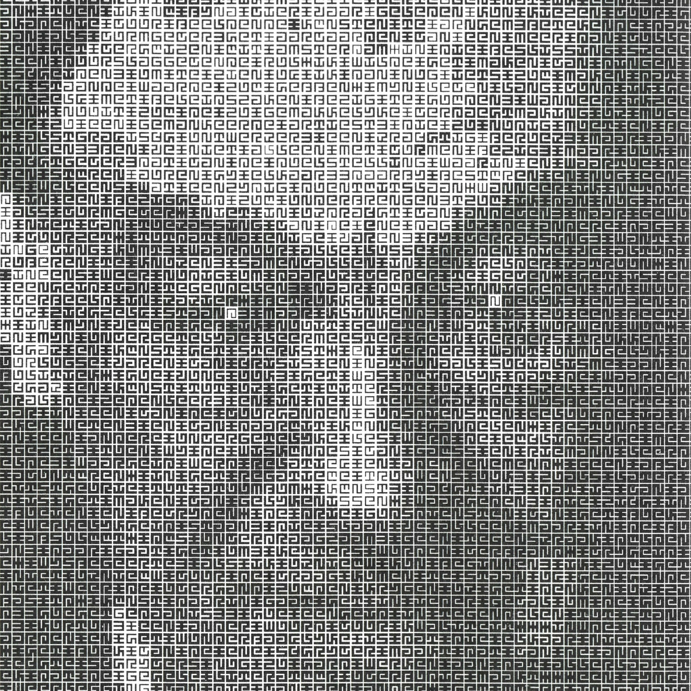
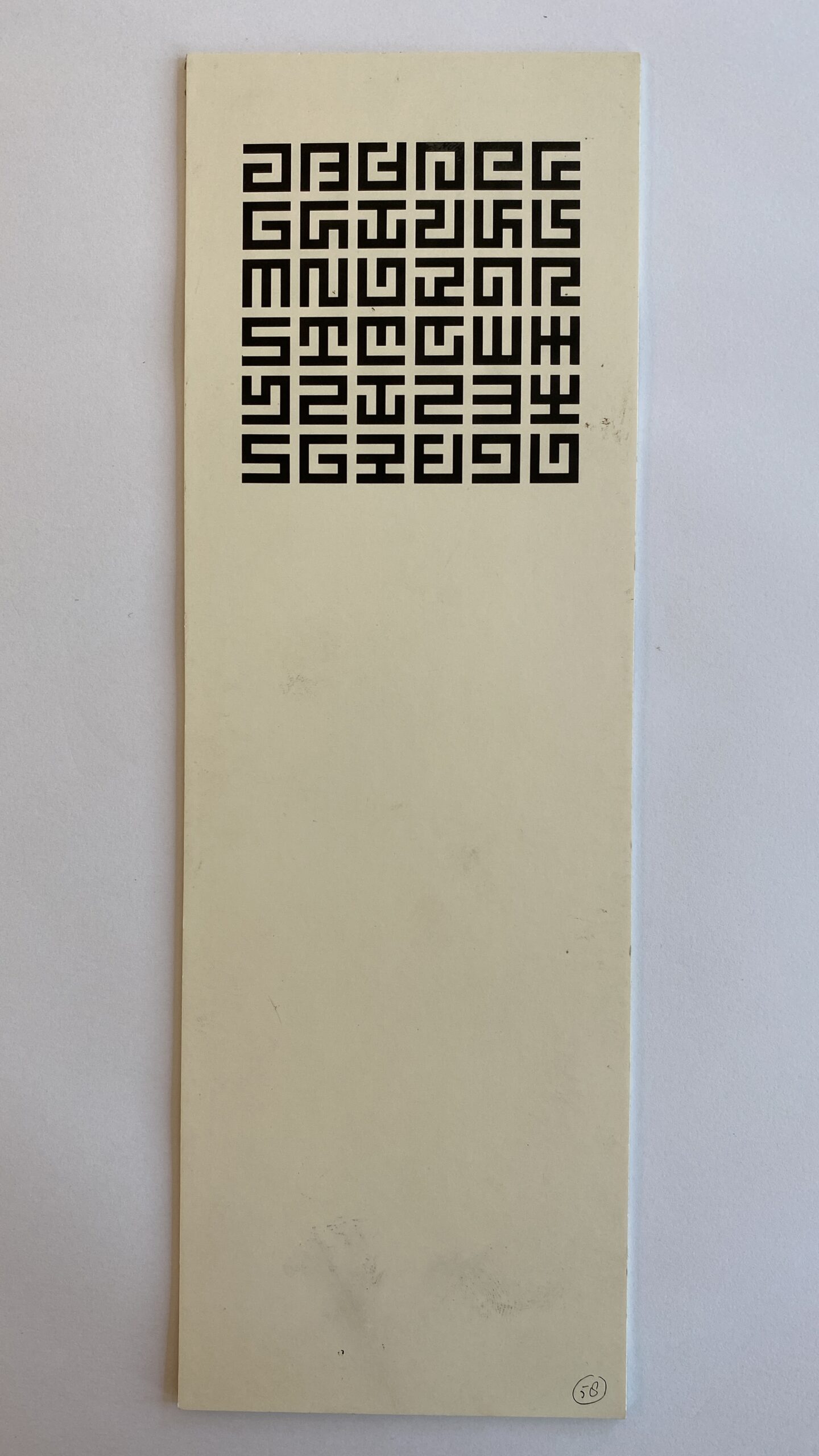
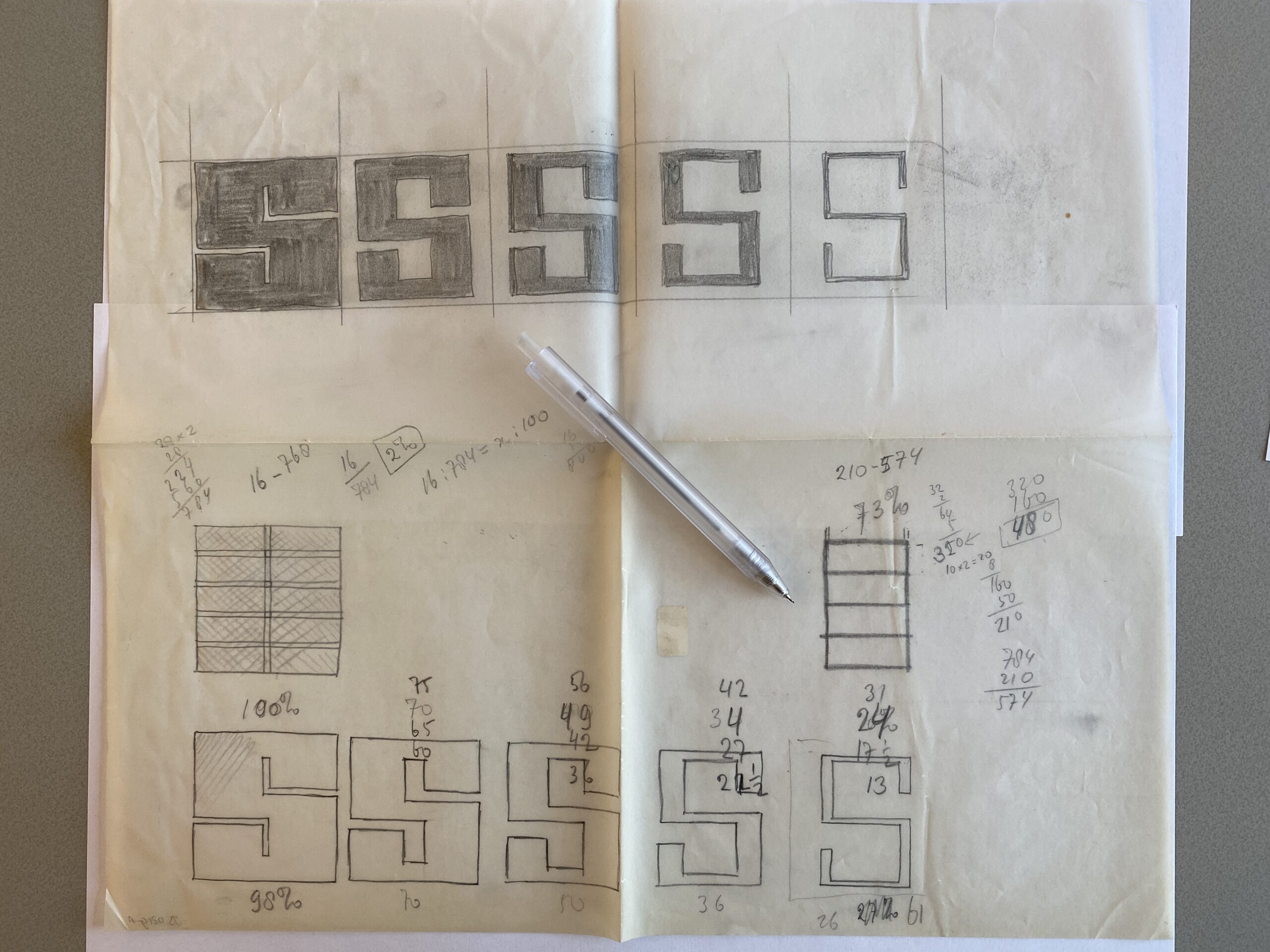
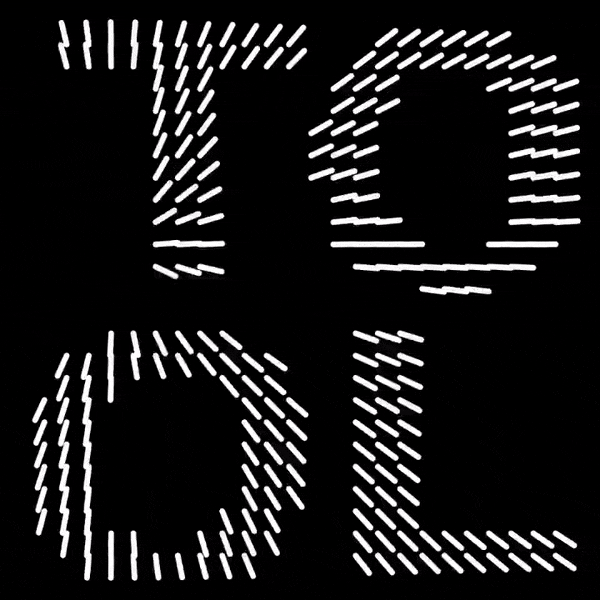
Portrait of Jurriaan Schrofer made in 1987 by Total Design, using a font and script that Schroder made in the 1970’s. It achieves this effect not by changing the text characters, as ASCII-converters usually do, but by changing the weight of the type. More info.
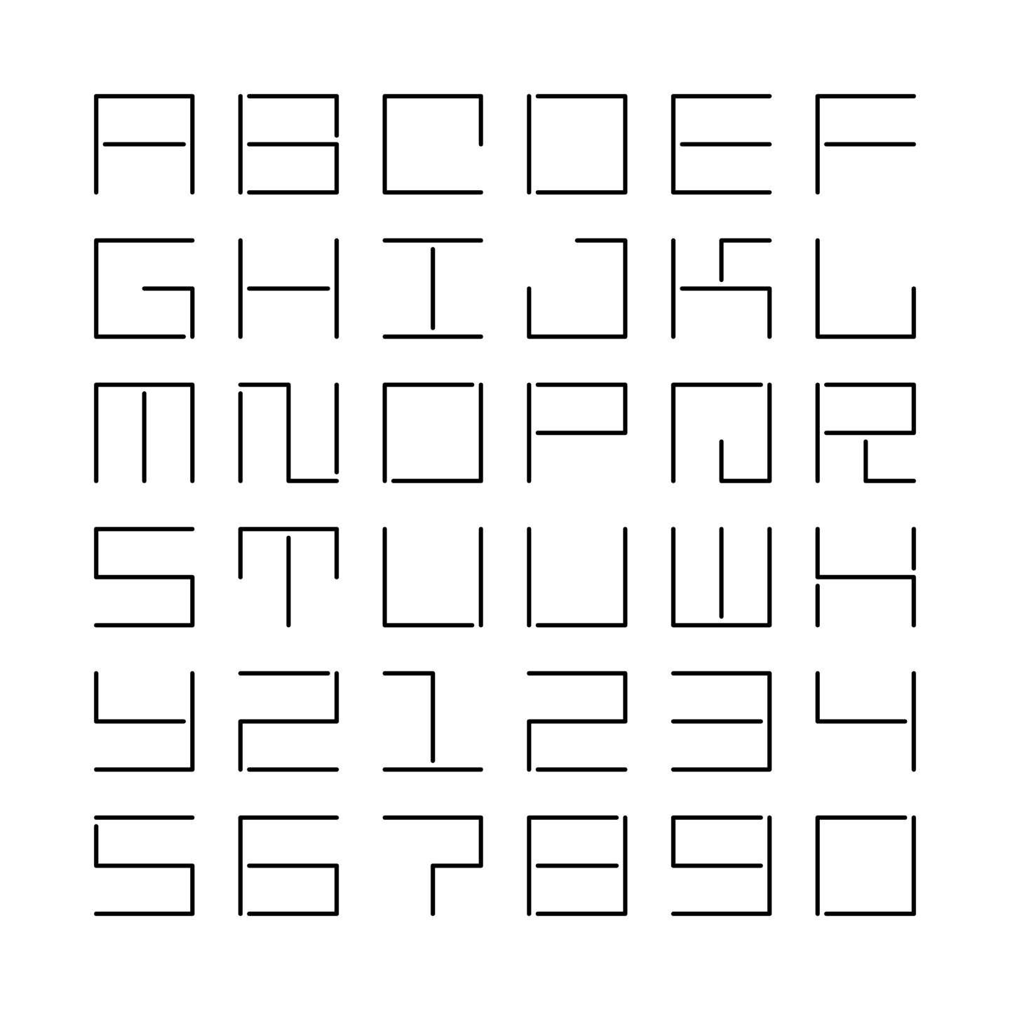
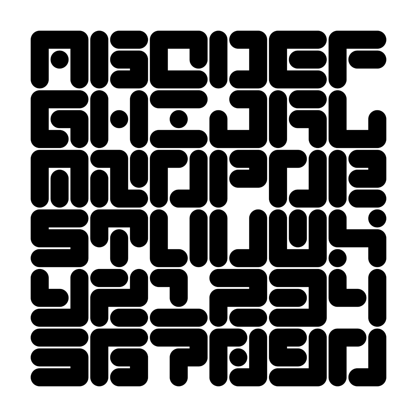
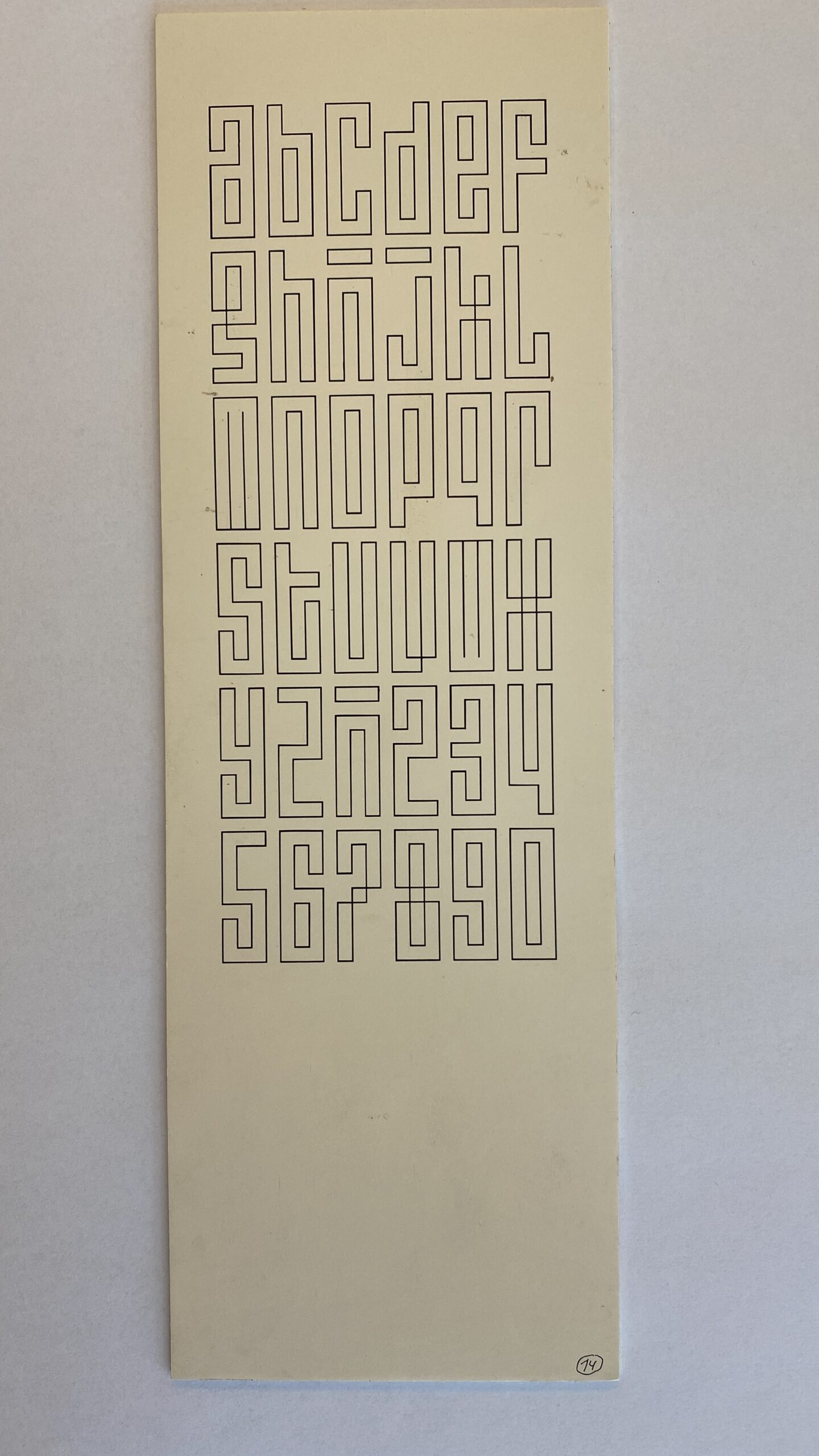
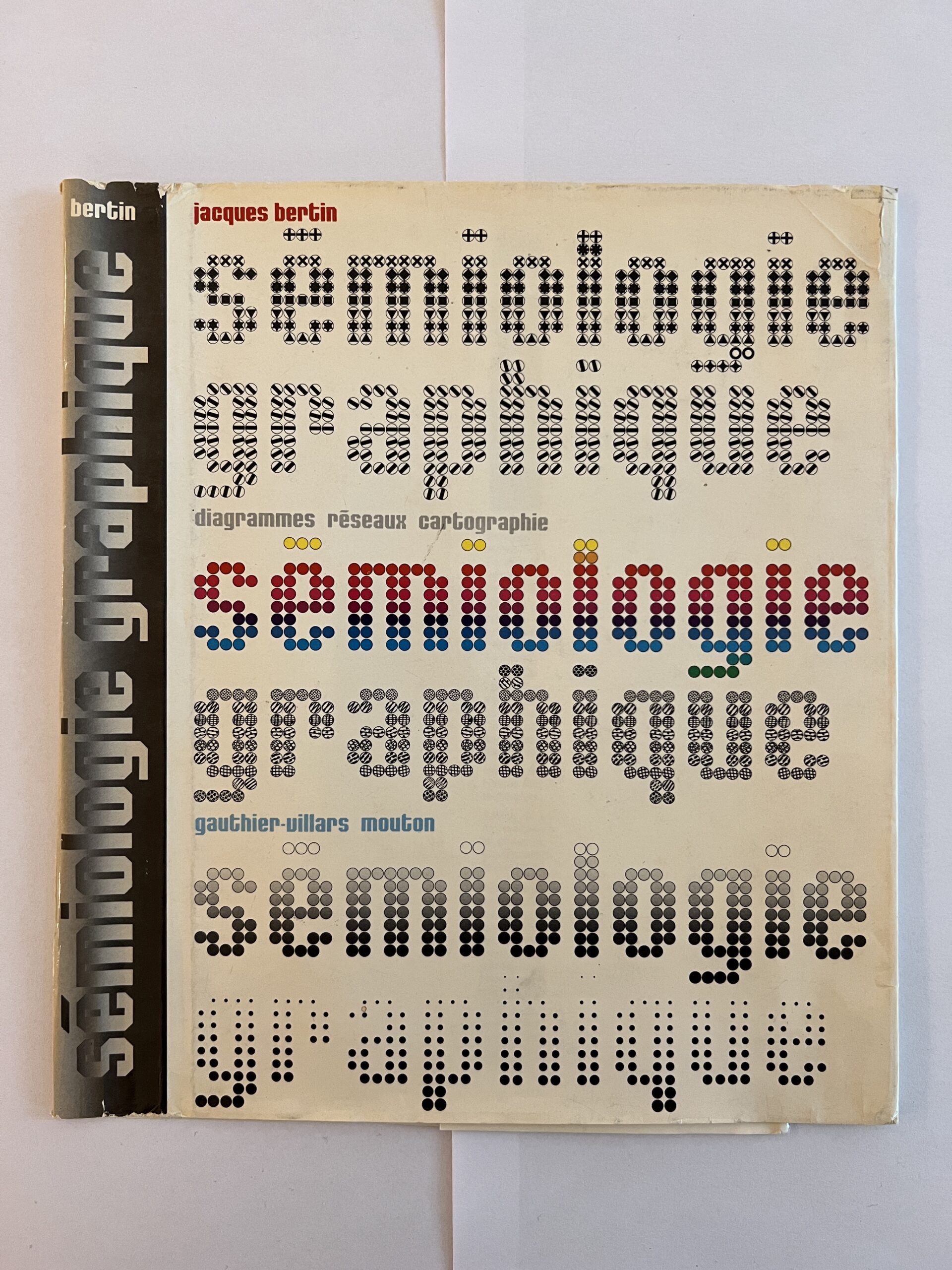
Image from Frederike Huygen’s biography Jurriaan Schrofer from 2013.
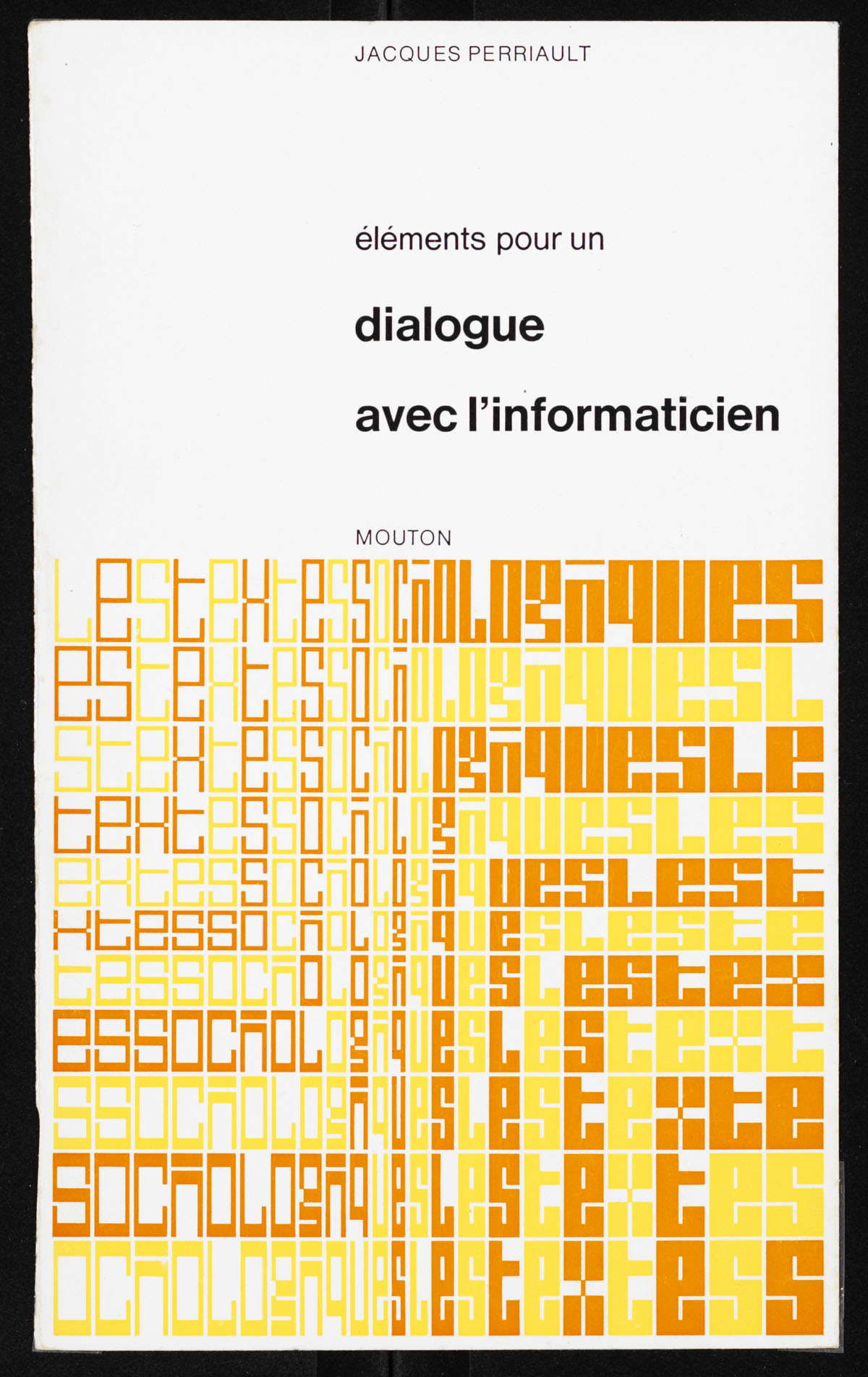
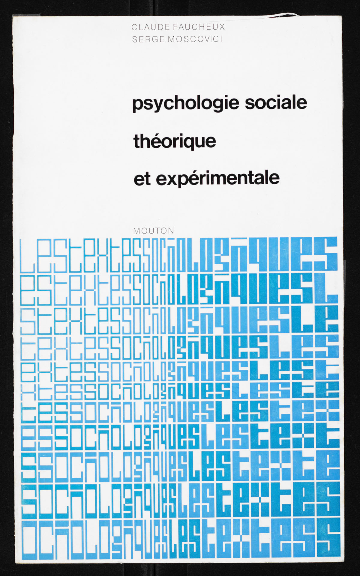
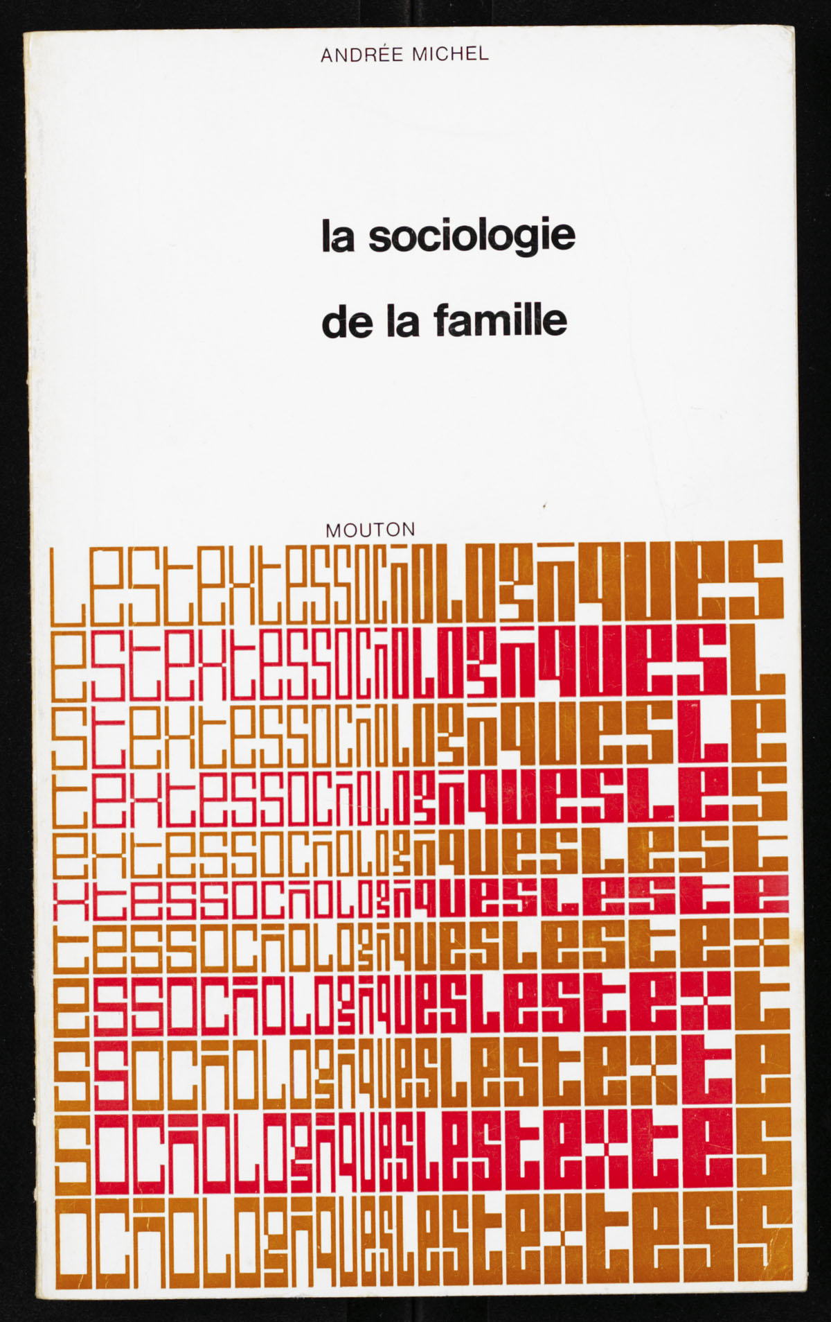
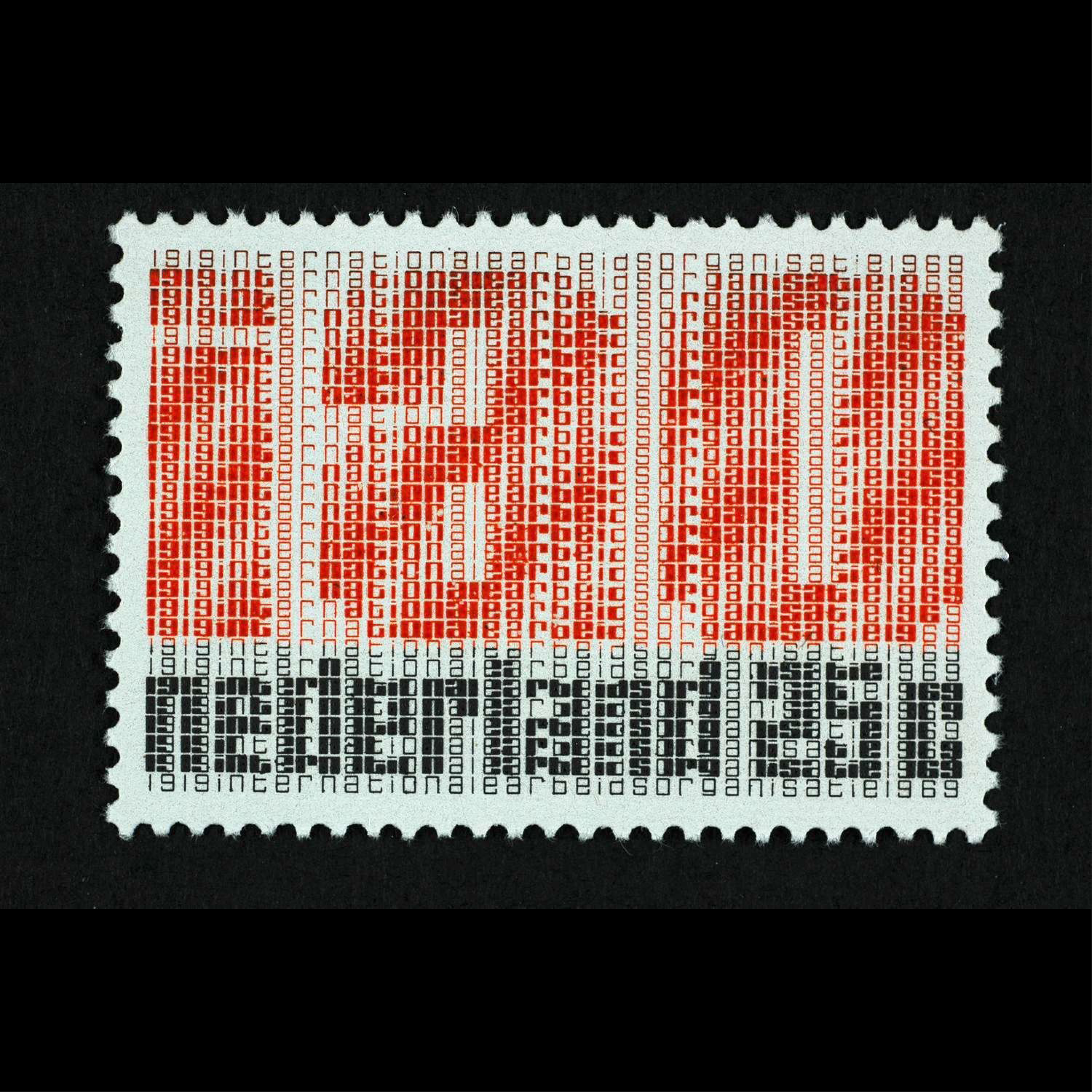
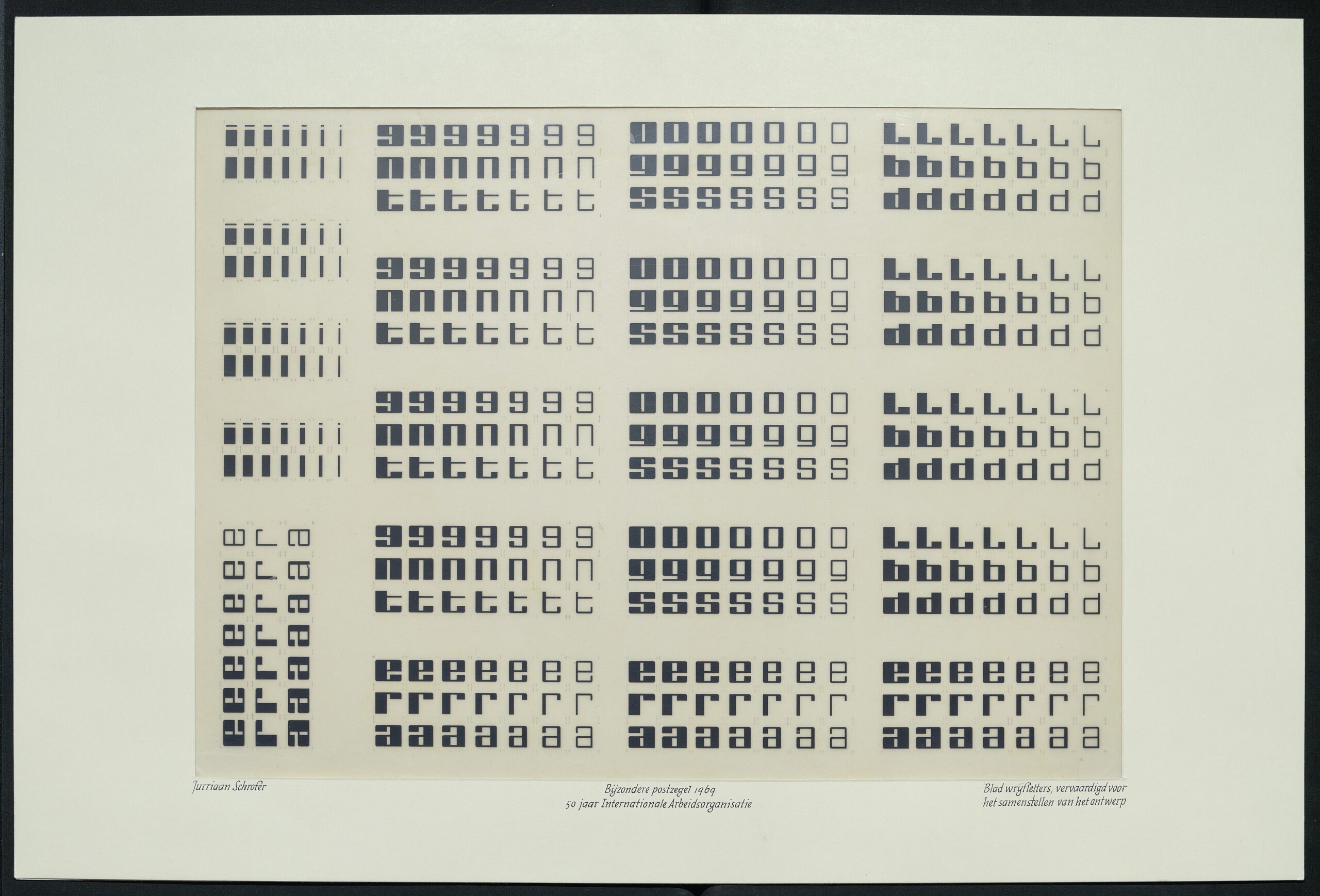
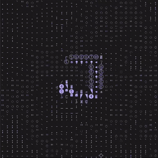
Jurriaan Schrofer’s stamps for the Netherlands, 1969. The text celebrates 50 years of International Labor Organization (IAO). More images and info in Maurice Meilleur’s excellent research.
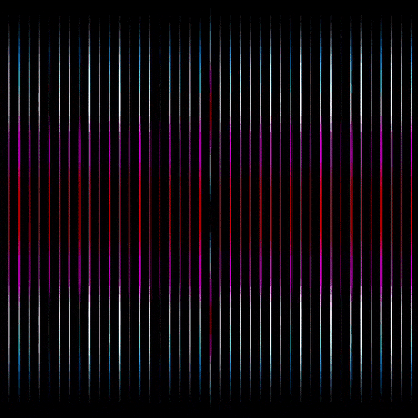
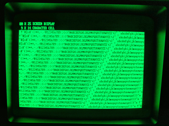
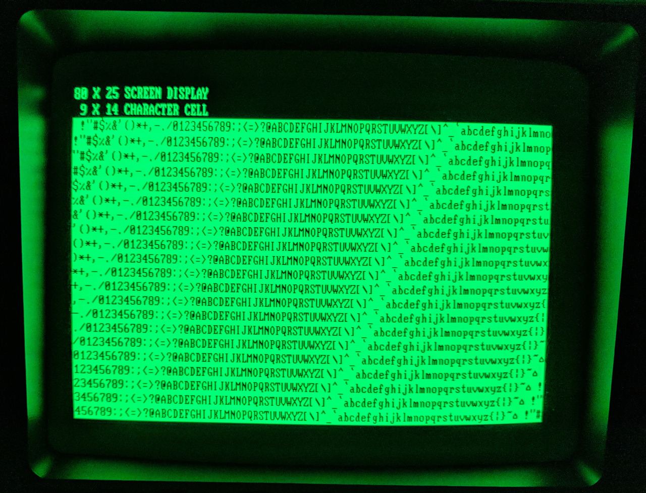
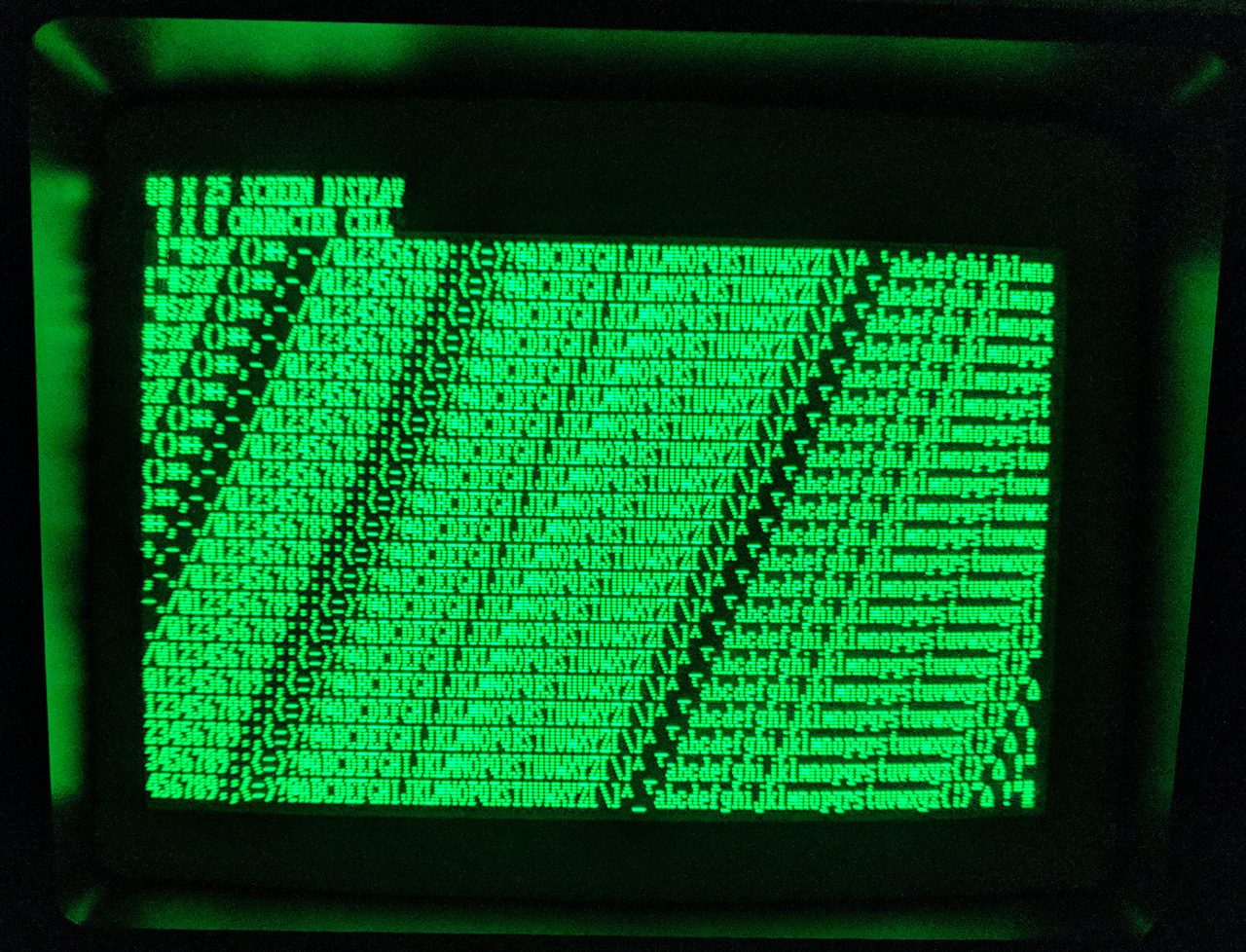
CGA and MDA, Part 2 As I briefly touched upon in my previous writeup on CGA vs. MDA, CGA’s 80×25 text mode is significantly coarser than MDA’s. CGA’s 80 column text mode is rendered at 640×200 with 8×8 characters (stretched vertically to approximately 640×400), while MDA’s 80 column text mode is rendered at 720×350 with larger 9×14 characters. MDA was capable of giving text attributes such as being bolded, italicized or underlined.
Seen here are the two side-to-side on the same display, a Compaq Portable’s screen.