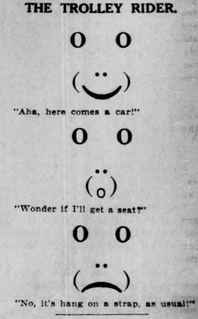
St. Louis Post-Dispatch, Missouri, January 21, 1910
Typewritten fonts by Murielle Rouleau (top, using only m) and Julius Nelson (bottom, using X and _). From Today’s Secretary 1950-1951. Scanned by Marcin Wichary.
From 1882, these graphics were made with 13 symbols (shown at the bottom). This is a modular type called Combination Border No. 16, by Bruce’s New York Type Foundry. A little bit like PETSCII, a little bit more like alpha blox.
Found by Pinwheel Press & thanks to Marcin Wichary for the tip.
LetraTime, a German magazine from 1975. This cover won ITC’s first Upper and Lower Case International Typographics Competition.
More info. h/t: Tim Koch
2024-update: Christof Gassner seems to the be designer.
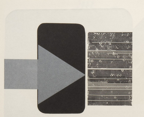
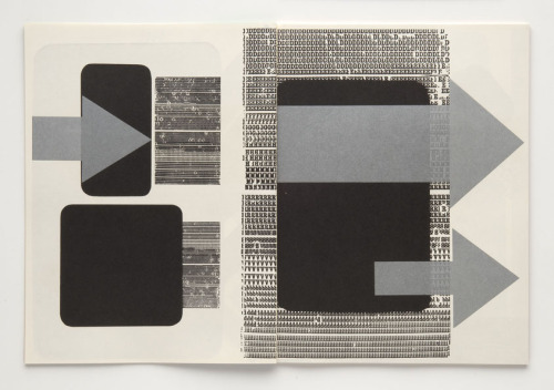
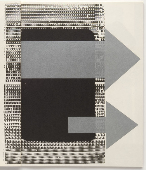
Book cover design by Walter Breker, 1960. Unusual style compared to other text graphics at the time, somewhere inbetween typewriter art and typography perhaps.
via design-is-fine:
Walter Breker, cover artwork for the book Reisebericht. Aluminium in der Architektur der USA, 1960. Düsseldorf, Aluminium-Verlag. Via Shuij Fukuda / pinterest
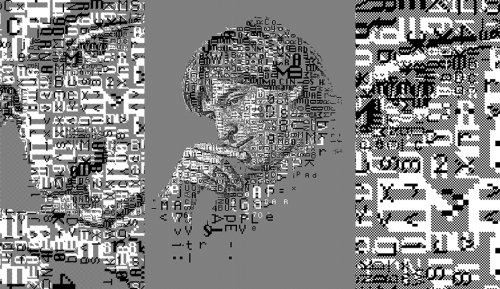
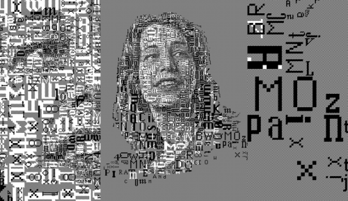
Steve Jobs & Susan Kare, by Charis Tsevis for Typorn, 2014. Uses the 1-bit fonts of the first Mac.
h/t: prostheticknowledge