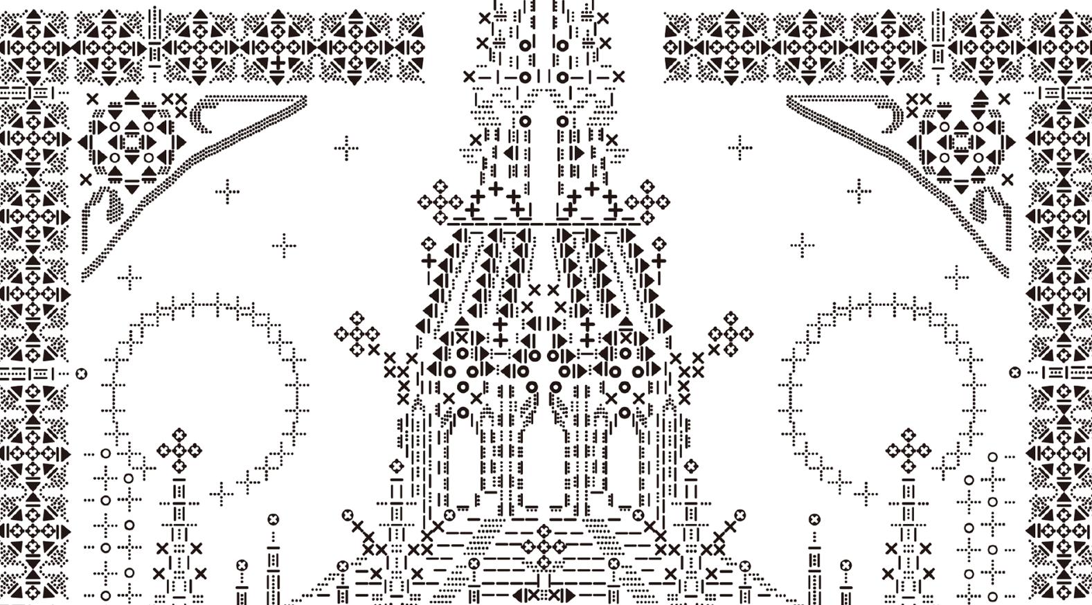
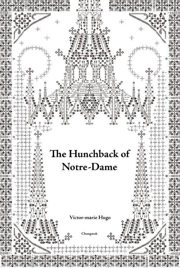
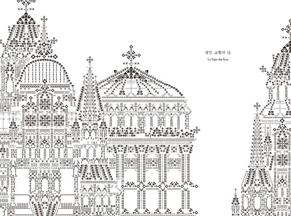
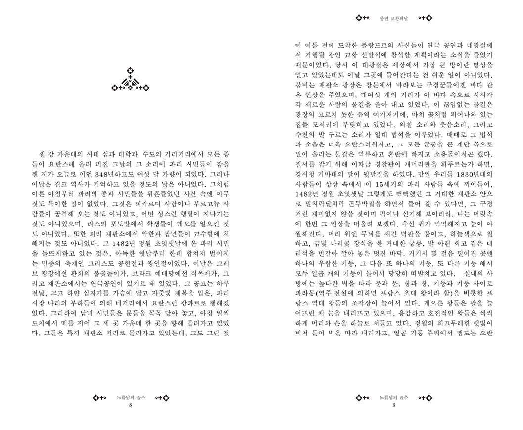
The Hunchback of Notre-Dame in Korean and dingbats, made by Jimin Hwang, 2017.
The Hunchback of Notre-Dame in Korean and dingbats, made by Jimin Hwang, 2017.
Algol (1970 and Textum 2 (1973) by Miroljub Todorović (Мирољуб Тодоровић), who founded the signalist movement.
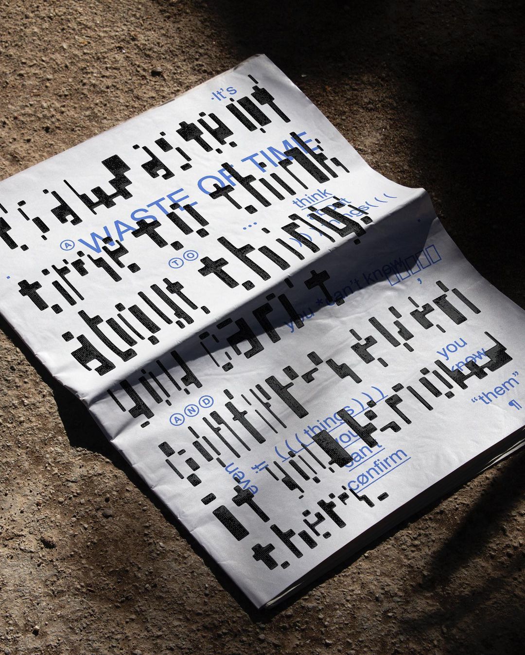
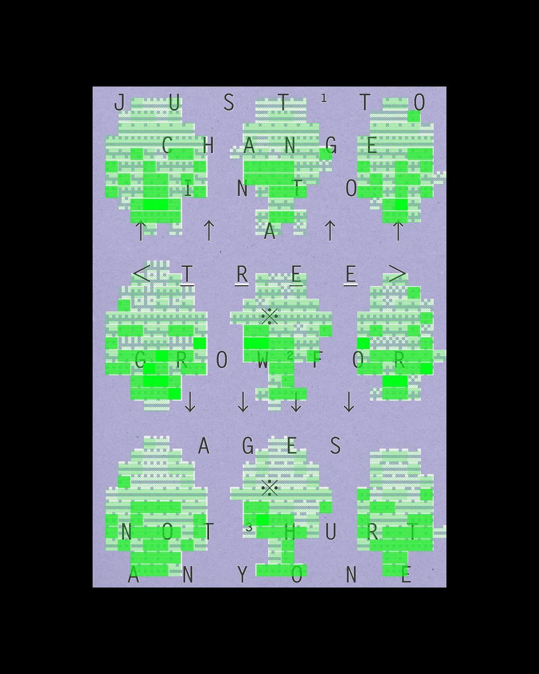
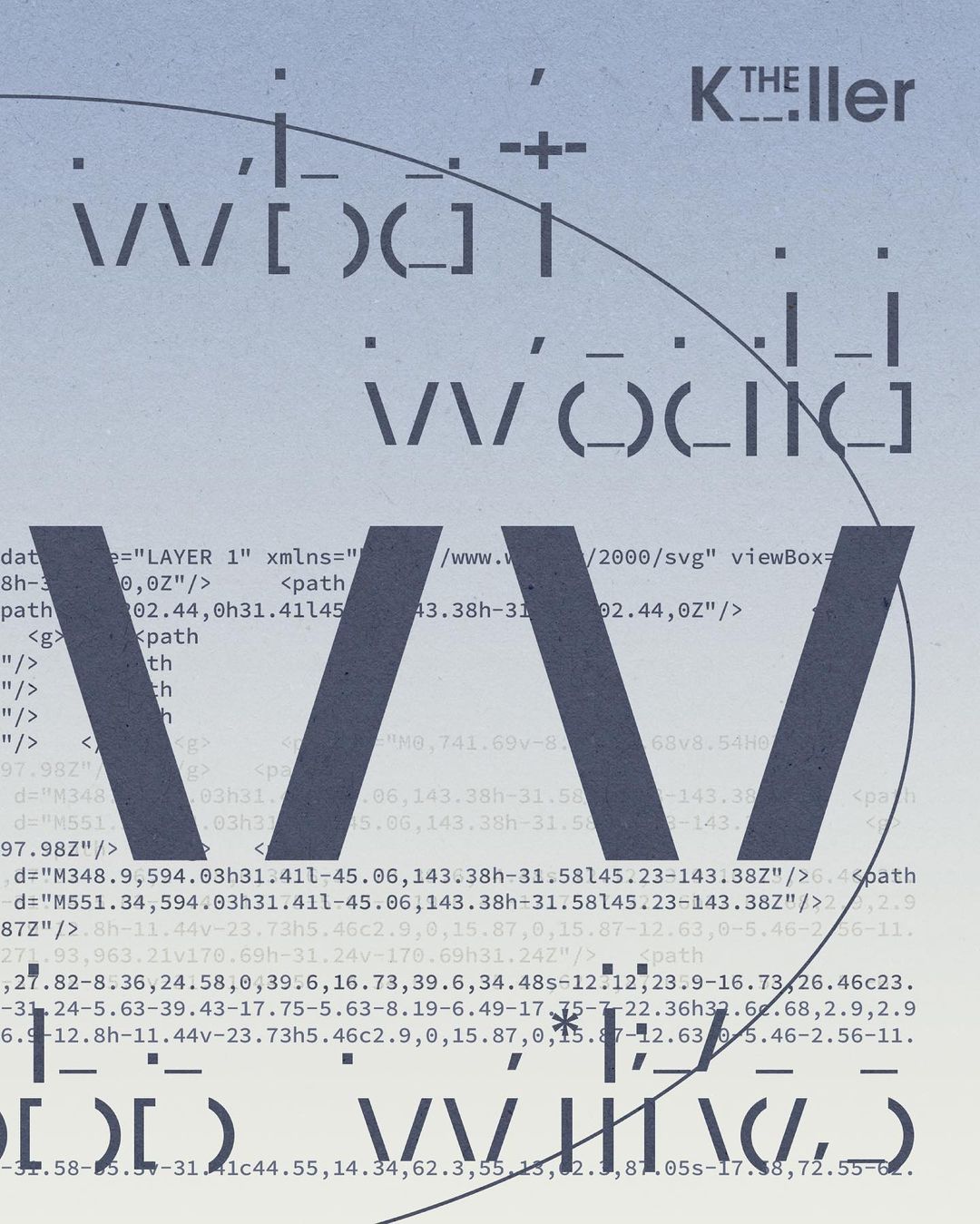
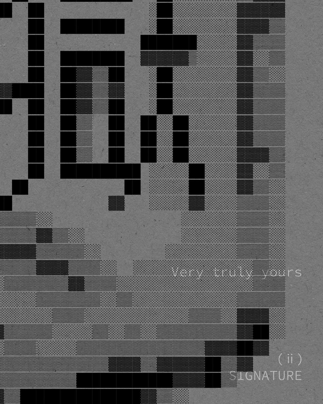
Works by Nigel Cottier from his Instagram. h/t: TYPE01
More posts on Cottier.
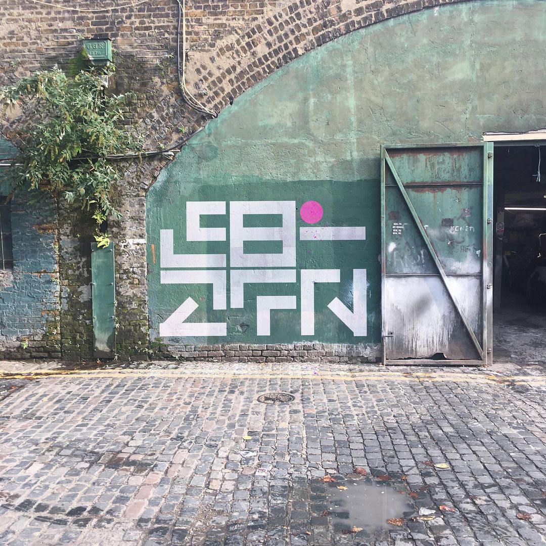
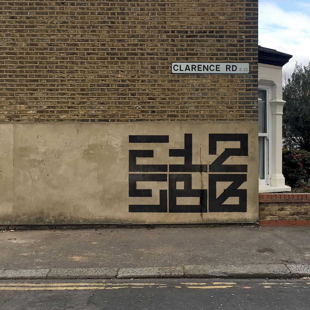
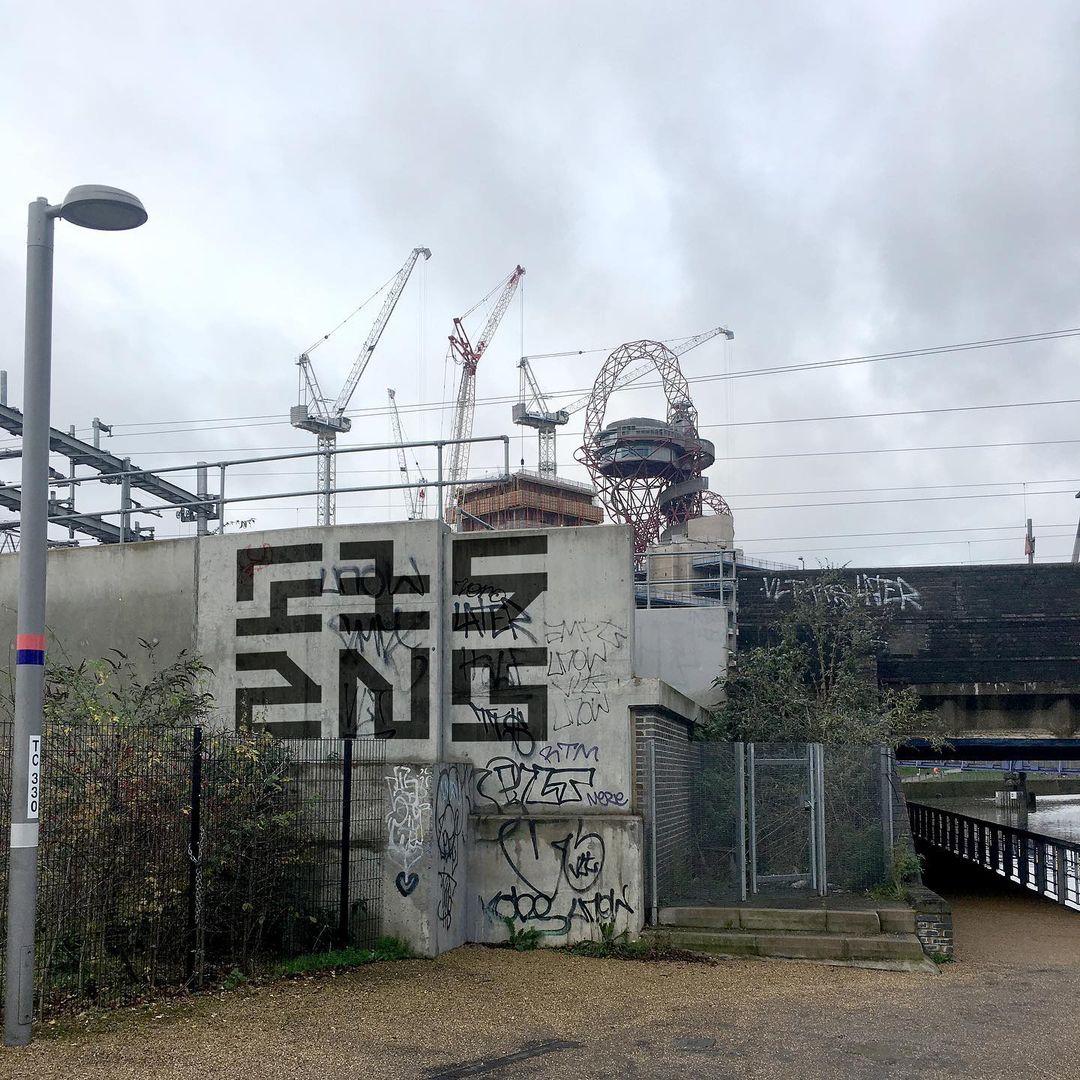
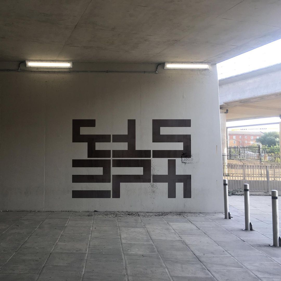
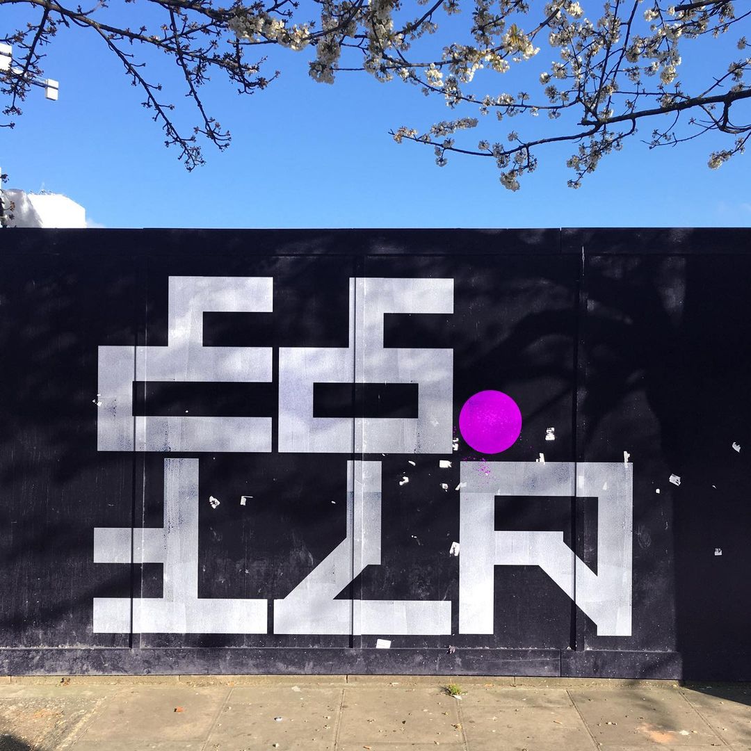
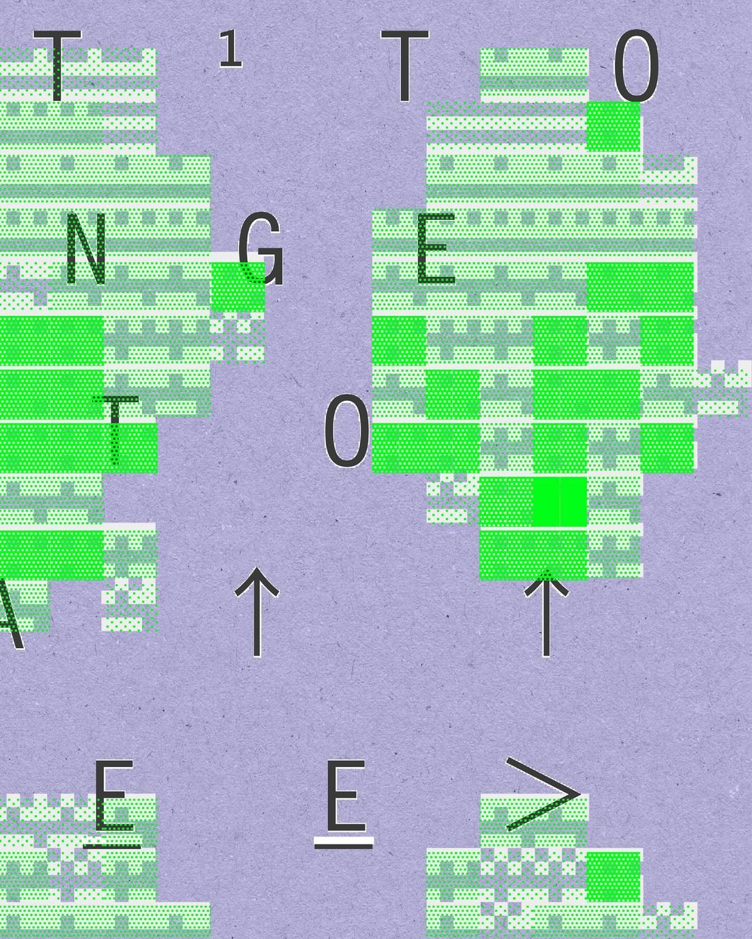
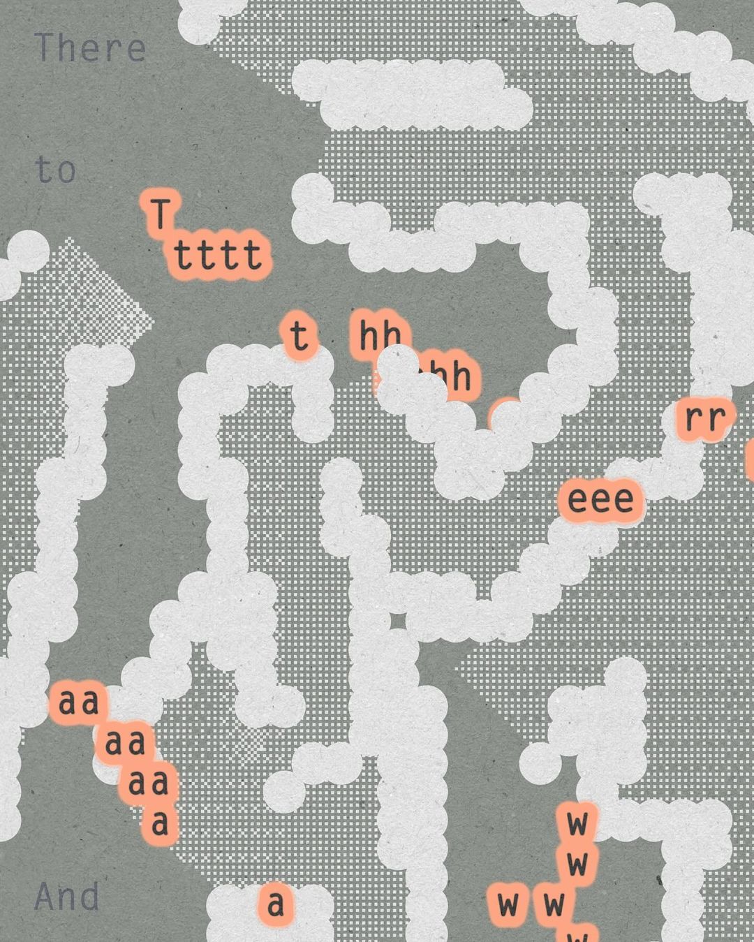
Postcodes around London by Nigel Cottier since 2019. From his Instagram. Similar to his Letter Variations fonts.
More posts on Cottier.
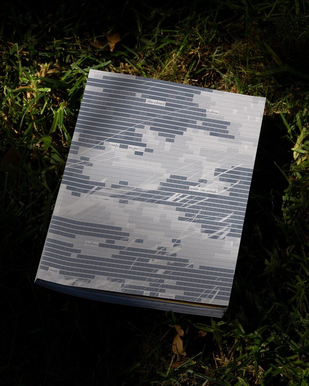
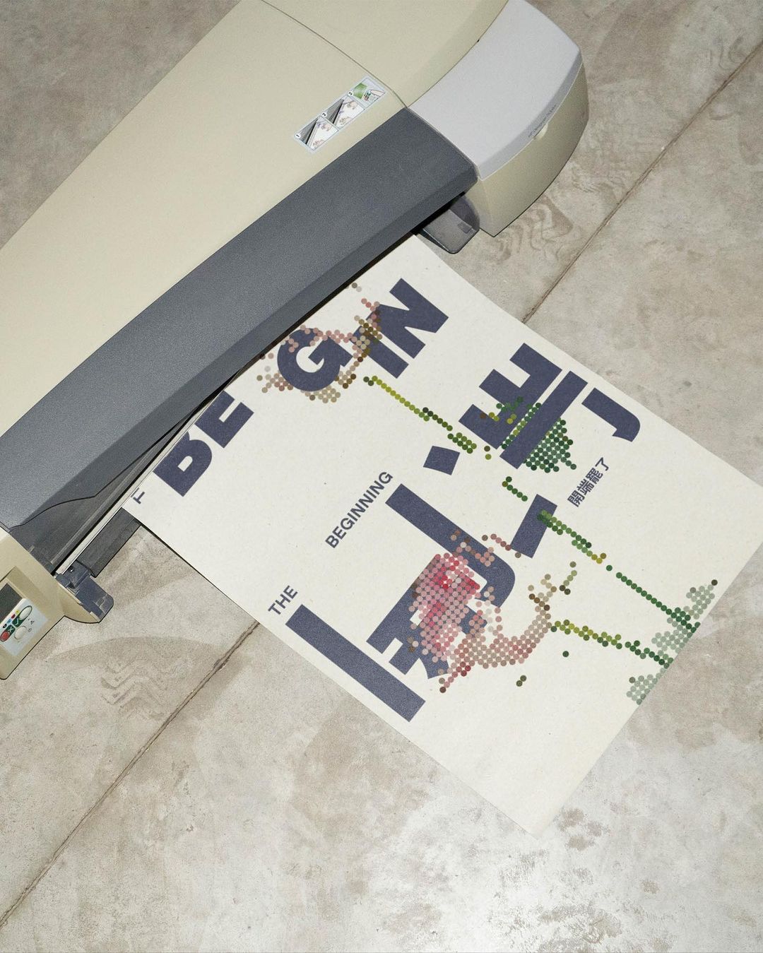
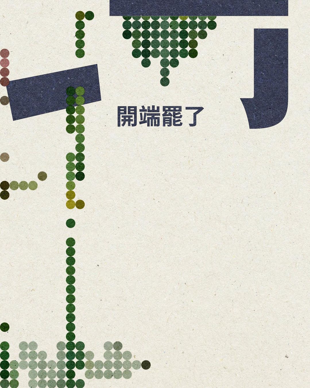
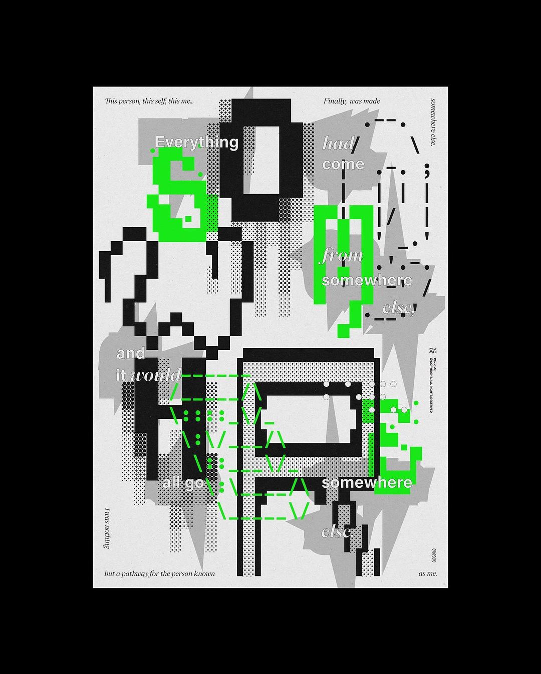
By Ou Zhang, 2023. From cloud.cb (野雲).
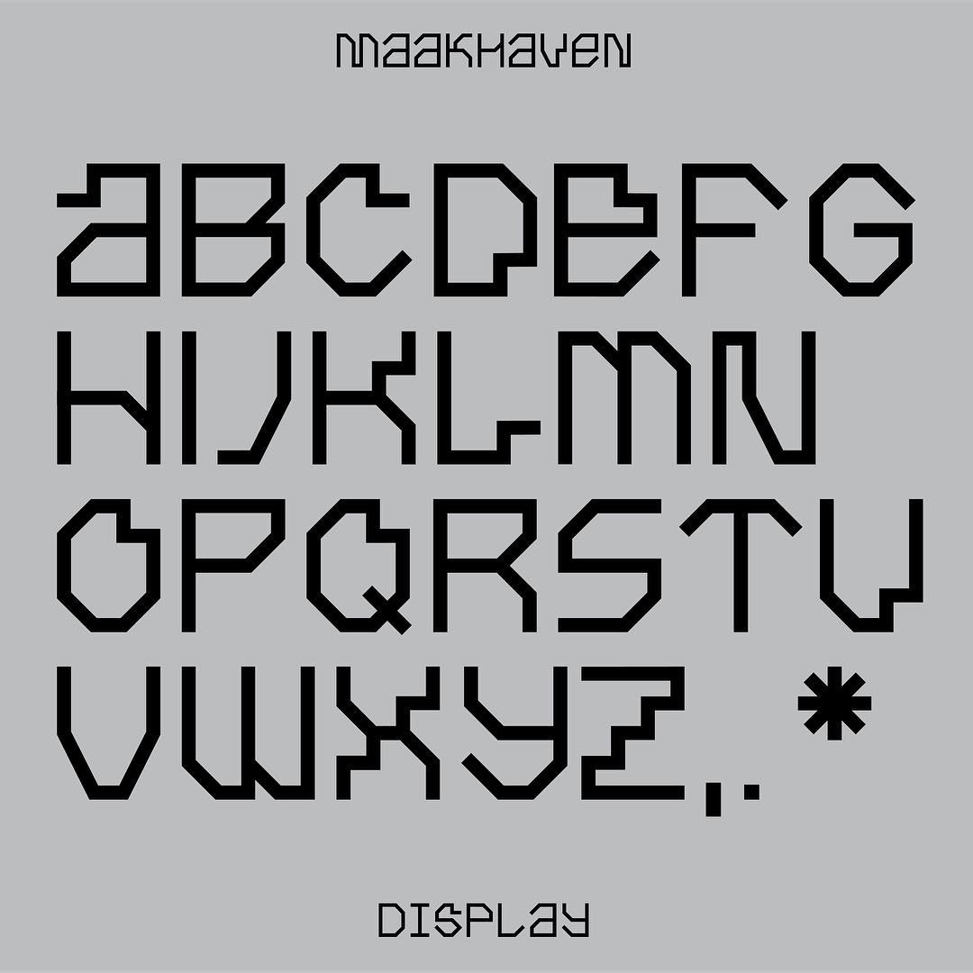
Maakhaven Display, designed by Lennarts & De Bruijn 2018.
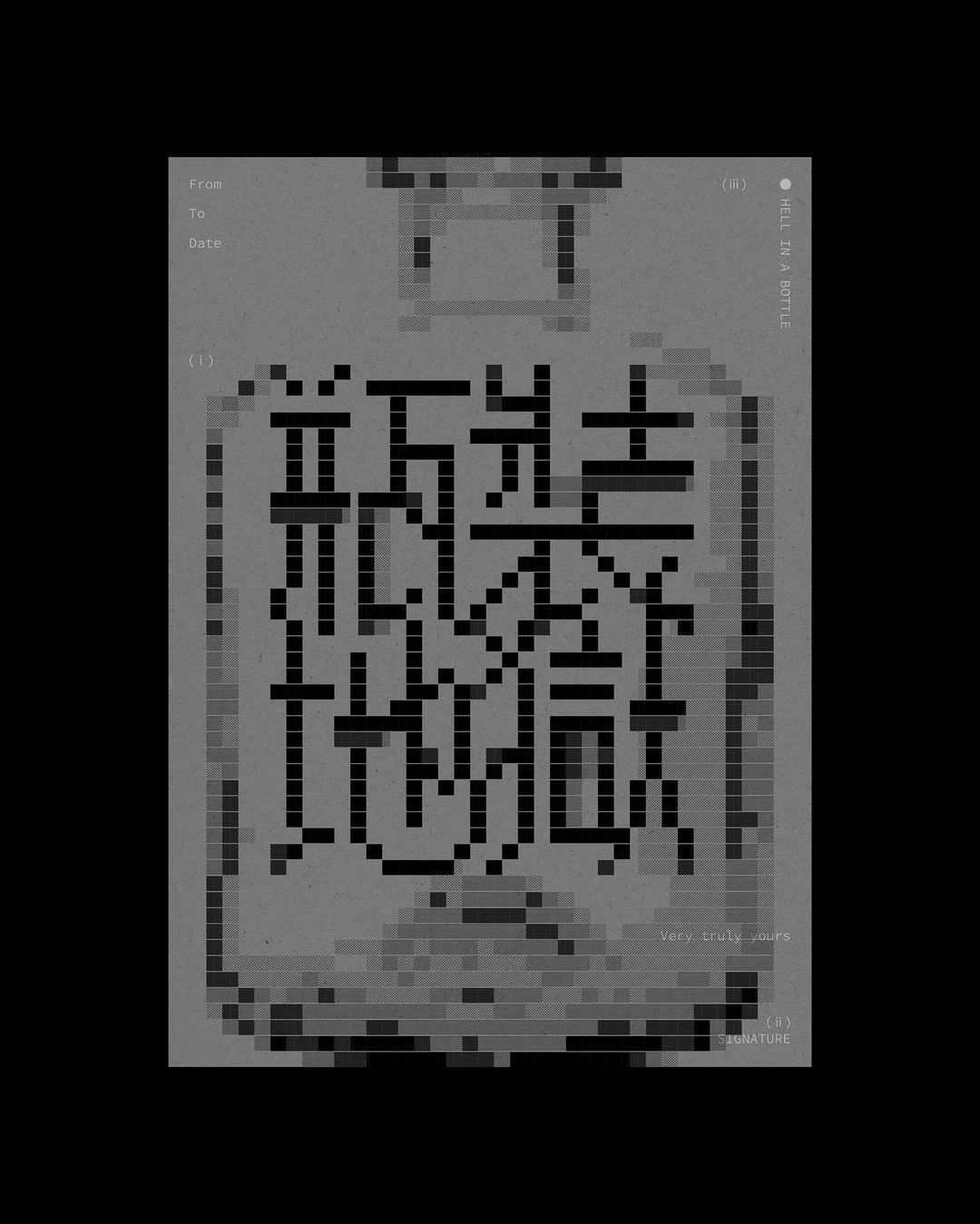
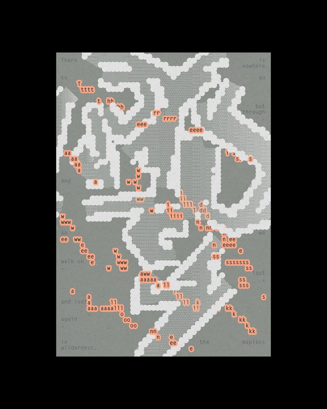
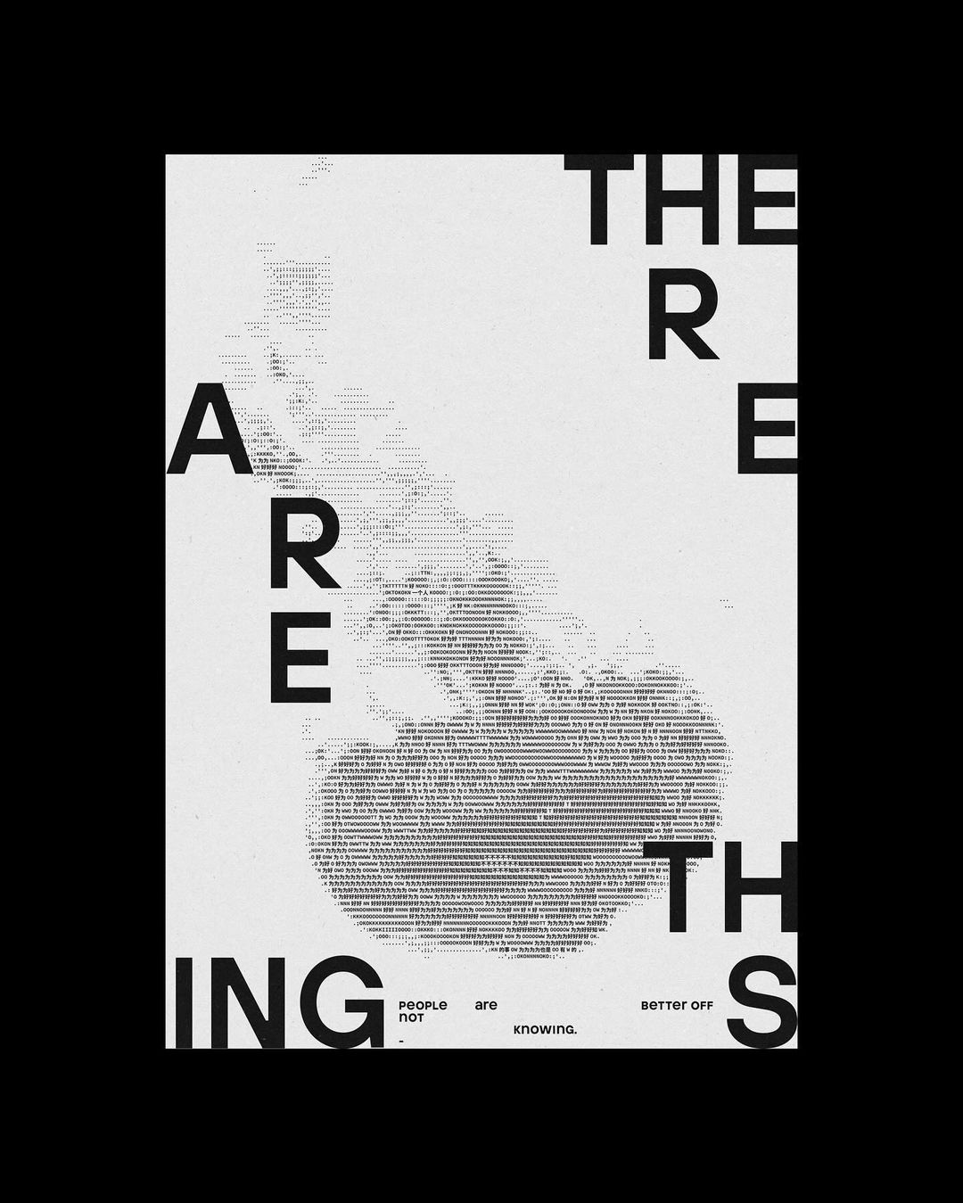
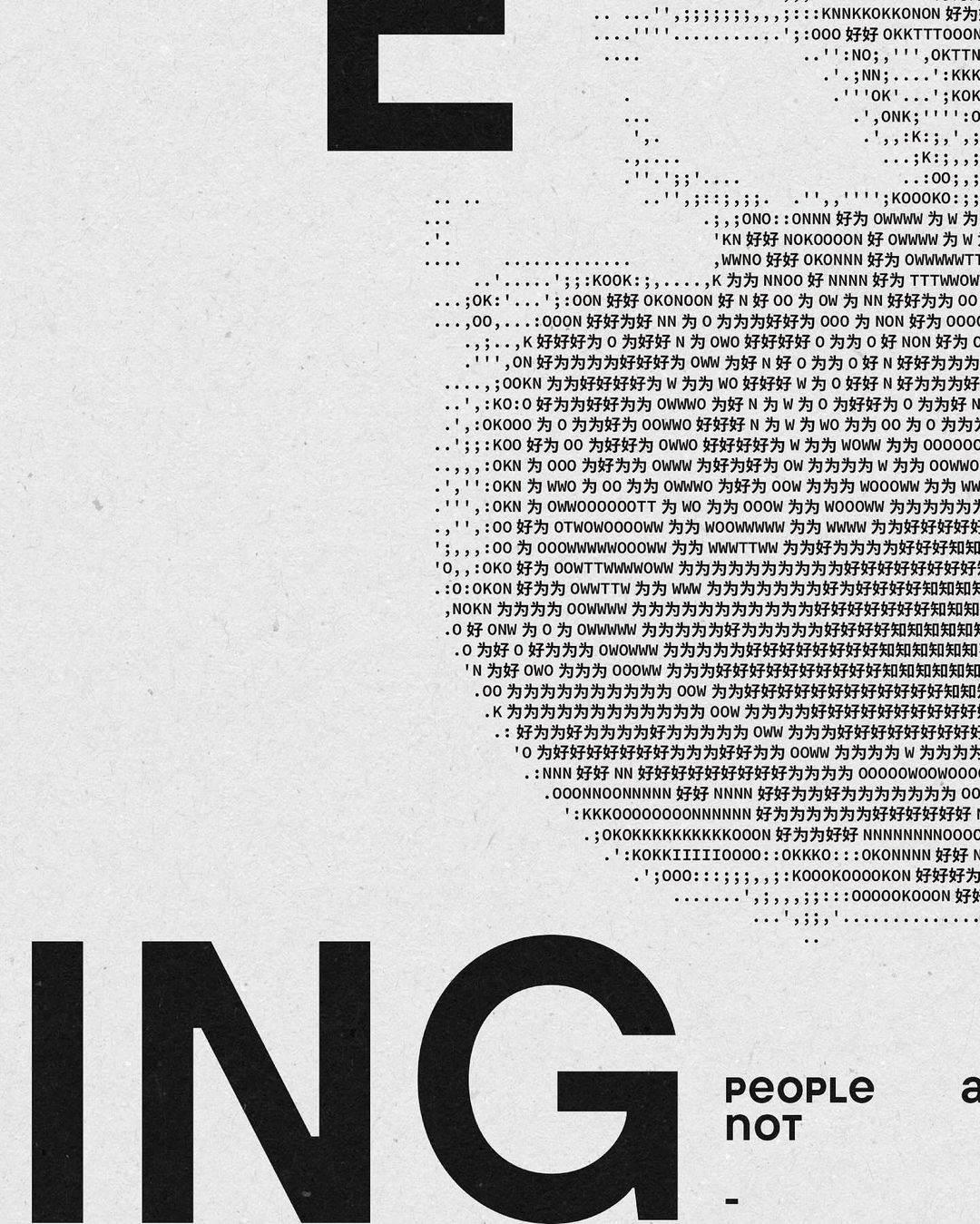
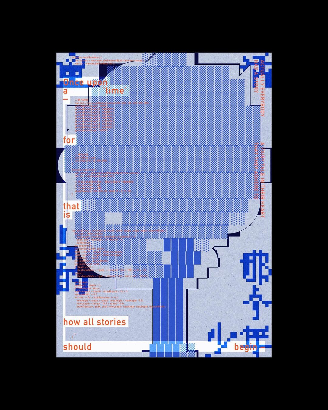
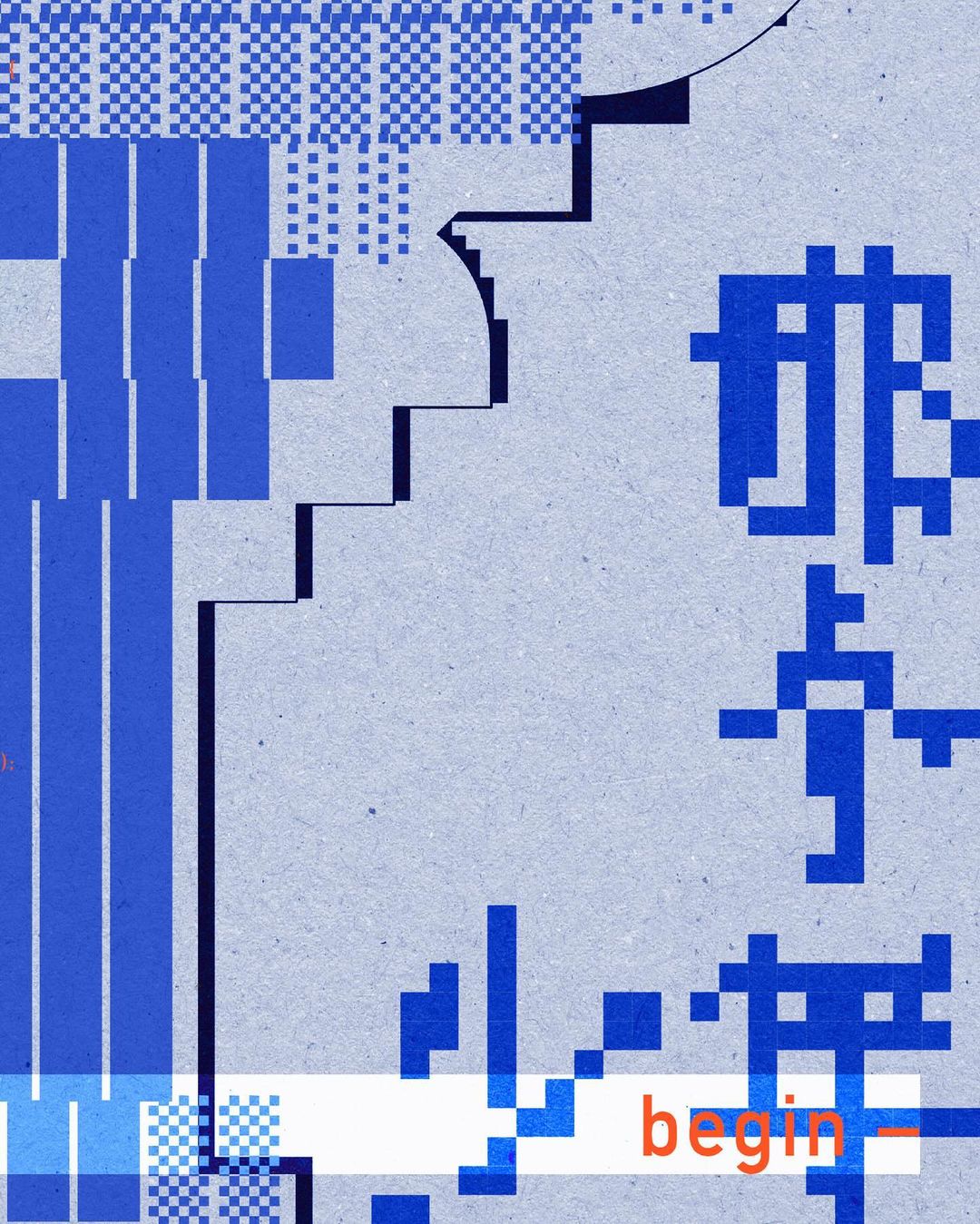
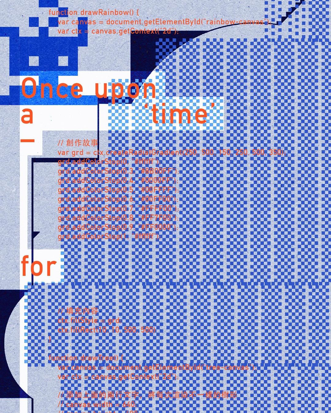
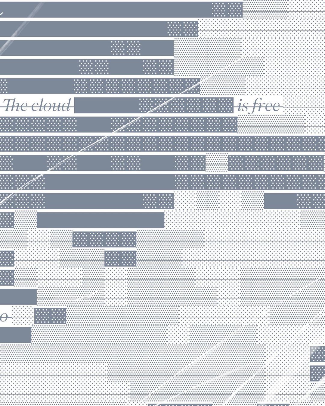
By Ou Zhang, 2023. From cloud.cb (野雲).