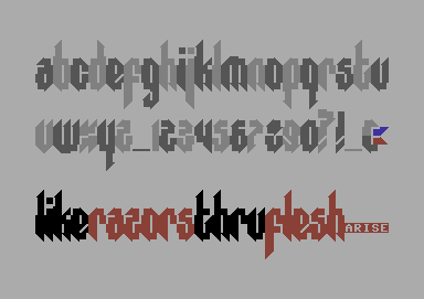
A font made in PETSCII by Wacek, 2013. Small characters are 2×3 PETSCII-chars, big ones 2×5 chars.
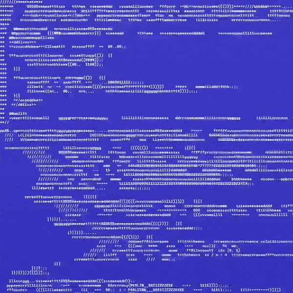

Javascript works by Yannick Gregoire, 2021-2024. Also check out his texty and keyboard-operated website.
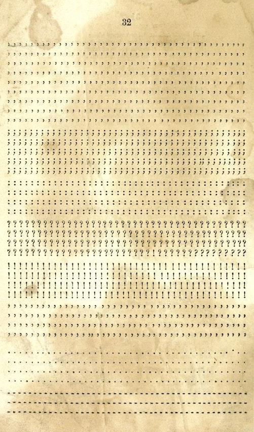
After complaints about Timothy Dexter’s A Pickle for the Knowing Ones (1797) being entirely devoid of punctuation, in future editions the eccentric businessman supplied a supplemental page so that people “may peper and solt as they please”. via publicdomainreview
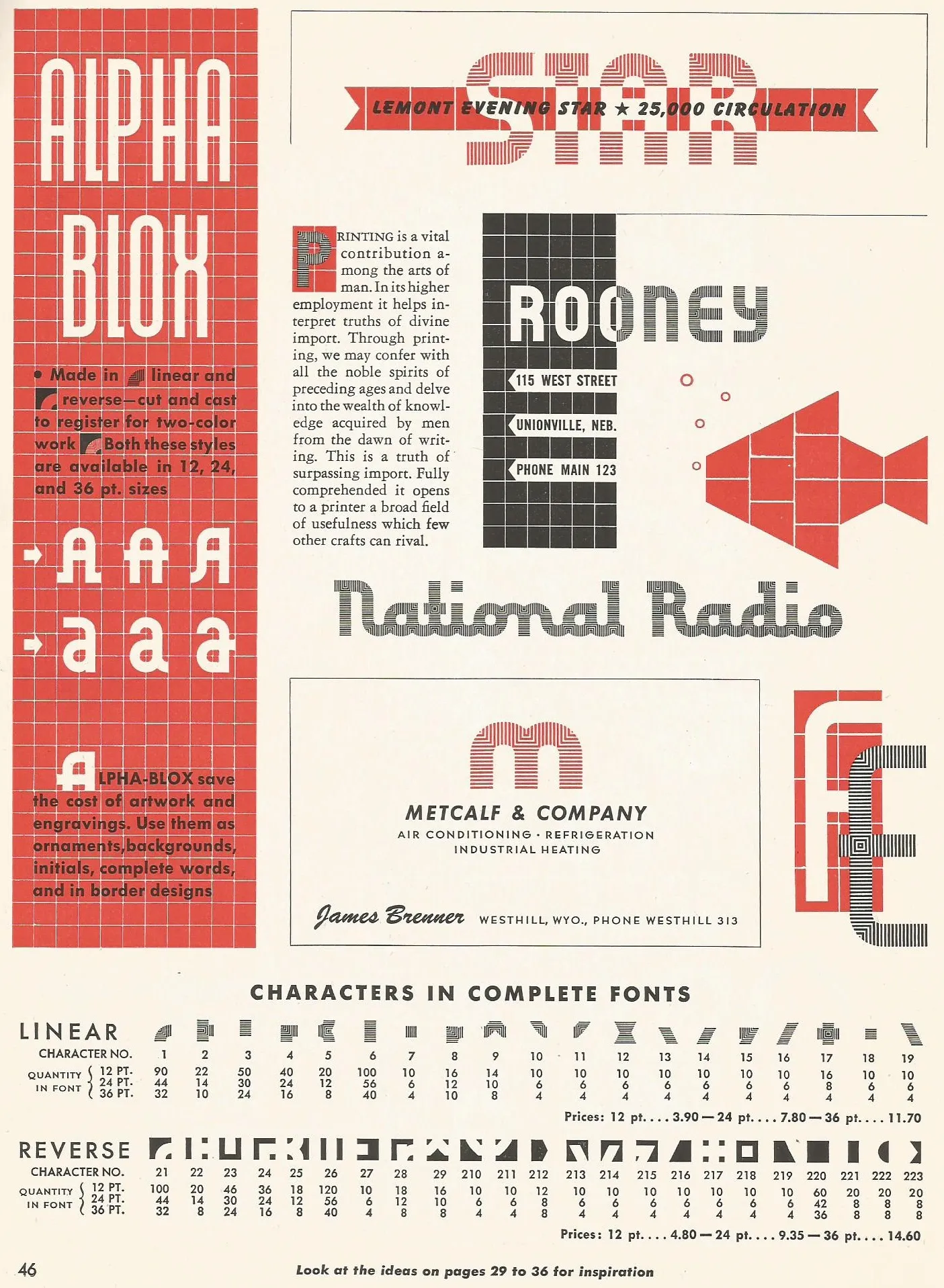
Alpha-blox, a font by American Type Founders, 1944. via
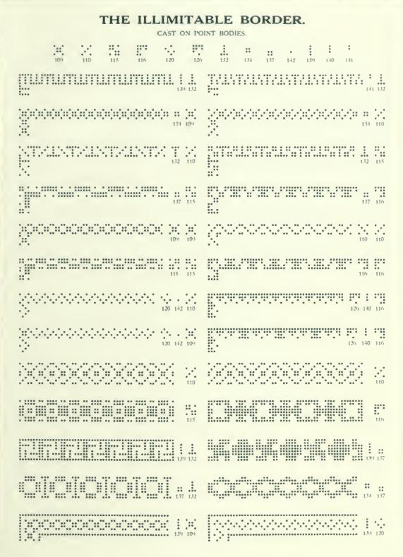
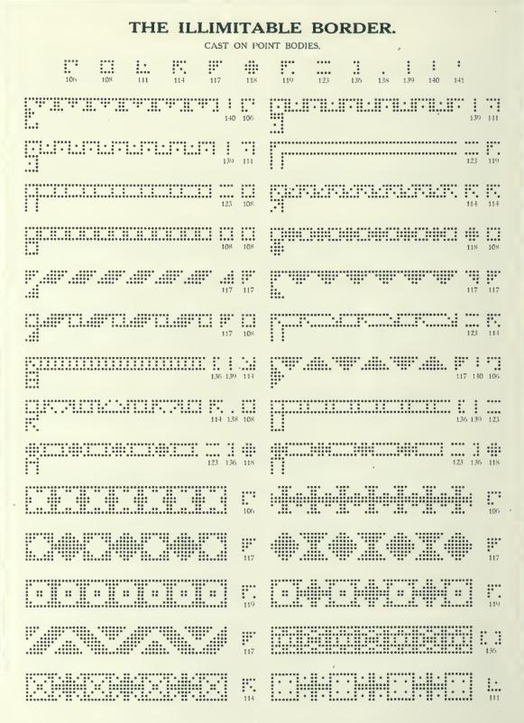
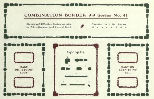

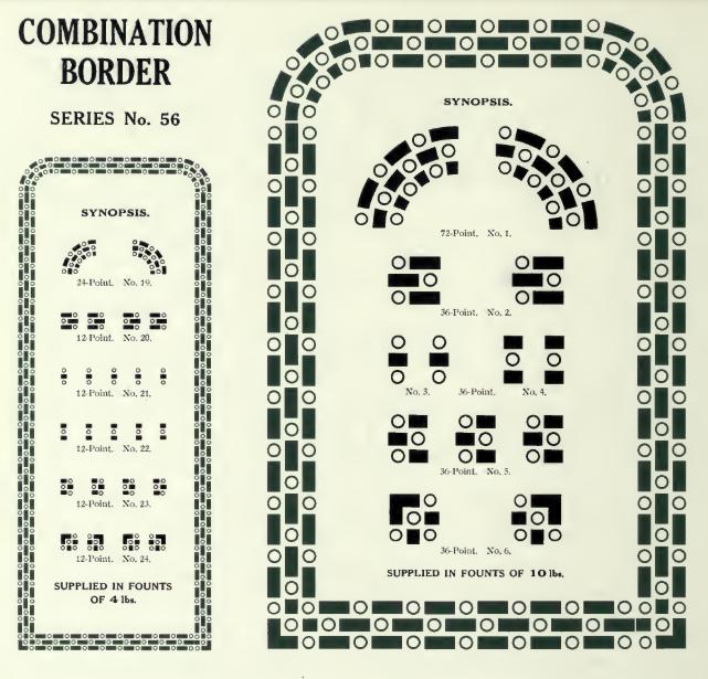
From Specimens of types & borders and illustrated catalogue of printers’ joinery and materials by H. W. Caslon & Co, 1915. via
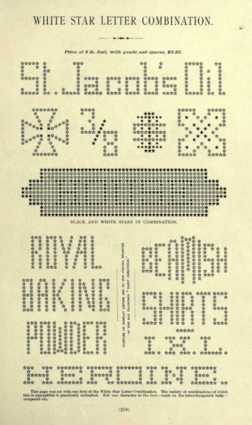
White Star Letter Combination from Palmer & Rey. Unknown date. via
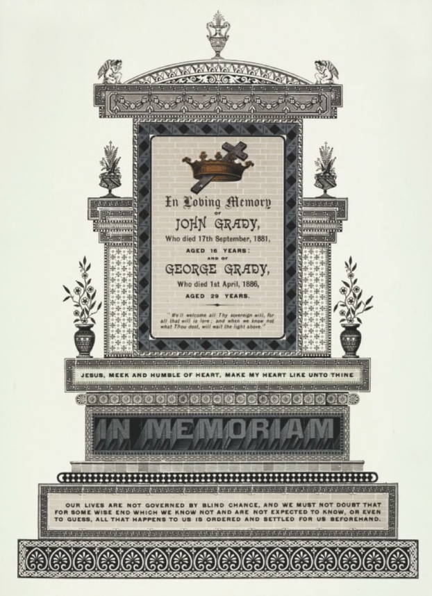
Memorial made with typographic ornament, 1870s or 80s. Apparently, this is called a typotecture by some historians (type + architecture). via
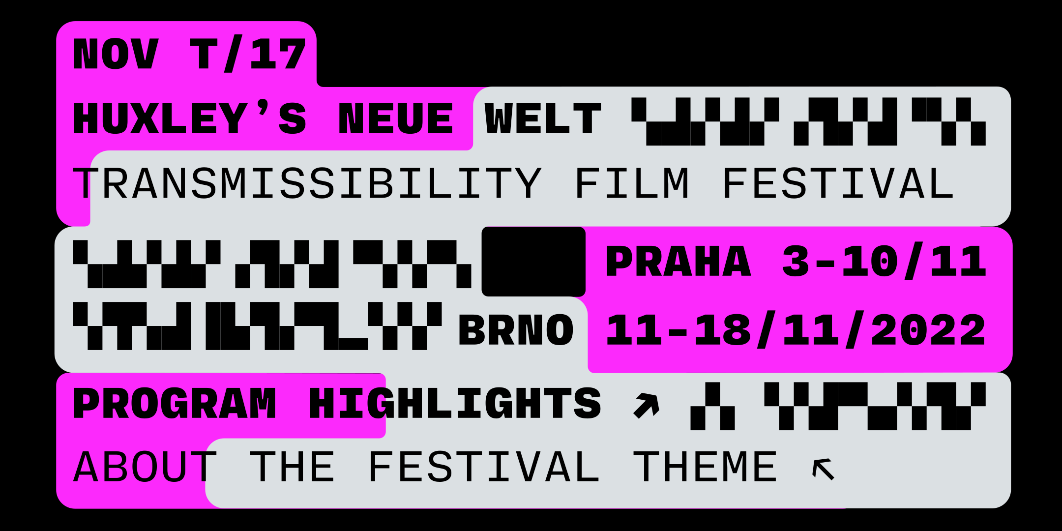
Adapter Mono, a monospaced variable font by Rosetta, 2024. Weight, slant and italicization (!?) can be modified, which is unusual for a monspaced font. It is pan-European and has characters for text graphics. Rosetta offers other variable fonts, supporting many other scripts.
via TYPE01