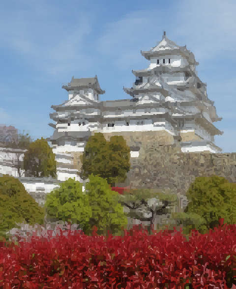
Tag Archives: font

By 1mpo$ter, 2023.

Works by 1mposter.

Microsoft Font Assistant (1993), via

airconditioncomputingnightmare:

CGA and MDA, Part 2
As I briefly touched upon in my previous writeup on CGA vs. MDA, CGA’s 80×25 text mode is significantly coarser than MDA’s. CGA’s 80 column text mode is rendered at 640×200 with 8×8 characters (stretched vertically to approximately 640×400), while MDA’s 80 column text mode is rendered at 720×350 with larger 9×14 characters. MDA was capable of giving text attributes such as being bolded, italicized or underlined.

Seen here are the two side-to-side on the same display, a Compaq Portable’s screen.

The first image shows a ROM-dump of the font in the legendary terminals VT100 and VT220. The second image is a representation of how they appear on screen. The difference is more than just aspect ratio. Look at letters like q and p: pixels are sometimes doubled, sometimes tripled. The fascinating explanation is here.

Southwest Technical’s 6800 computer and the CT-64 terminal, and a photo of its 64×16 textmode. Launched in 1975. First image from Creative Computing and second one from here.

(First?) conversion from video to variable font text mode. Made by Toshi Omagari, via @pixelambacht.

The 1986 retina screen: the WY-700 video card/screen gave the PC a 1280×800 resolution, and a text-mode of 160 columns by 50 lines. It had a built-in 16×16 font (download), and you could even use your own custom fonts. The high-res modes only supported greyscale, but who needs colours anyway?

Sources: John Elliot, thecomputerarchive.com, PC Mag.

Glyphdrawing, a new online textmode editor that supports ttf-font import and independent font size and cell size. Made by grmmxi (images from his Instagram) and Ian Tuomi.