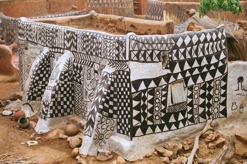
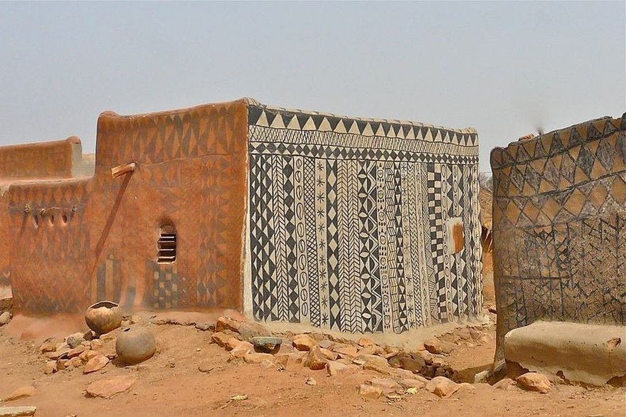
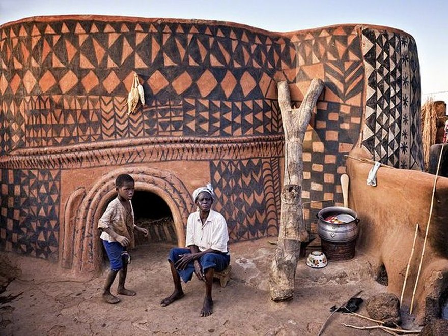

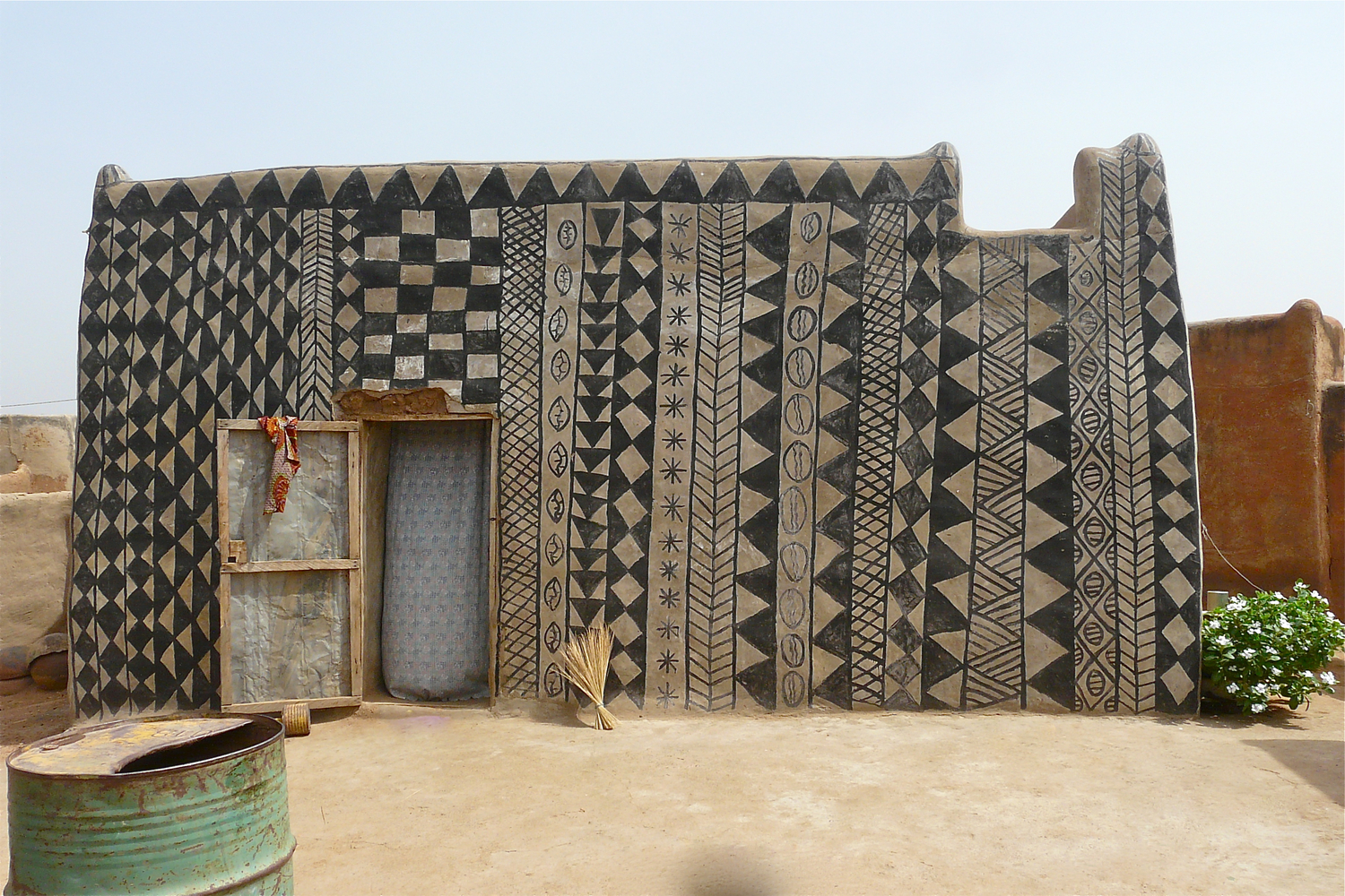
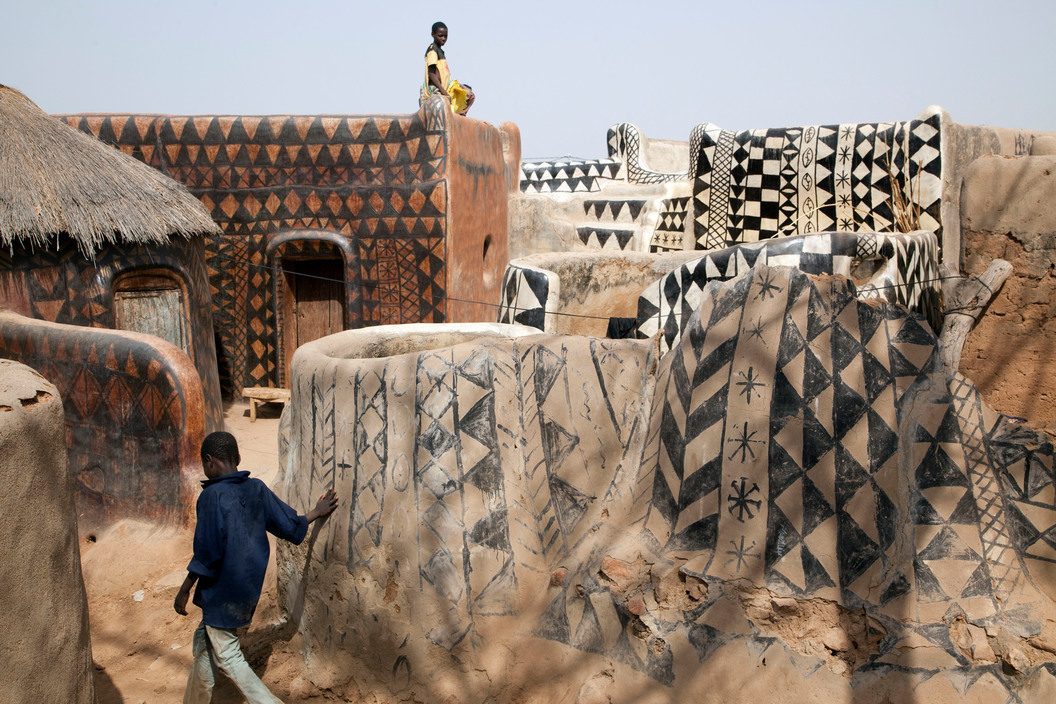
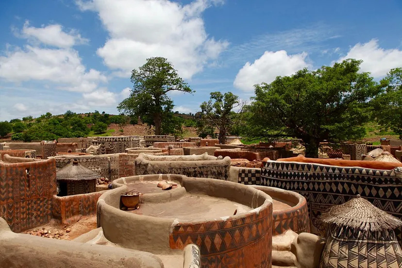
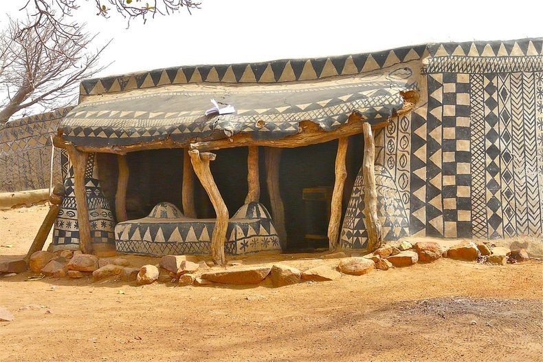
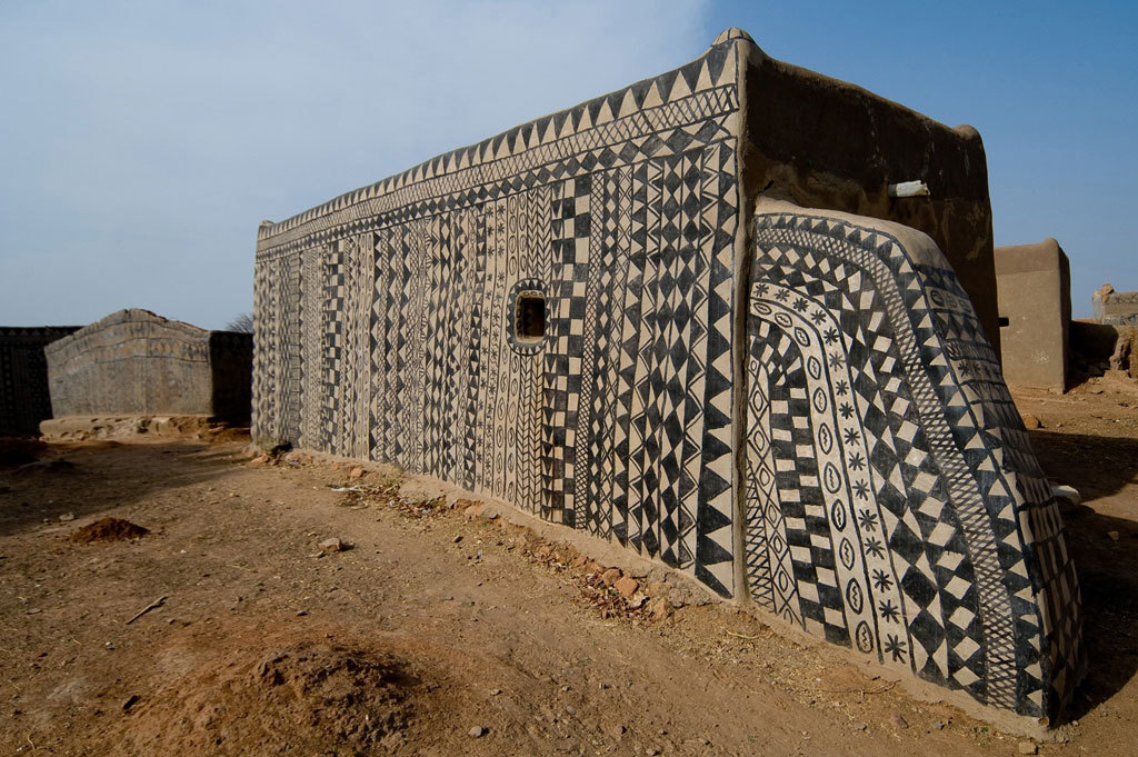
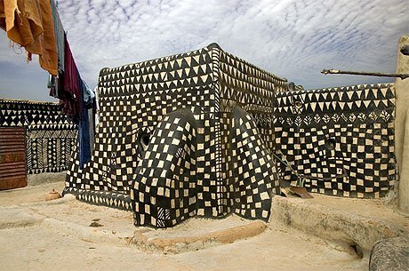
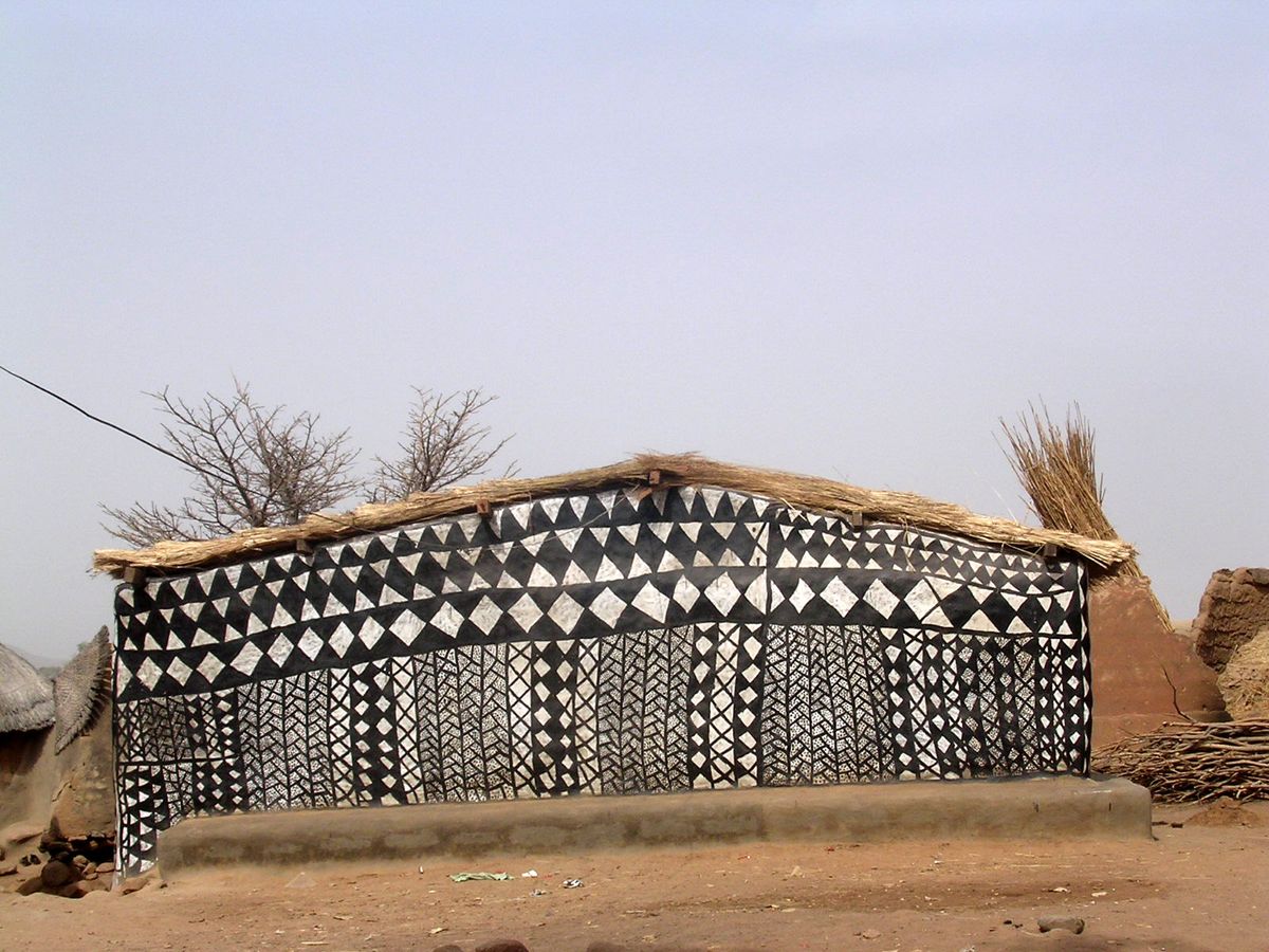
Photos of houses in Tiébélé, Burkina Faso, gathered from around the interwebs.
Photos of houses in Tiébélé, Burkina Faso, gathered from around the interwebs.
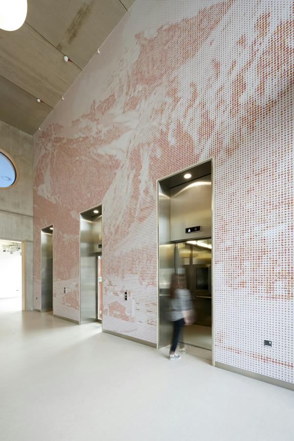
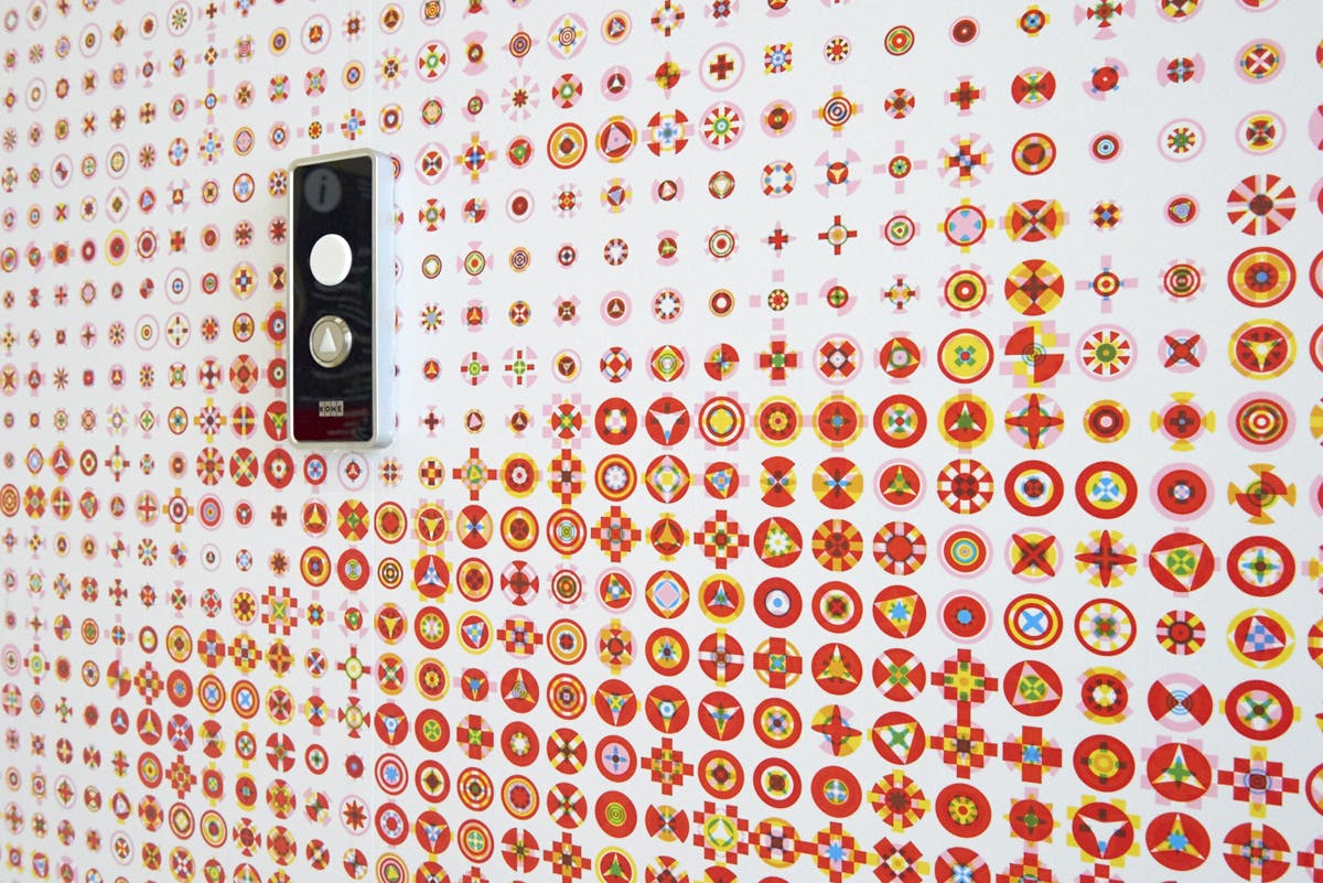
Karel Martens‘ work for Guy’s Hospital Cancer Centre in London, 2016.
source
In the 1960s, Eduardo Joselevich and Fanny Fingerman developed a technique to represent images with only four symbols. Full blocks or circles, in either black or white. They called it Fototrama and it was used at Olivetti and Philips for example.
More here.
The Crolux Complex in Barlad, Romania. Designed by B.A.C.U in the 1970s? source
Liverpool pavilion, designed by FAT Architecture.
BBC Cardiff, designed by FAT Architecture 2010.