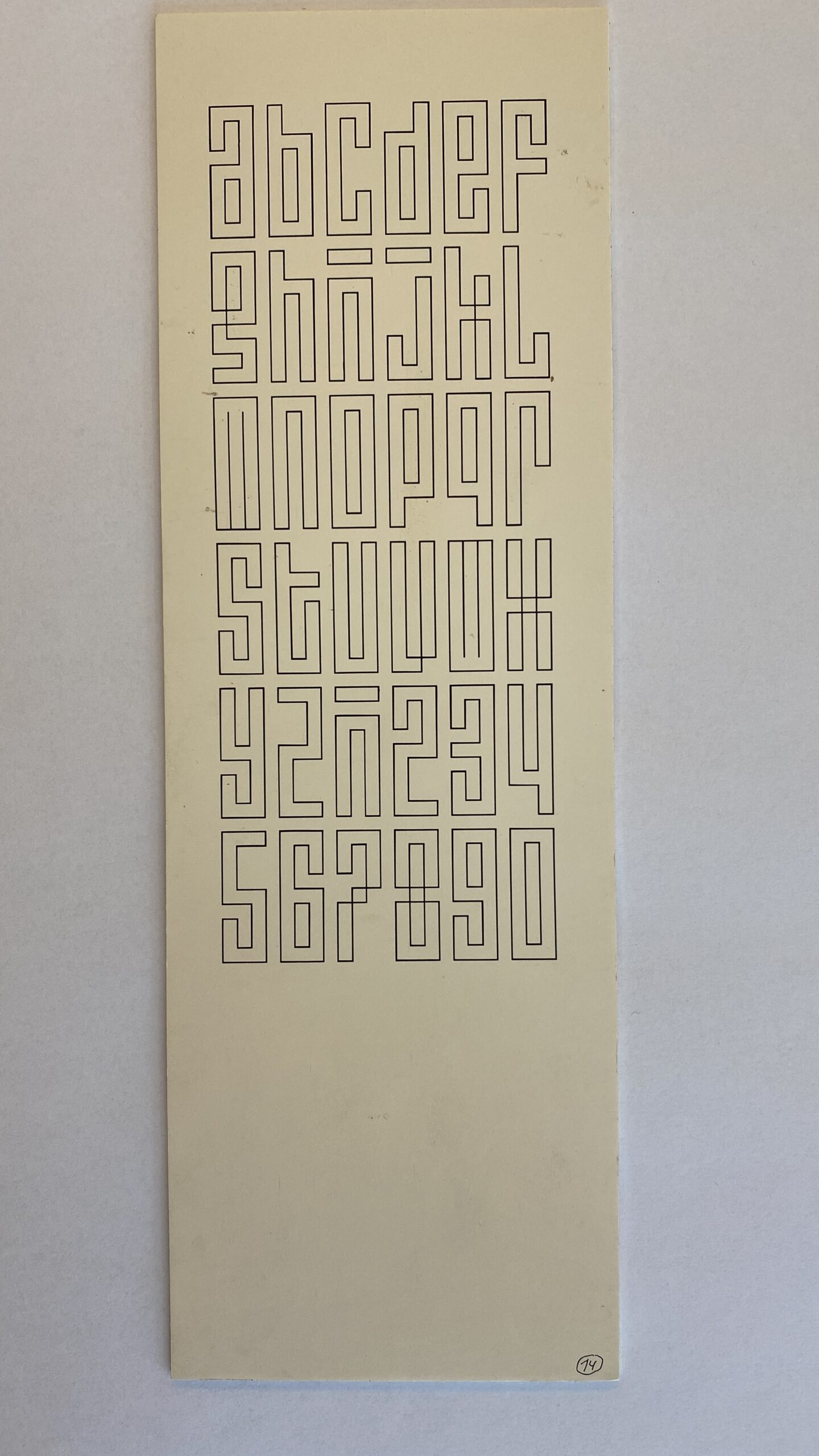
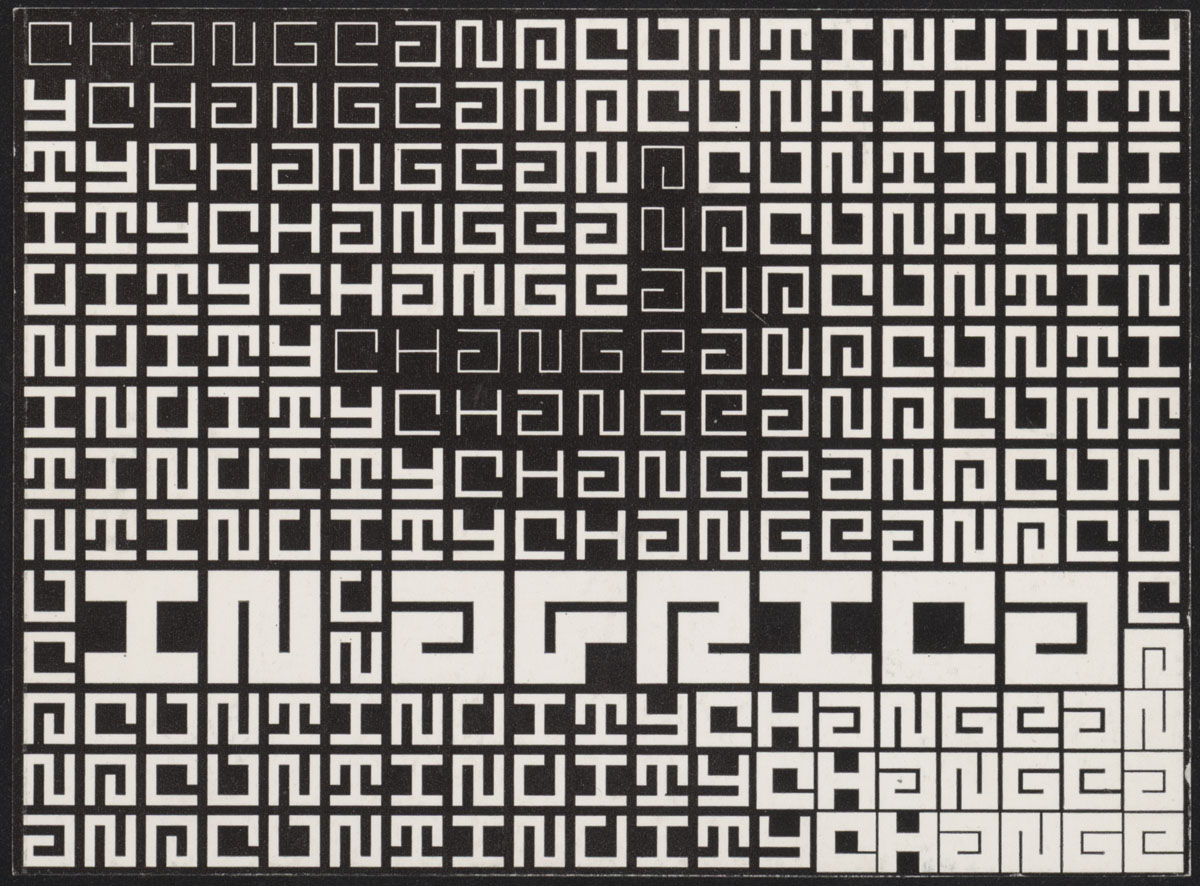
By Jurriaan Schrofer, perhaps in the 1960s? Via Maurice Meilleur.
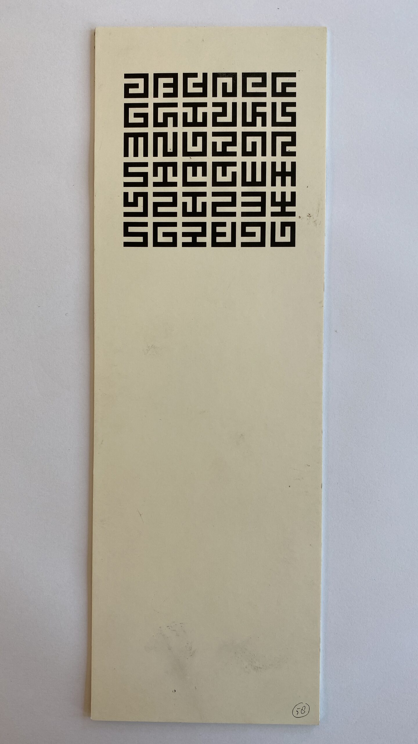
By Jurriaan Schrofer, perhaps in the 1960s? Via Maurice Meilleur.
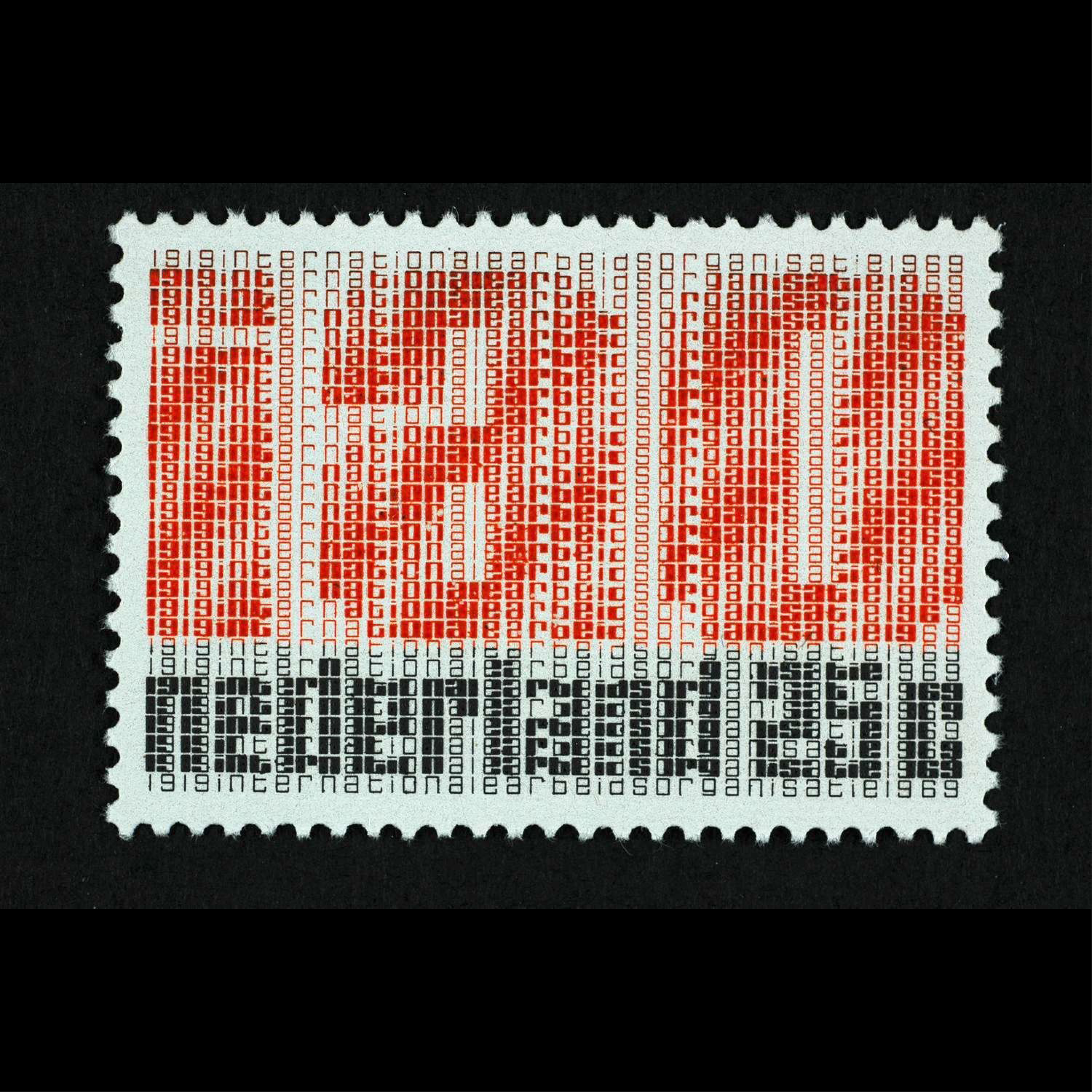
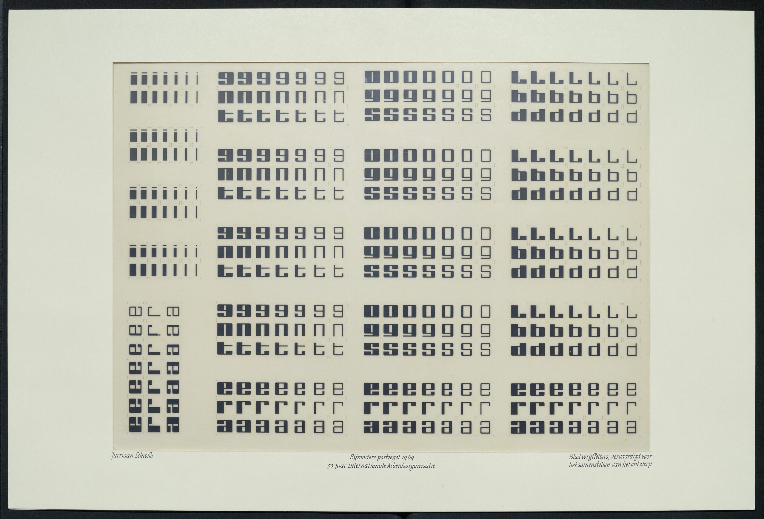
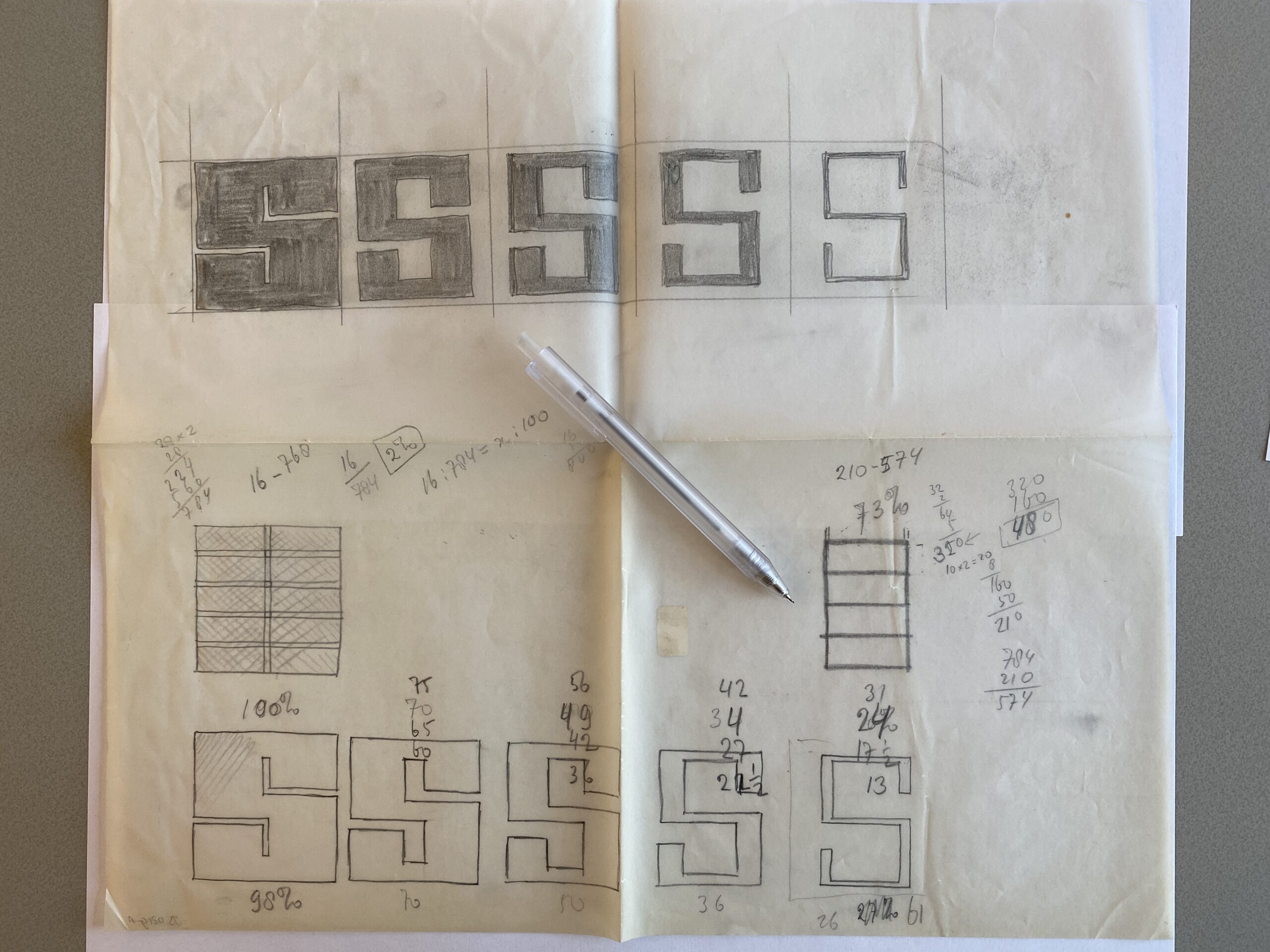
Jurriaan Schrofer’s stamps for the Netherlands, 1969. The text celebrates 50 years of International Labor Organization (IAO). More images and info in Maurice Meilleur’s excellent research.

Microsoft Font Assistant (1993), via
airconditioncomputingnightmare:
CGA and MDA, Part 2
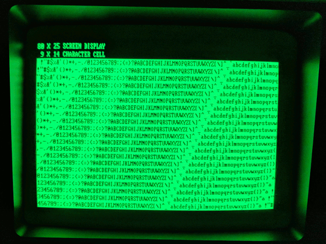
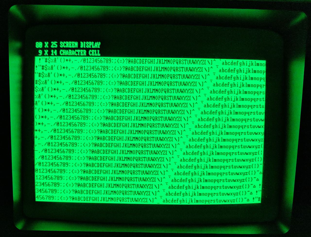
As I briefly touched upon in my previous writeup on CGA vs. MDA, CGA’s 80×25 text mode is significantly coarser than MDA’s. CGA’s 80 column text mode is rendered at 640×200 with 8×8 characters (stretched vertically to approximately 640×400), while MDA’s 80 column text mode is rendered at 720×350 with larger 9×14 characters. MDA was capable of giving text attributes such as being bolded, italicized or underlined.
Seen here are the two side-to-side on the same display, a Compaq Portable’s screen.
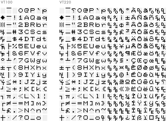
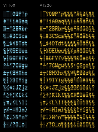
The first image shows a ROM-dump of the font in the classic terminals VT100 and VT220. The second image is how they appear on screen. The difference is more than just aspect ratio. Look at letters like q and p: pixels are sometimes doubled, sometimes tripled. The fascinating explanation is here.
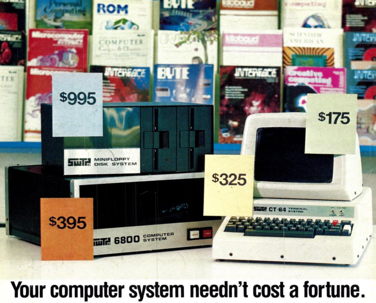

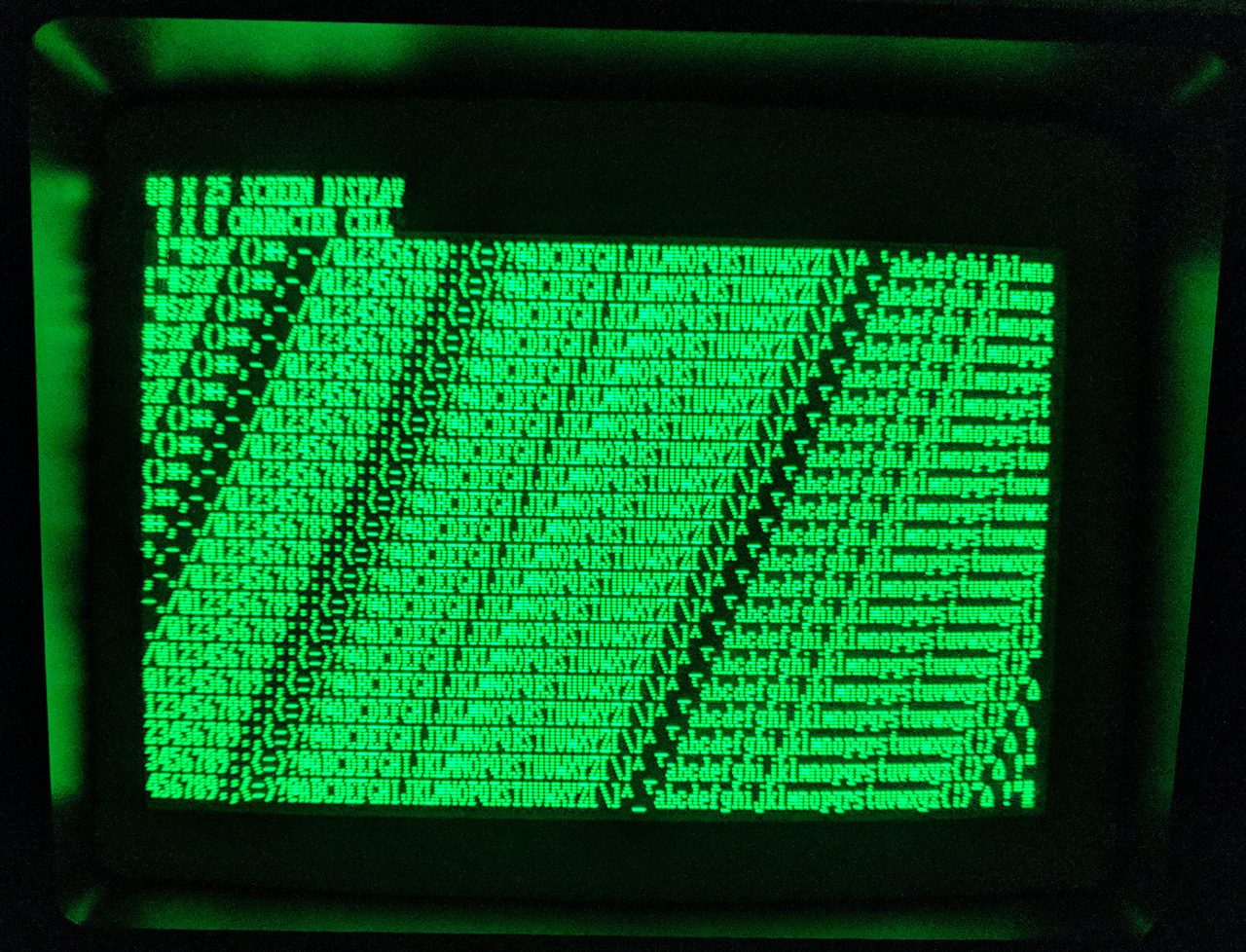
Southwest Technical’s 6800 computer and the CT-64 terminal, and a photo of its 64×16 textmode. Launched in 1975. First image from Creative Computing and second one from here.

Self portrait by Janez Loger, 1971.
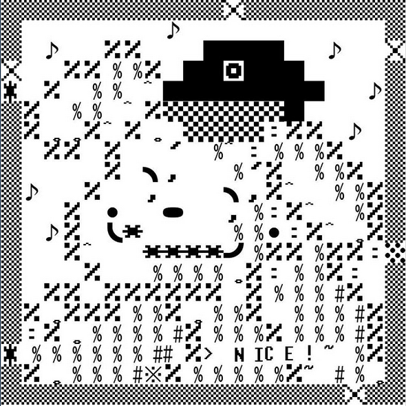
By Unamalva (aka una niña malvada) using Glyph Drawing Club. Uses several fonts with different cell sizes.