Matches for: “jurriaan schrofer” …

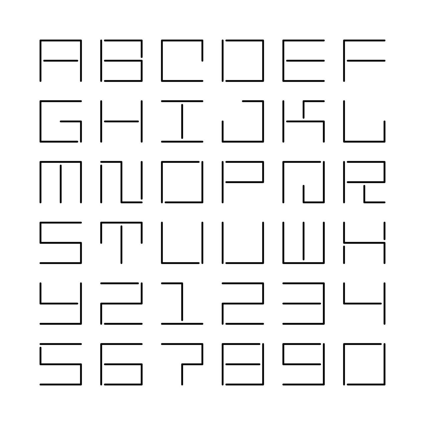
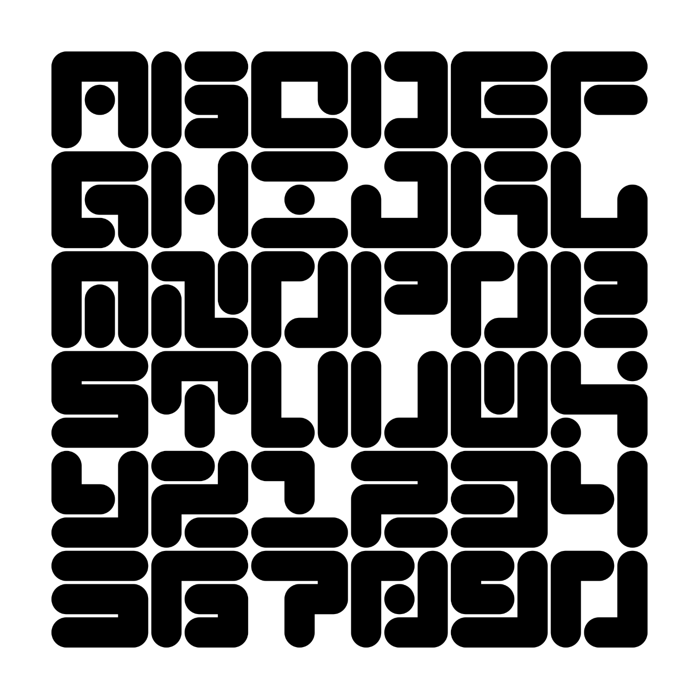
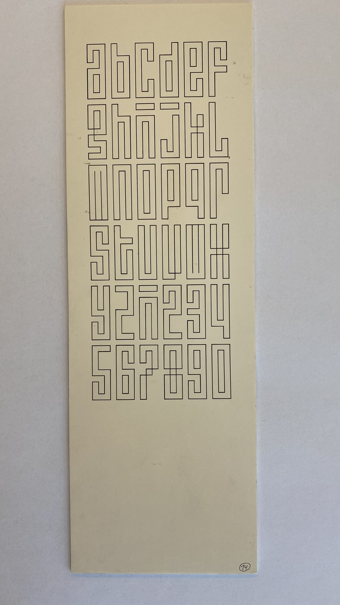
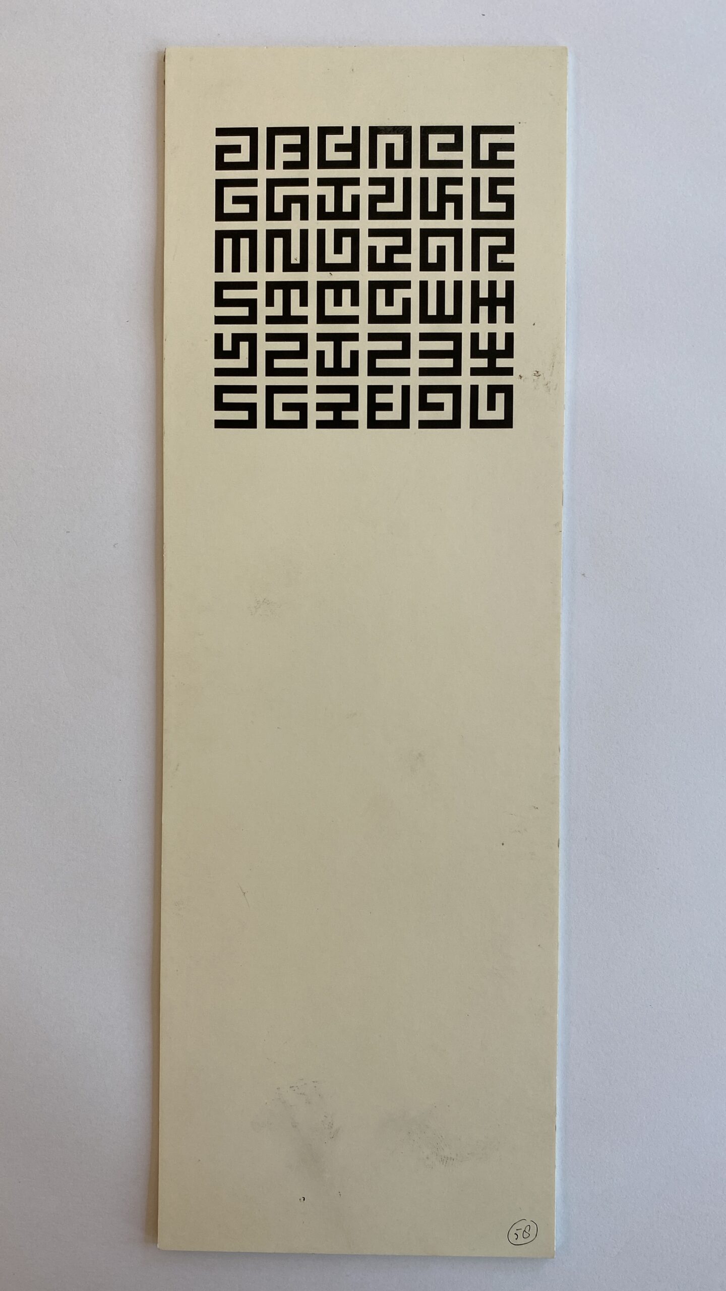
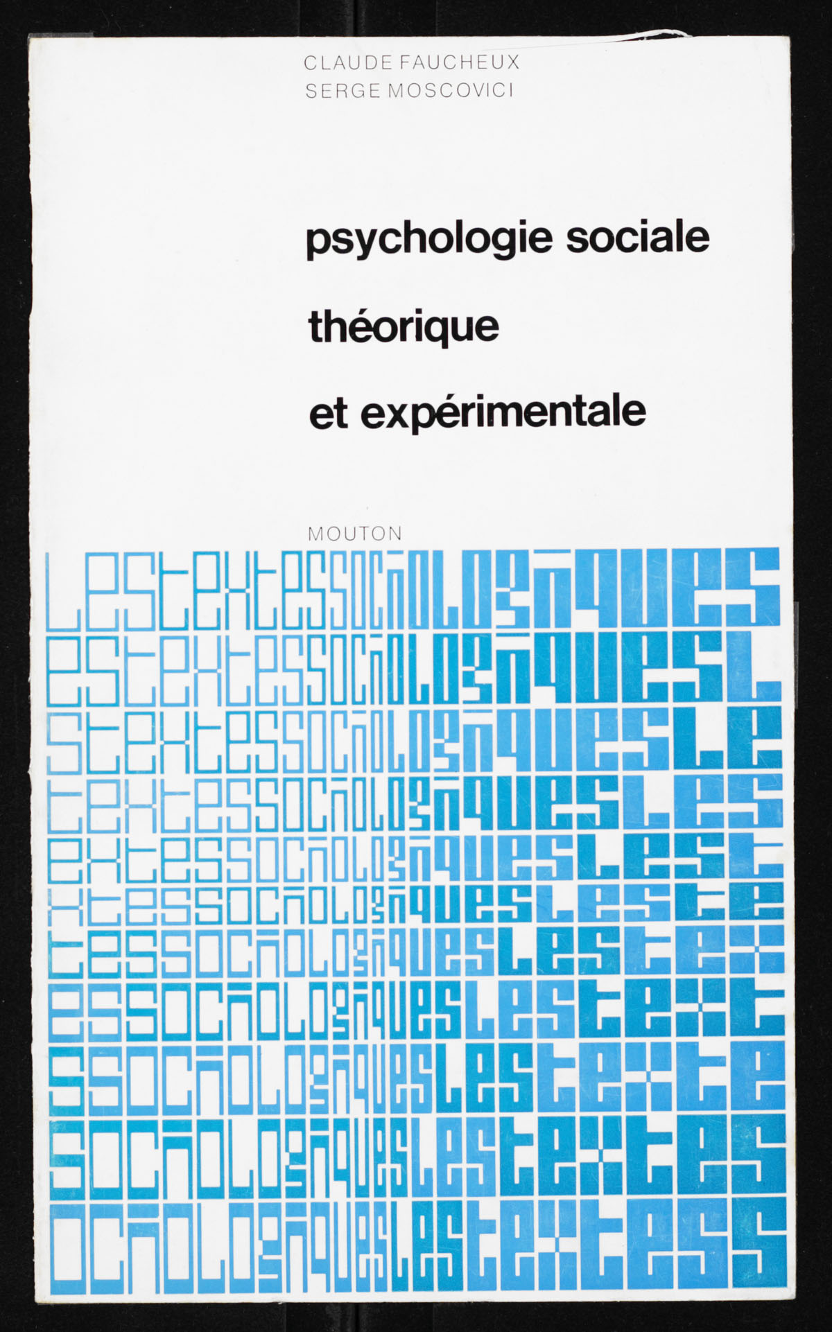
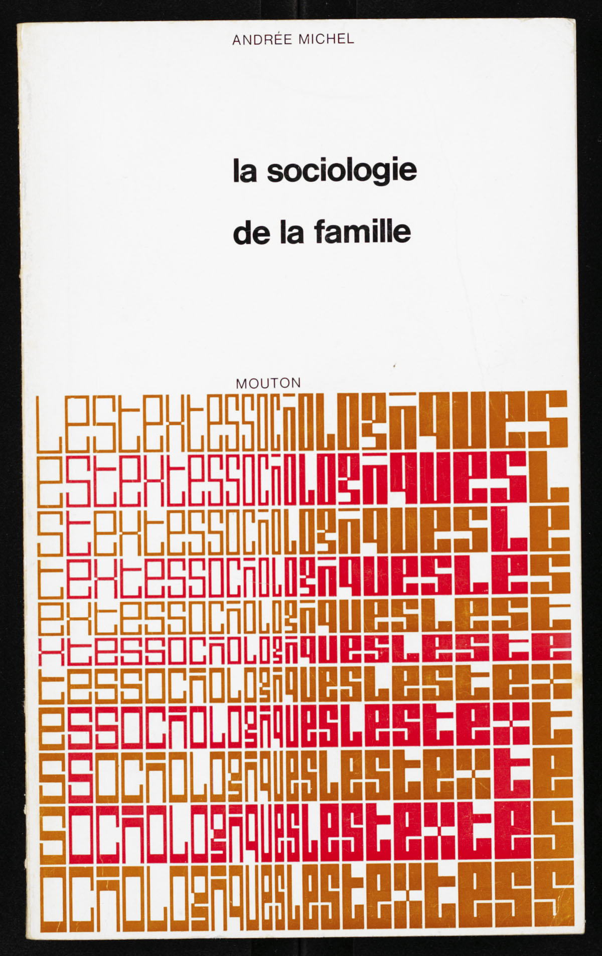
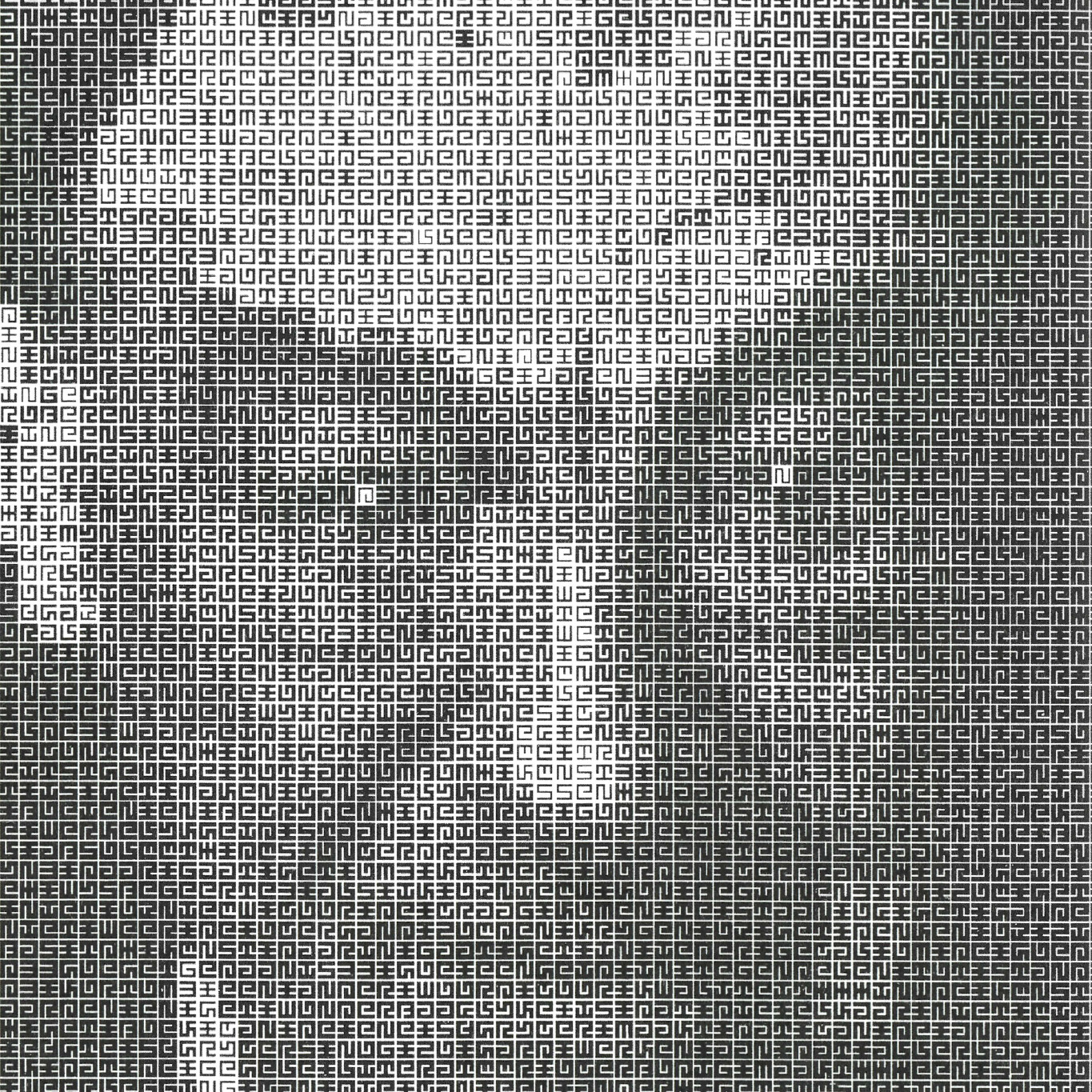
Portrait of Jurriaan Schrofer made in 1987 by Total Design, using a font and script that Schroder made in the 1970’s. It achieves this effect not by changing the text characters, as ASCII-converters usually do, but by changing the weight of the type. More info.

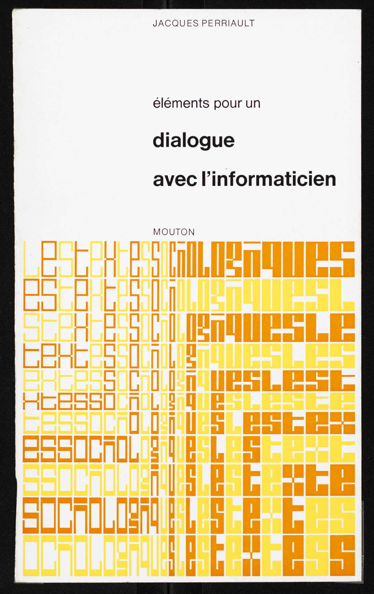
Image from Frederike Huygen’s biography Jurriaan Schrofer from 2013.

Maurice Meilleur’s re-creations of a typeface made by Jurriaan Schrofer in the 1970’s for the Dutch street cleaning and garbage removal services. It was designed to be “stencil-friendly”. In the end, it was not used as a monospaced font.

By Jurriaan Schrofer, perhaps in the 1960s? Via Maurice Meilleur.

Jurriaan Schrofer’s stamps for the Netherlands, 1969. The text celebrates 50 years of International Labor Organization (IAO). More images and info in Maurice Meilleur’s excellent research.

Various works by Dutch typographer Jurriaan Schrofer, mostly from 1960s and 1970s.

FatFonts Player by Santiago Ortiz lets you change animated patterns in realtime. The patterns are created with FatFonts that make higher numbers more bold. An unusual approach in the ASCII-world, also made by for example Jurriaan Schrofer.

Post updated in 2024.