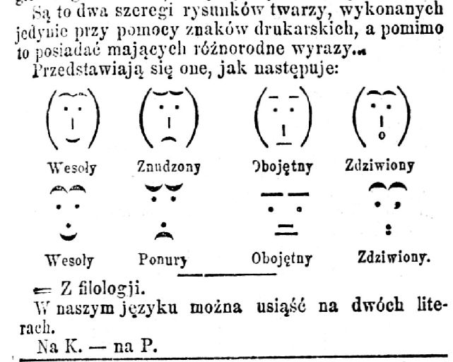
Emoticons from Kurjer Warszawski (5 March 1881) that depict joy, melancholy, indifference and astonishment just like these emoticons did a few weeks later.
via Wikipedia
Emoticons from Kurjer Warszawski (5 March 1881) that depict joy, melancholy, indifference and astonishment just like these emoticons did a few weeks later.
via Wikipedia
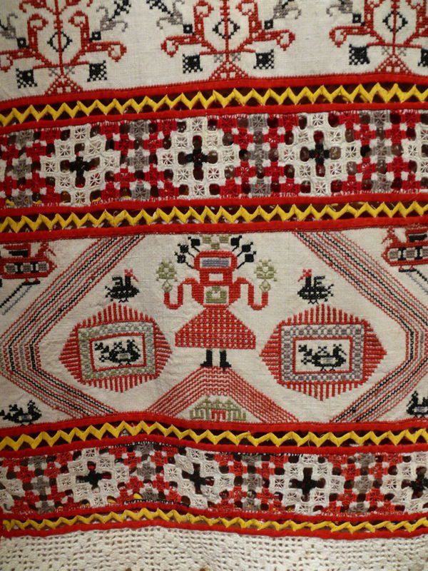
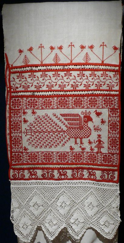
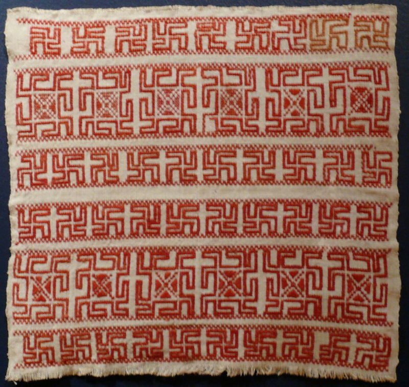
Embroidery from Tarnoga in the Arkhangelsk region in Russia.
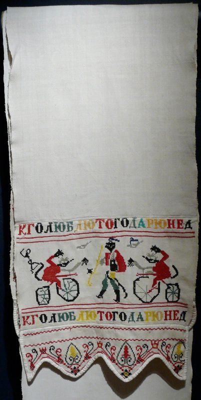
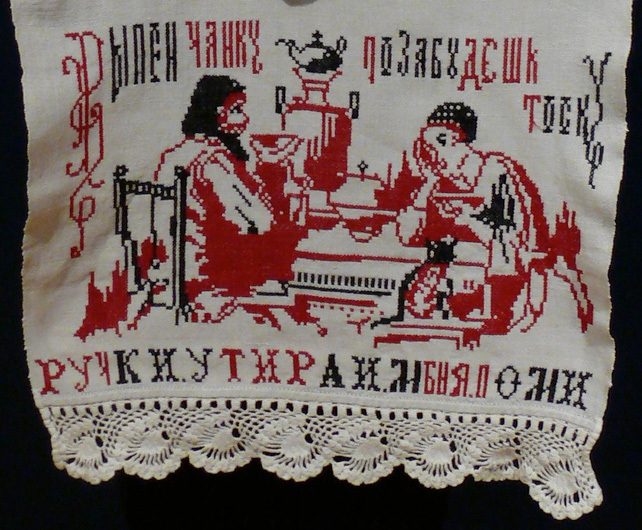
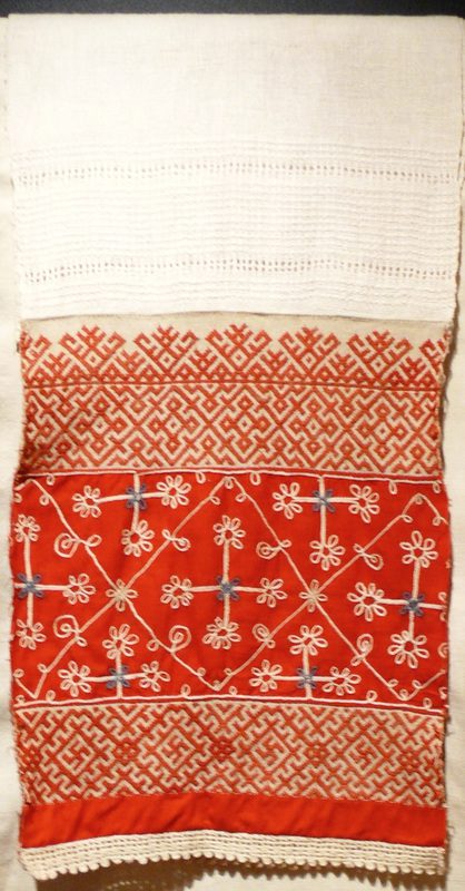
Embroidery from the Vologda region.
All of the above were made in the late 1800s and early 1900s. (source)
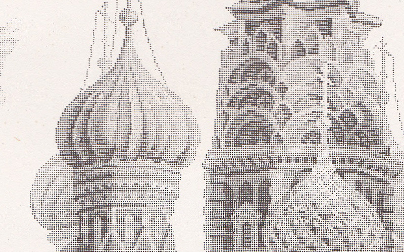
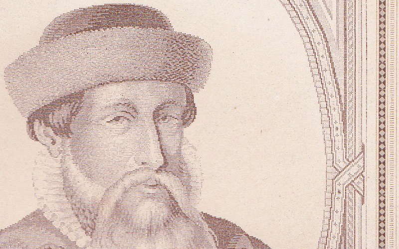
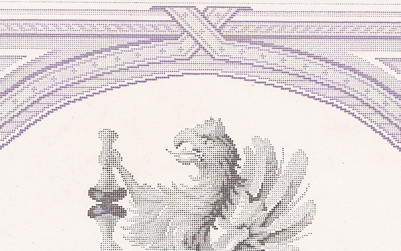
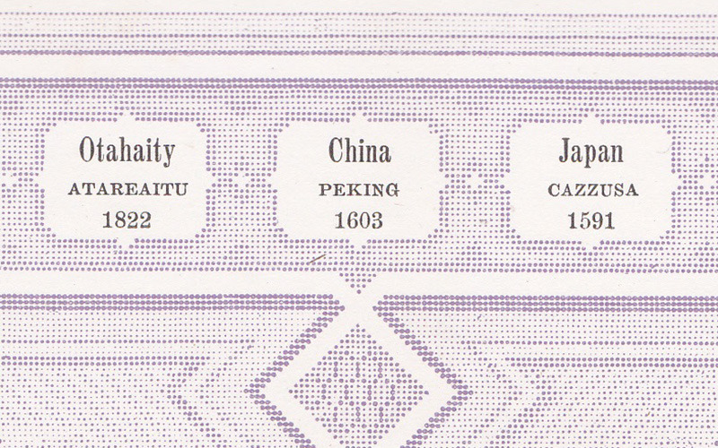
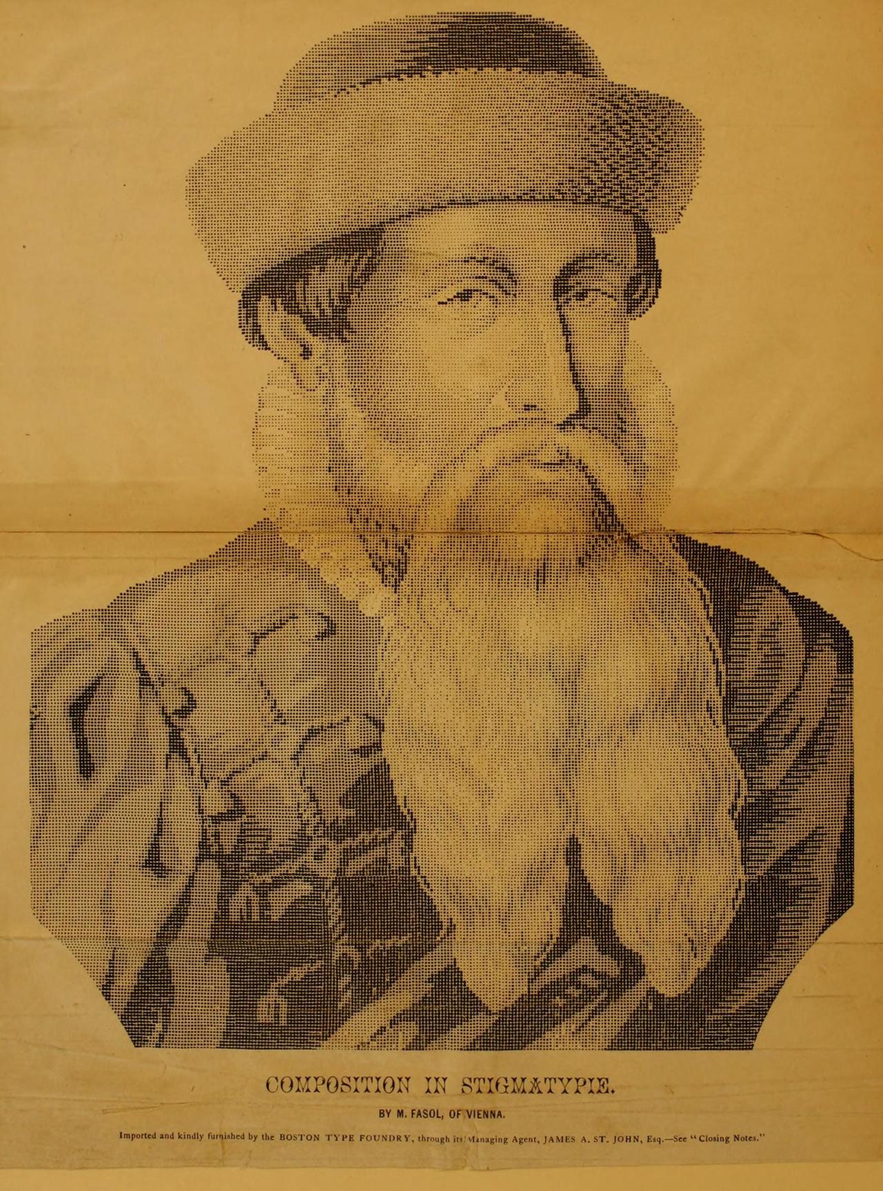
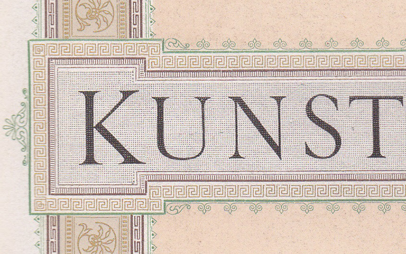
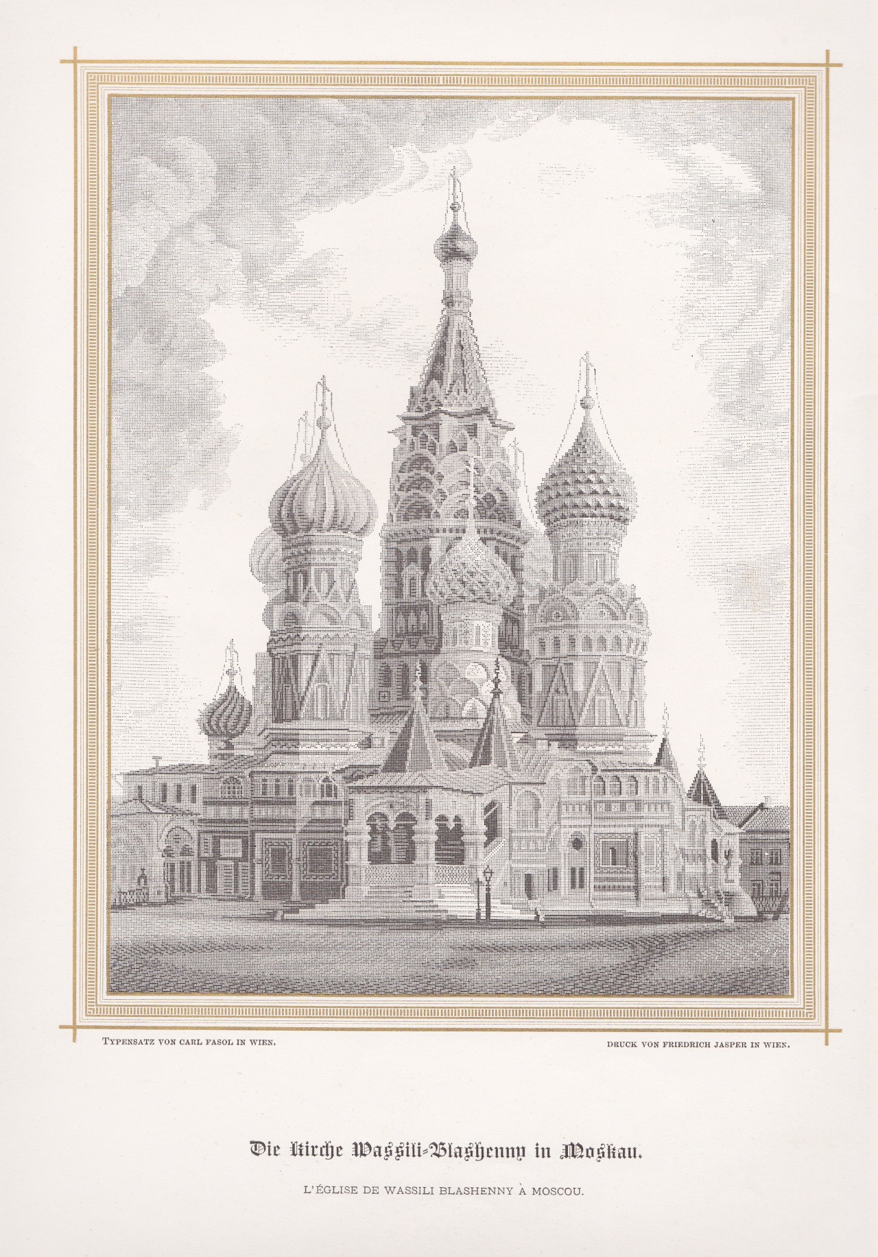
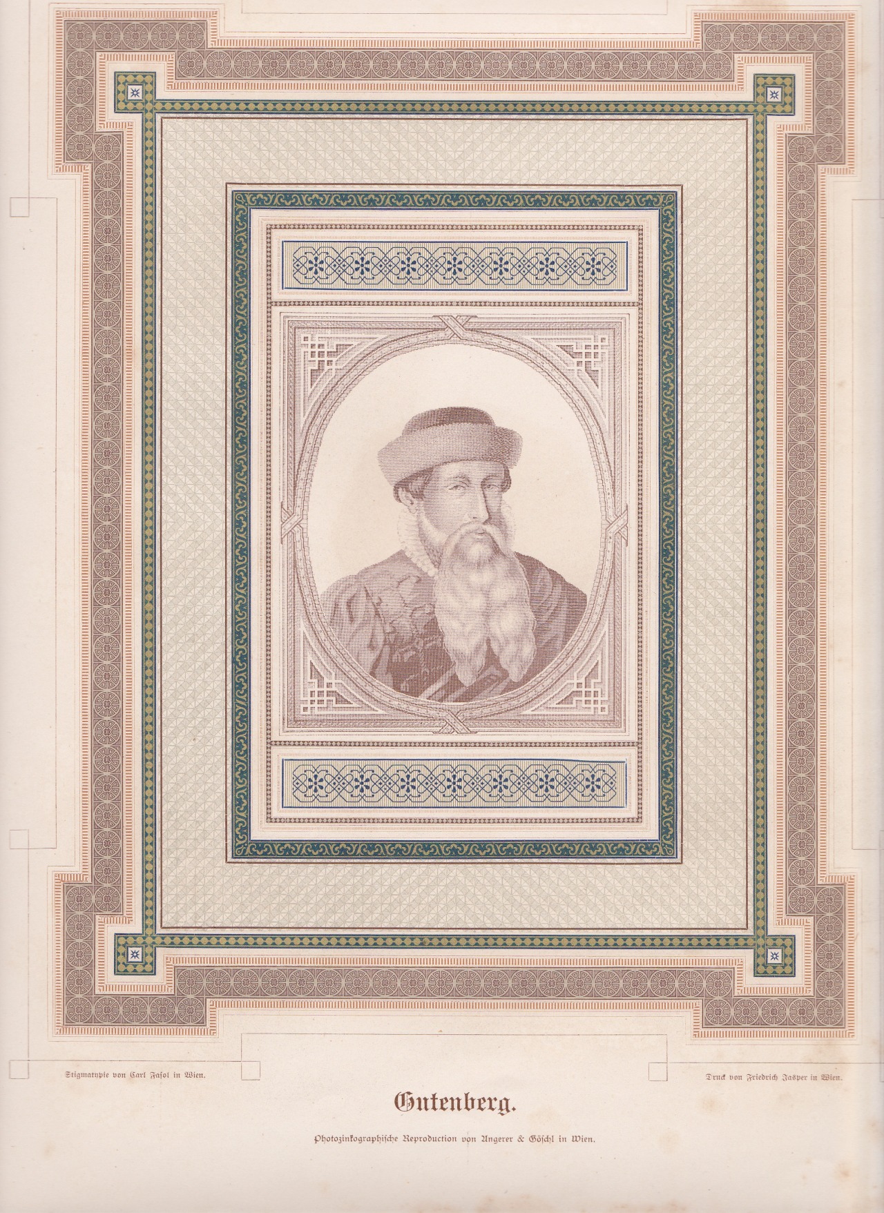
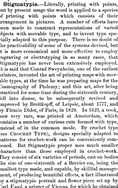
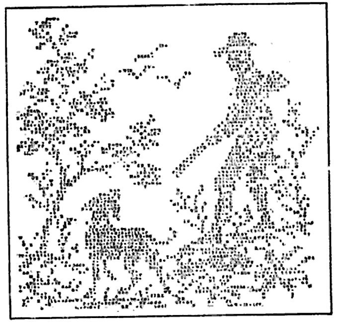
Stigmatypie works from Harpel’s Typograph, 1870. You can zoom in on the details thanks to archive.org.
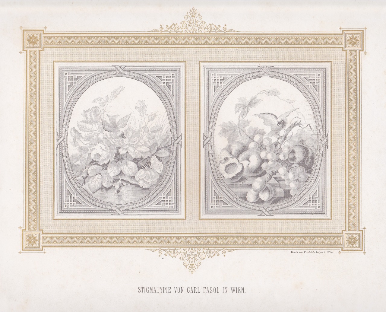
Stigmatypie produces halftone images with small text characters, like the period (.), similar to dot matrix printing. The technique was developed in 1867 by Carl Fasol, who btw also inspired Valto Malmiola that we recently posted about.
The text segment is from American Encyclopaedia of Printing (1871).
via. h/t: Roel Nieskens
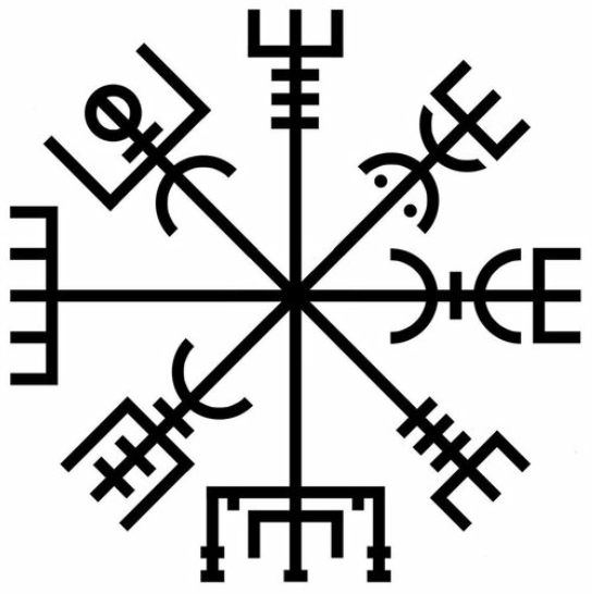
The Icelandic Vegvísir (wayfinder) is a magical stave that helps you find your way home through rough weather. Oldest known example is from 1860.
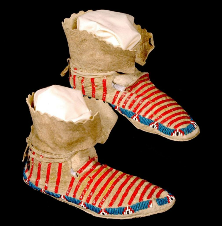
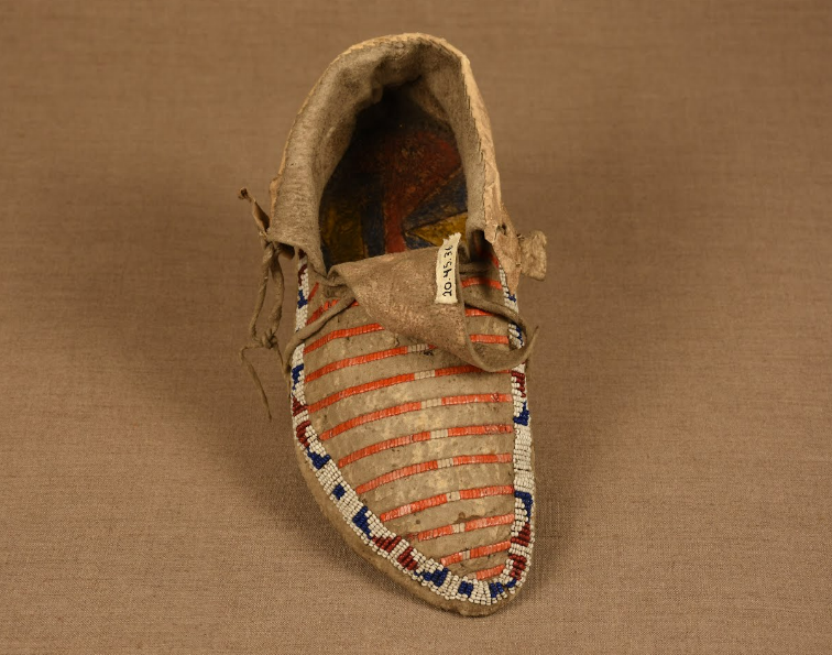
The red lines are quillwork, made with porcupine quills. This technique was used for hundreds of years before beadwork became popular in the 1800s with glass beads from Venice.
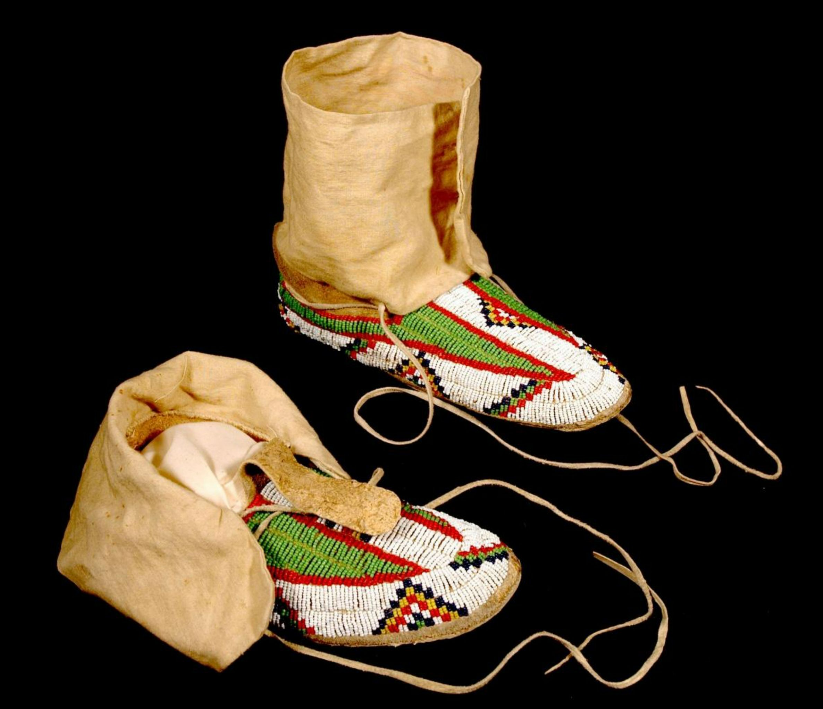
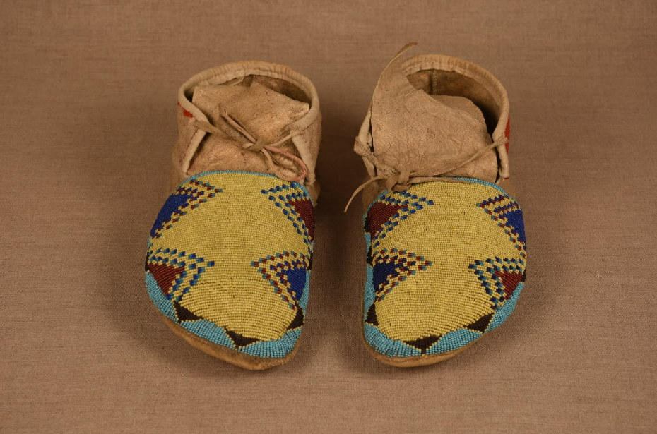
These kinds of triangles are called step triangles.
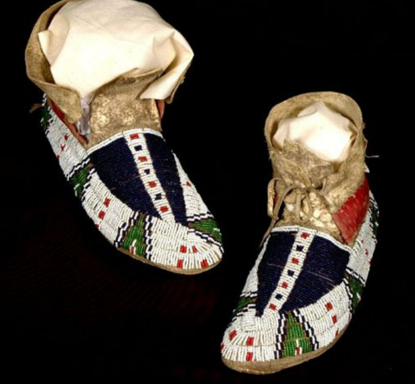
The dark blue shapes are called buffalo tracks, space or part-between.

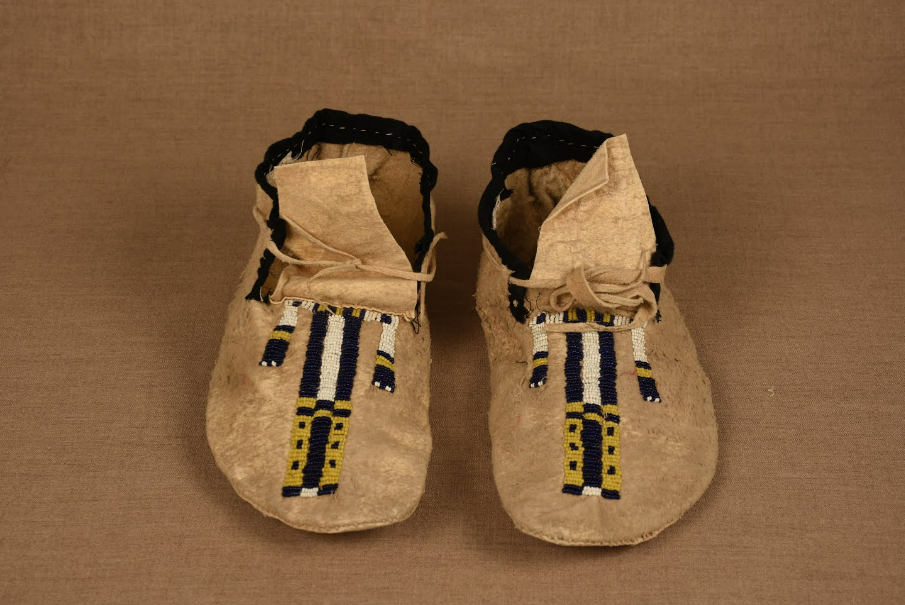
Tripe design.
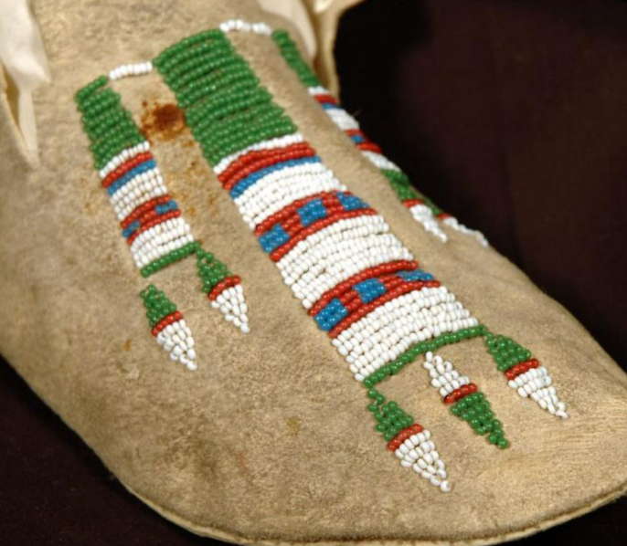
“Two-color, elongated diamond shapes are usually called the Feather, Whirlwind or Breath of Life design.”
Four directions
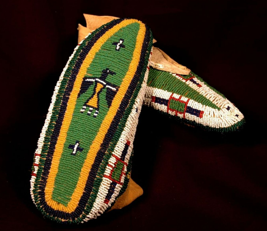
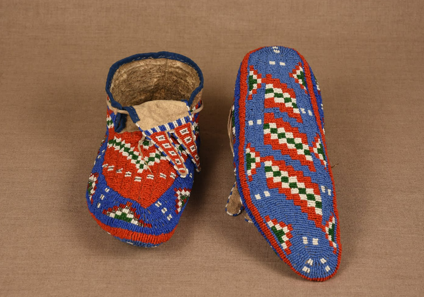
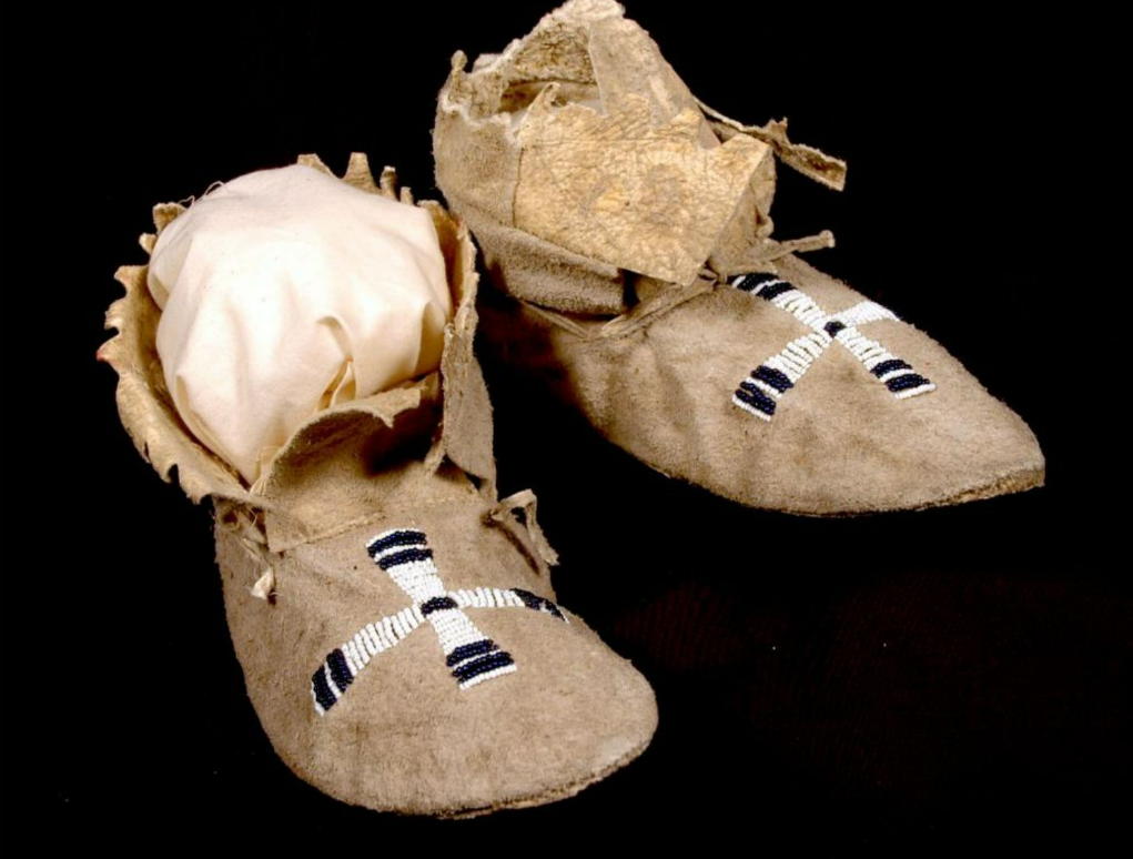
Women of several tribes started making moccasins with beaded soles in the 1880s.
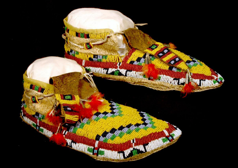
“Twisted design” (beads in diagonal checker rows)
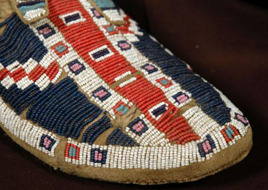
Box designs. The squares often represented bags.
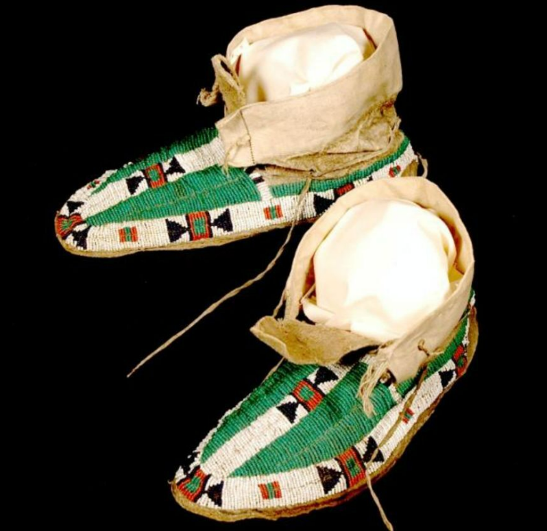
Boxes with inverted triangles were common in the Shoshone tribe, therefore known as Shoeshone design.
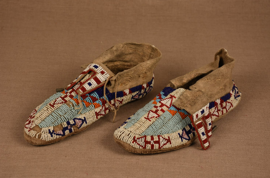
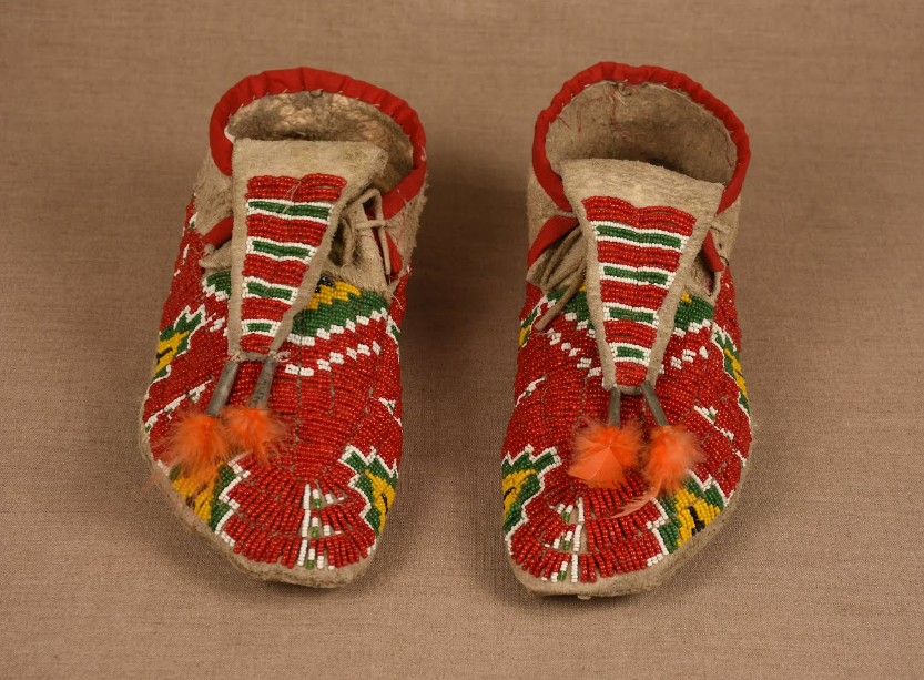
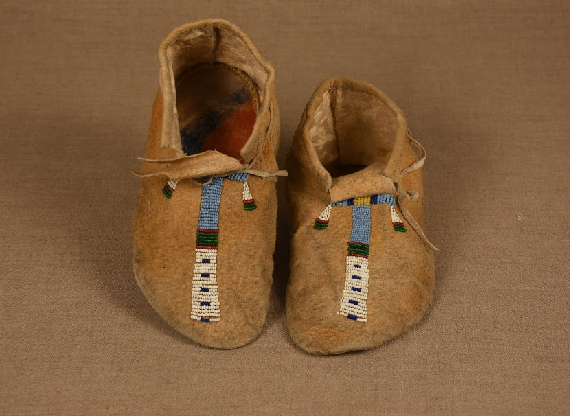
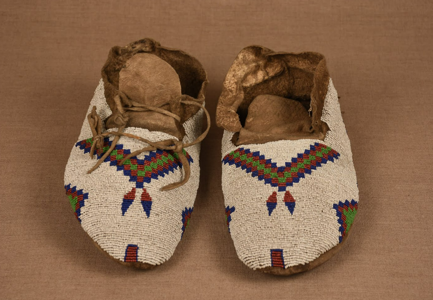
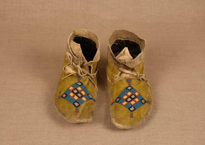
All images and information from Wyoming State Museum’s Beautiful Shoes (2012) which also explains different techniques, and the same museum’s moccasin page at Göögle Arts & Culture.
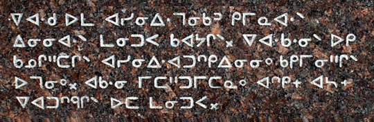
Canadian syllabics, created by an English missionary in 1827. Used to write a variety of indigenous languages, among which Cree, Ojibwe, Inuktitut.
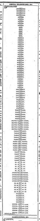
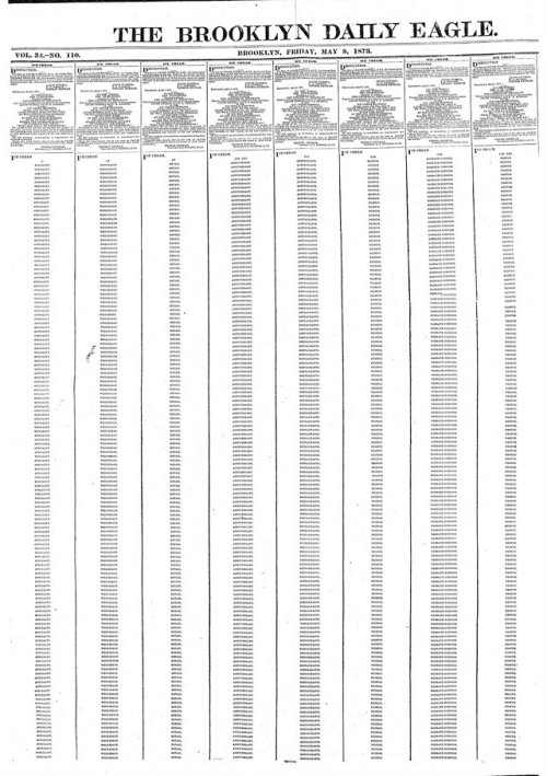
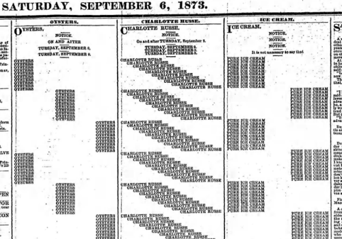
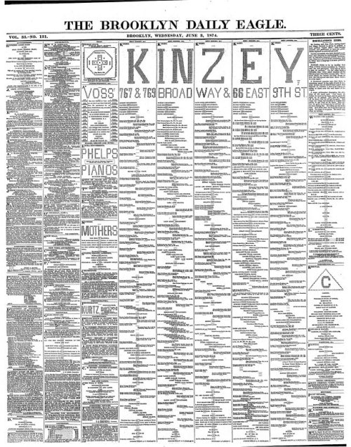
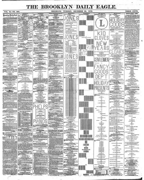
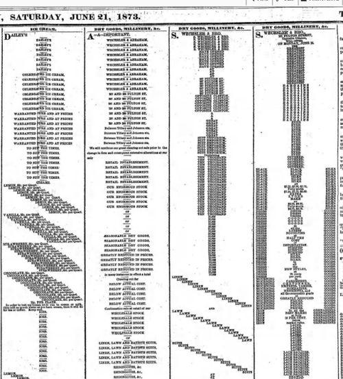
Ads in the Brooklyn Daily Eagle, 1873-1874 found by Paul Soulellis. ASCII advertising was quite popular at the time, and these are almost like concrete poetry advertising?
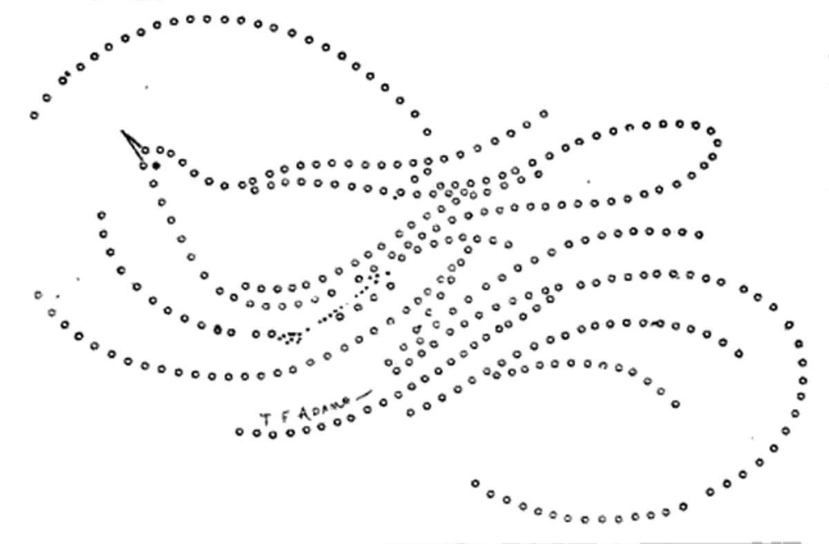
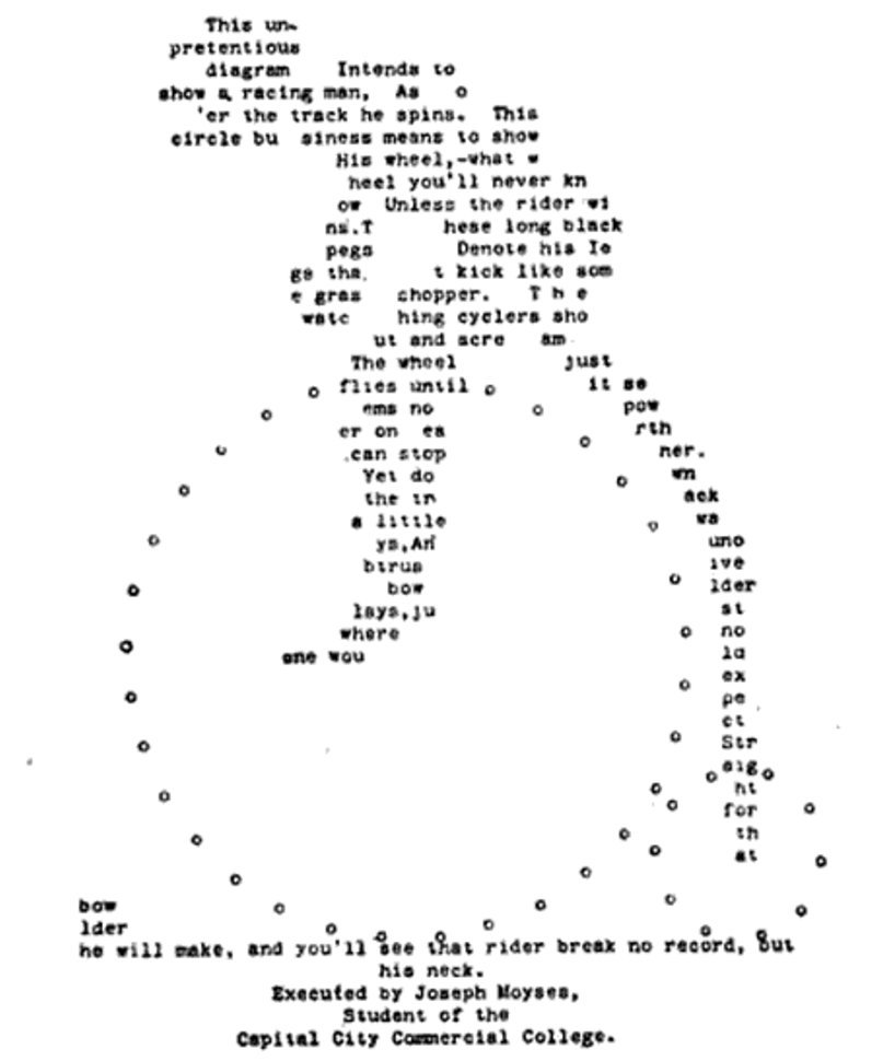
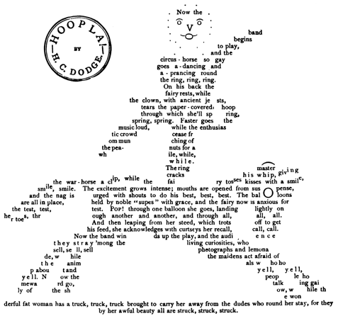
Written graphics from 1892. First two by T.F. Adams, the next one by Frank Baunelle, and the final one by an unknown artist. via James Ryan.