Telidon graphics by John Vaughan for the PBS-station WETA, 1981. He created them with a Norpak Frame Creation Terminal.
Telidon graphics by John Vaughan for the PBS-station WETA, 1981. He created them with a Norpak Frame Creation Terminal.
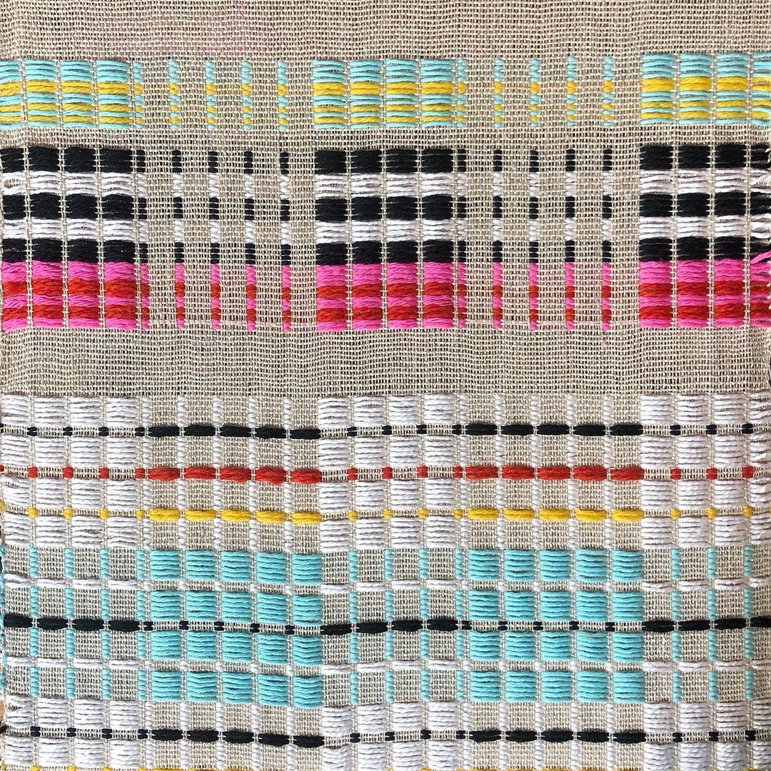
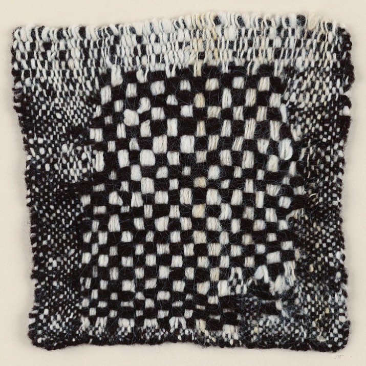
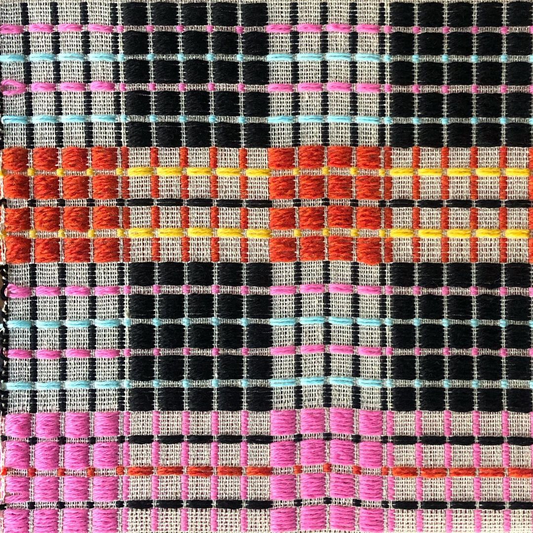
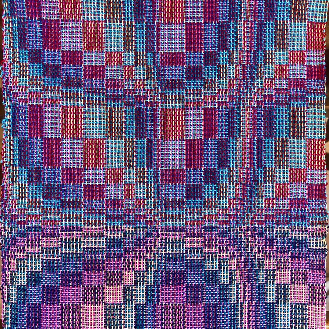
Posted on Catskill Weaving School’s Instagram, 2021-2023.
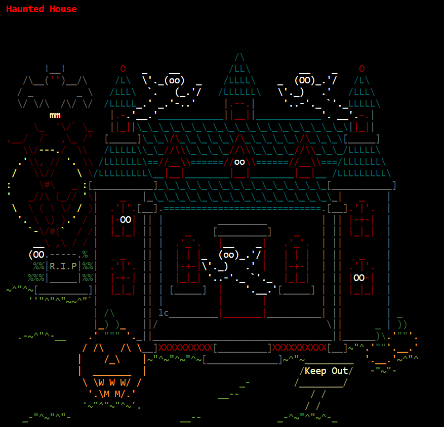
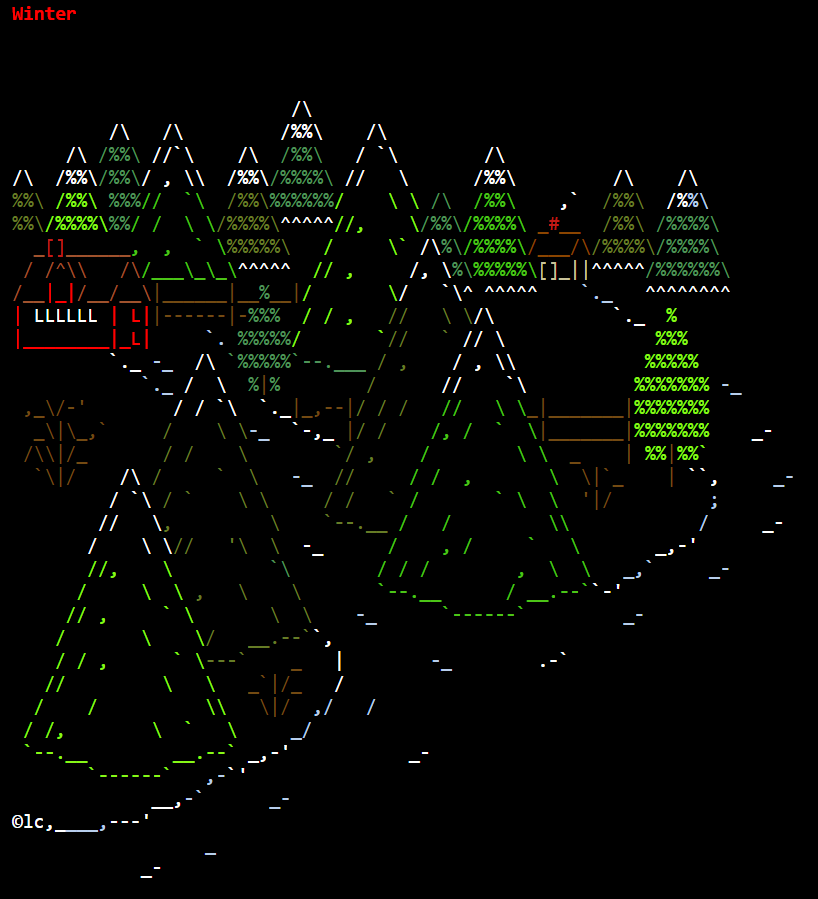
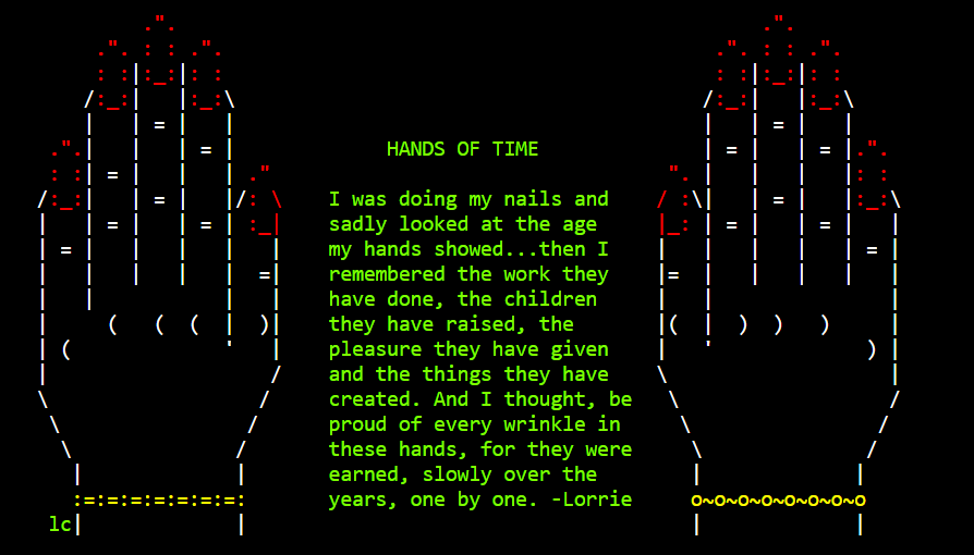
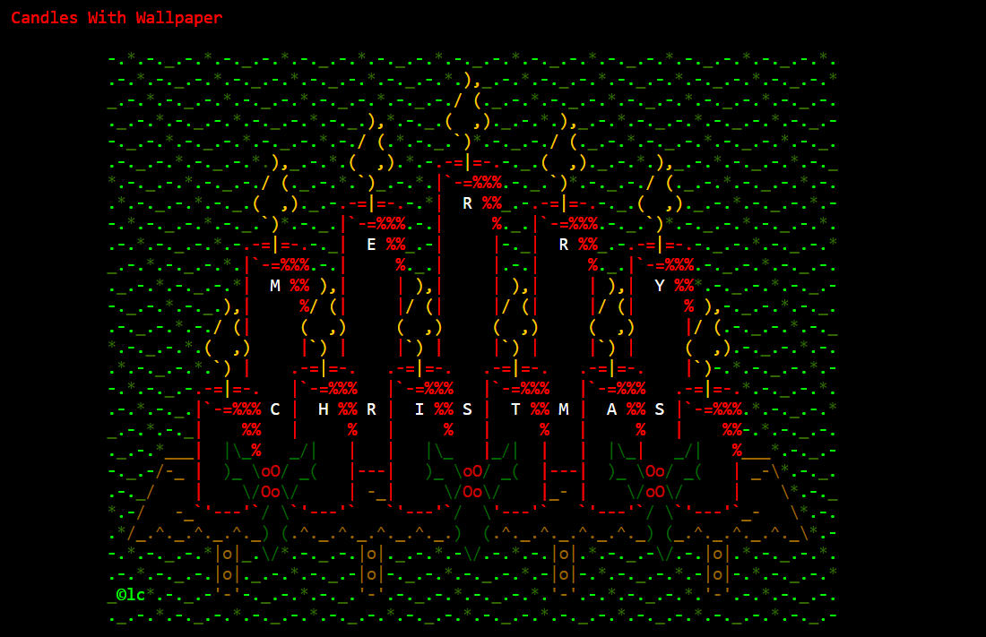
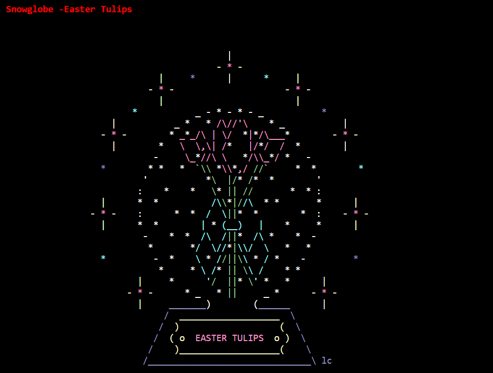
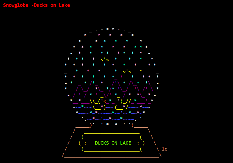
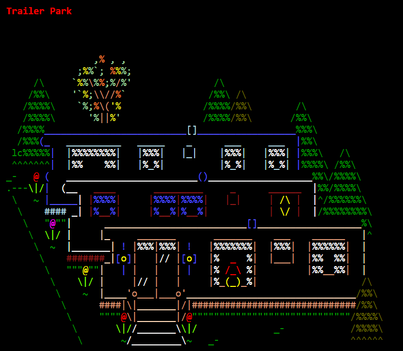
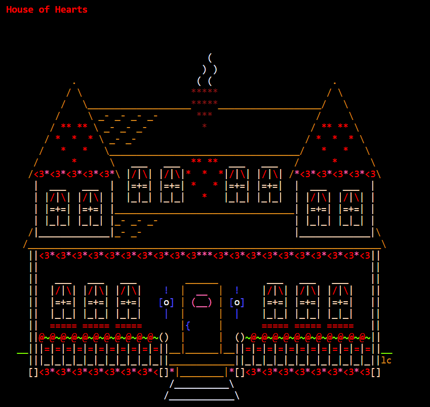
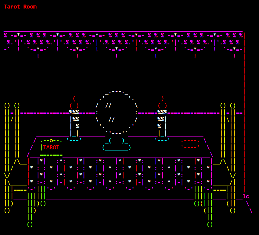
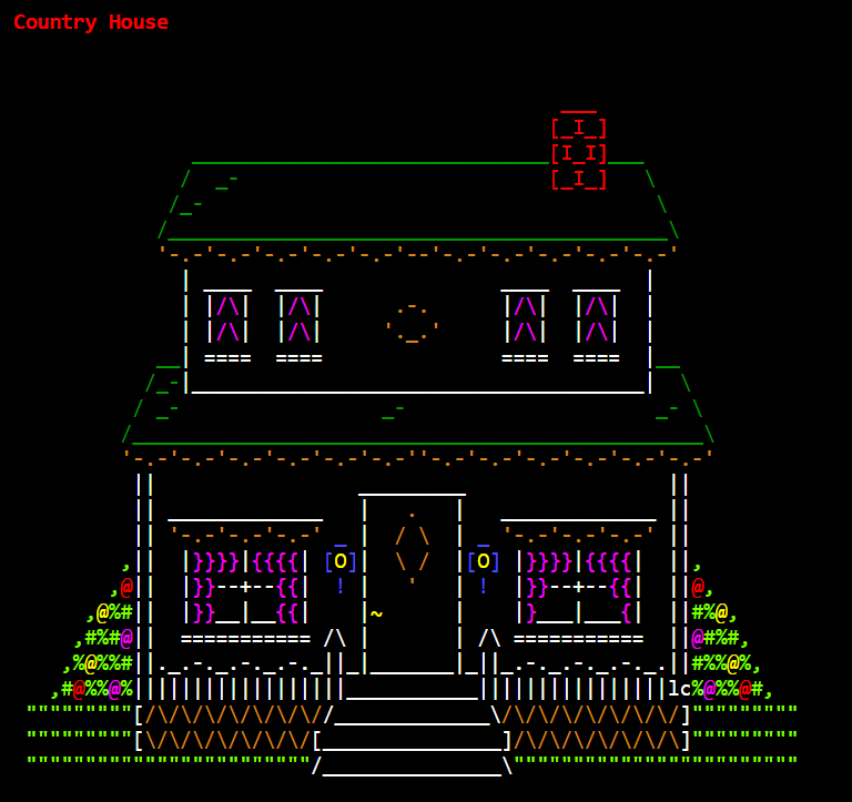
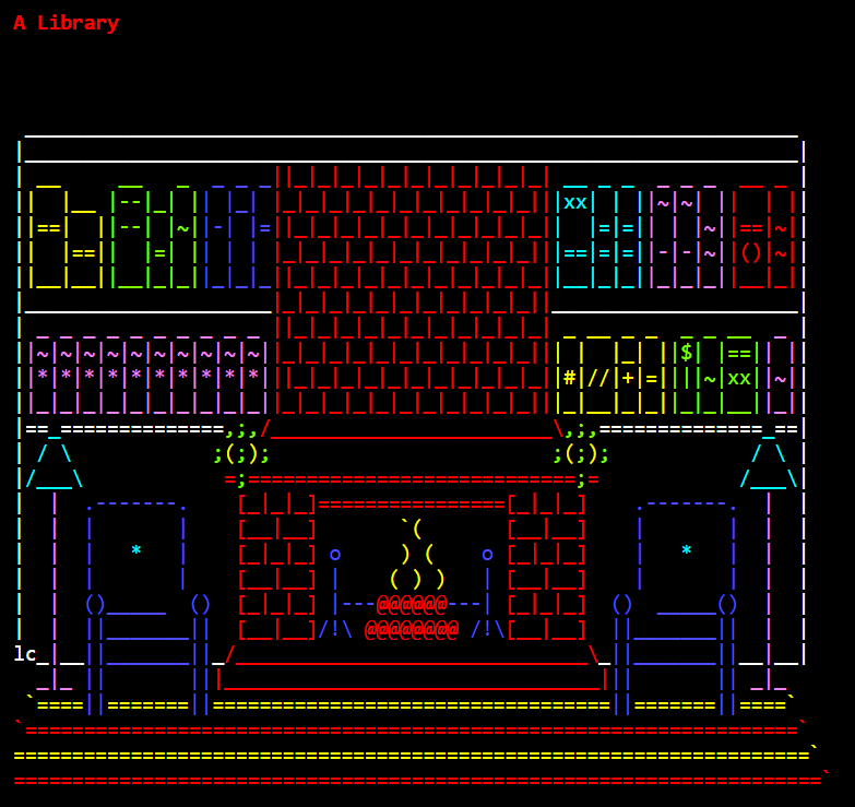
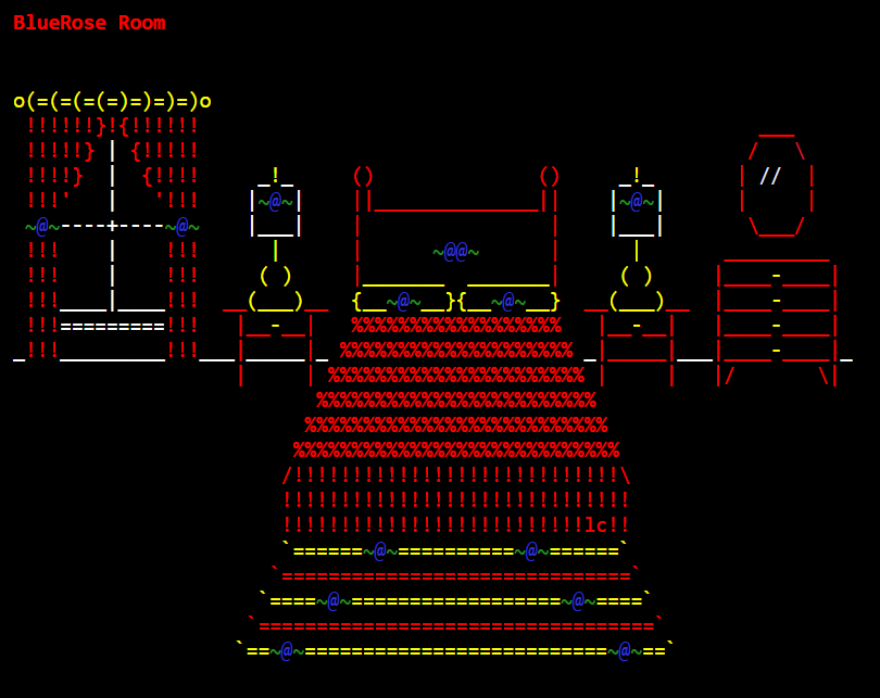
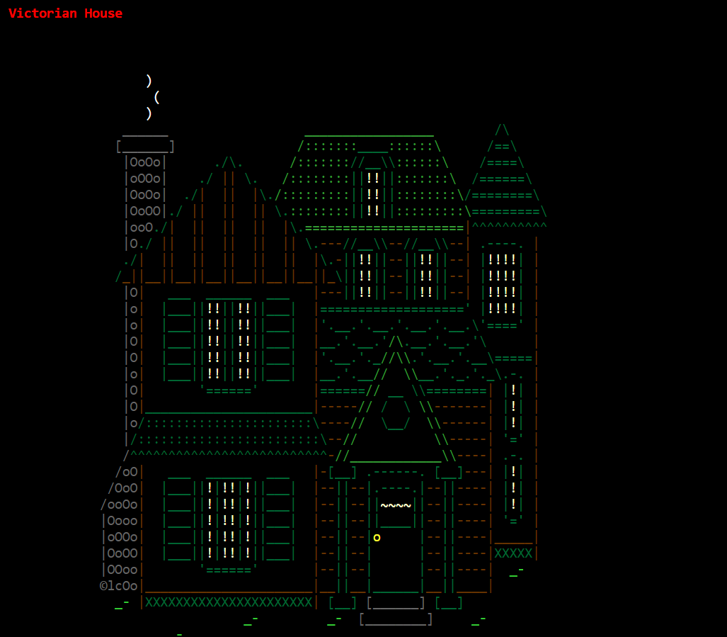
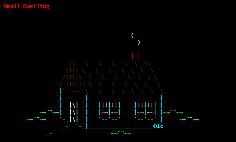
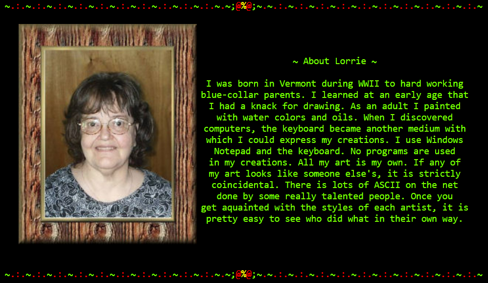
Coloured ASCII by Lorrie Carrington (lc), late 1990’s and early 2000’s. Her work is available in various archives without colour, but they were in colour on her own website. HTML supports millions of colours (although a 256-limit was good for compatibility at the time), so it looks a bit different from classic ASCII and ANSI that uses 8 or 16 colours.
Other ASCII-artists also used HTML-colour. See for example Joan Stark and Allen Mullen. Maybe there was a lot of colourful ASCII that was only preserved without colour…
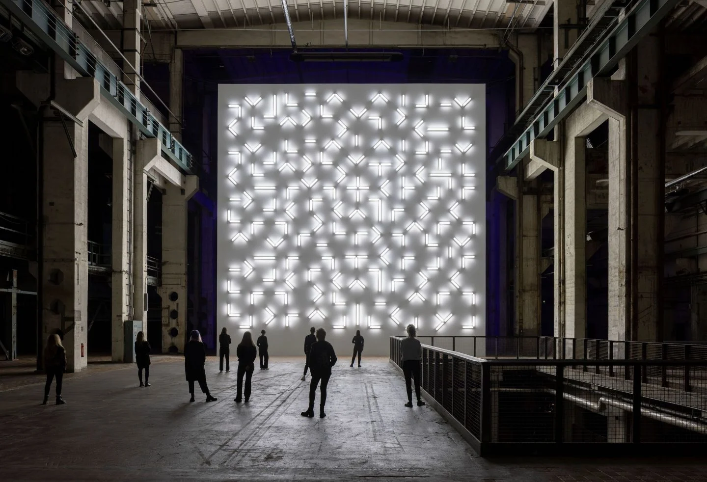
Light and Space by Robert Irwin at Kraftwerk Berlin, 2022. He passed away the next year. Previously.
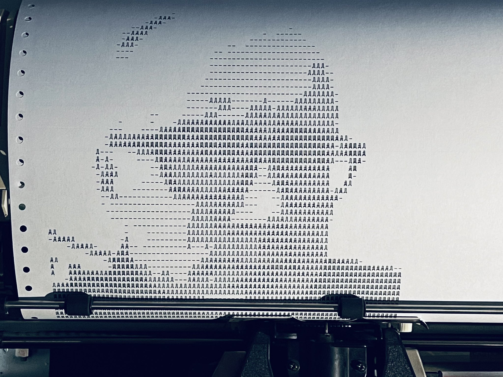
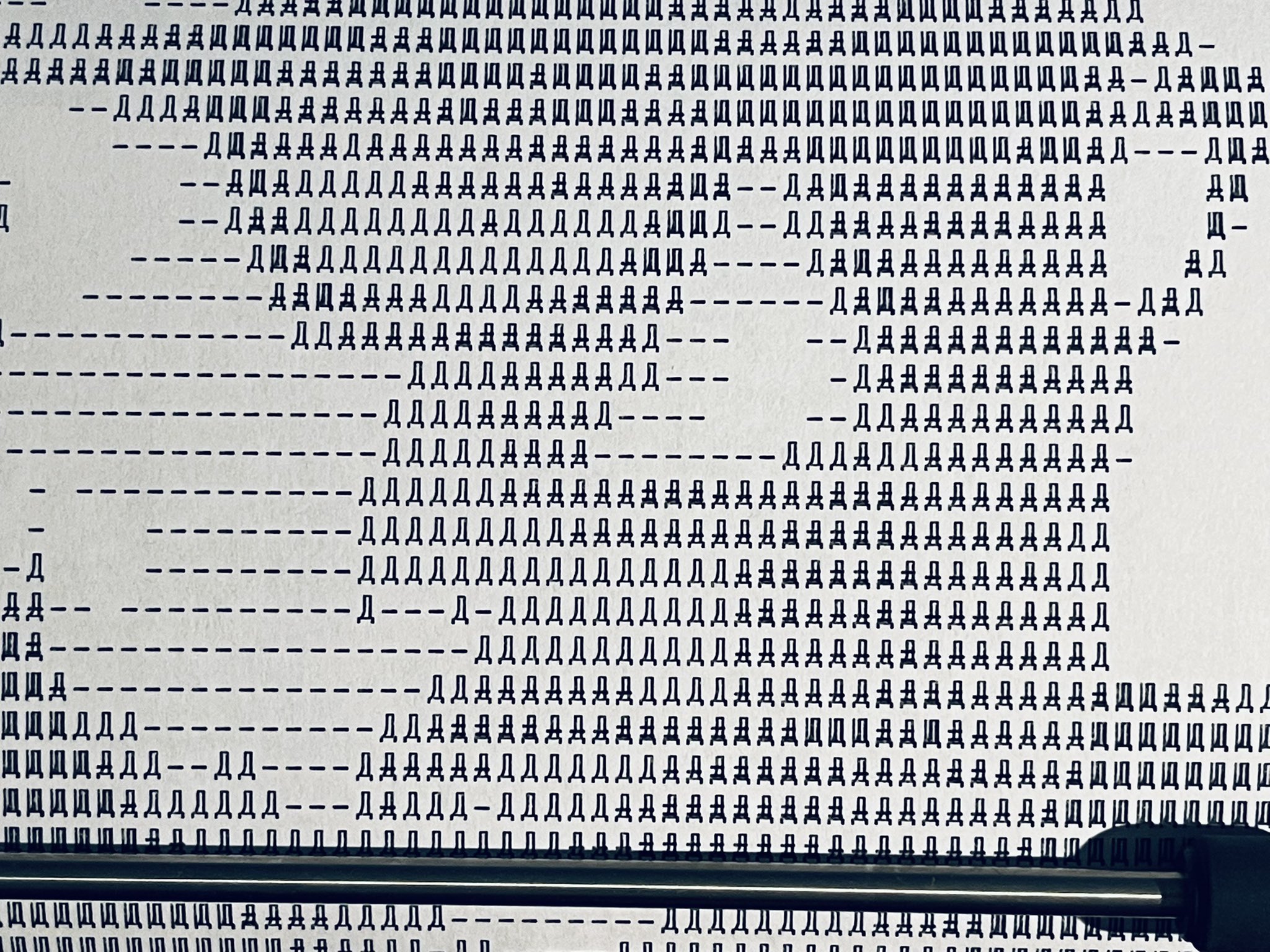
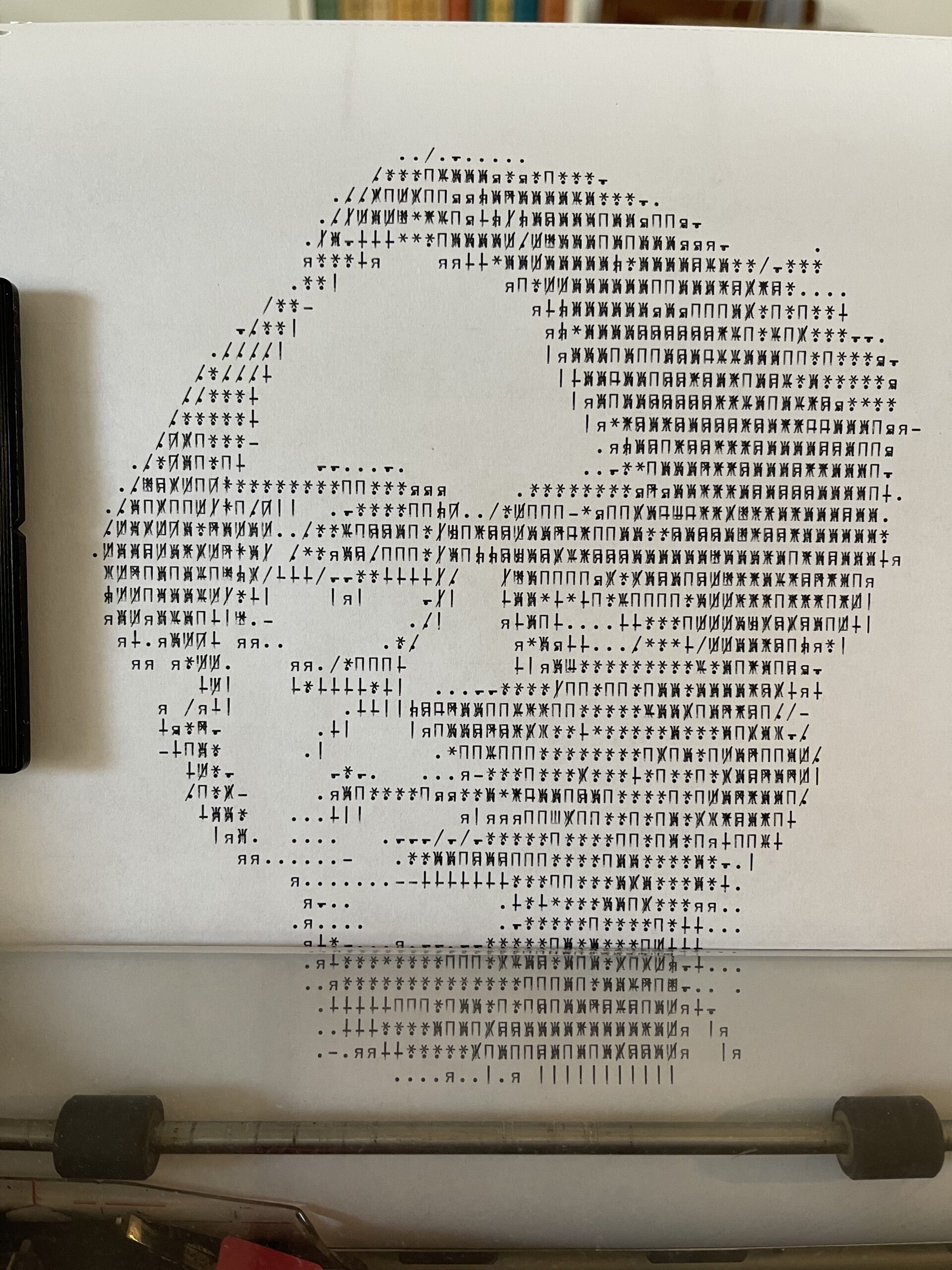
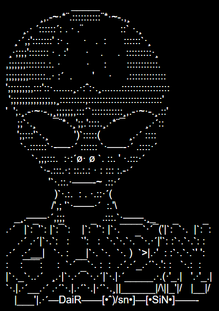
Cyrillic ASCII art (КОИ-7 art, more correctly) by Eric Furst, 2021-2022. Uses overstriking, ie printing characters on top of each other. More here.
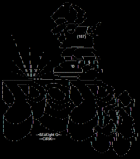
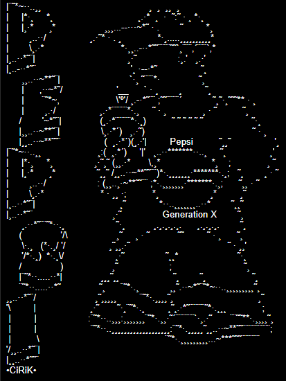
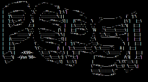
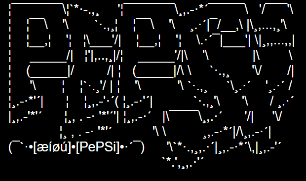
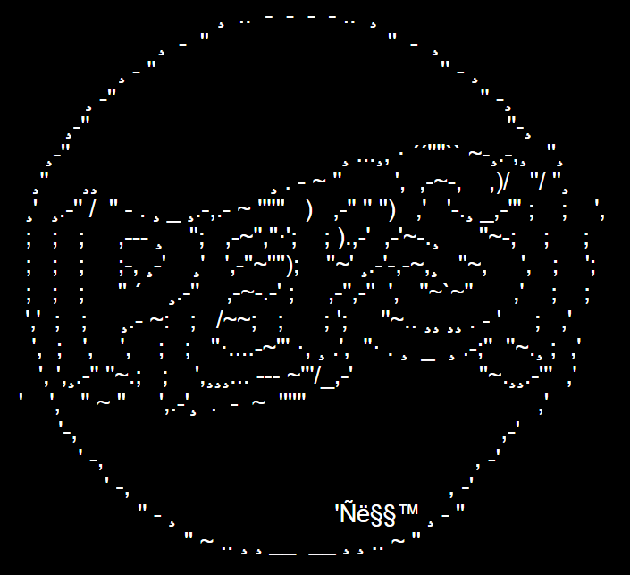
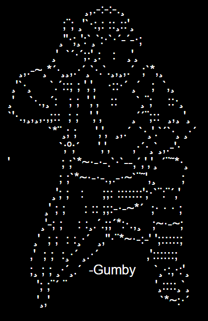
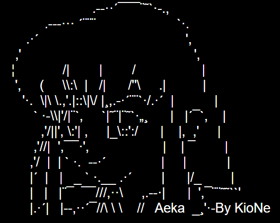
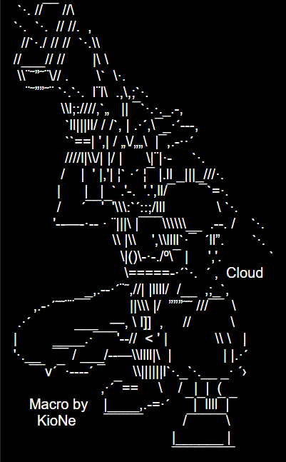
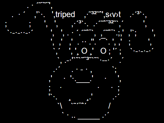
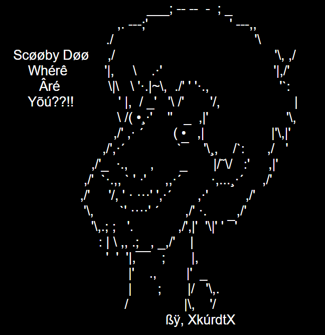
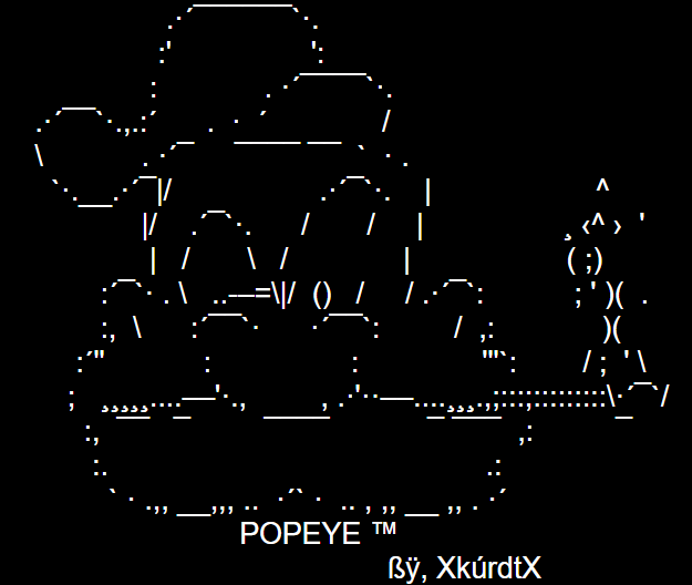
Logos for the Pepsi software, by various authors. Pepsi was a software (“proggie”) to make ASCII art (“macros”) for AOL. It was made by cpride and dc, 1997-1998. Since AOL used the proportional Arial font, it wasn’t possible to use a standard ASCII art software.
More Arial ASCII and also here.
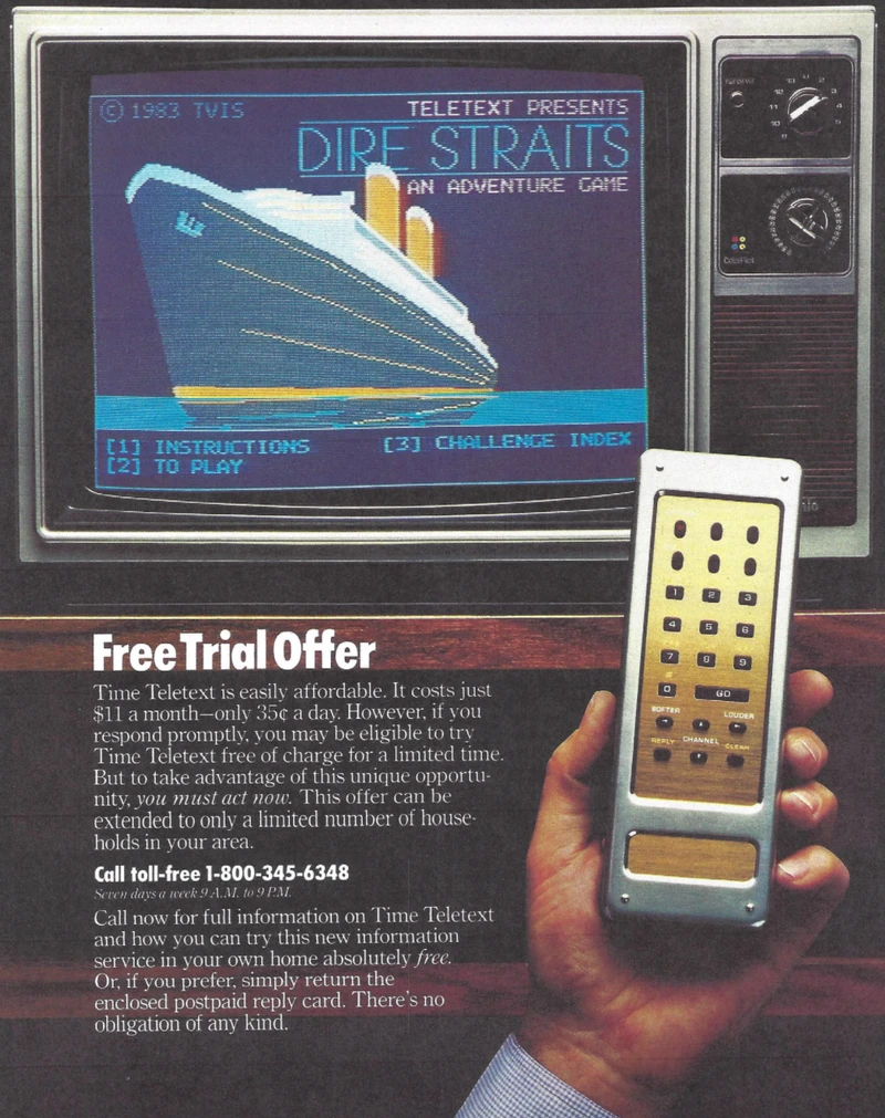
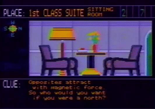
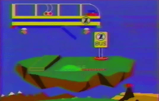
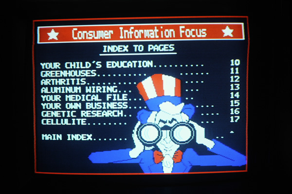
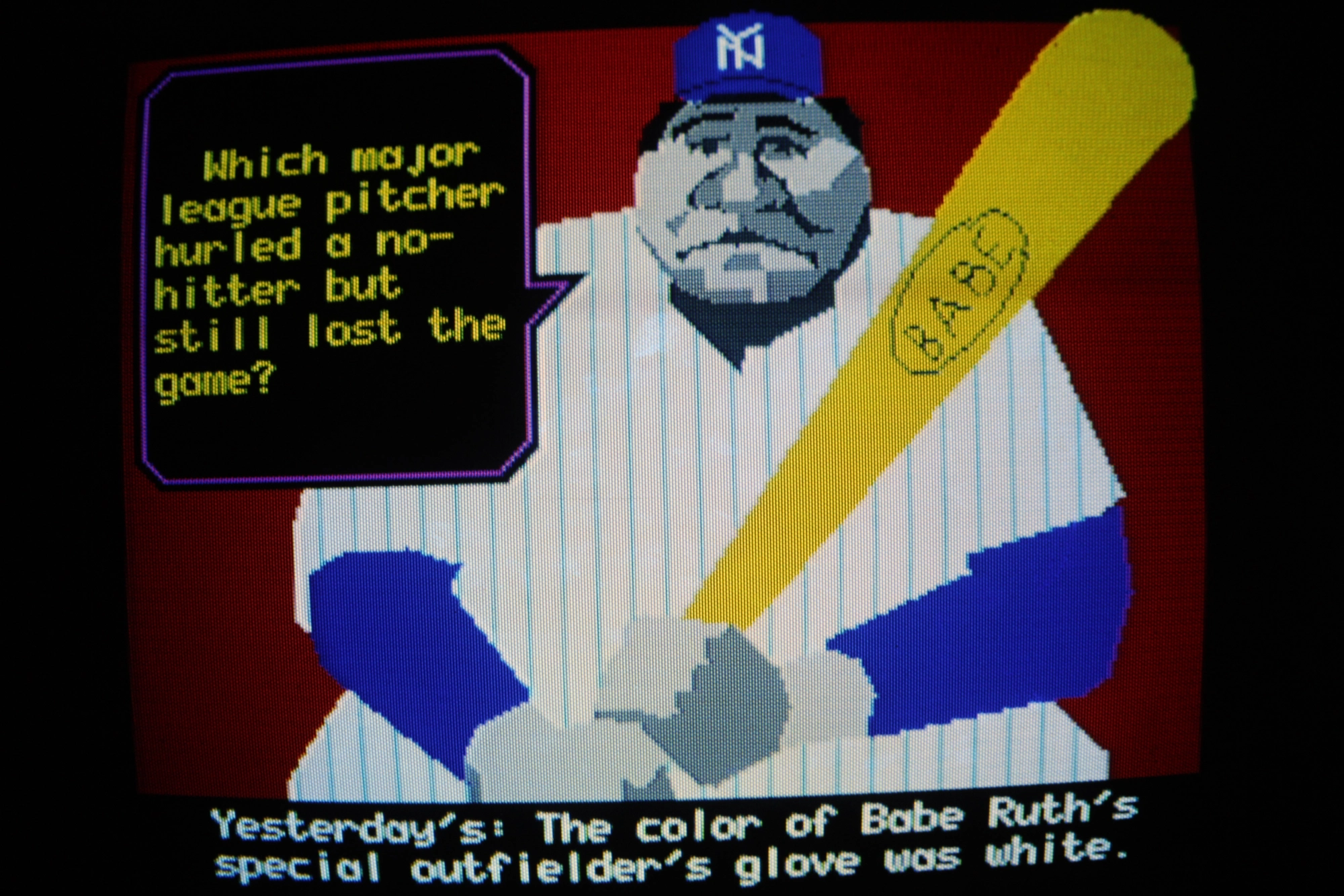
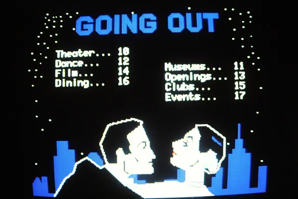
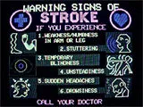
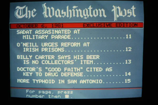
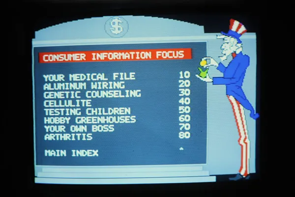
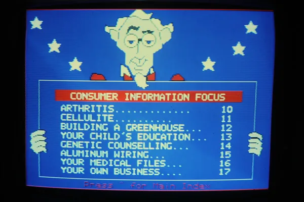
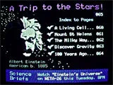
Time Teletext was a US teletext service, 1981-1983. Compared to common British teletext, Time offered smooth vector graphics with the NAPLPS-standard (common in American videotex). Time used satellite and cabe cable, so it had more pages and a better frame than other teletext. That paved the way for teletext games sucha as Dire Straits and Outer Space Zoo. The games turned out to be more popular than the news, which was not what Time was hoping for with their $25,000,000+ investment…
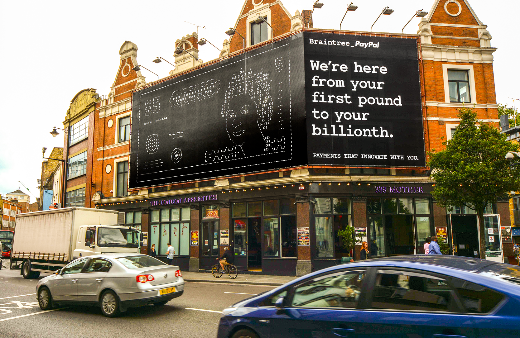
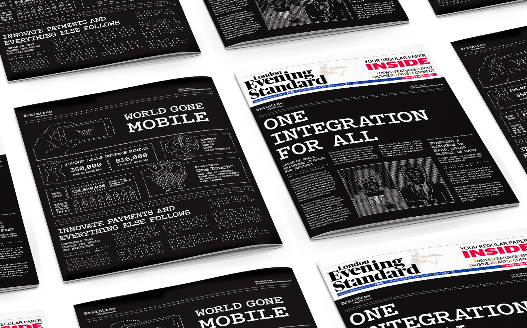
Braintree was branded with Courier ASCII art back in 2014/2015 with ads, posters, videos, games, etc. We’ve posted about before. More images and videos available in Jason Rosenberg’s posts here and here.
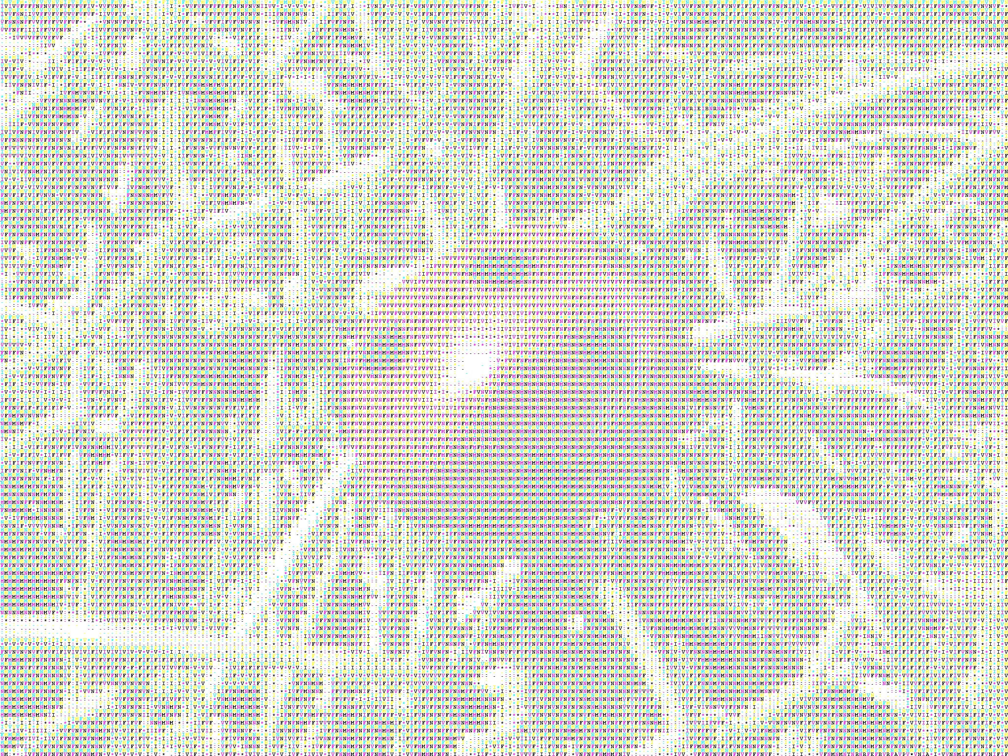
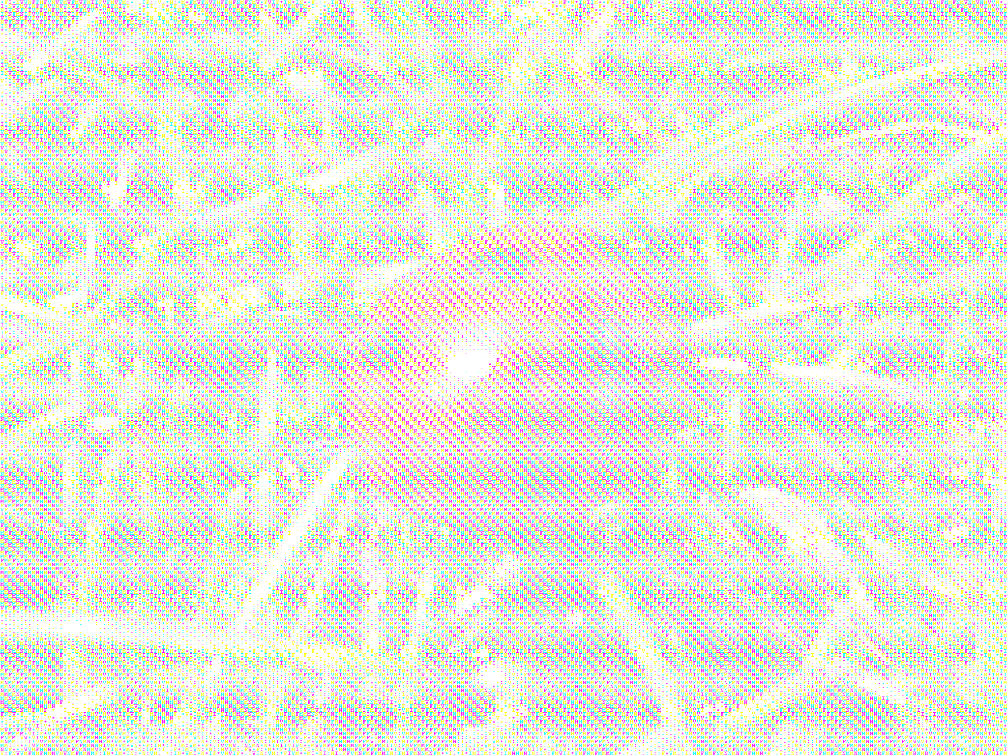
Ian Parberry’s experiments with coloured ASCII in high (text) resolutions. One image uses 3 colours, and the other 4. Made in 2011.
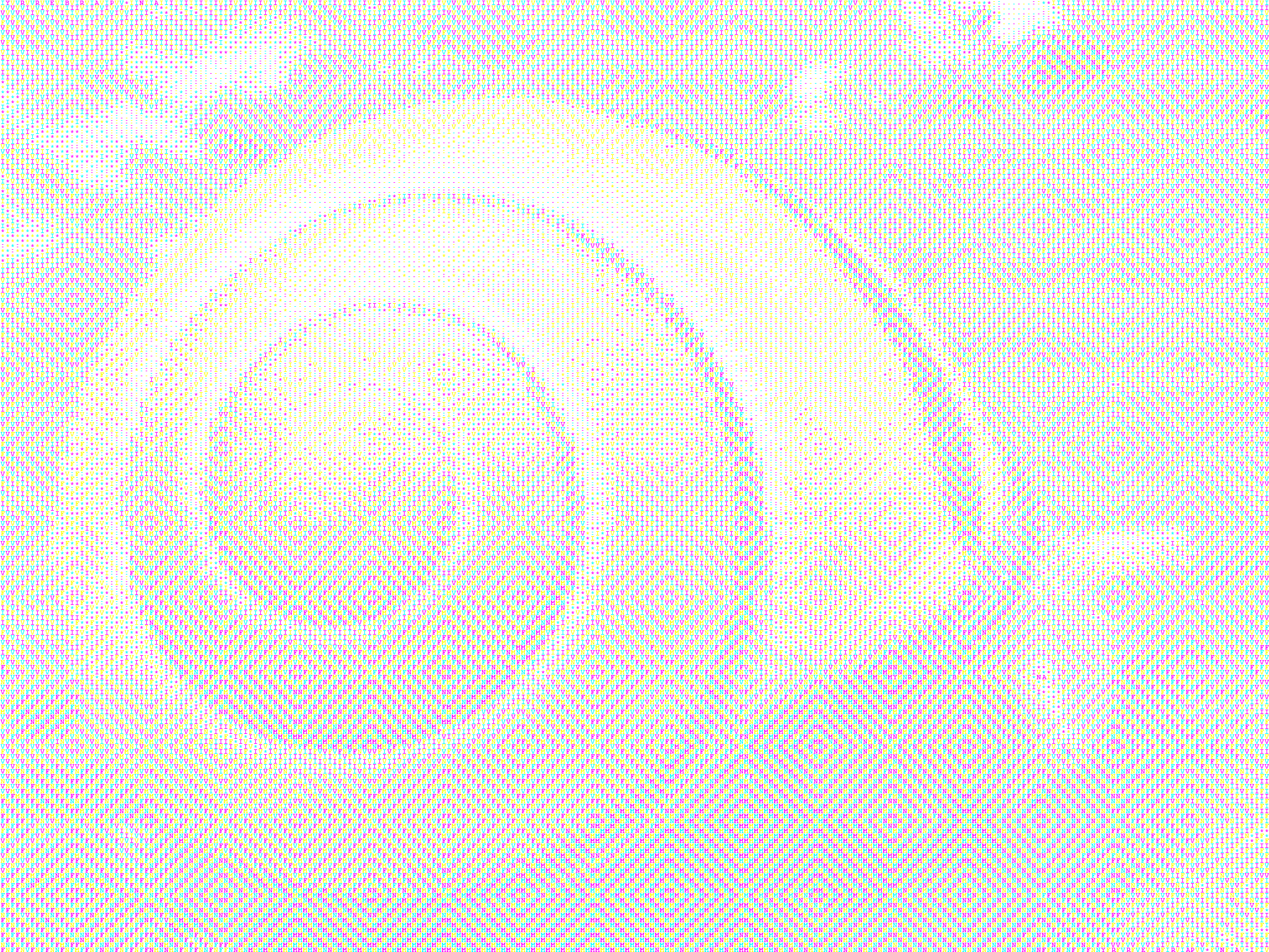
Another experiment by Parberry in 2012.
Three-color ASCII Art gives you the option of rearranging the order of the CMY triples to give an embedded texture that is only visible at middle distances. The texture disappears when viewed from long distances. Once again, click on the images for a larger version.
More examples are available here. Parberry has made lots of experiments with colours and resolutions in ASCII-conversions. He also made typewriter art in the 1970s, as previously posted.