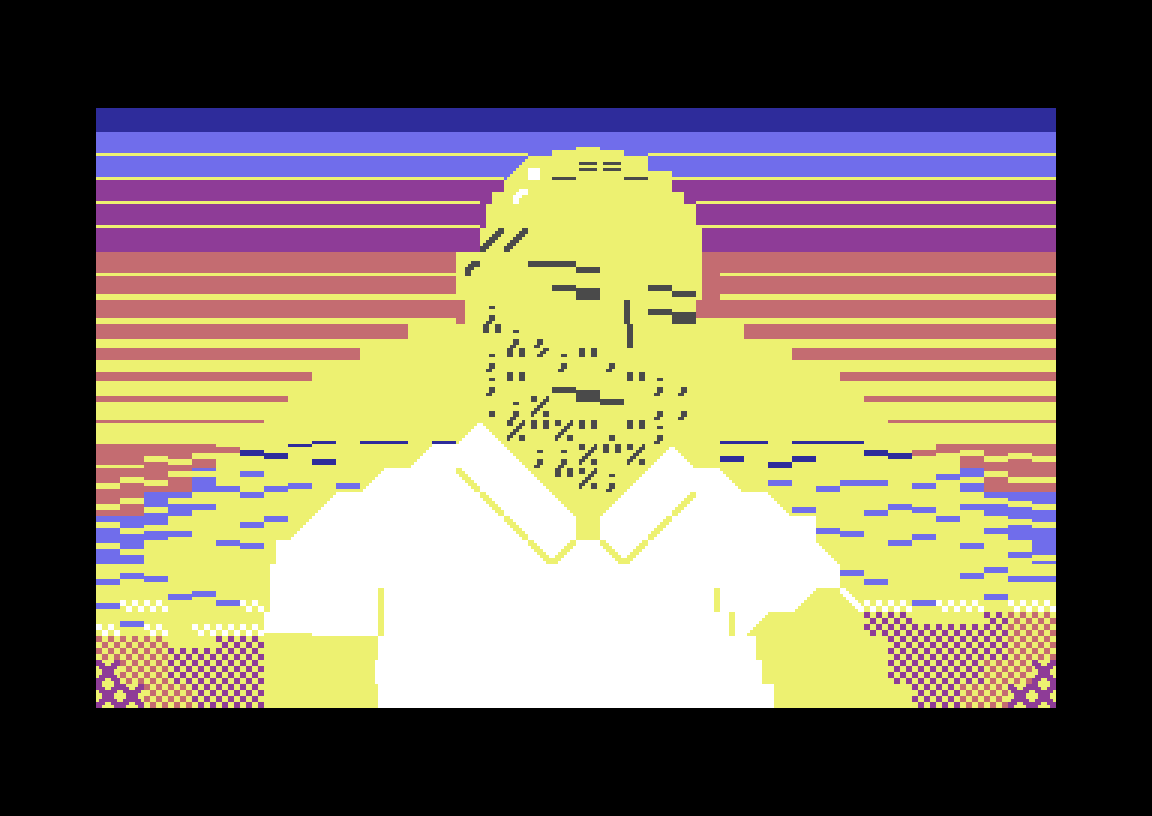
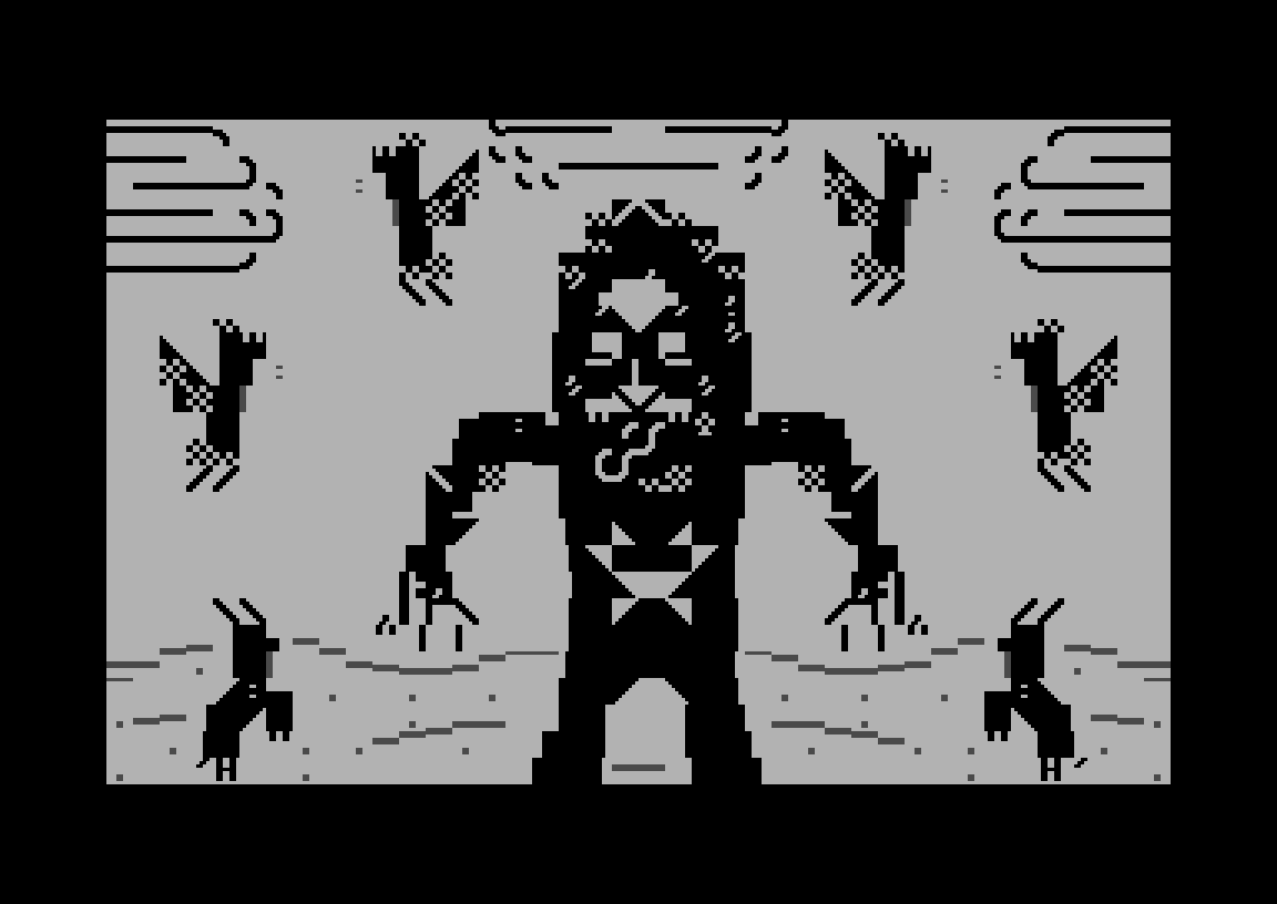
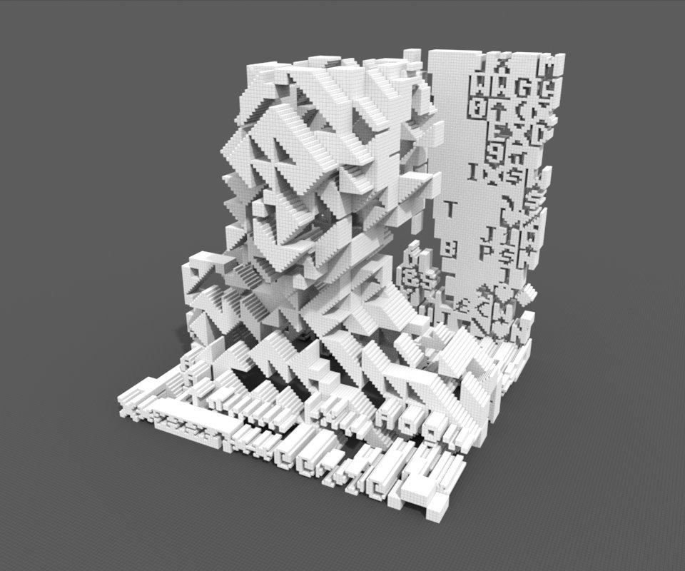
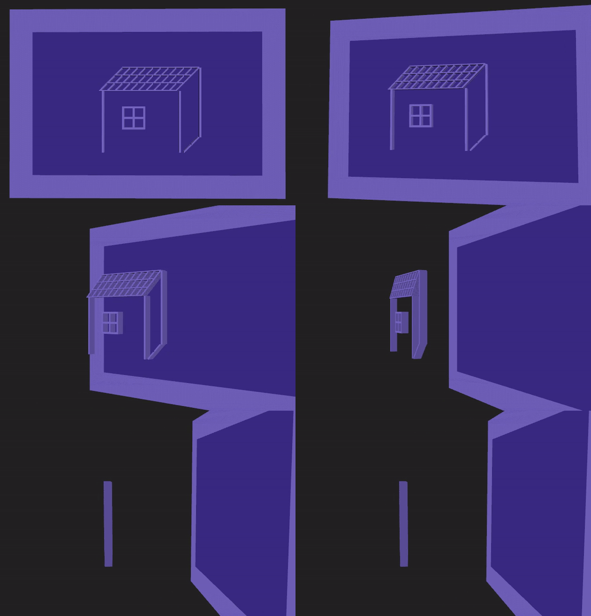
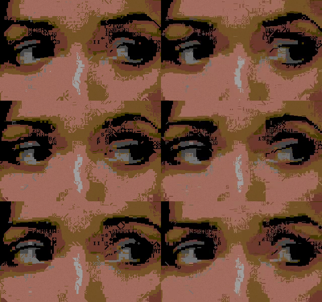

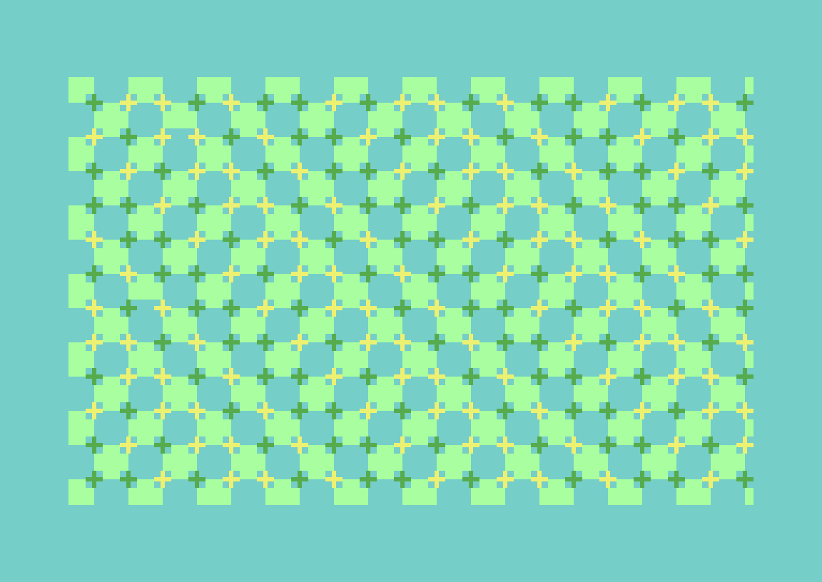
PETSCII-works by James, using his own lvllvl editor that runs in the browser. It even supported 3D and had its own C64 music editor back in the day. RIP. Hope you liked our little demo for you. <3


PETSCII-works by James, using his own lvllvl editor that runs in the browser. It even supported 3D and had its own C64 music editor back in the day. RIP. Hope you liked our little demo for you. <3
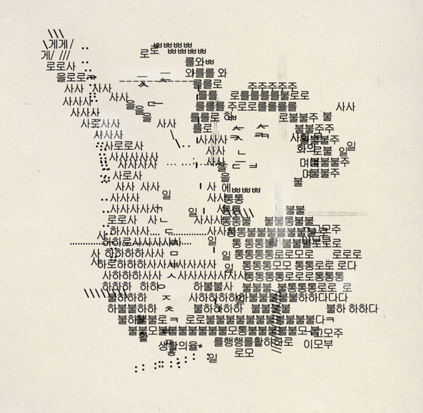
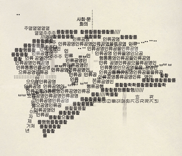
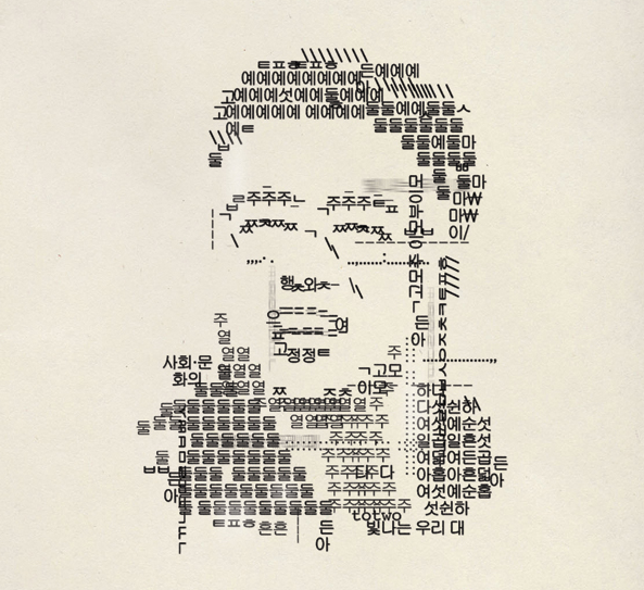
Illustrations by Otadoya for Esquire Russia, 2014. Seems to be using Korean characters.
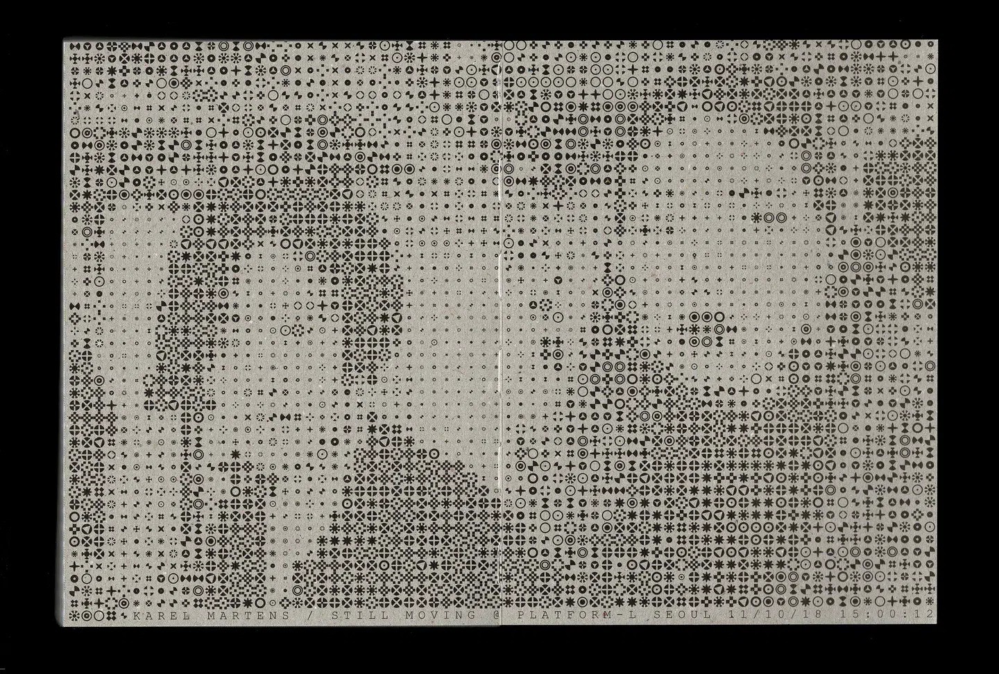
Karel Martens, 2018.
source
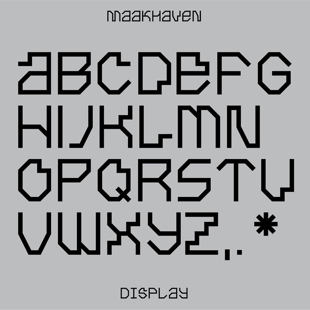
Maakhaven Display, designed by Lennarts & De Bruijn 2018.
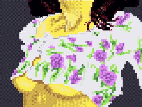
By mthw 2010, originally posted in this thread. Made with Melly’s ASCII-Paint (like this one) and it seems to not be a standard ANSI in terms of colours, charset and font. via
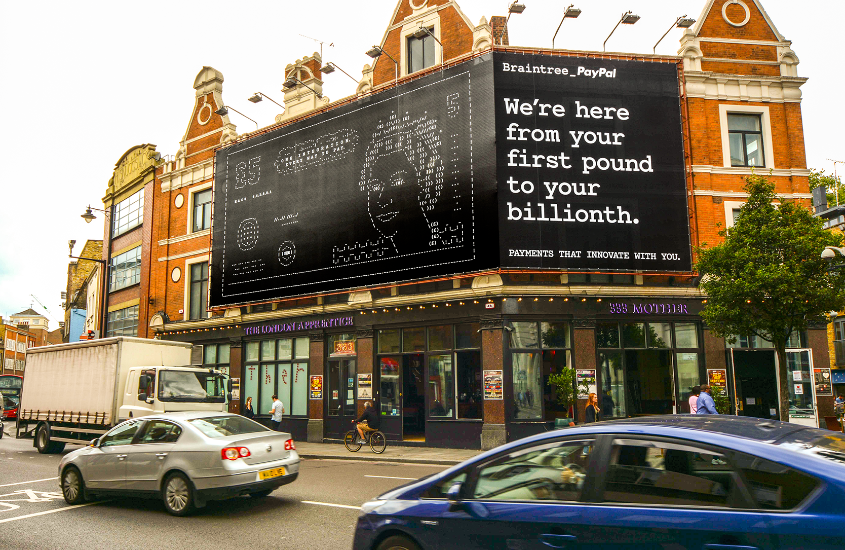
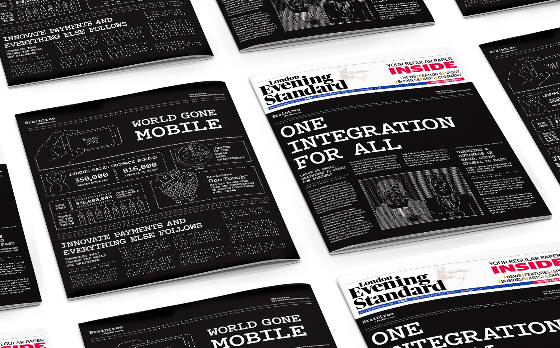
Braintree was branded with Courier ASCII art back in 2014/2015 with ads, posters, videos, games, etc. We’ve posted about before. More images and videos available in Jason Rosenberg’s posts here and here.
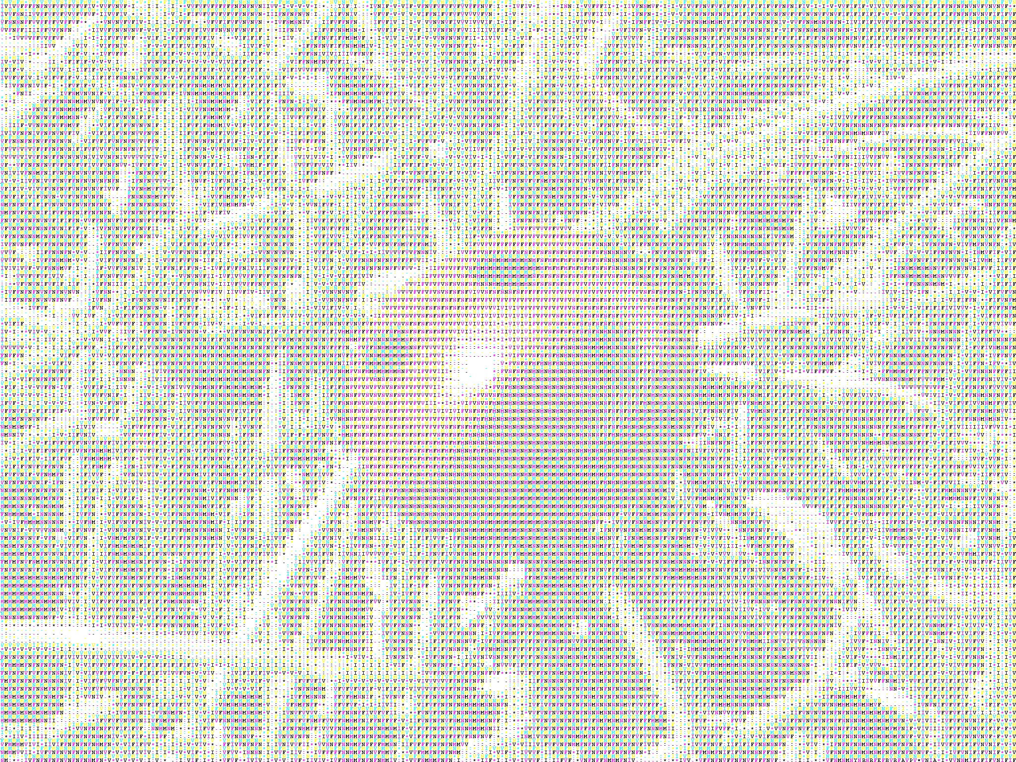
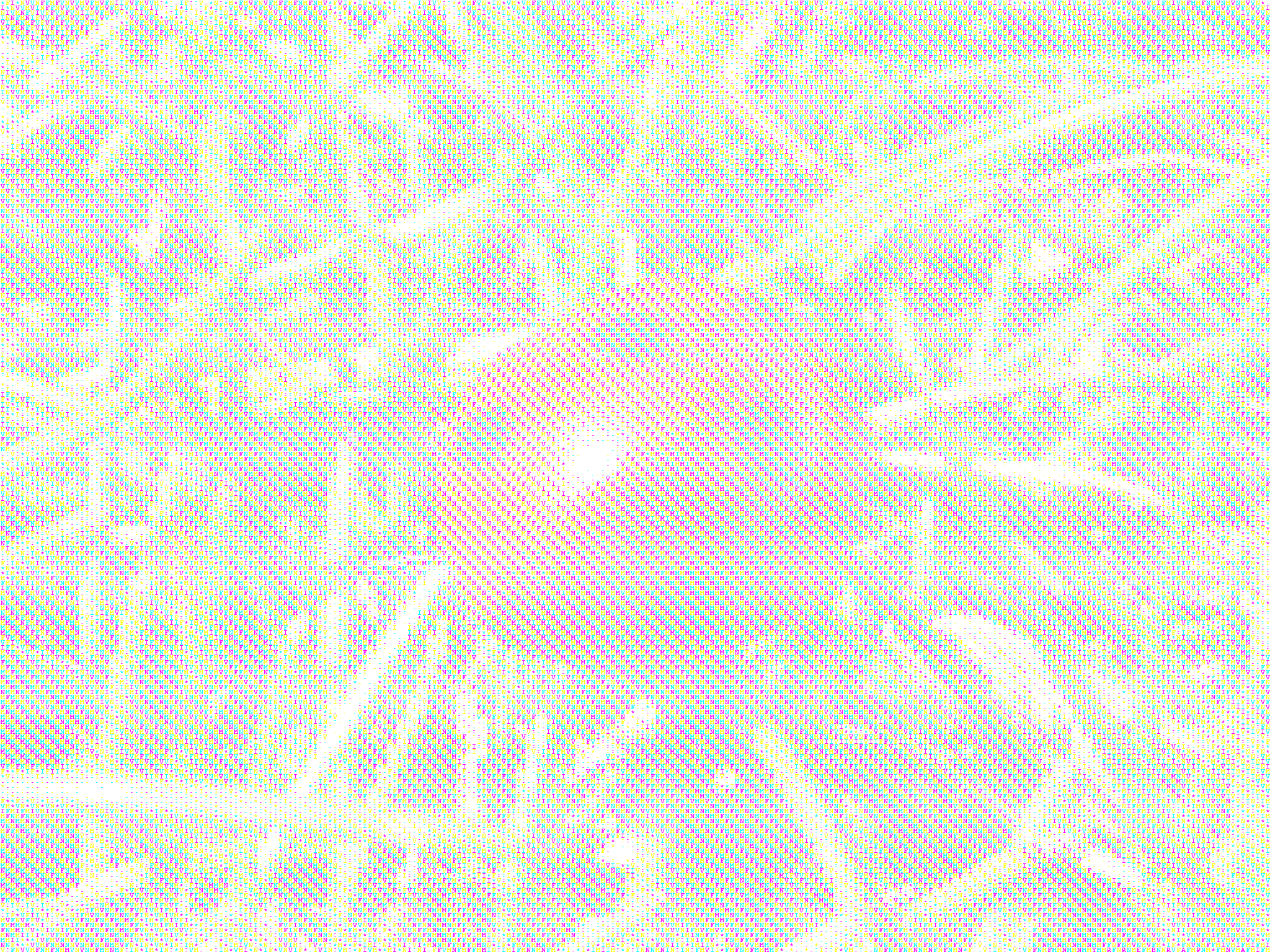
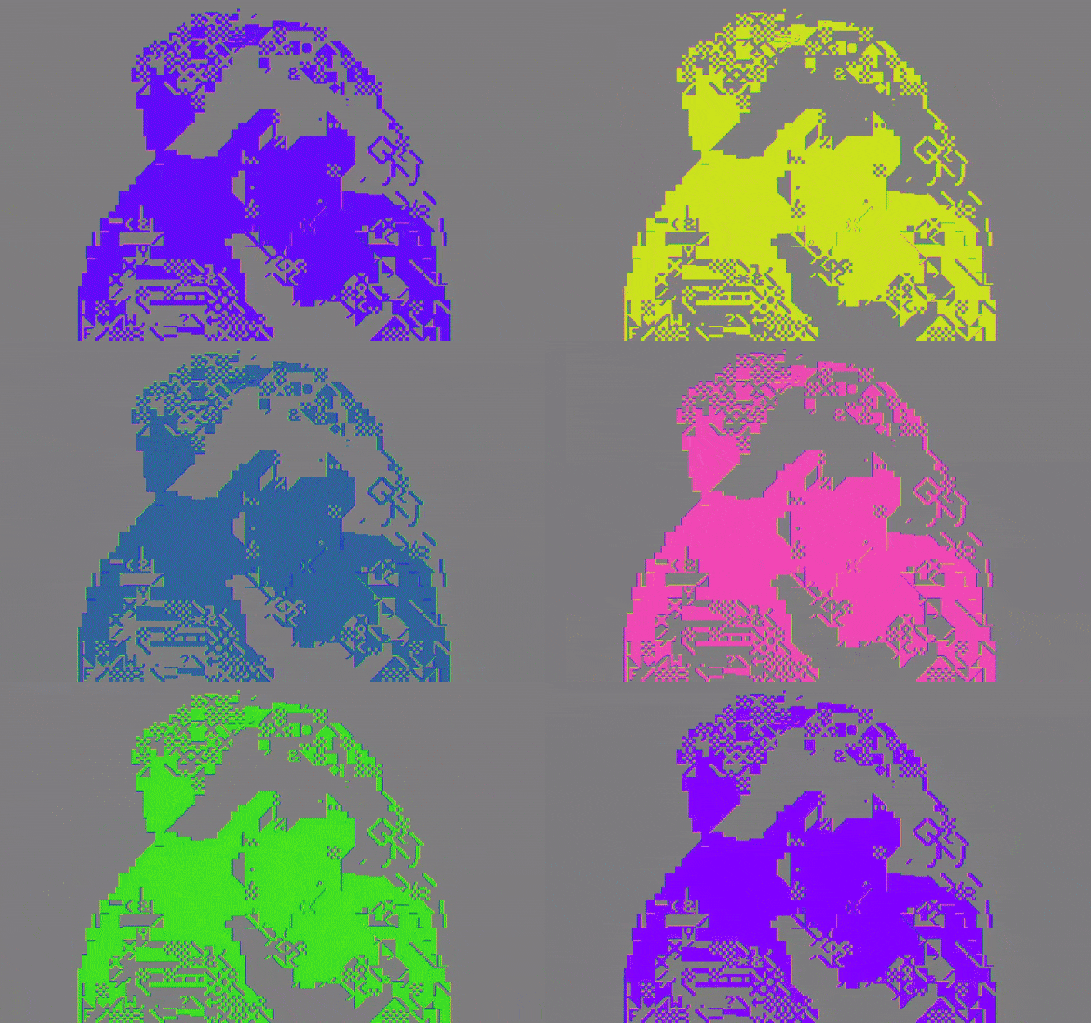
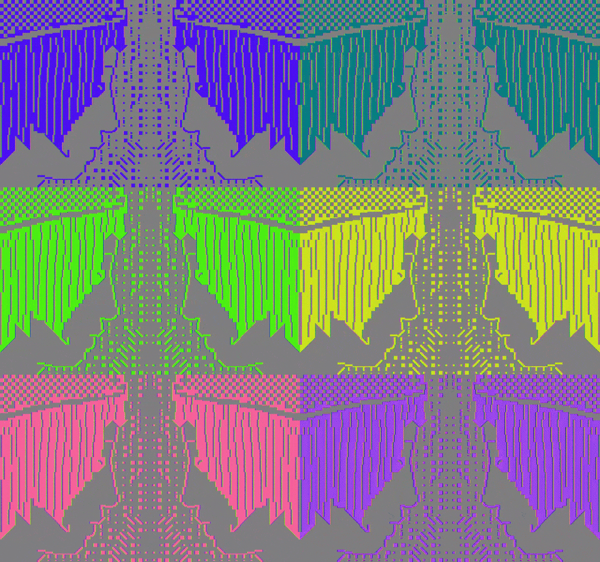
Ian Parberry’s experiments with coloured ASCII in high (text) resolutions. One image uses 3 colours, and the other 4. Made in 2011.
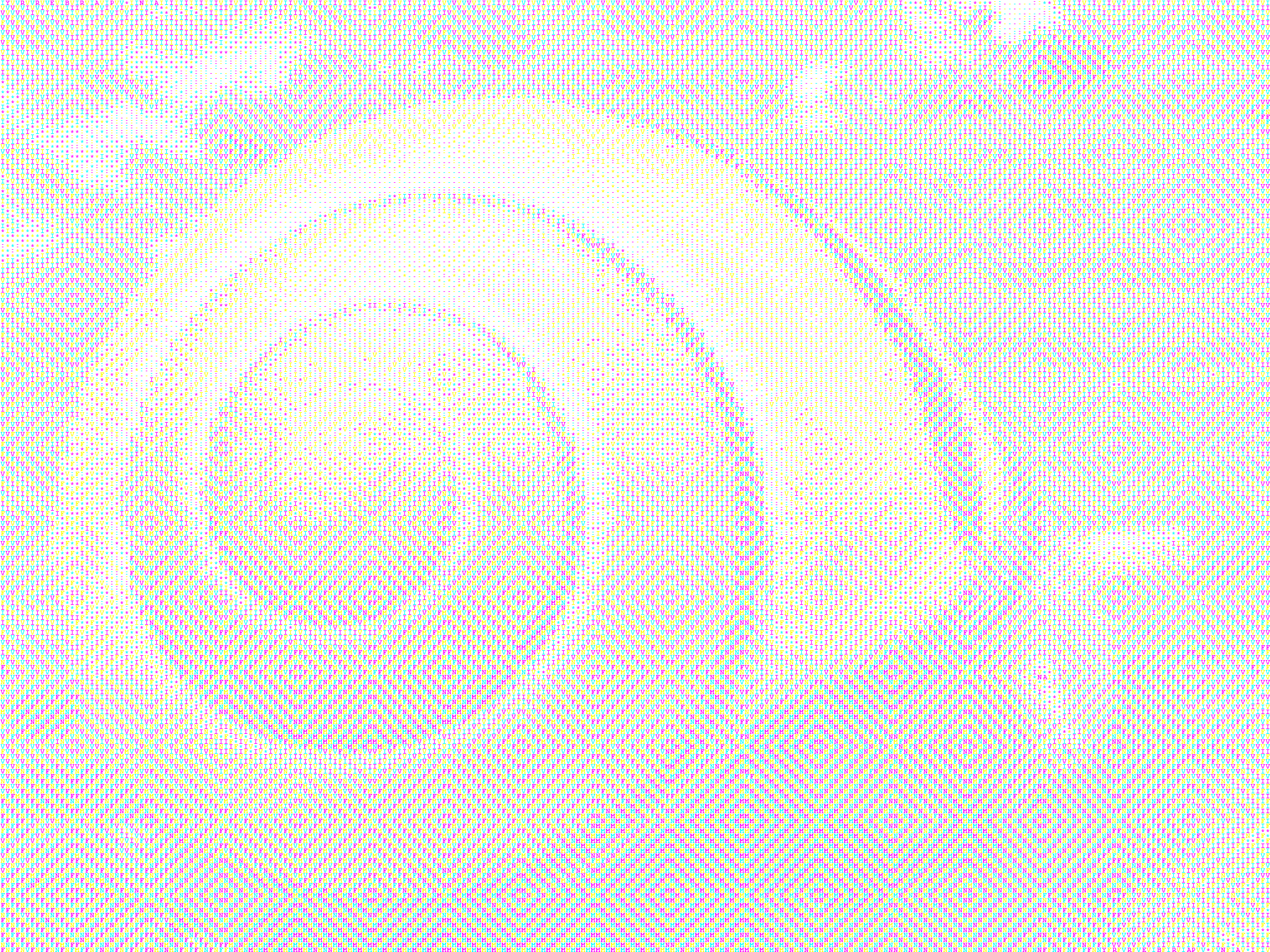
Another experiment by Parberry in 2012.
Three-color ASCII Art gives you the option of rearranging the order of the CMY triples to give an embedded texture that is only visible at middle distances. The texture disappears when viewed from long distances. Once again, click on the images for a larger version.
More examples are available here. Parberry has made lots of experiments with colours and resolutions in ASCII-conversions. He also made typewriter art in the 1970s, as previously posted.
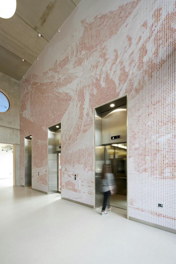
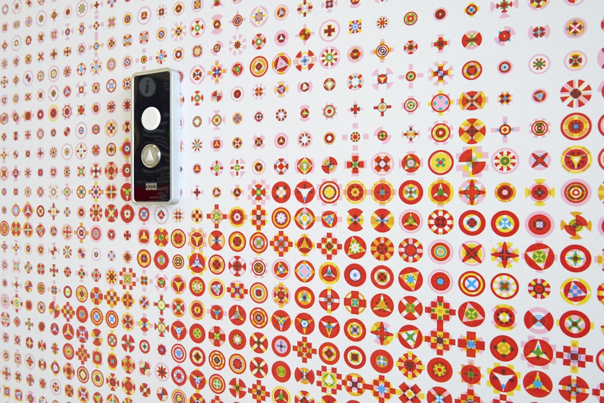
Karel Martens‘ work for Guy’s Hospital Cancer Centre in London, 2016.
source
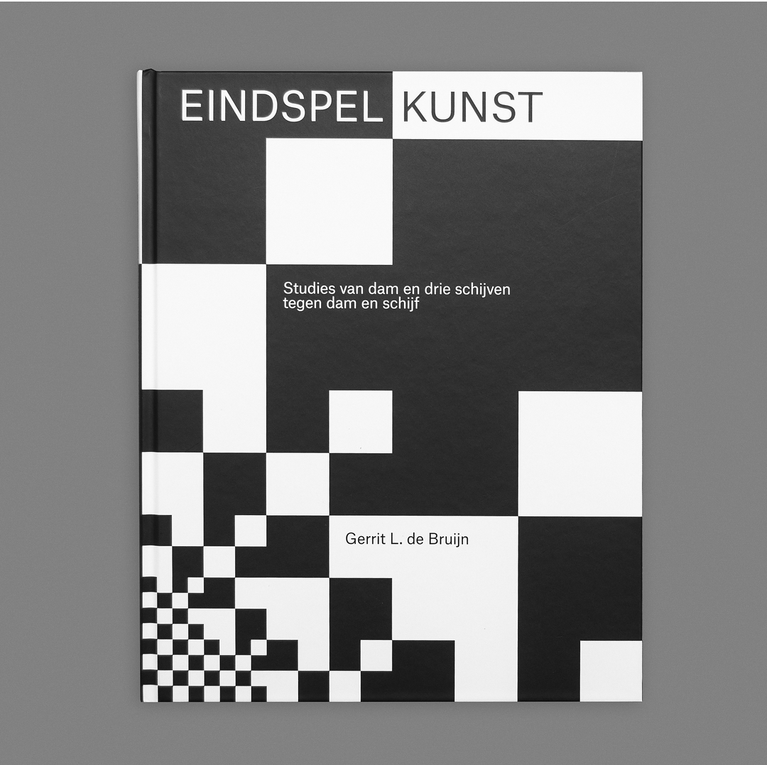
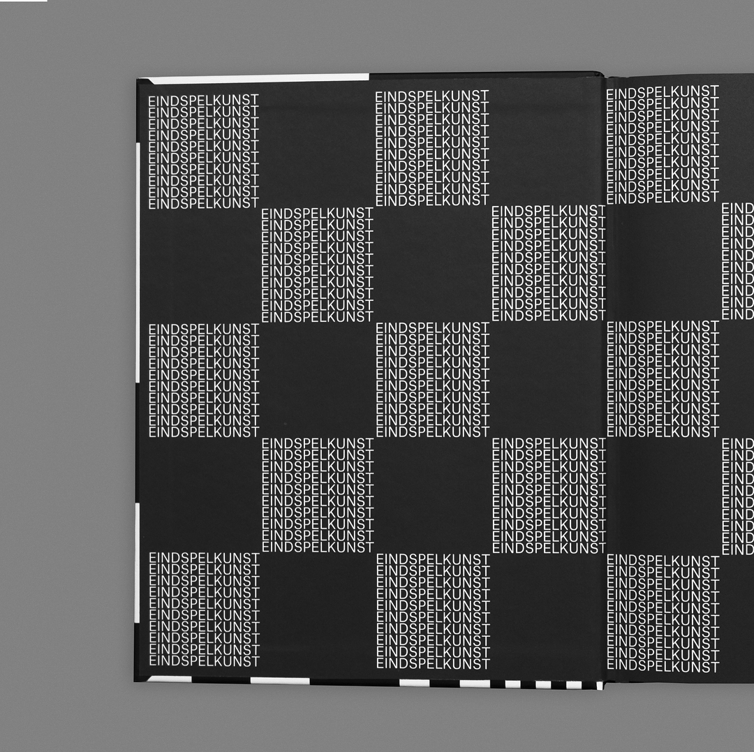
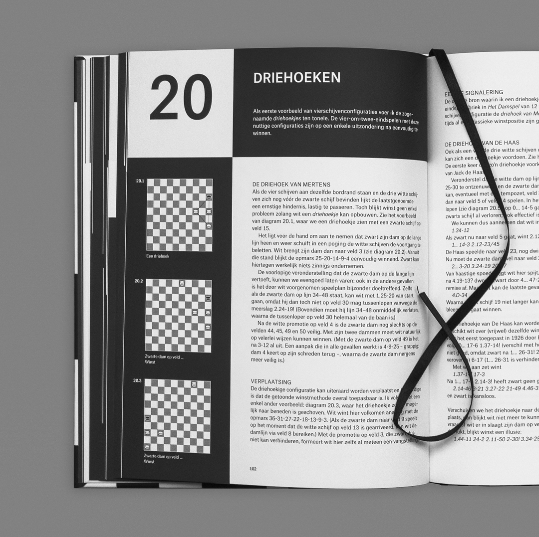
Eindspelkunst Studies van dam en drie schijven tegen dam en schijf, designed by Lennarts & De Bruijn, 2018.