
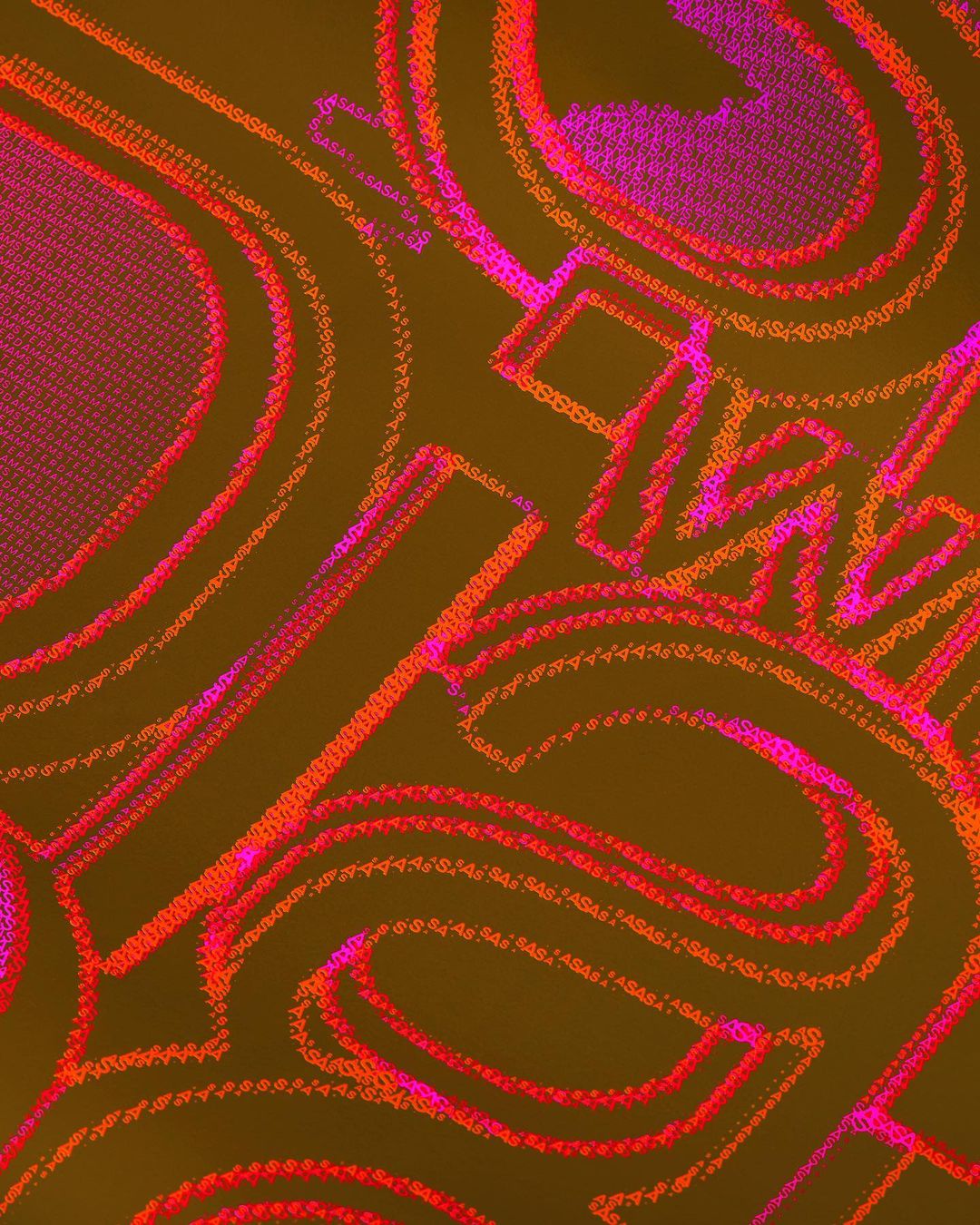
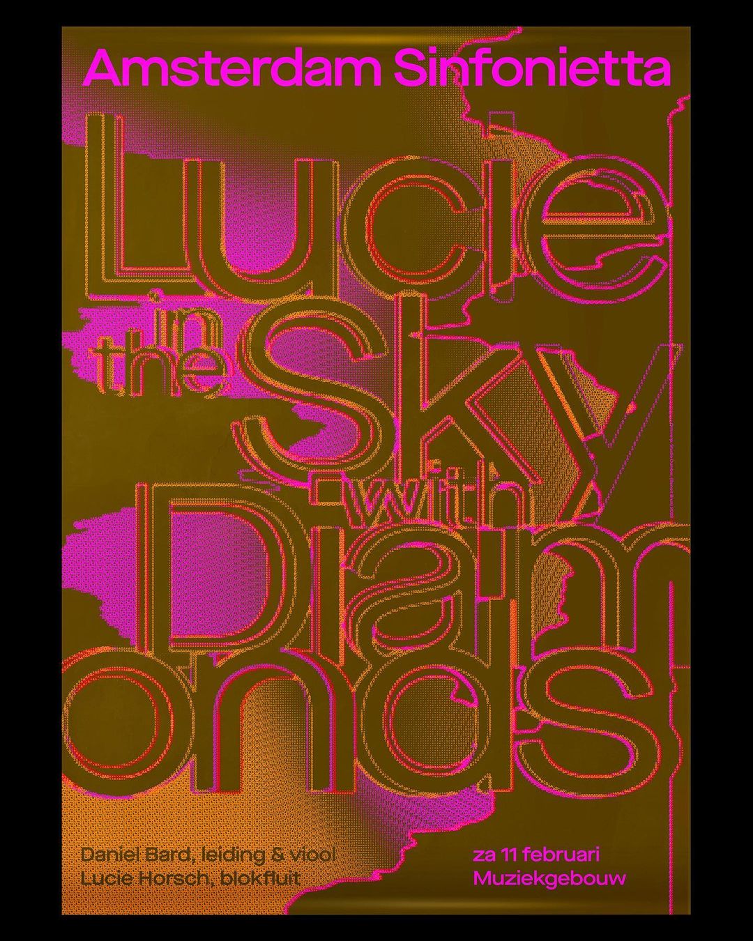
Animations by Lennarts & De Bruijn. via TYPE01
Tag Archives: netherlands
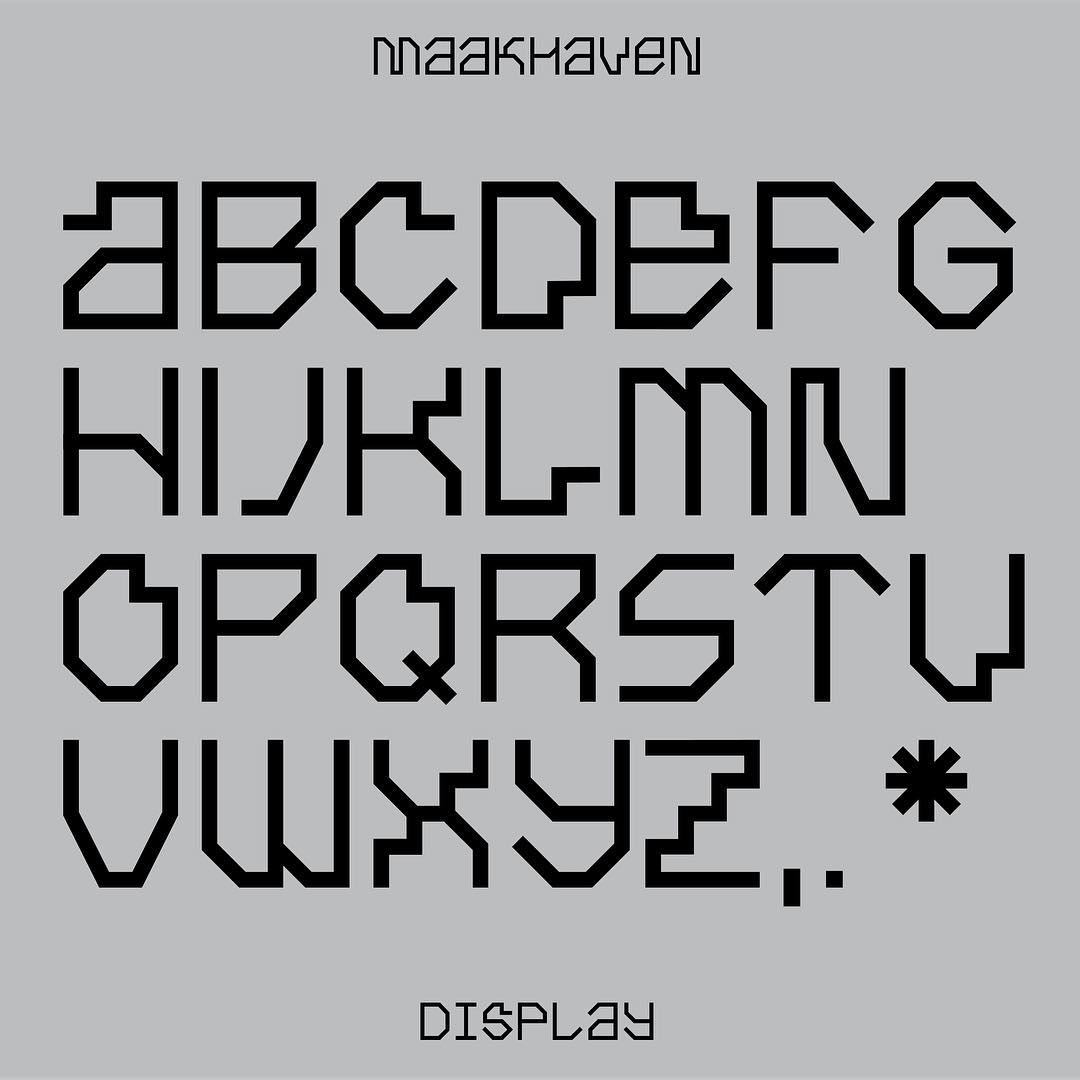
Maakhaven Display, designed by Lennarts & De Bruijn 2018.
Vuk Ćosić and the ASCII Art Ensemble
I couldn’t find a comprehensive history on the ASCII-stuff that Vuk Ćosić and the ASCII Art Ensemble did, so I tried to write one myself. Please consider this a work in progress.
ASCII Art Ensemble
The ASCII Art Ensemble consisted of Walter van der Cruijsen (NL), Luka Frelih and Vuk Ćosić (SI). They were all working with net.art. Vuk Ćosić was born in Belgrade 1966 and is often called a pioneer of net.art. He co-founded the medialab Ljudmila in Ljubljana, together with Luka Frelih who has a long CV of art/tech/community projects. Walter van der Cruijsen has worked in the art world since 1986, and was Media and net art curator at ZKM in Karlsruhe during the ASCII Art Ensemble years.
The ensemble did works together 1998-2000, during which Vuk Ćosić also did solo works, and it is not exactly clear who to credit for what.
Their first meeting was a week in Amsterdam in August 1998, in the premises of the Worldwide Video Festival. They made a plan to bring moving ASCII images to the web. This idea had been “floating in meetings at various European Internet conferences and festivals during the last three years”. They discuss this in an interview with Josephine Bosma in 1998.
They had three specific projects in mind: History of Art For the Blind, History of Moving Images and Deep ASCII. They planned three more projects initially, but they never happened: ASCII Wall, MTV stream and History of Silent Film. More info here and here.
The ASCII Art Ensemble distanced themselves from ASCII art in general. “Ascii art is from the deep paleolithic of computers, if anybody remembers that stuff”, said Ćosić in an interview in 1998. In the same interview, van der Cruijsen said: “We aim at different things. The whole ascii art as it was so far, in usenet and email, was a lot based upon the idea of media being streamed and distributed. It was more like: ‘I have a idea, this is an image, I want to present it. [..] We try to make real objects out of it, concrete things”. Lev Manovich connected their approach to the history of the cinema.
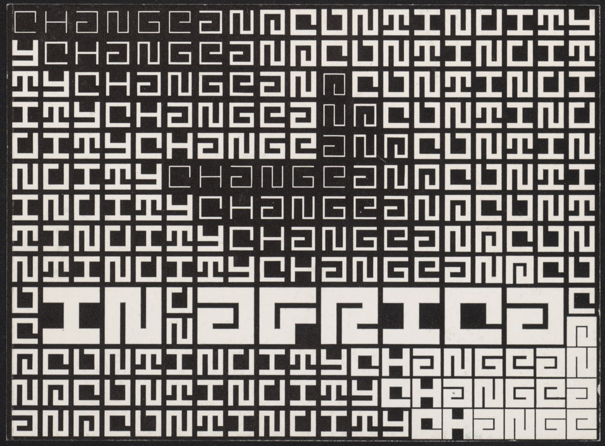
Their work was indeed different from the typed text graphics that was popular on Usenet and in various subcultures at the time. The group was more interested in image-to-text software and they wanted to convert the whole world into ASCII. Conversion softwares like these have been around at least since the 1960’s, but the ensemble’s mission was to bring this online, preferrably in realtime. They developed their own software for this in 1998 (see below). The grand idea of converting the world into ASCII continued in 2000 with collaborations with Thomax Kaulman on ASCII video-streaming in 2000. This seems to be the last activities of the ensemble, but Ćosić continued to build on the idea and started to explore 3D and architecture (see below).
- Vuk Cosic’s semi-old website
- Vuk Cosic’s old website
- Medienkunstnetz
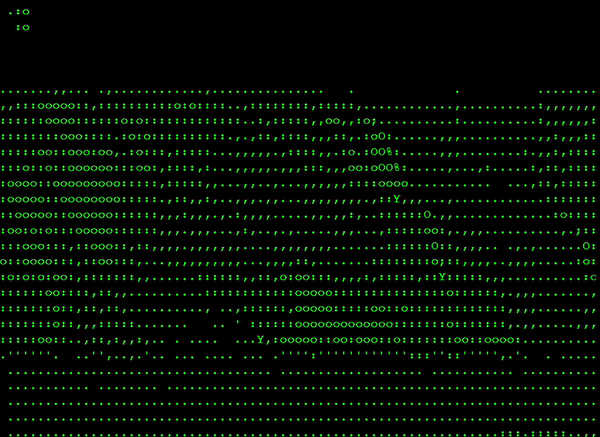
Deep ASCII (1998)
Deep ASCII “is a full length conversion of the classic porno film Deep Throat, which amounts to 55 minutes of pure mute ascii porn. This genre was selected for it’s dominating close-ups, very convenient for resolutions ASCII can support. It is presented both as a video work and online.” Initially, “the Deep ASCII project consist(ed) of a gallery installation of a Pong Arcade running a continuous loop of the ASCII version of Deep Throat – as simple as that.”
In 2021, Deep ASCII was offered as an NFT at the price of £40,000-£50,000.
- Javascipt version online at ZKM here
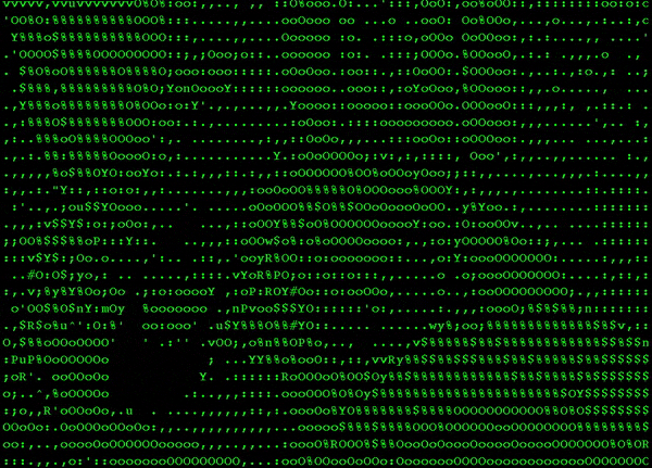
ASCII History of Moving Images (1998)
This is arguably the most famous of their works. They’ve made ASCII-clips of footage from the Lumière brothers, Sergei Eisenstein’s Battleship Potemkin, King Kong (pictured above), Star Trek, Blow Up, Psycho, and Deep Throat. More here.
ASCII music videos (1998?)
This is possibly more of a solo project from Vuk Ćosić than a group effort. It is music videos made in ASCII for six General MIDI covers of classic pop songs by Alexei Shulgin and one for Atom TM. The General MIDI ASCII combo was later adopted by Yoshi Sodeoka in ASCII Rock (2003).
ASCII History of Art For the Blind (1999)
The ASCII Art Ensemble also explored sound. In ASCII History of Art For the Blind, they made ASCII-versions of classic art pieces and then had a text-to-speech software read the ASCII art aloud. More here.
Instant ASCII Camera (1999)
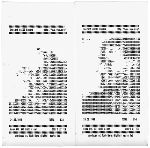
Solo project from Ćosić, coded by Frelih. Instant ASCII Camera was a free-to-use photo booth that printed ASCII-portraits on receipt paper. It was shown on several art events in 1999. We previously posted about it here, and mentioned Atari’s ASCII photo booth from the 1970s.
ASCII Architecture (2000)
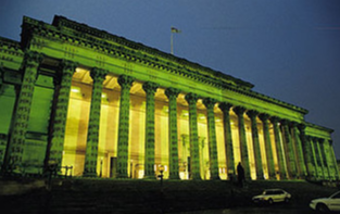
ASCII Architecture seems to have been a one-off project by Ćosić to fully cover Liverpool’s St. Georges Hall with the projection of an ASCII rendition of the same surface that it’s being projected on. It was made in 2000.
ASCII Unreal (1999-2009)

ASCII Unreal is part of Ćosić’s venture into 3D ASCII. It is a form of machinima that superimposes ASCII-style graphics into the game Unreal Tournament (source). It doesn’t use Latin letters but cyrillic ones, which are not available in ASCII.
An early version was submitted to the Synreal project in 1999.
- Interview where the work is dated to 1998
- Alexei Shulgin’s ASCII VR goggles, 2007
ASCIImades
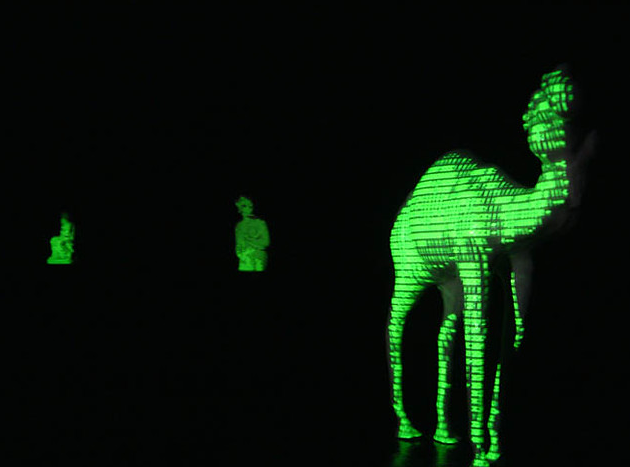
Similar to ASCII architecture, ASCIImades converts objects into ASCII and projects them back on itself. Unknown date.
Very Deep ASCII (2013)
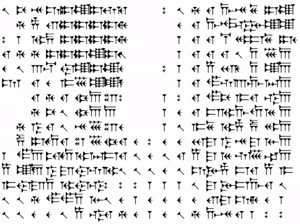
This is a cuneiform conversion of the infamous scene in Deep Throat where Linda Lovelace discovers that her clitoris is in her throat. Ćosić writes on Twitter: “Proved Sumerians could have done movie files. Never found the partner to collab on a player.” A still from the movie was shown in 3D at Graphic bienal in Ljubljana, 2013.
Software
The ASCII Art Ensemble developed their own software (and distributed it for free), but they also collaborated with other programmers. The original Deep ASCII was recorded with ttyvideo by Chris Pirazzi (1995) for Silicon Graphics computers (source). It produced a 175 megabyte text file to be played in a terminal. Frelih developed a player in Java that could display such files online. It was called ASCIImator and it was released in September 1998. Deep ASCII came bundled with this software, and it can be downloaded here. Unlike other similar software at the time, you could use ASCIImator without crediting the author.
Thomax Kaulman and Andreas Schiffler, “who wrote more beautiful source codes“, made other players. Schiffler’s Libbgrabb was made for the ensemble’s exhibition at the net_condition in 1999. Kaulman’s software was presumably made for their collaborations in 2000. Jaromil and others at Dyne continued in this spirit and developed HasciiCam in 2000. It converts video to ASCII using AAlib and plays it using a modified version of ASCIImator.
- The Ensemble’s software and resources at desk.org
- The old webpage of Libbgrabb
- ascvid (by Bernd Diemer, Andreas Schiffler, Walter van der Cruijsen) was another software, based on Libbgrabb
By Benoît Brun, 2016 and 2023. h/t: TYPE01
Karel Martens‘ work for Guy’s Hospital Cancer Centre in London, 2016.
source
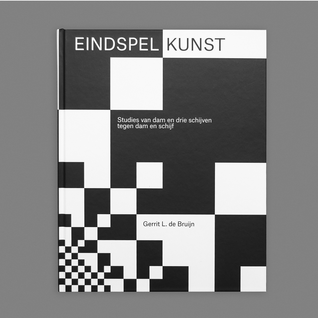
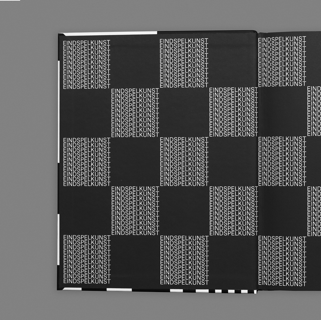
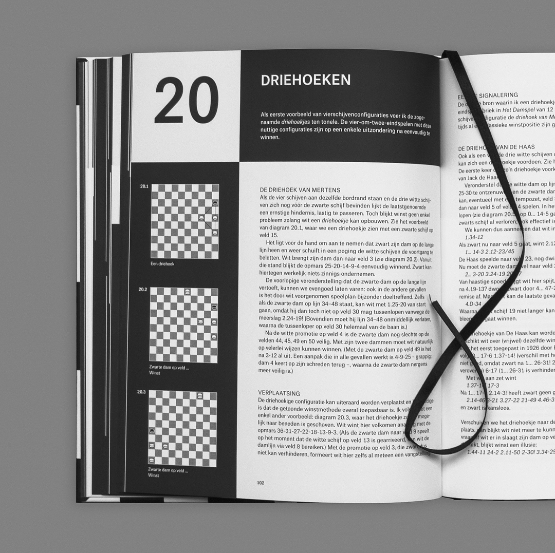
Eindspelkunst Studies van dam en drie schijven tegen dam en schijf, designed by Lennarts & De Bruijn, 2018.
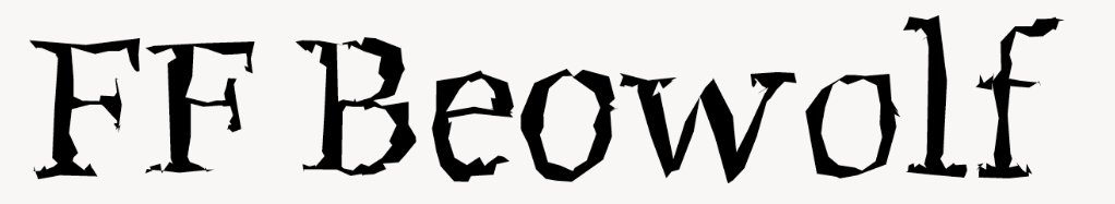
FF Beowulf by Erik van Blokland and Just van Rossum, published in 1990. A typeface that looks different every time it’s typed, because there is Postscript code to randomize the outlines. The original authors have made a new version called LTR Beowulf.
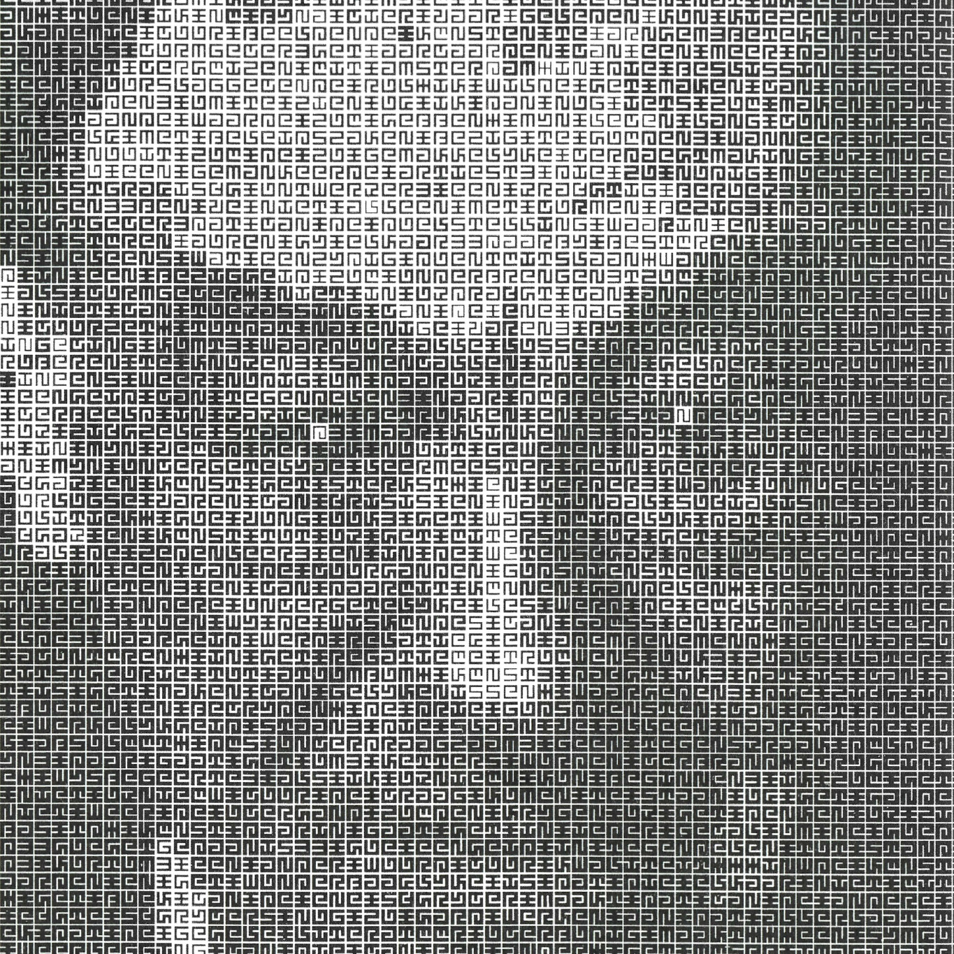
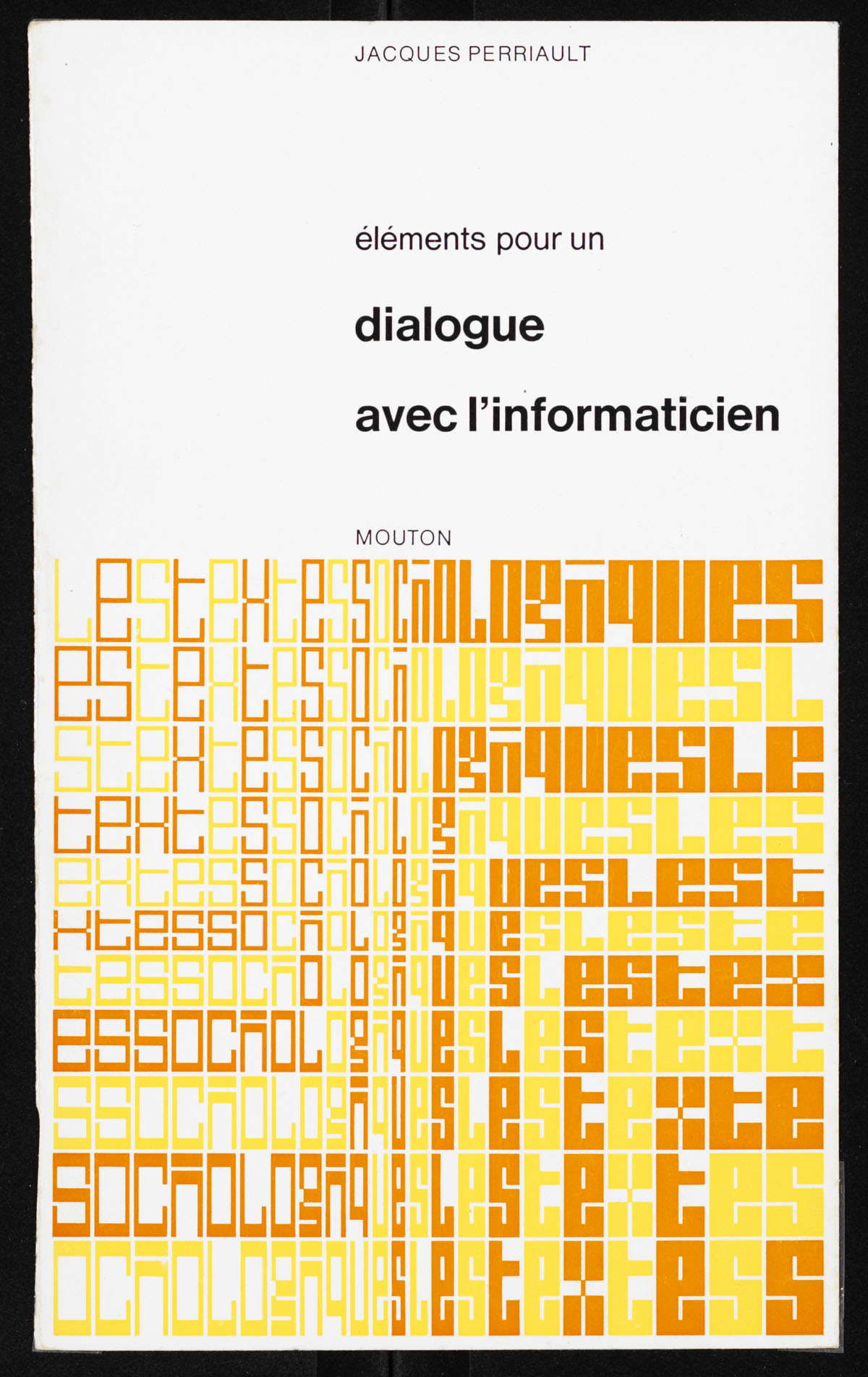
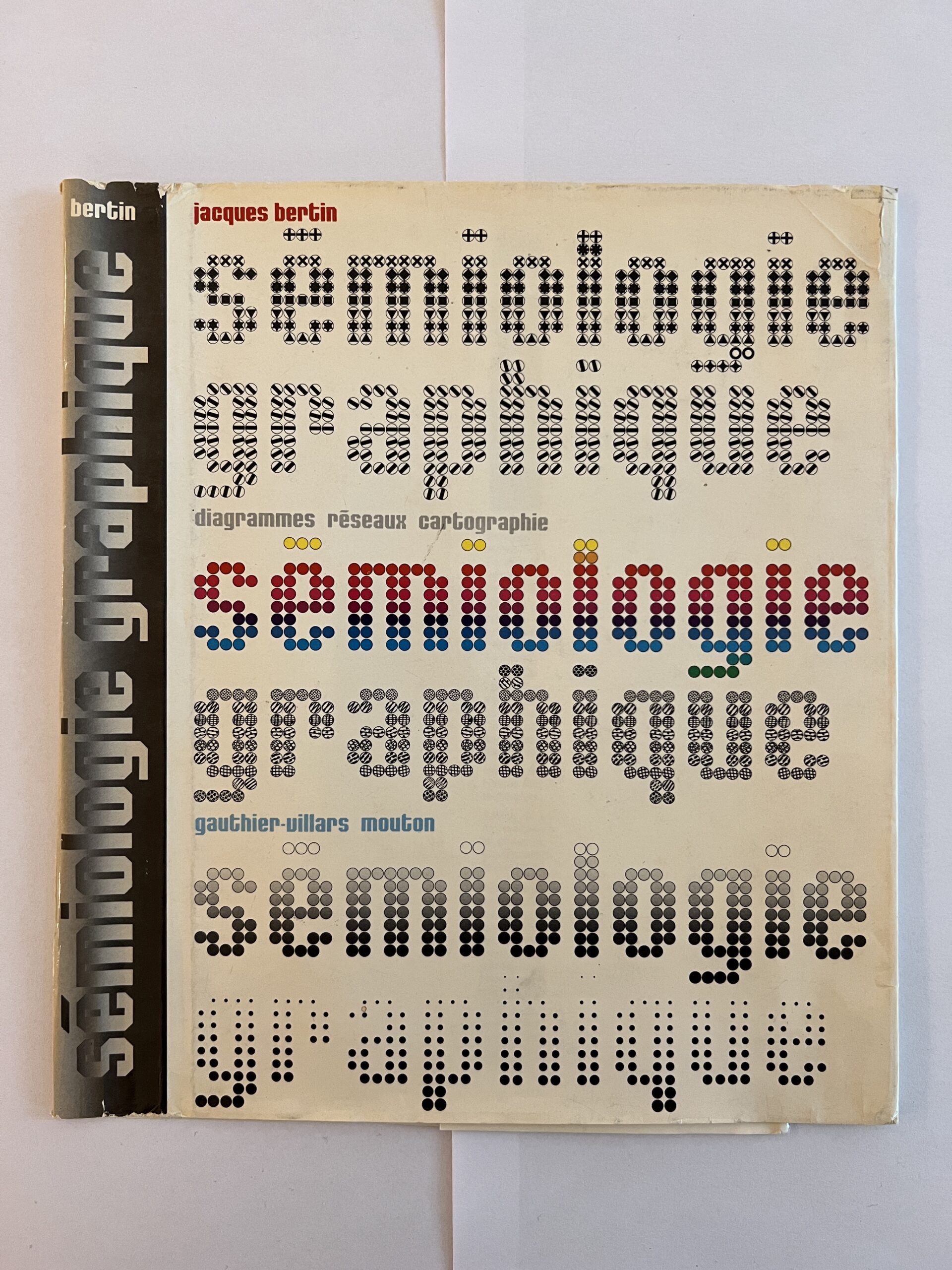
Portrait of Jurriaan Schrofer made in 1987 by Total Design, using a font and script that Schroder made in the 1970’s. It achieves this effect not by changing the text characters, as ASCII-converters usually do, but by changing the weight of the type. More info.
Image from Frederike Huygen’s biography Jurriaan Schrofer from 2013.
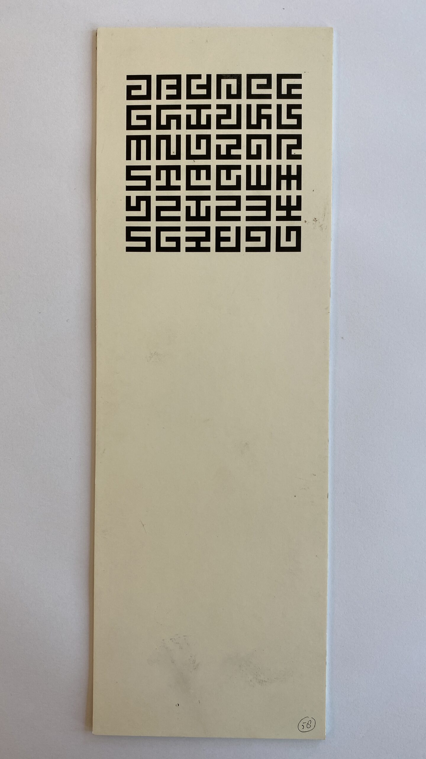
Maurice Meilleur’s re-creations of a typeface made by Jurriaan Schrofer in the 1970’s for the Dutch street cleaning and garbage removal services. It was designed to be “stencil-friendly”. In the end, it was not used as a monospaced font.
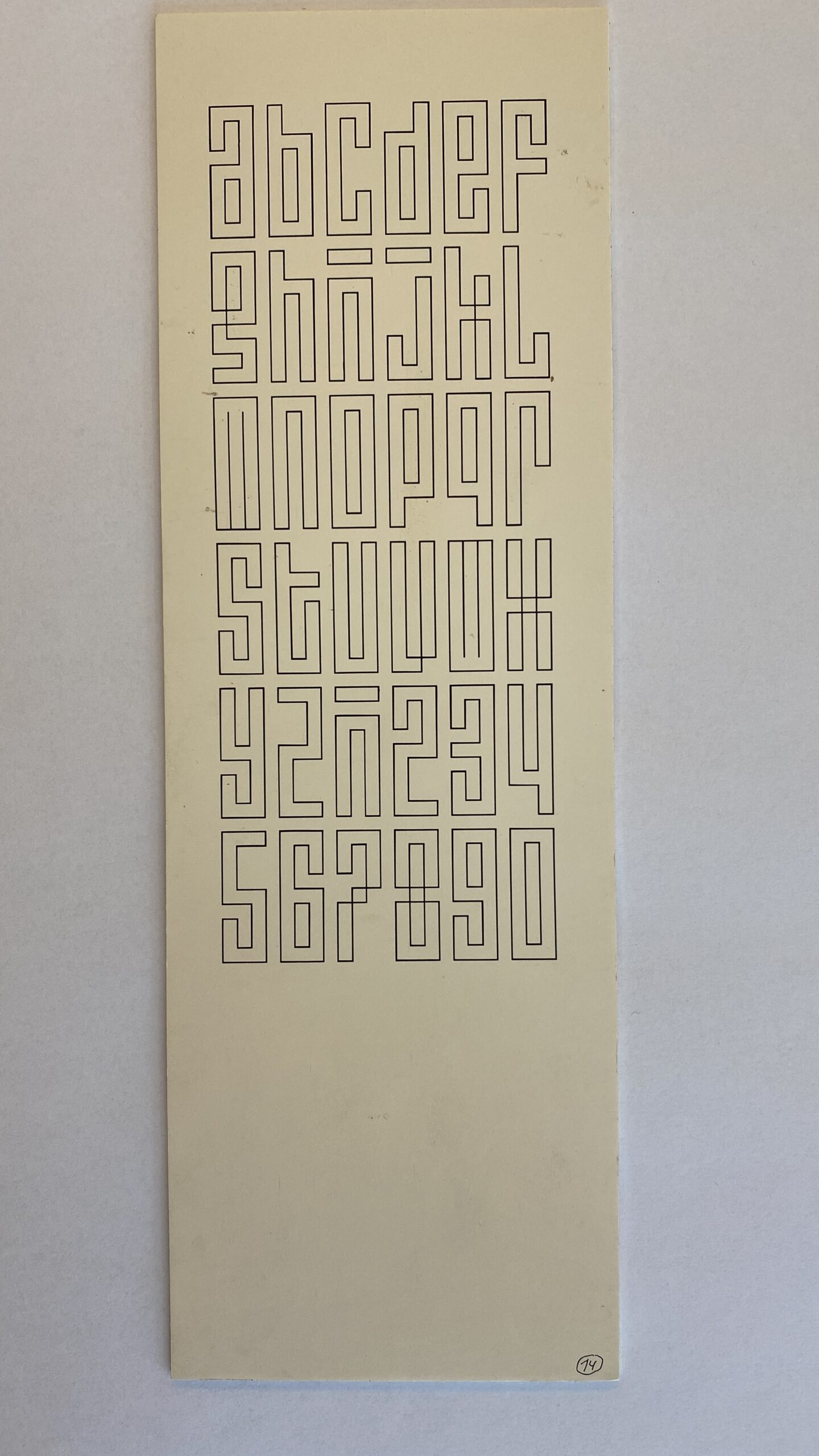
By Jurriaan Schrofer, perhaps in the 1960s? Via Maurice Meilleur.