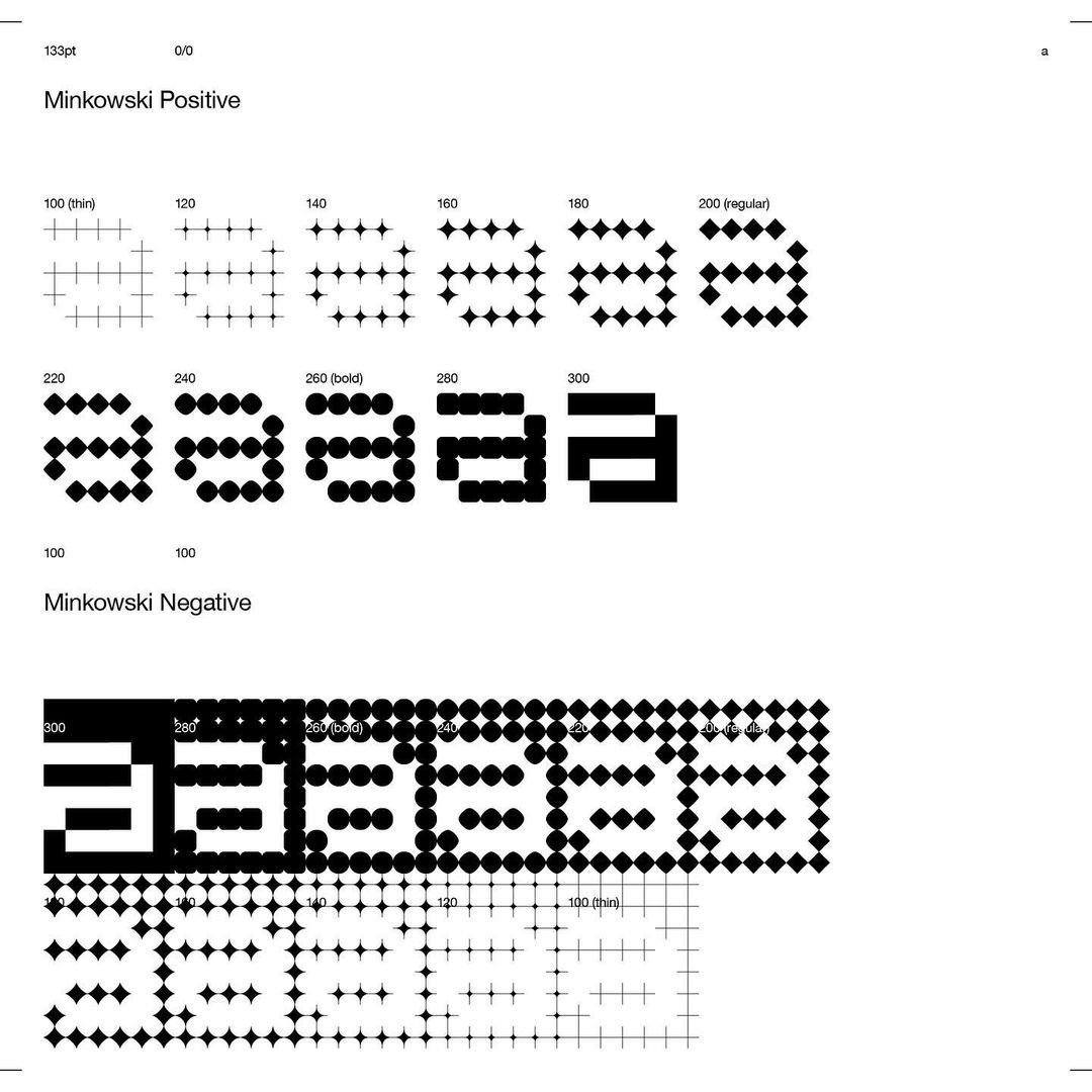
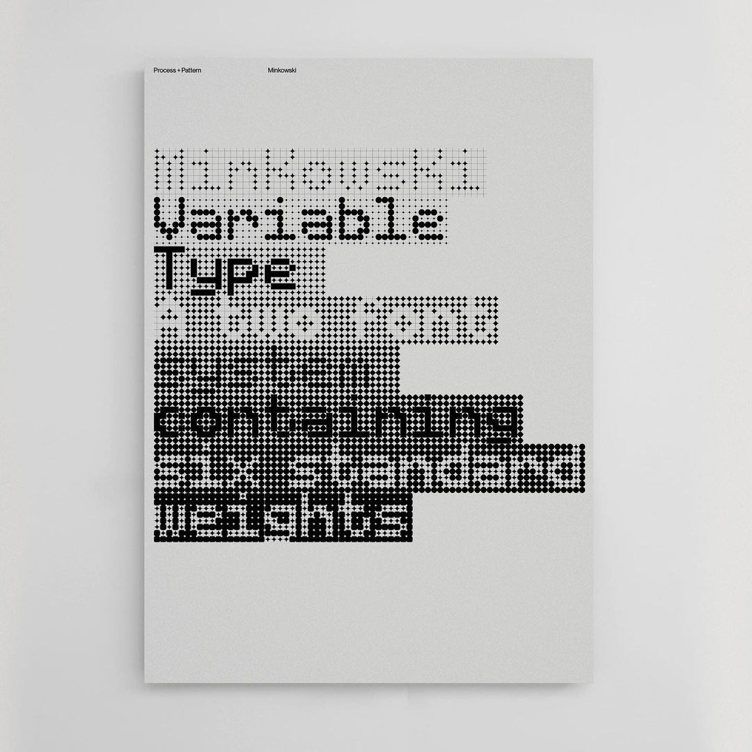
Minkowski, a variable typeface by Nigel Cottier, 2022. It’s based on Minkowski distance curves. From his Instagram.
More posts on Cottier.


Minkowski, a variable typeface by Nigel Cottier, 2022. It’s based on Minkowski distance curves. From his Instagram.
More posts on Cottier.

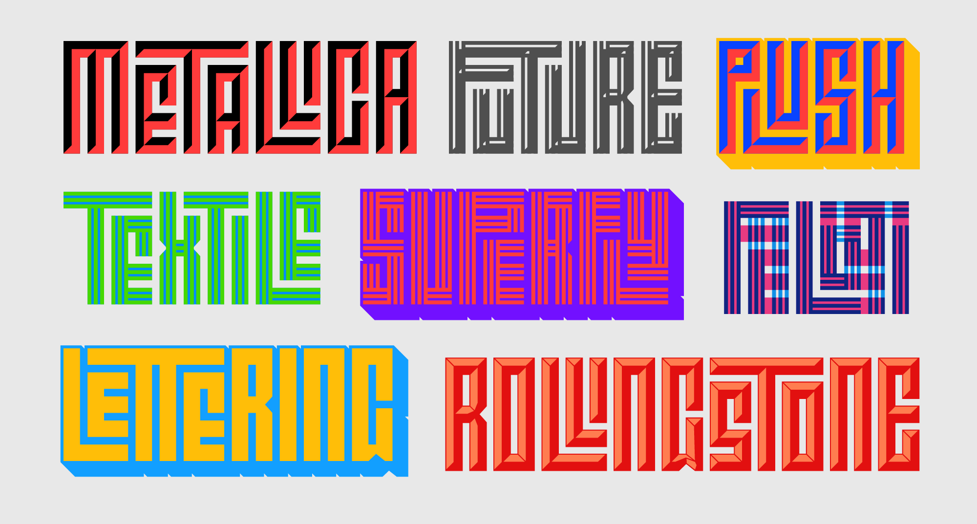
Calcula by Shiva Nallaperumal and Tal Leming, 2017. A square kufic typeface that has thousands of ligatures to change the letter according different combinations.
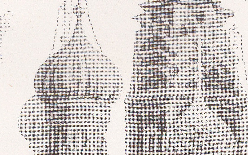
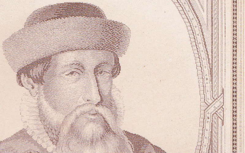
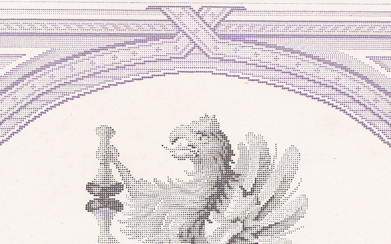
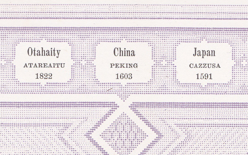
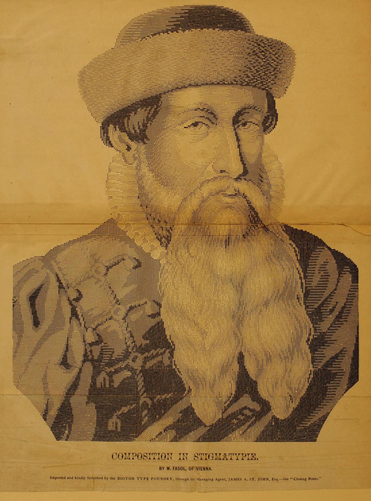
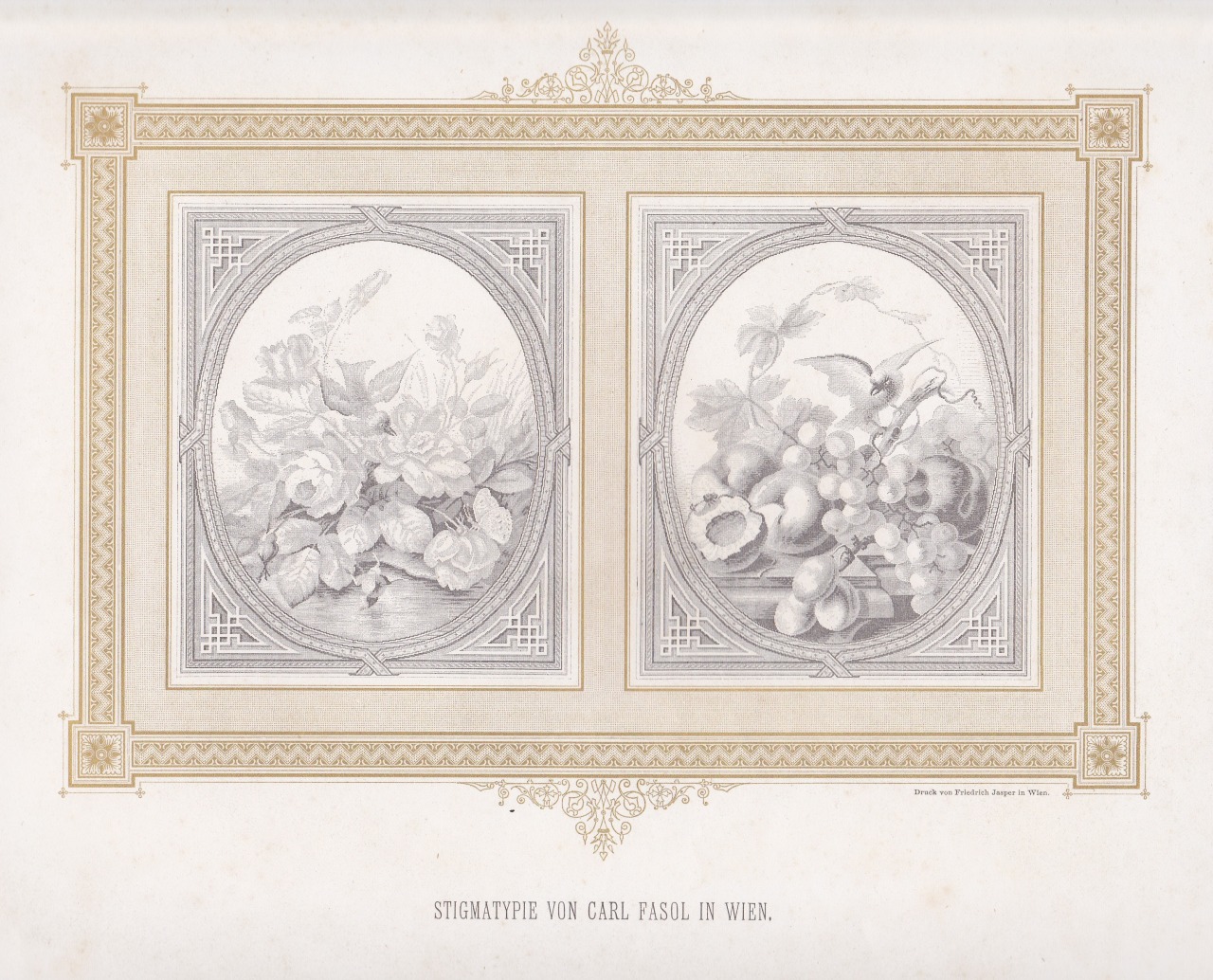
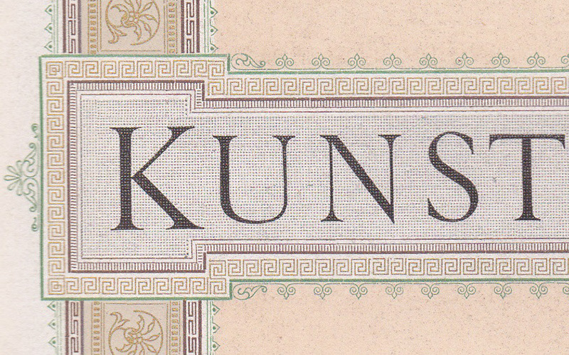
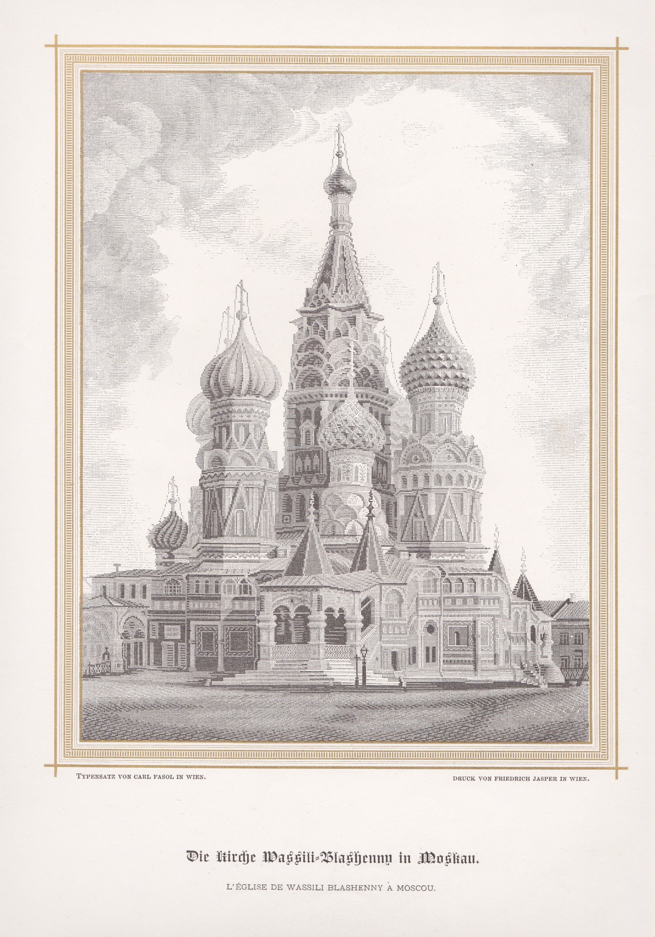
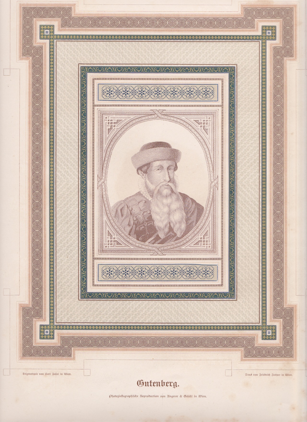
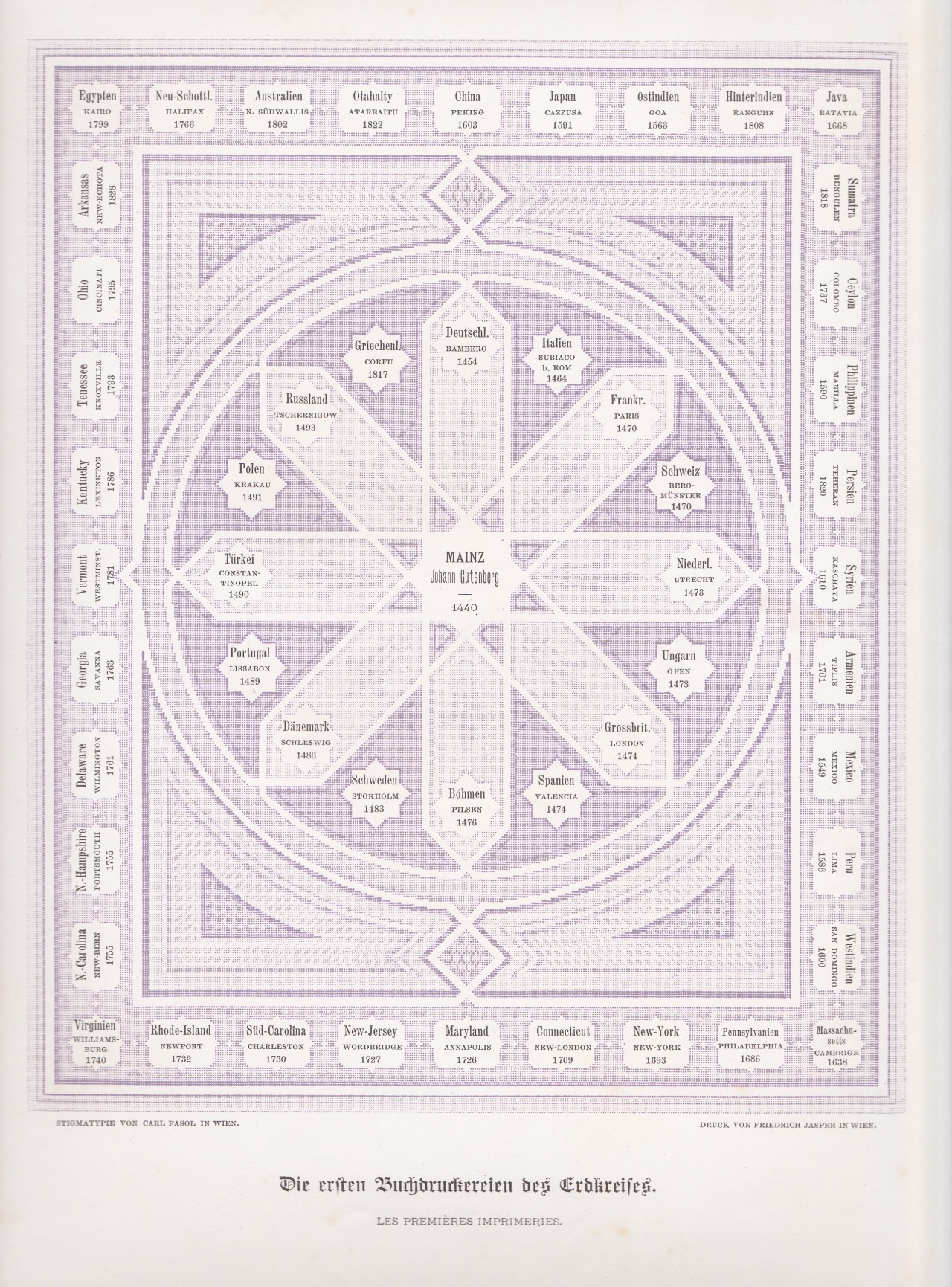
Stigmatypie works from Harpel’s Typograph, 1870. You can zoom in on the details thanks to archive.org.
Stigmatypie produces halftone images with small text characters, like the period (.), similar to dot matrix printing. The technique was developed in 1867 by Carl Fasol, who btw also inspired Valto Malmiola that we recently posted about.
The text segment is from American Encyclopaedia of Printing (1871).
via. h/t: Roel Nieskens
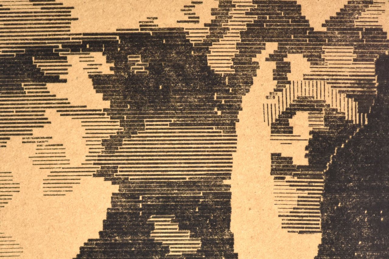
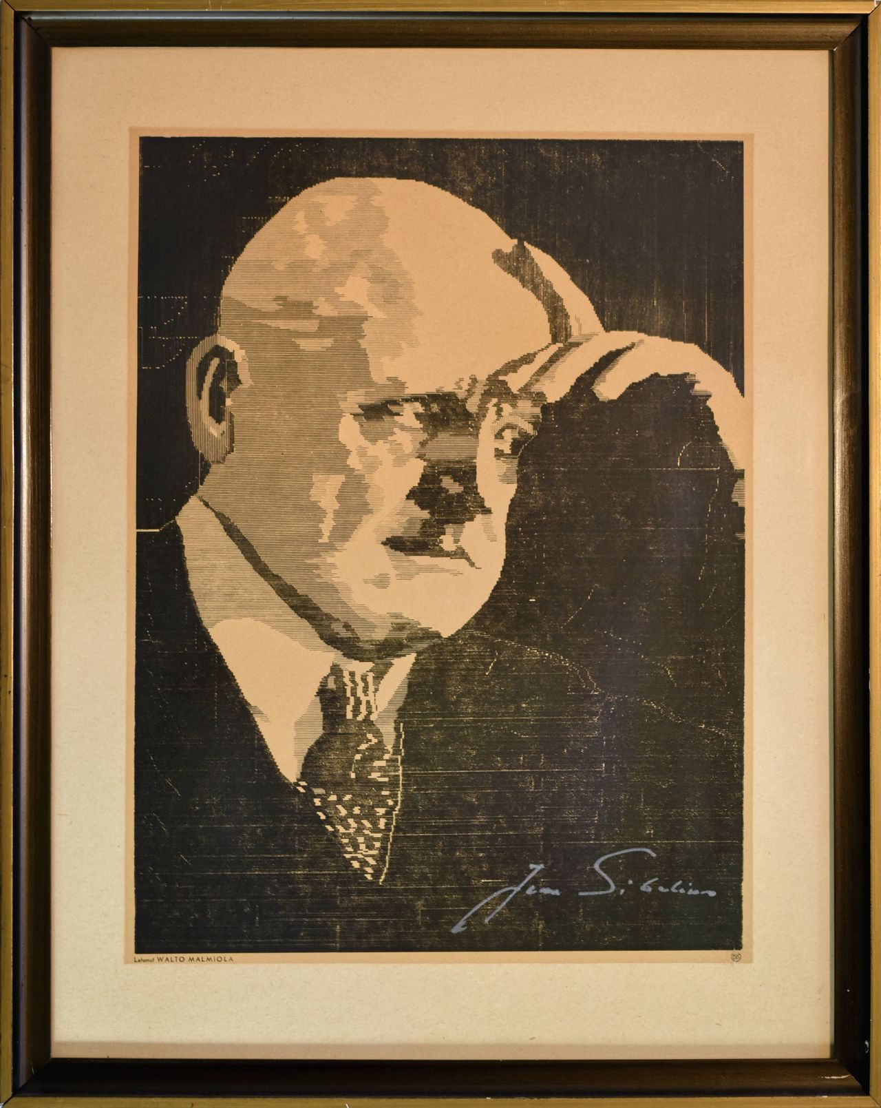

Valto Malmiola’s portrait of Sibelius, 1937. It was made with 30,000 so-called rules – strips of metal, often brass or type-cast metal, used for printing lines since the 1500’s.
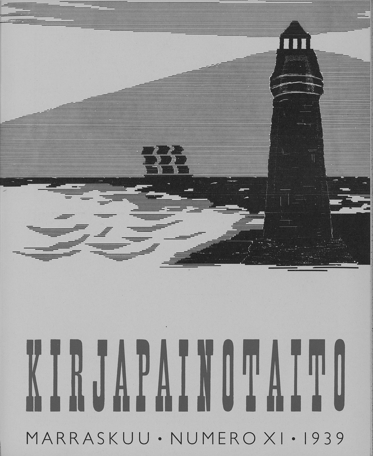
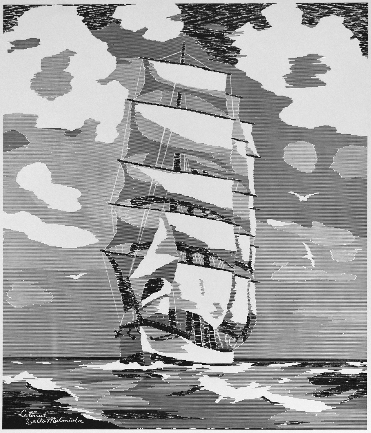
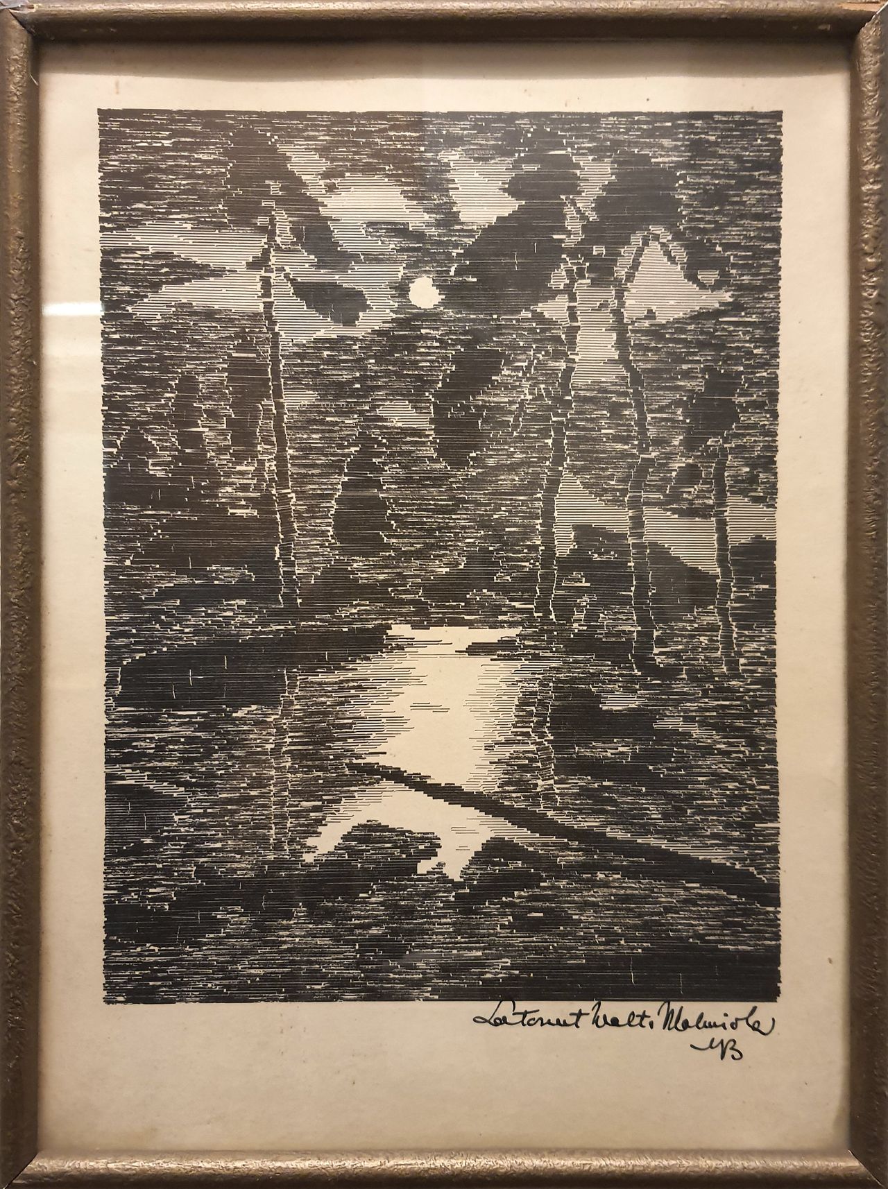
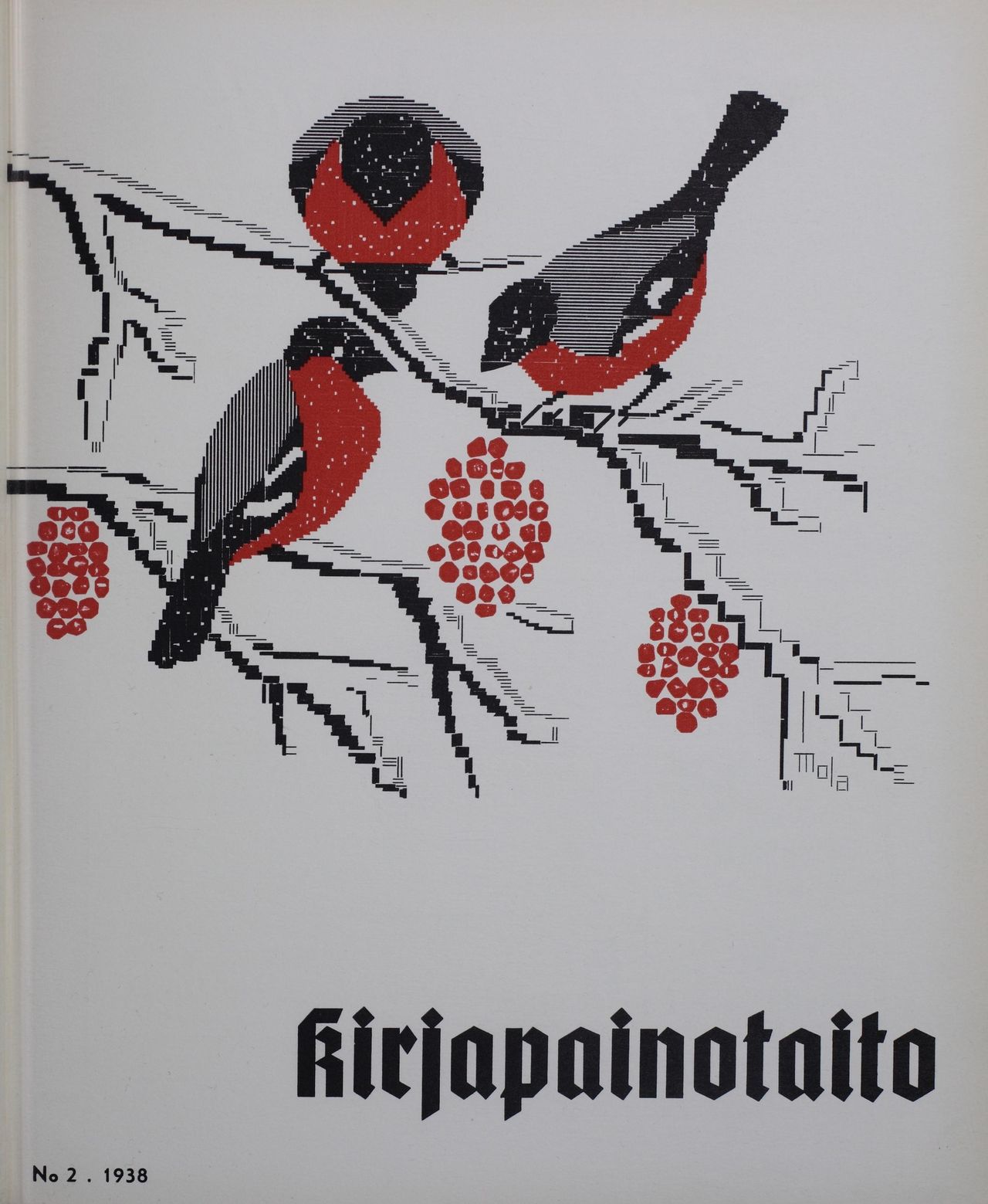
More works by Valto Malmiola, made with the same technique, 1938-1943.
Images and info from Typographic Art of Valto Malmiola by Heikki Lotvonen, 2023. He mentions that for example Carl Fasol used this technique before Malmiola.
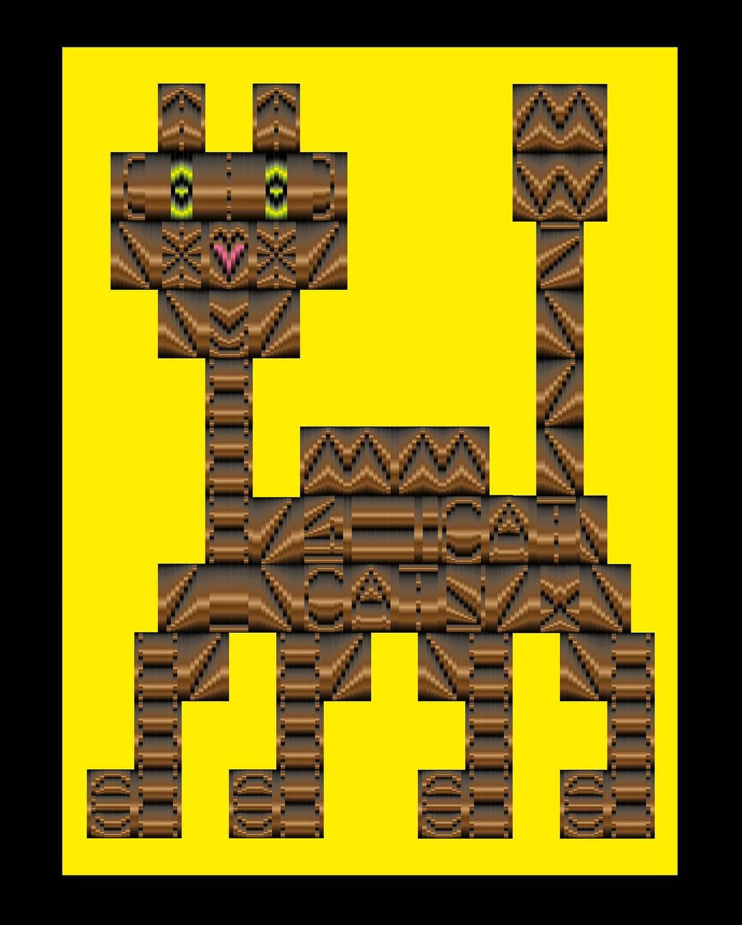
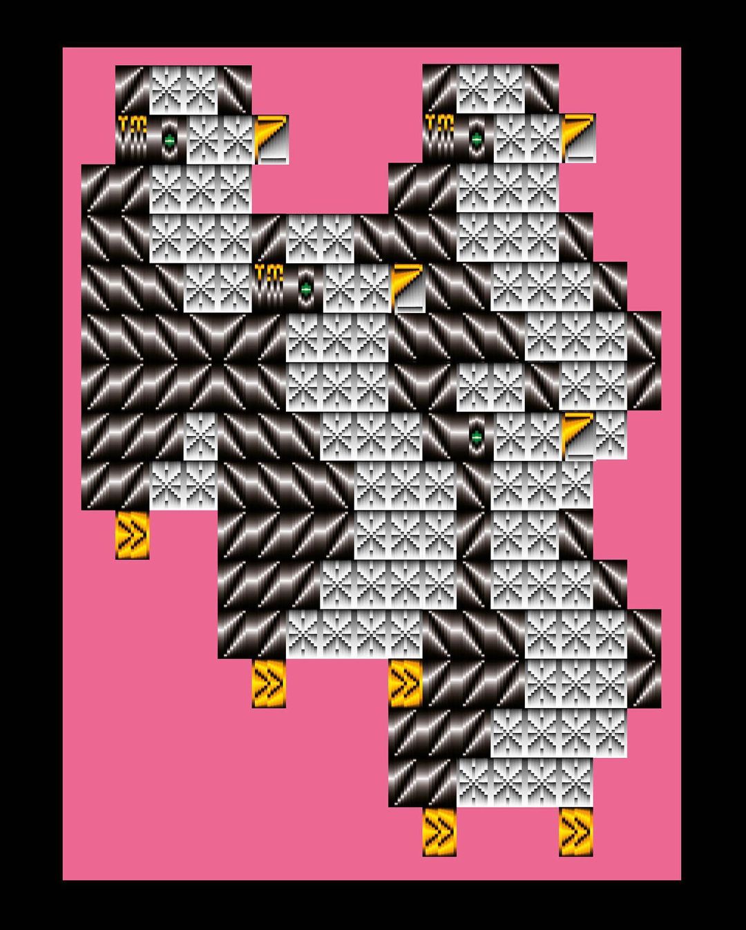
Lena Weber makes incredible variable typefaces that are very graphical, like Gradial used here. It doesn’t look like it, but all this is made of (variable) text characters. Like these:
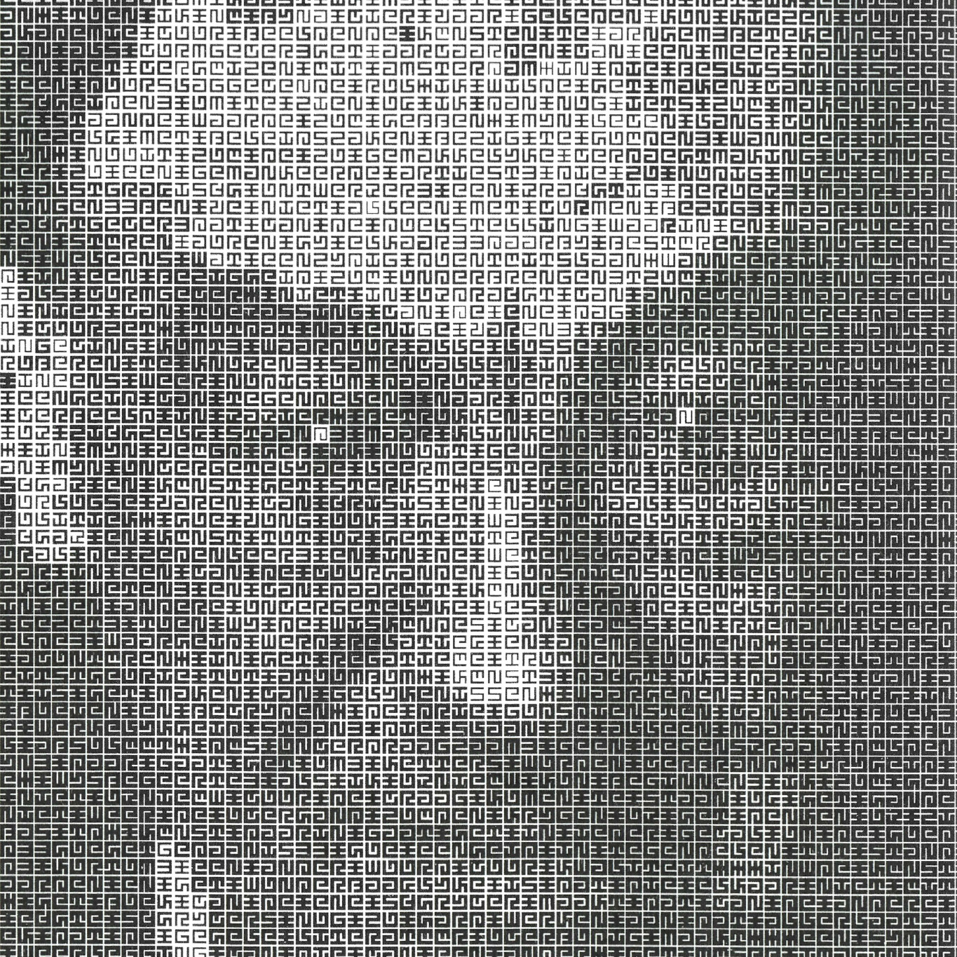
Portrait of Jurriaan Schrofer made in 1987 by Total Design, using a font and script that Schroder made in the 1970’s. It achieves this effect not by changing the text characters, as ASCII-converters usually do, but by changing the weight of the type. More info.
Image from Frederike Huygen’s biography Jurriaan Schrofer from 2013.
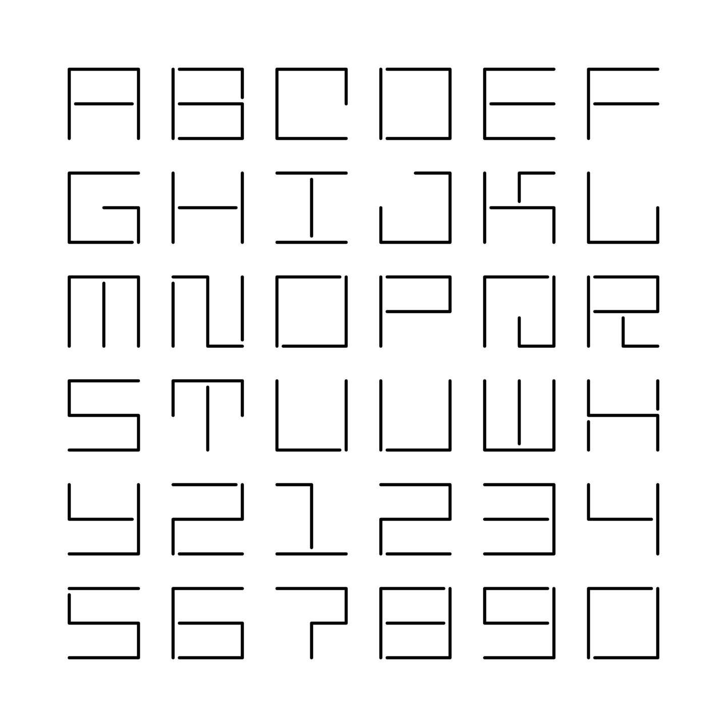
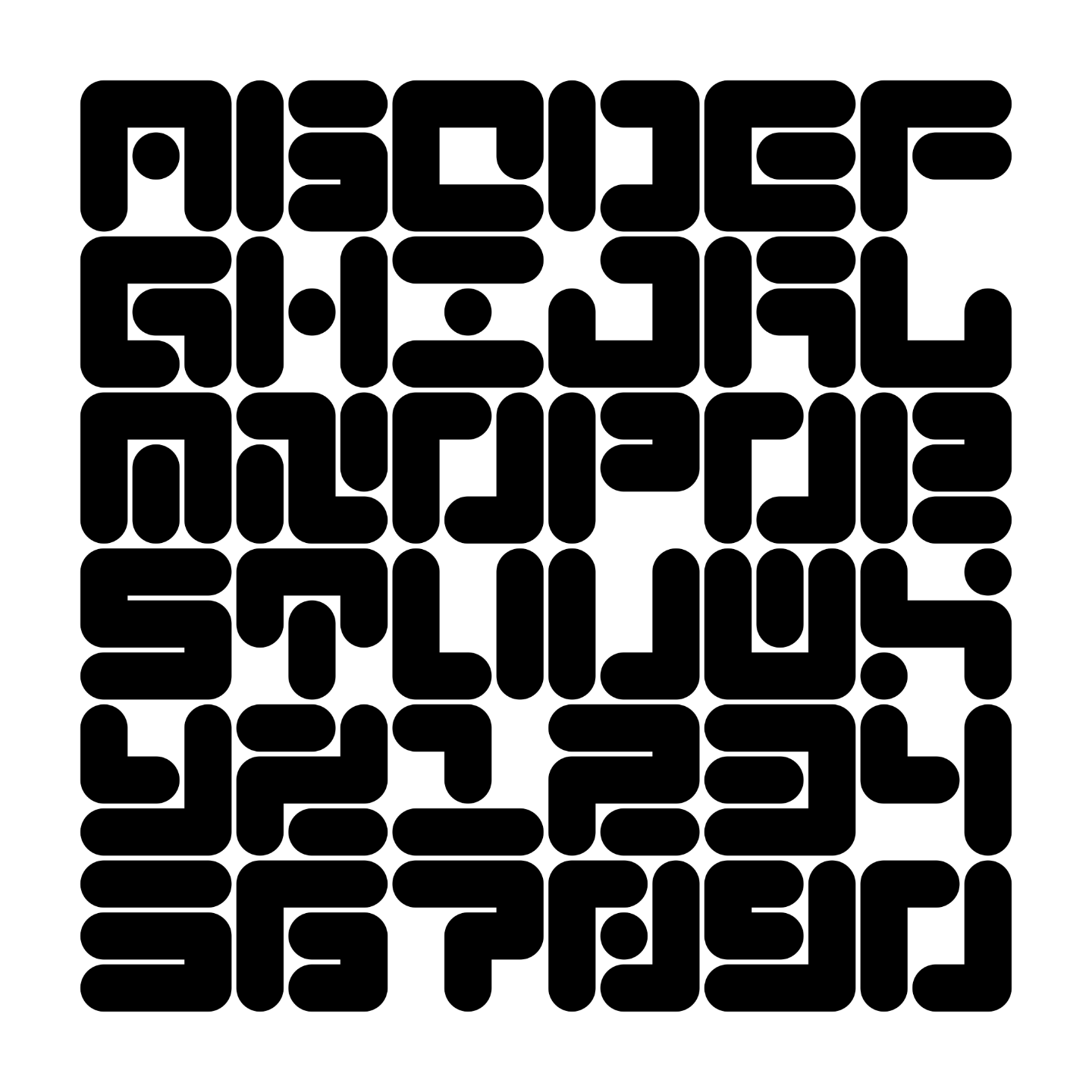
Maurice Meilleur’s re-creations of a typeface made by Jurriaan Schrofer in the 1970’s for the Dutch street cleaning and garbage removal services. It was designed to be “stencil-friendly”. In the end, it was not used as a monospaced font.
By Jurriaan Schrofer, perhaps in the 1960s? Via Maurice Meilleur.