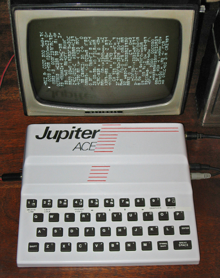
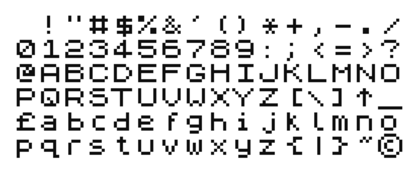
Jupiter Ace, a British computer from 1982. It used Forth instead of BASIC and it could display more text characters on the screen than most of its competitors (64×48 compared to the more common 40×24). It used the same font as ZX Spectrum.
Jupiter Ace, a British computer from 1982. It used Forth instead of BASIC and it could display more text characters on the screen than most of its competitors (64×48 compared to the more common 40×24). It used the same font as ZX Spectrum.
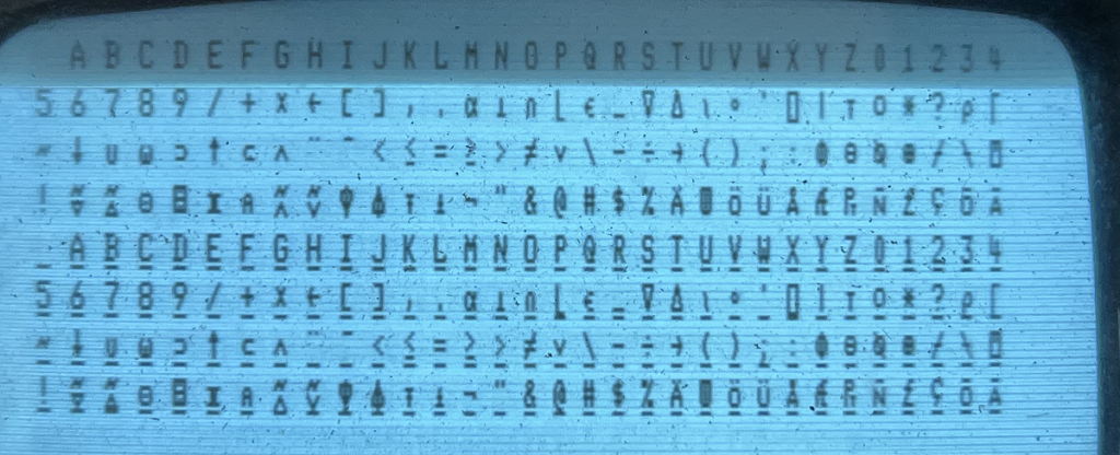
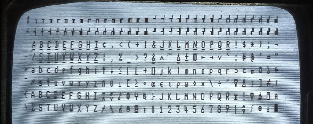
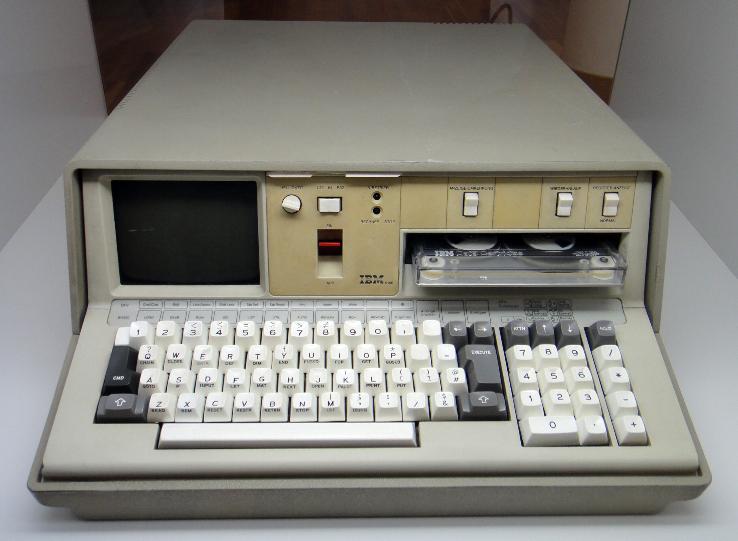
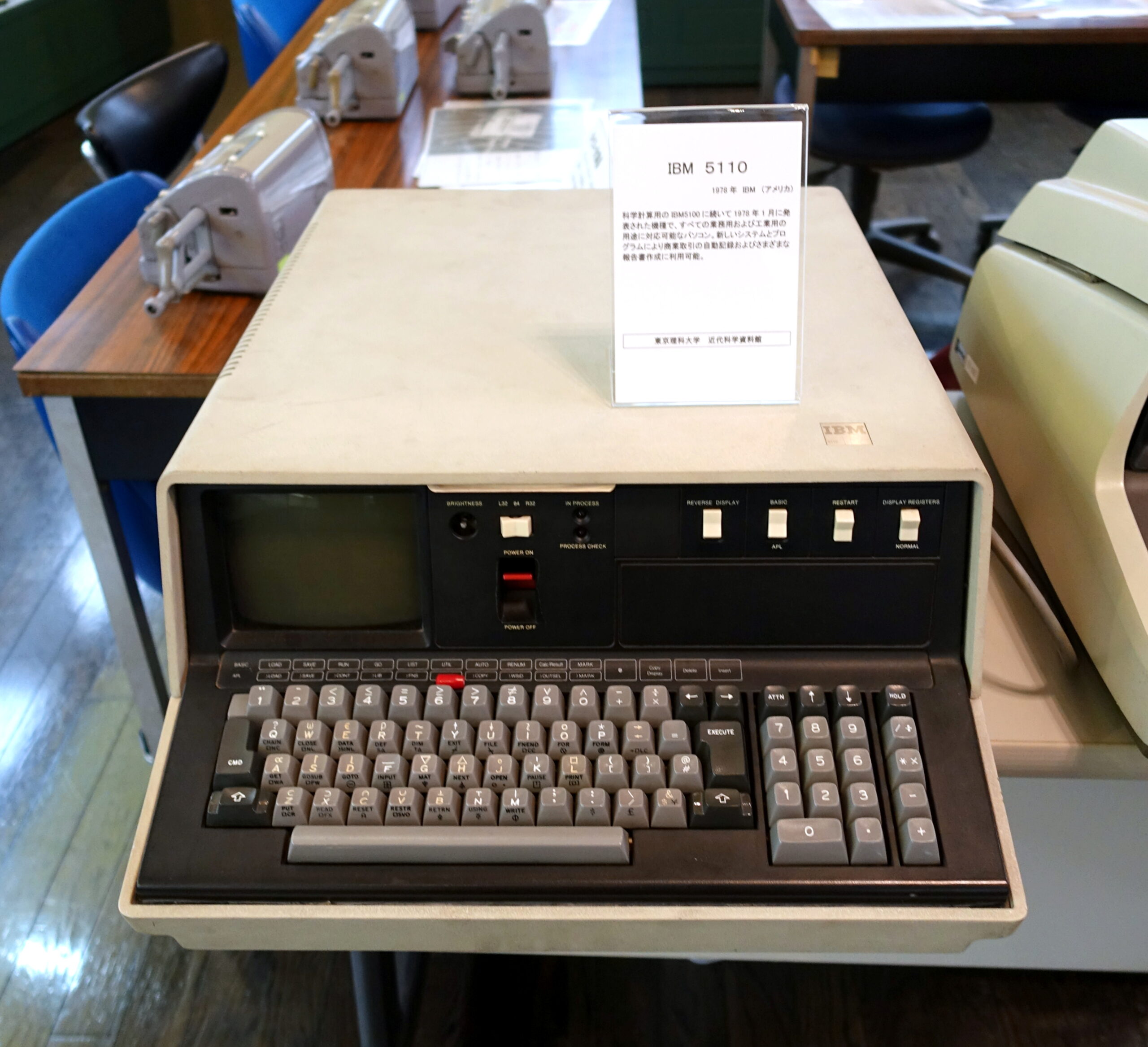
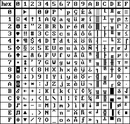
These are IBM’s first computers: IBM 5100 (1975) and IBM 5110 (1978).
The 5100 had 256 characters but half of the characters were just underscored versions of the other half. It used IBM’s mega obscure EBCD encoding instead of ASCII. IBM 5110 dropped most of the underscored characters, which made room for semi-graphic characters. Encoding was changed to the slightly less obscure EBCDIC, and there were 14 localized character sets with 12 characters each.
Character set photos from Voidstar, where there are also more details about the character sets.
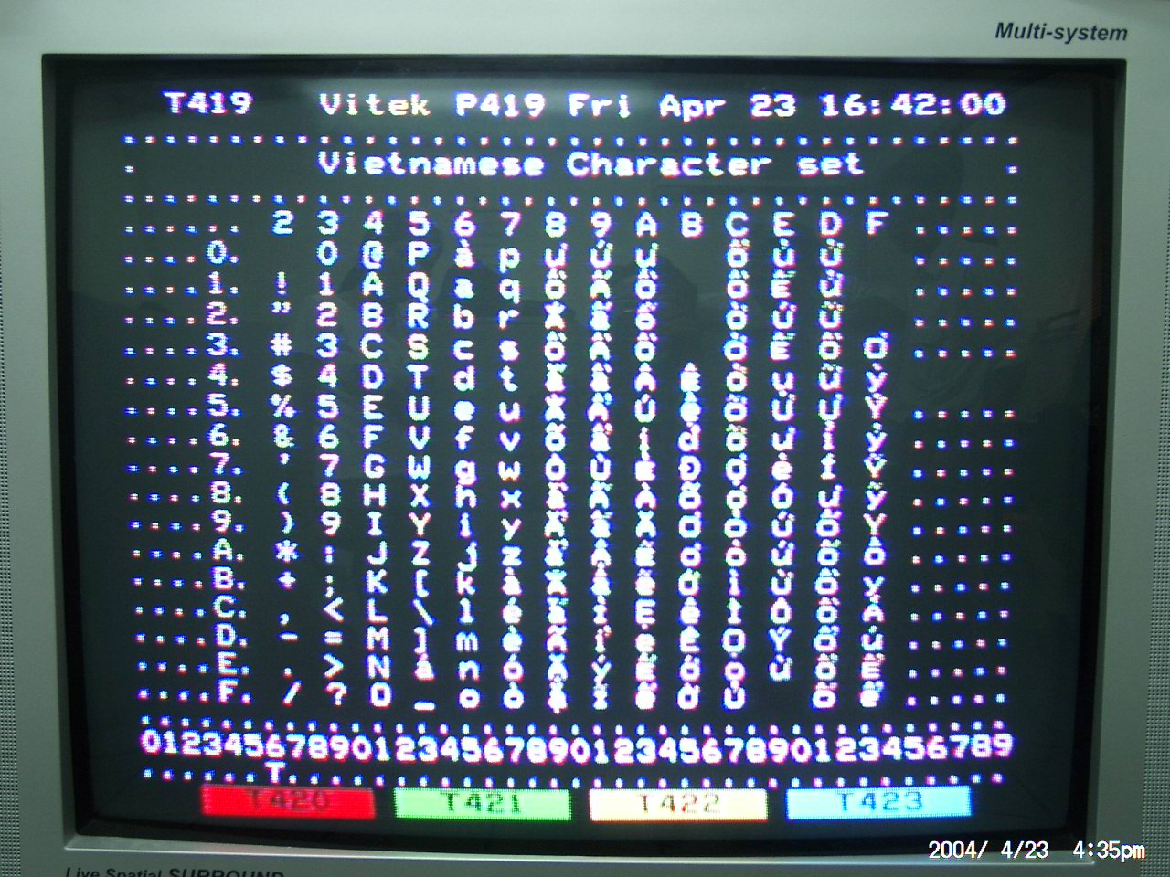
Vietnamese teletext character set made by Colin Hinson at Europe Technologies. This seems to have been for the first Vietnamese teletext service, Vitek, in 2004. The photo was taken before all the characters were finished.
The Vietnamese script needs at least 134 additional letters to ASCII, which has lead to solutions like VISCII and VSCII in the past. Hinson describes the process in detail here, but it seems like they simply removed enough characters to make it work. :-)
Topaz Unicode by Screwtape, 2024. Adds a rich set of Unicode characters to the default Amiga 500 font, and offers it as a TTF-font. New characters include
The font is available as TTF at GitLab.
h/t: Ne7
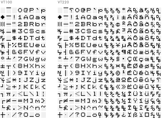
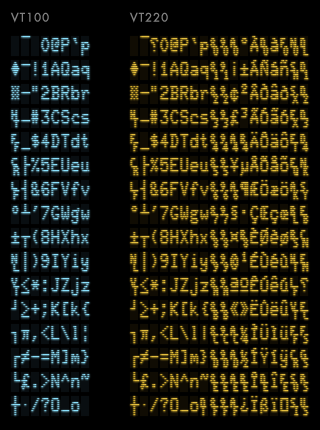
The first image shows a ROM-dump of the font in the classic terminals VT100 and VT220. The second image is how they appear on screen. The difference is more than just aspect ratio. Look at letters like q and p: pixels are sometimes doubled, sometimes tripled. The fascinating explanation is here.
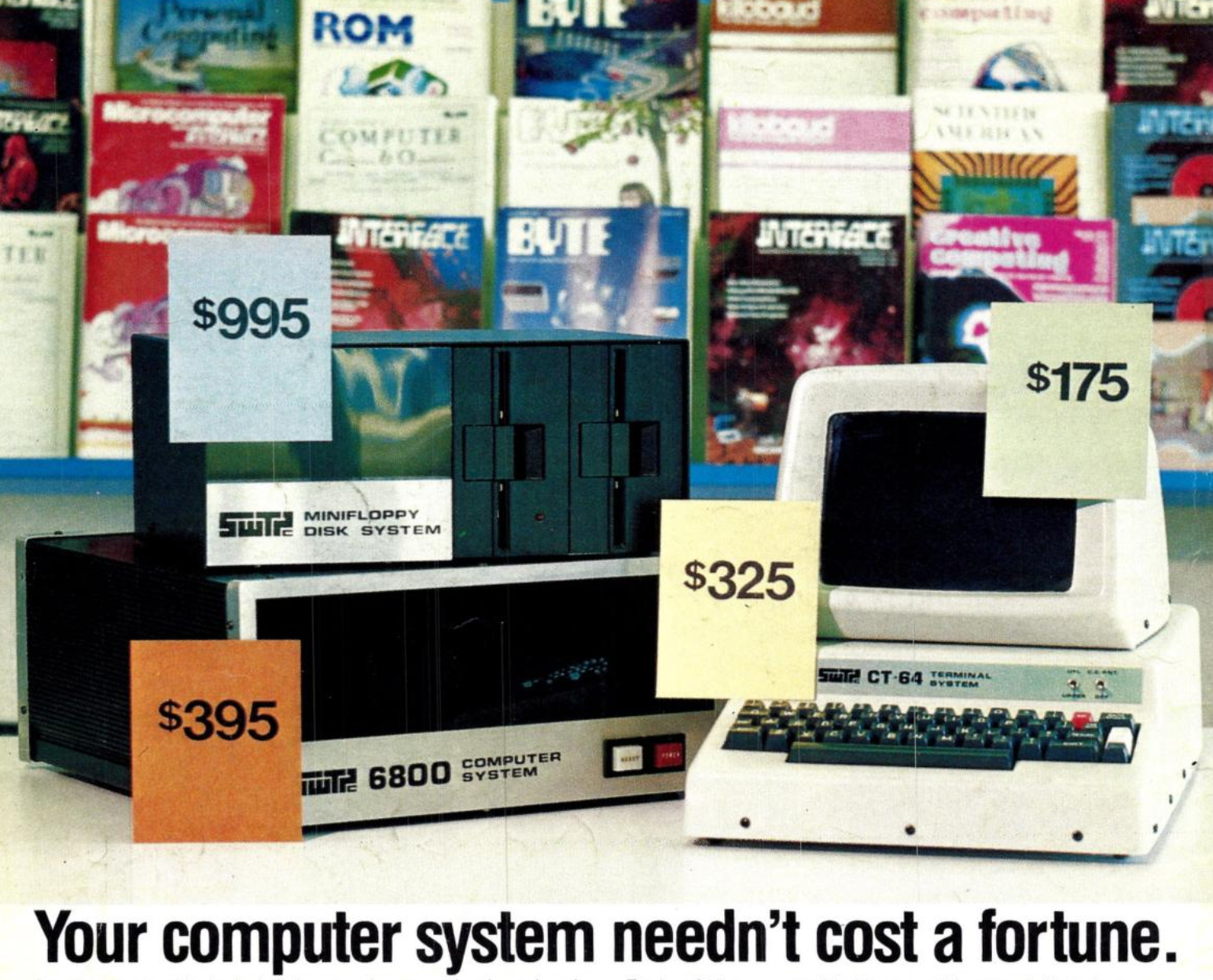

Southwest Technical’s 6800 computer and the CT-64 terminal, and a photo of its 64×16 textmode. Launched in 1975. First image from Creative Computing and second one from here.
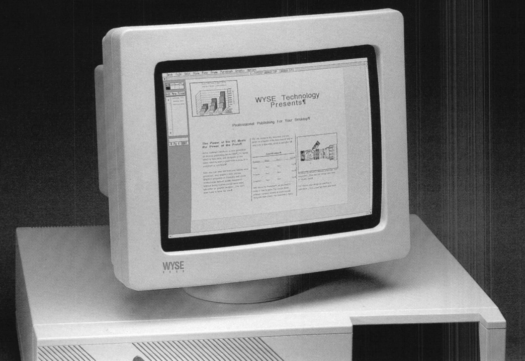
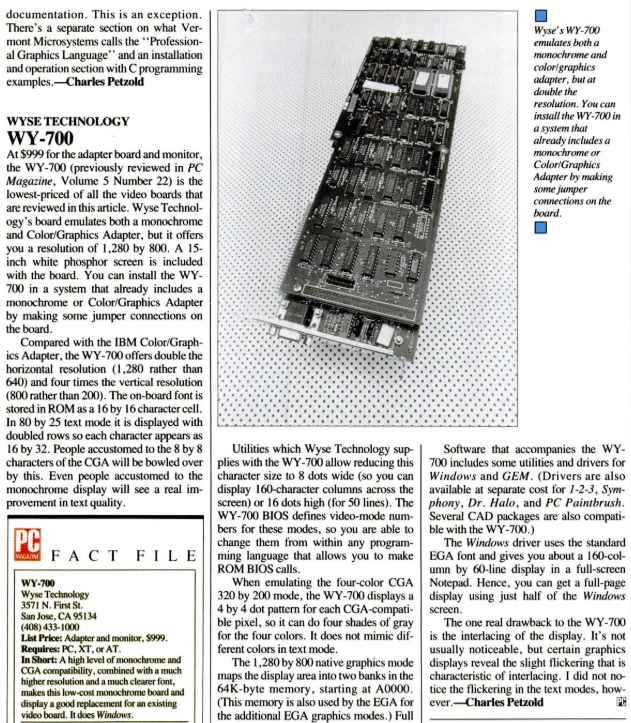
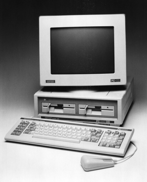
The 1986 retina screen: the WY-700 video card/screen gave the PC a 1280×800 resolution, and a text-mode of 160 columns by 50 lines. It had a built-in 16×16 font (download), and you could even use your own custom fonts. The high-res modes only supported greyscale, but who needs colours anyway?
Sources: John Elliot, thecomputerarchive.com, PC Mag.
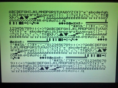
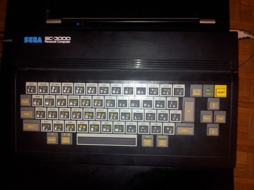
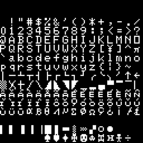
The European font of the Sega SC-3000. Notice how curvy the full triangles and slashes are. Images from SMS Power and Saverio Russo.
By Ray Manta, @datad00r, using his own Circlex charset, now available in Retrospecs.