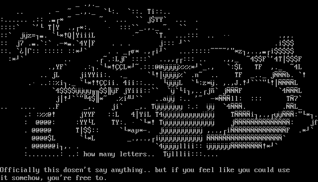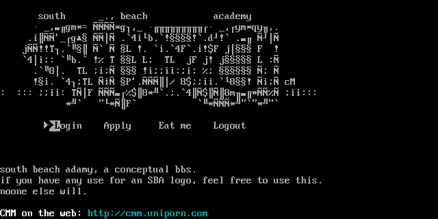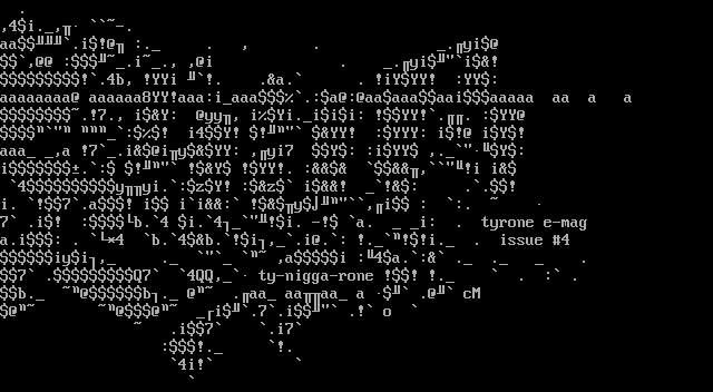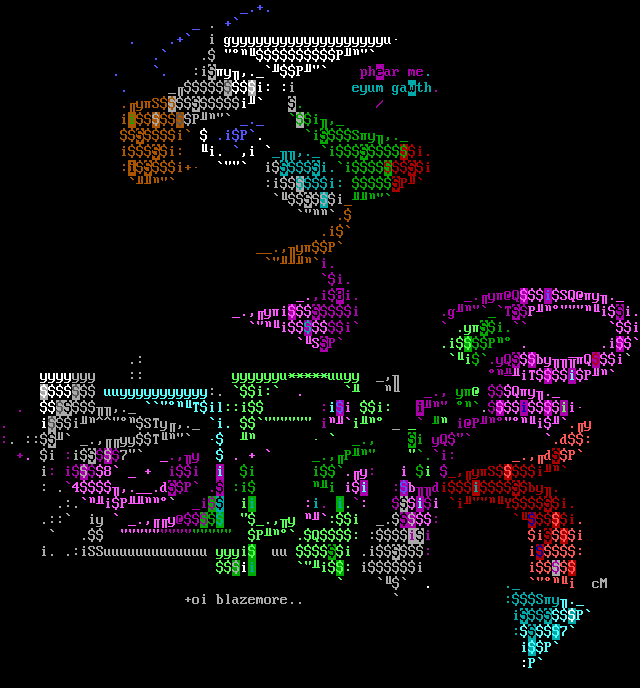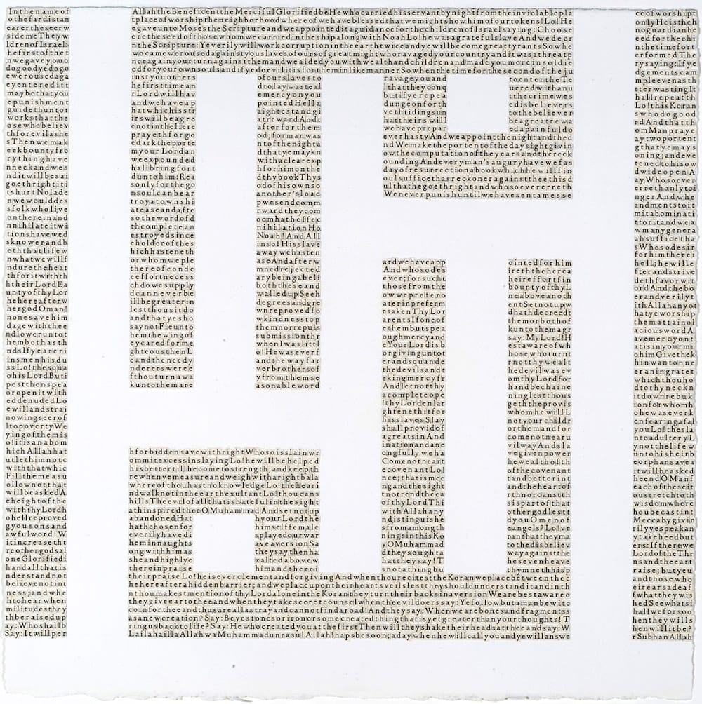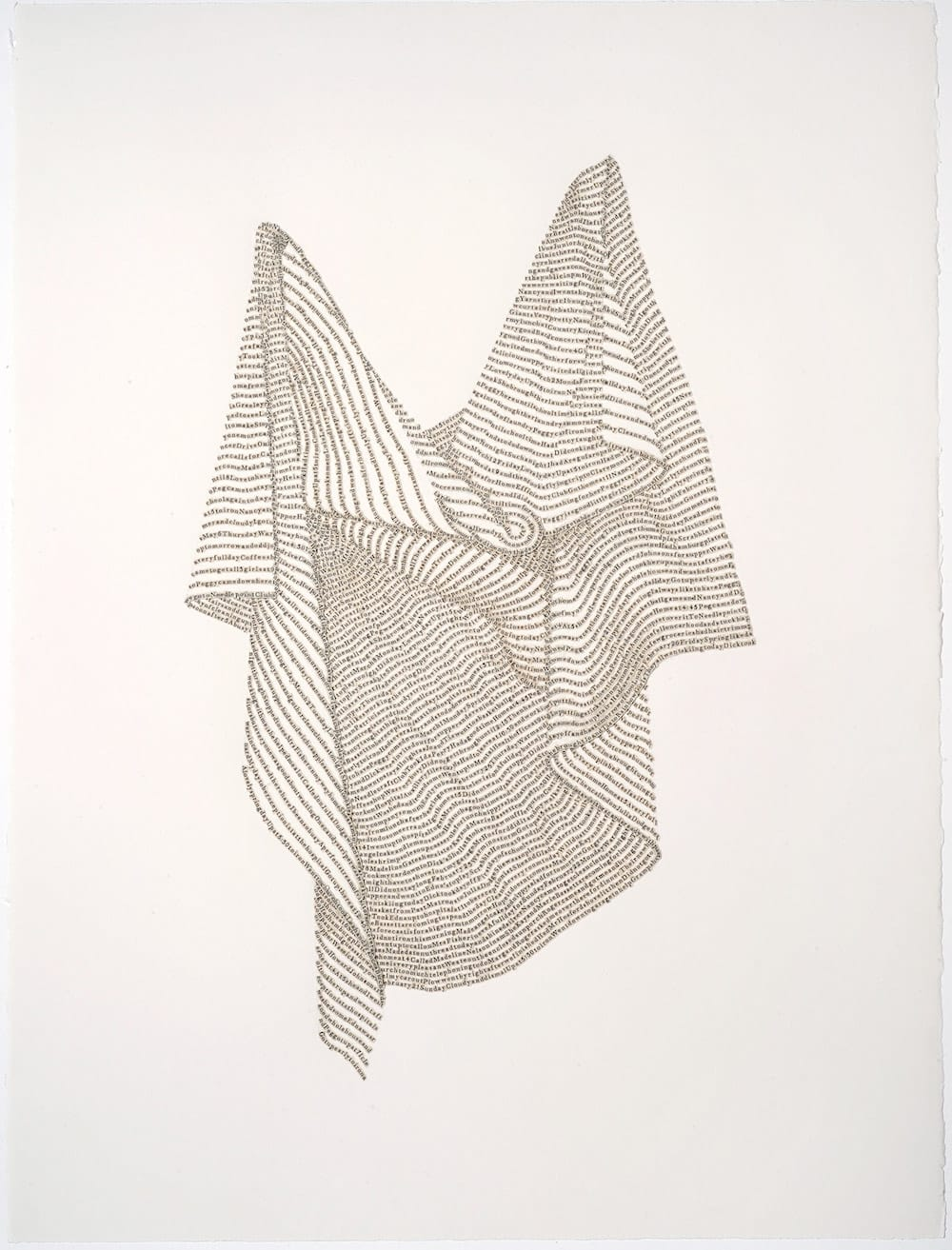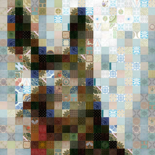
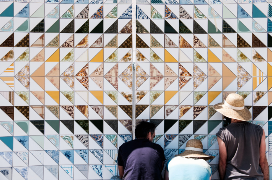
Grão, Details of a Larger Nature by Pedrita, 2007.
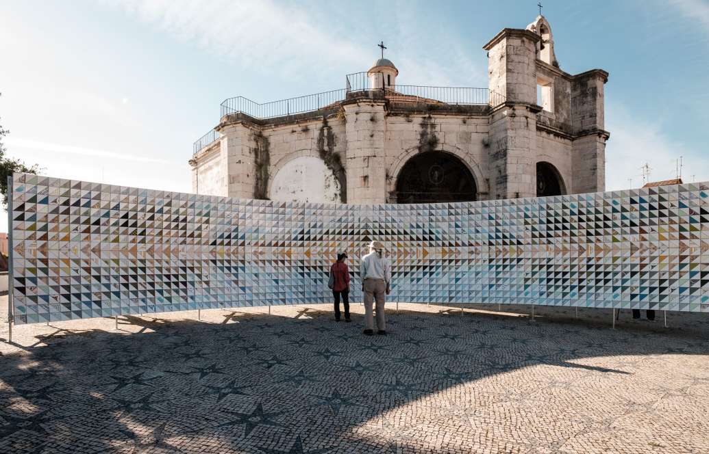
Pavilhão by Pedrita, 2016.
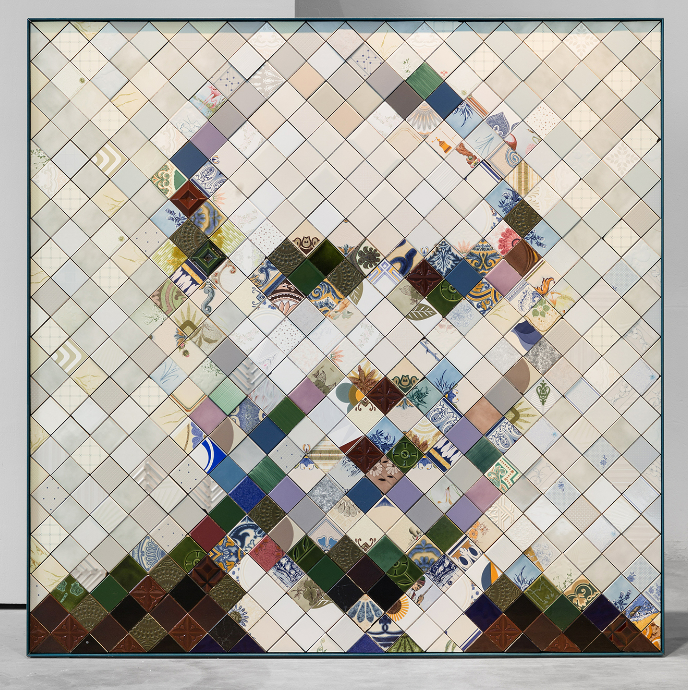
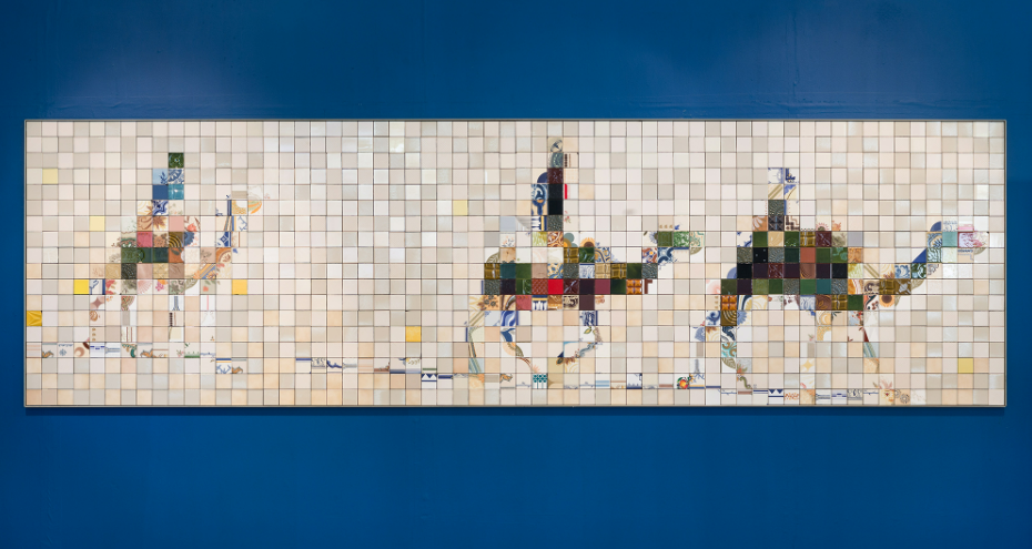
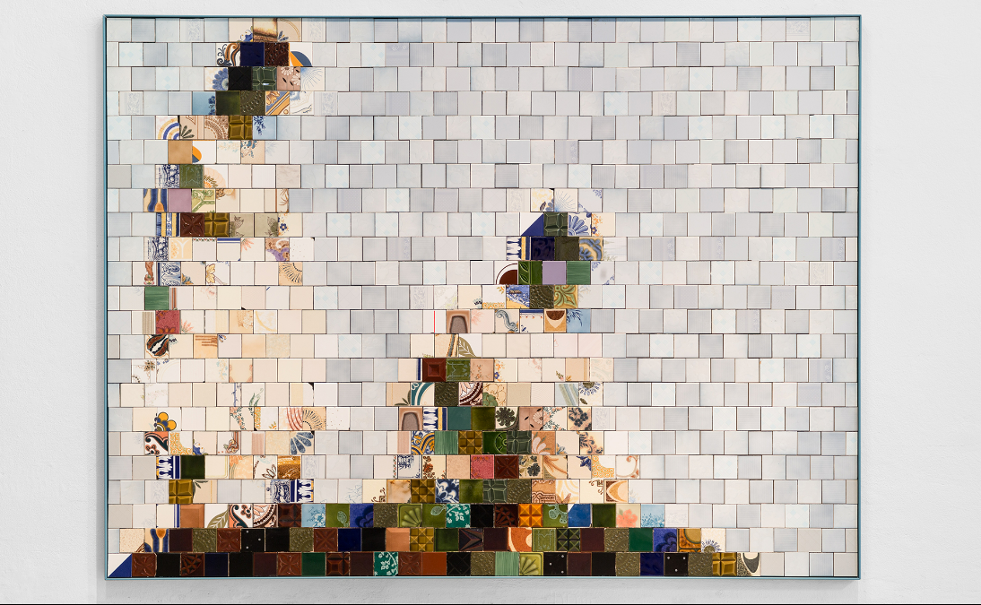
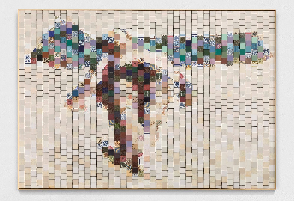
Lost and Found by Pedrita, 2018.
Also see this.
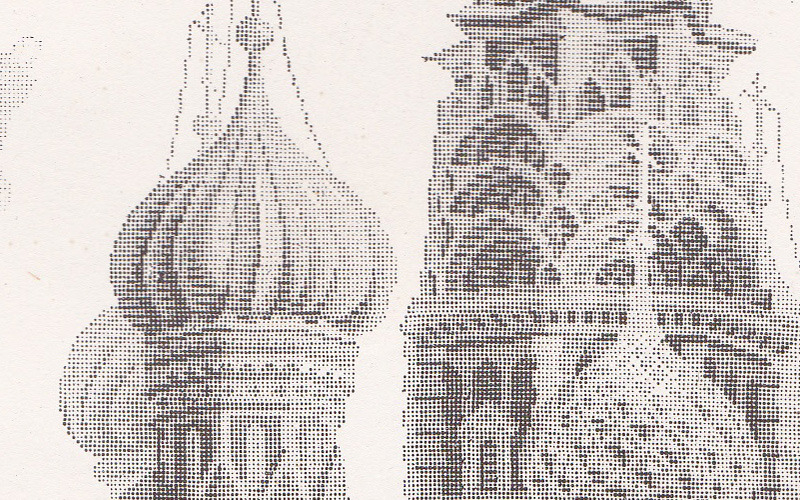
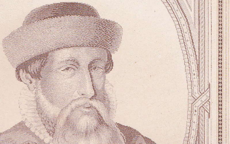
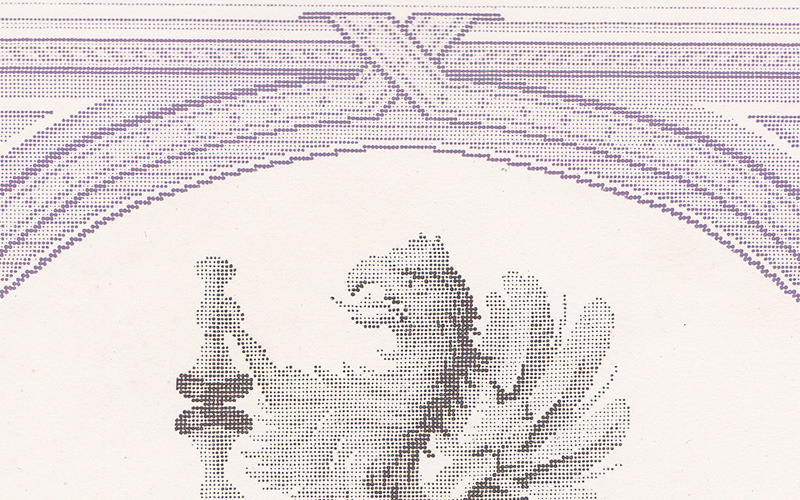
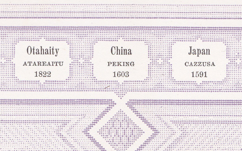
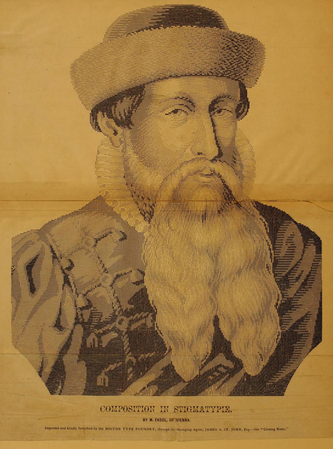
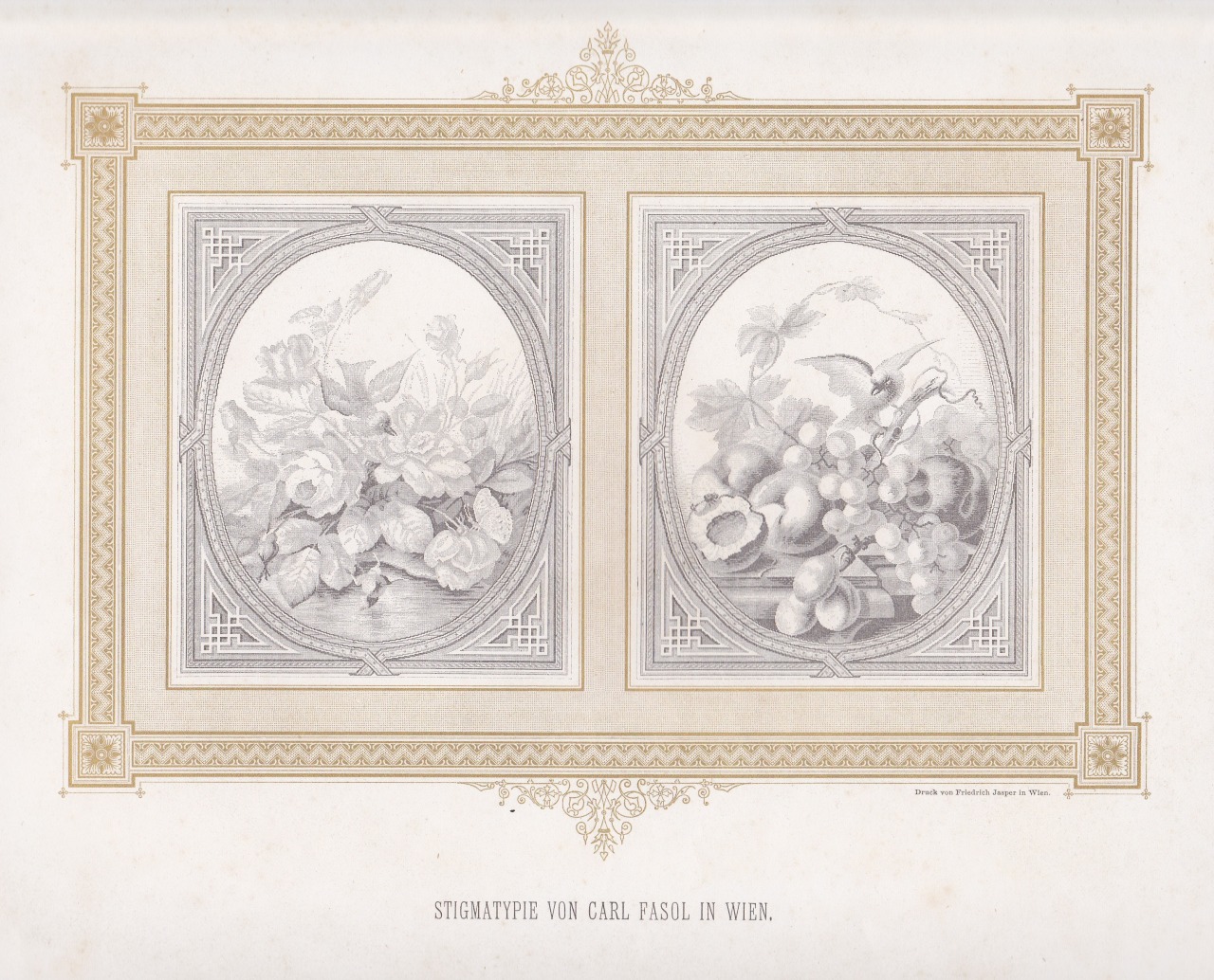
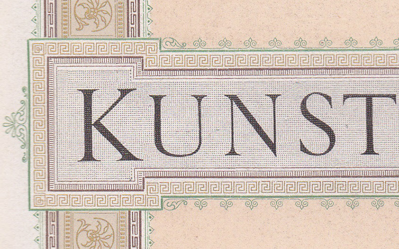
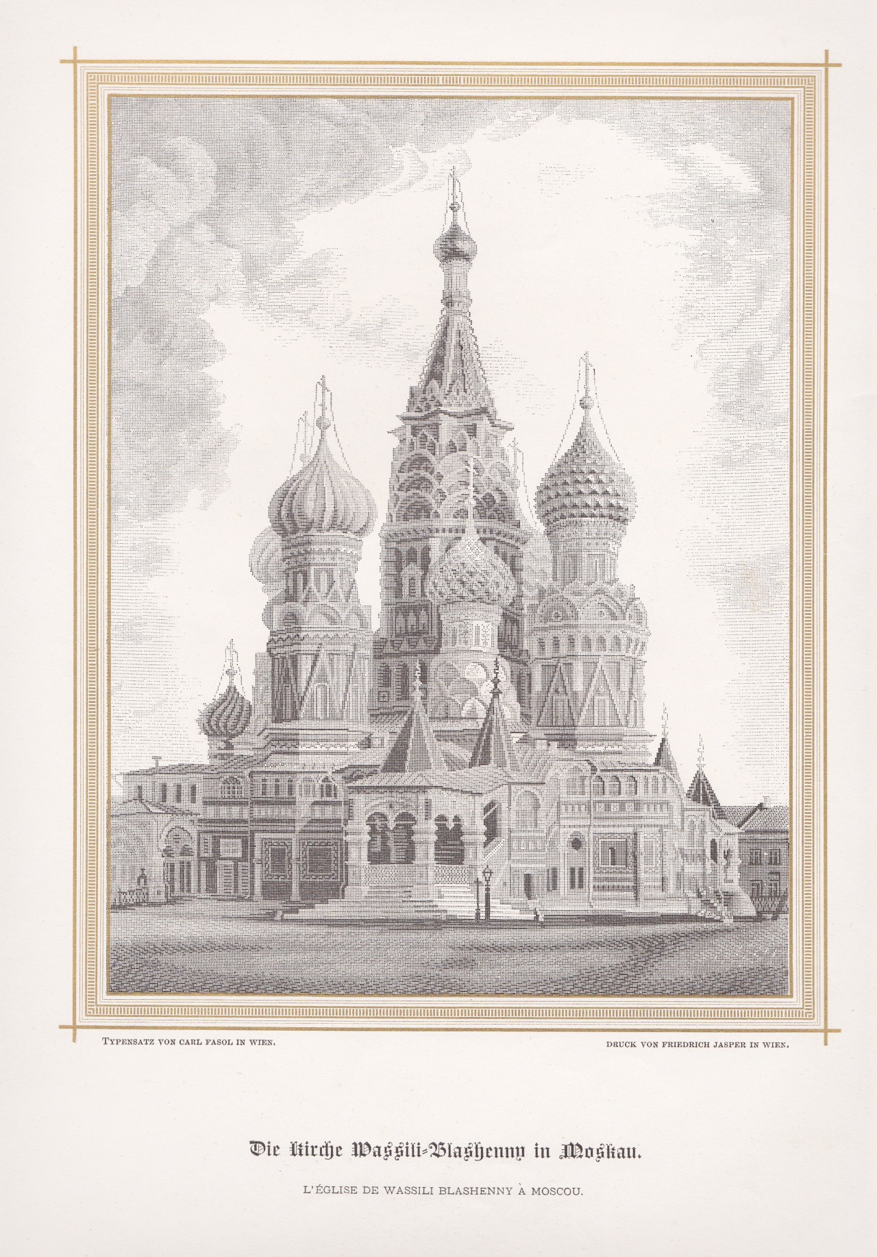
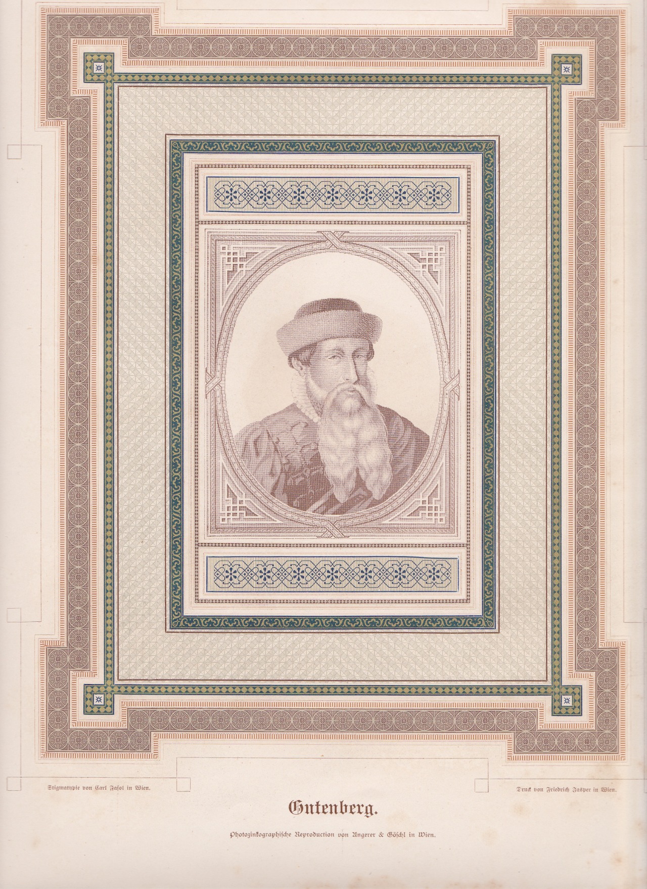
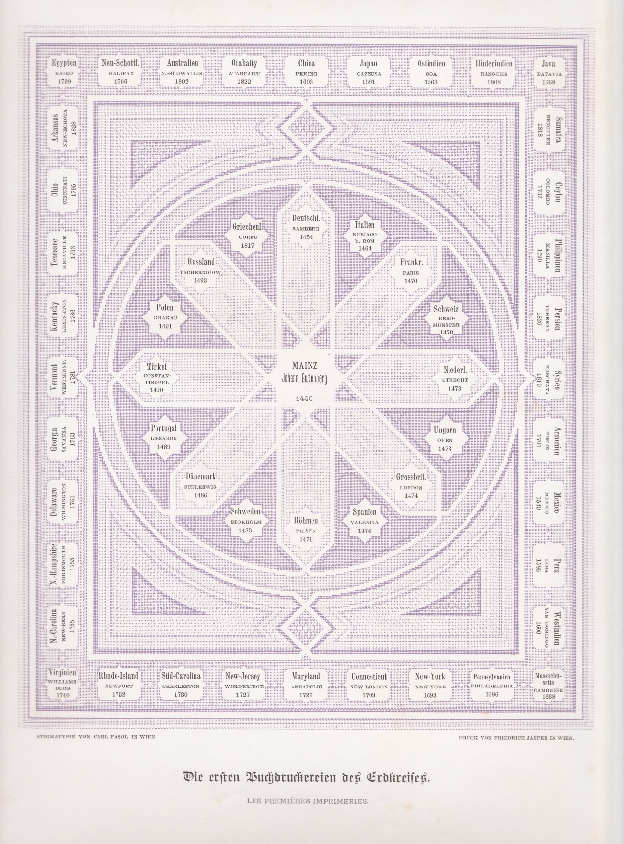
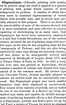
Stigmatypie works from Harpel’s Typograph, 1870. You can zoom in on the details thanks to archive.org.
Stigmatypie produces halftone images with small text characters, like the period (.), similar to dot matrix printing. The technique was developed in 1867 by Carl Fasol, who btw also inspired Valto Malmiola that we recently posted about.
The text segment is from American Encyclopaedia of Printing (1871).
via. h/t: Roel Nieskens
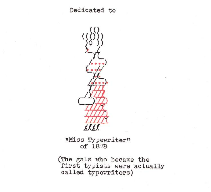
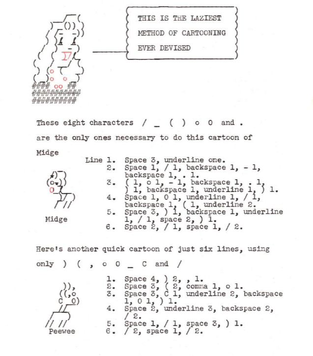
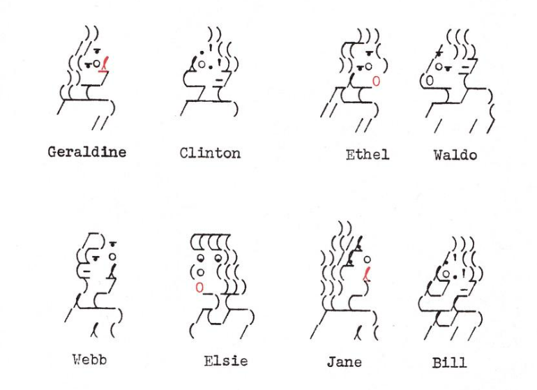
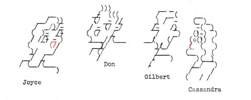
From Fun With Your Typewriter, a book by Madge Roemer from 1956. Half of the book consists of detailed instructions on how to produce the works, sort of like software for humans. We covered the book back in 2012 but since then the book has been made available on archive.org thanks to Marcin Wichary. <3
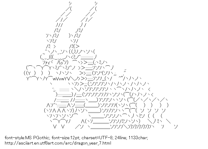
Posted by asciiart to start off 2024, the year of the dragon in the Chinese calendar.
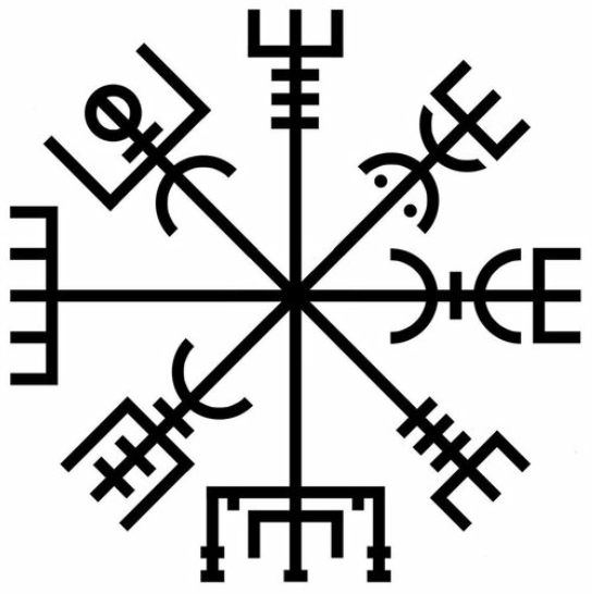
The Icelandic Vegvísir (wayfinder) is a magical stave that helps you find your way home through rough weather. Oldest known example is from 1860.
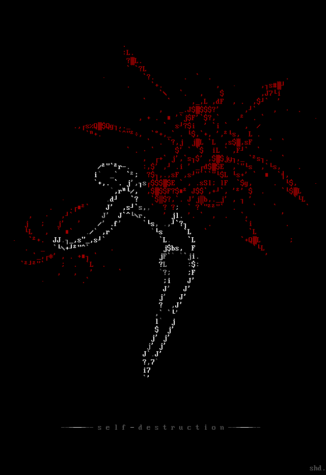
Self Destruction by Shadow, for Galza. Made sometime between 1999 and 2004.
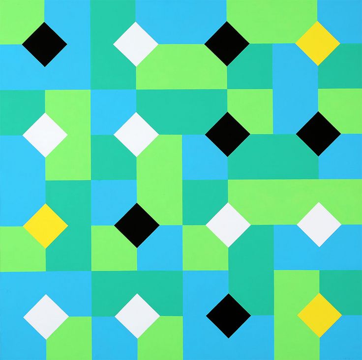
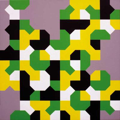
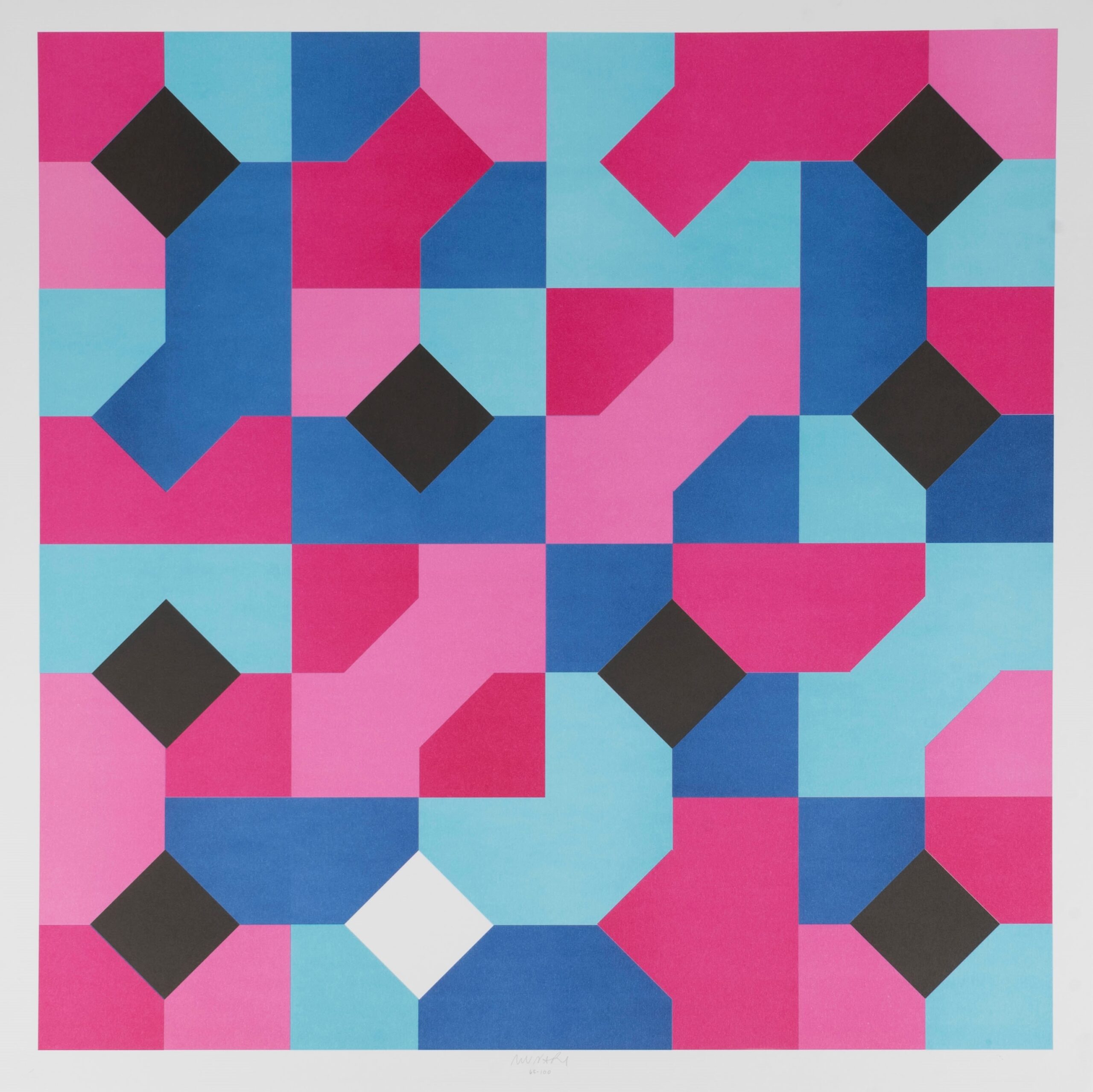
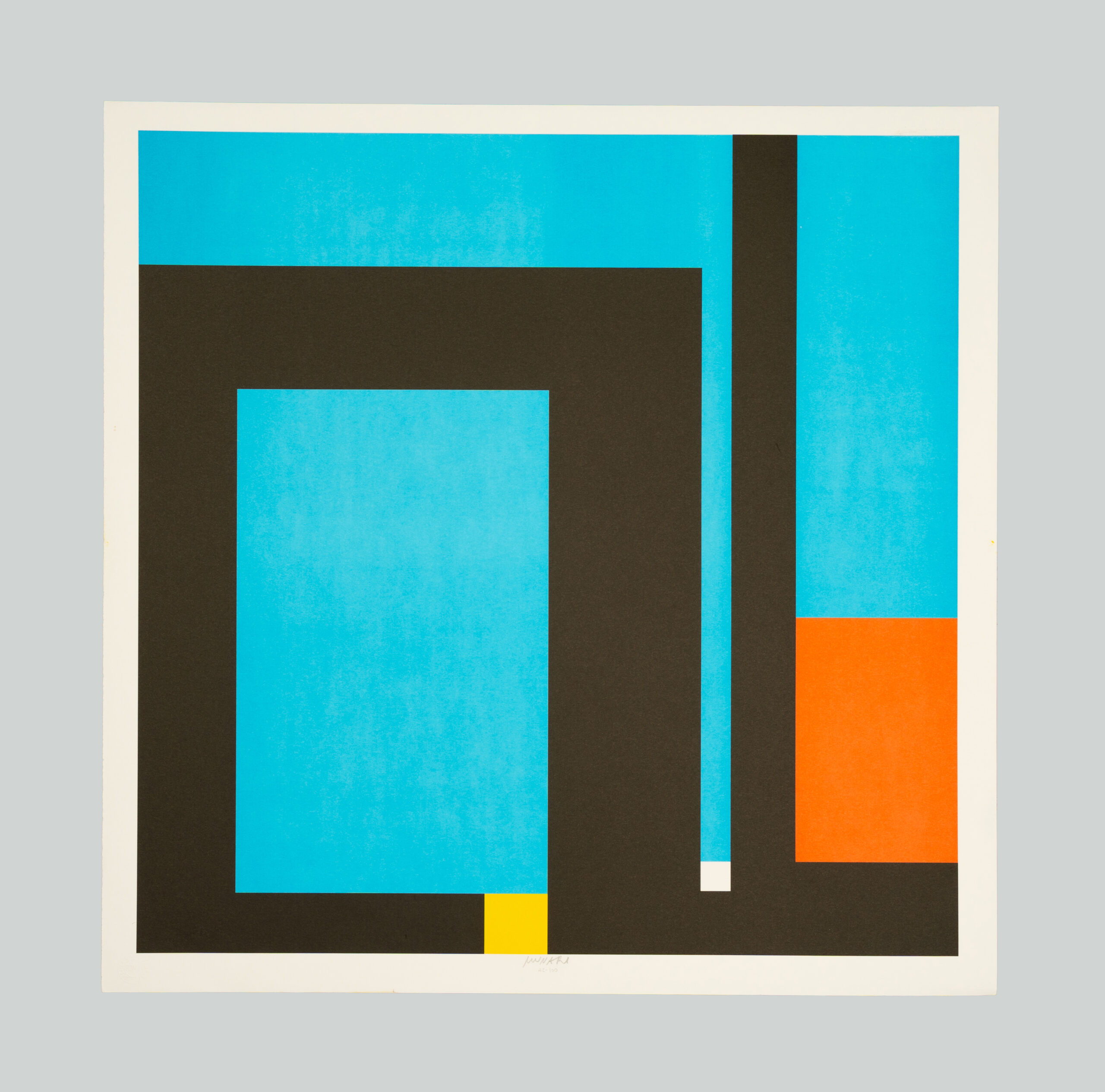
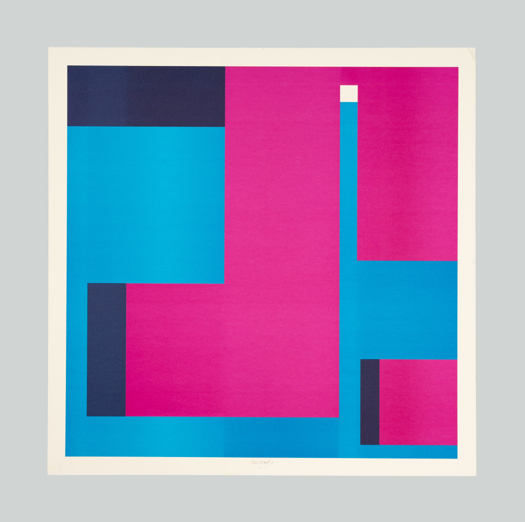
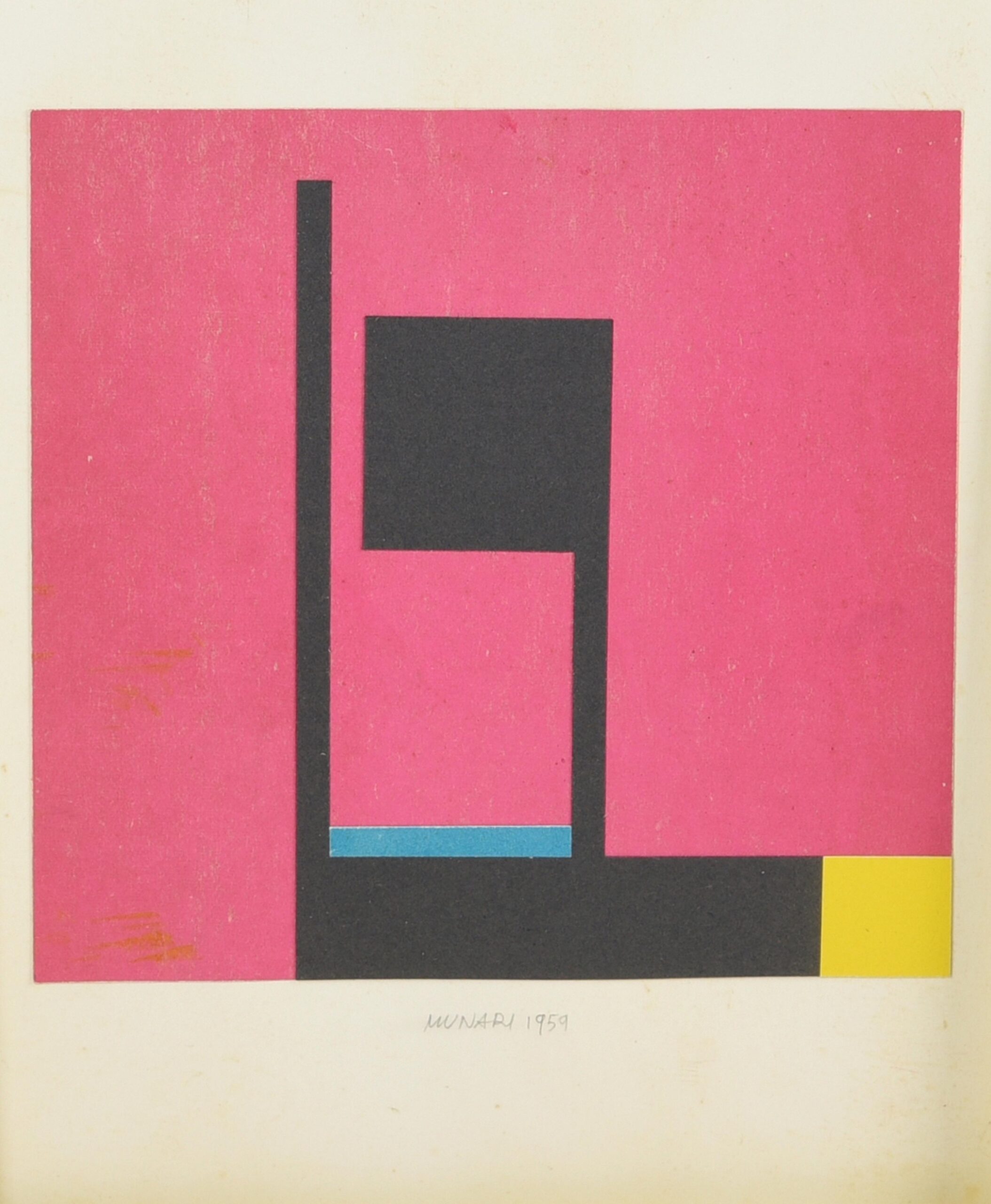
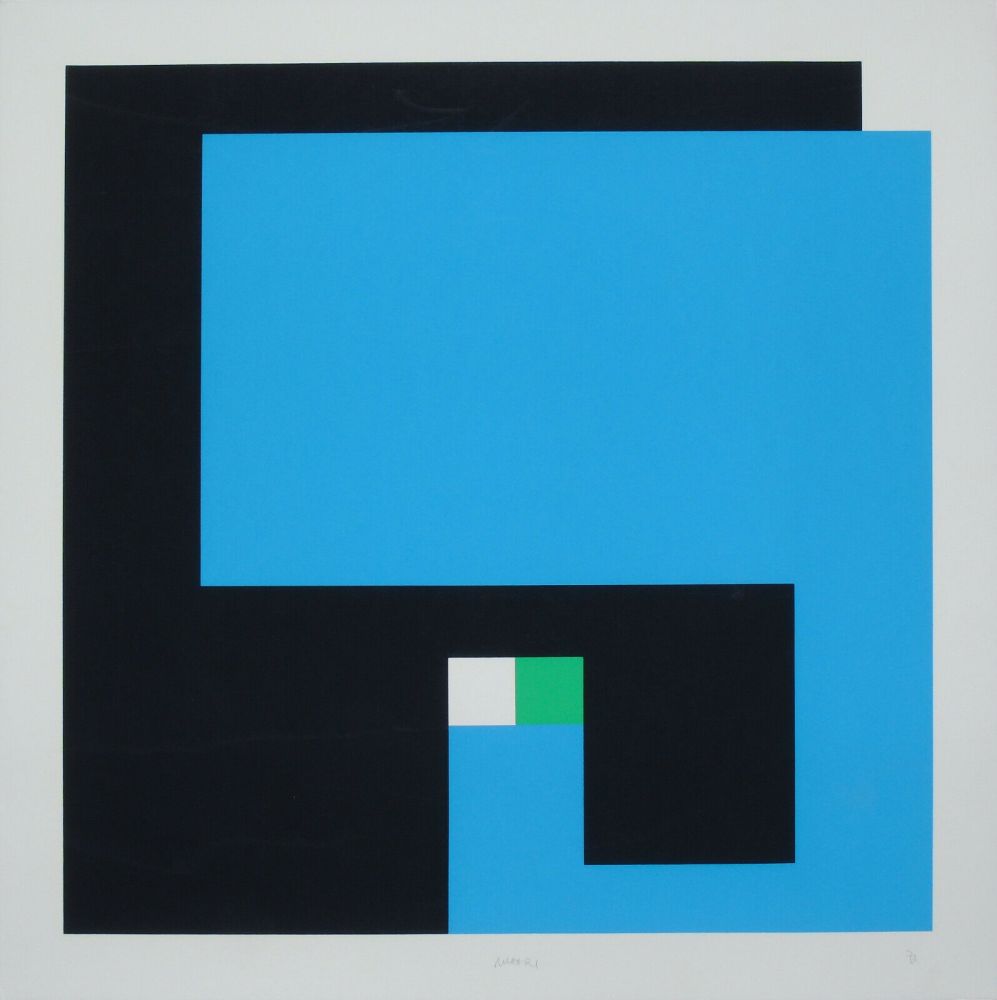
Examples from Bruno Munari‘s Curve di Peano series (1970’s) and the Negativo Positivo series (1950’s).

