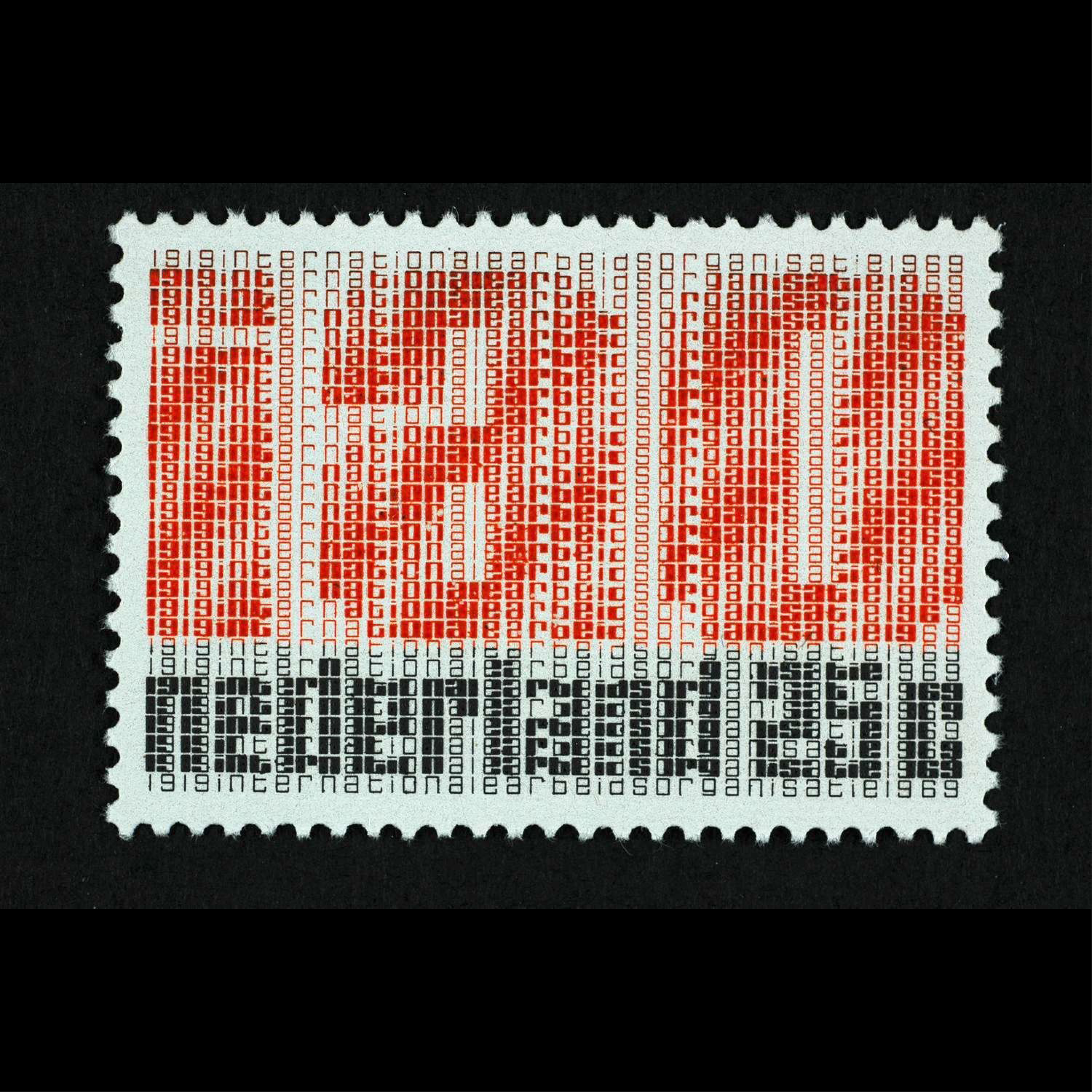
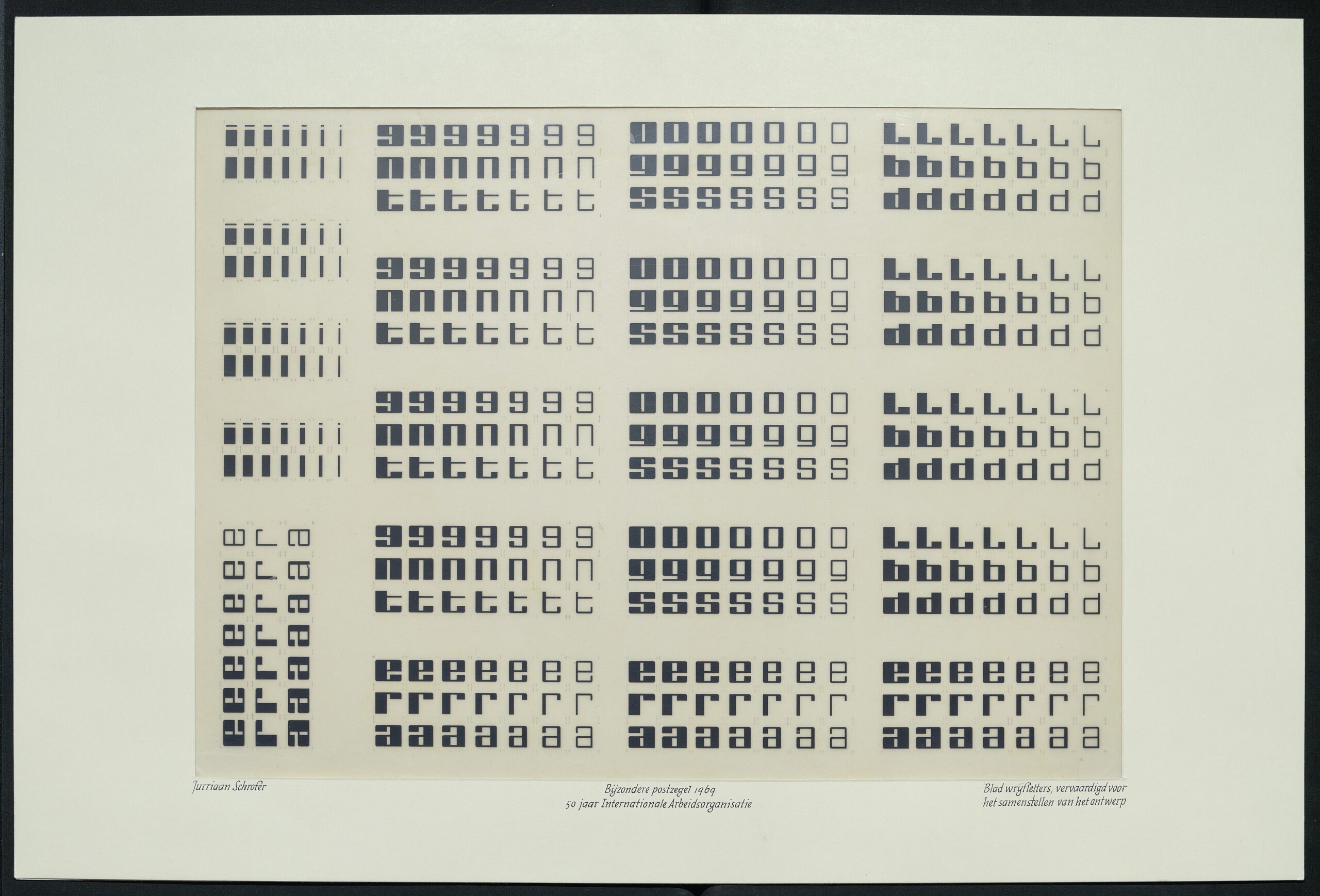
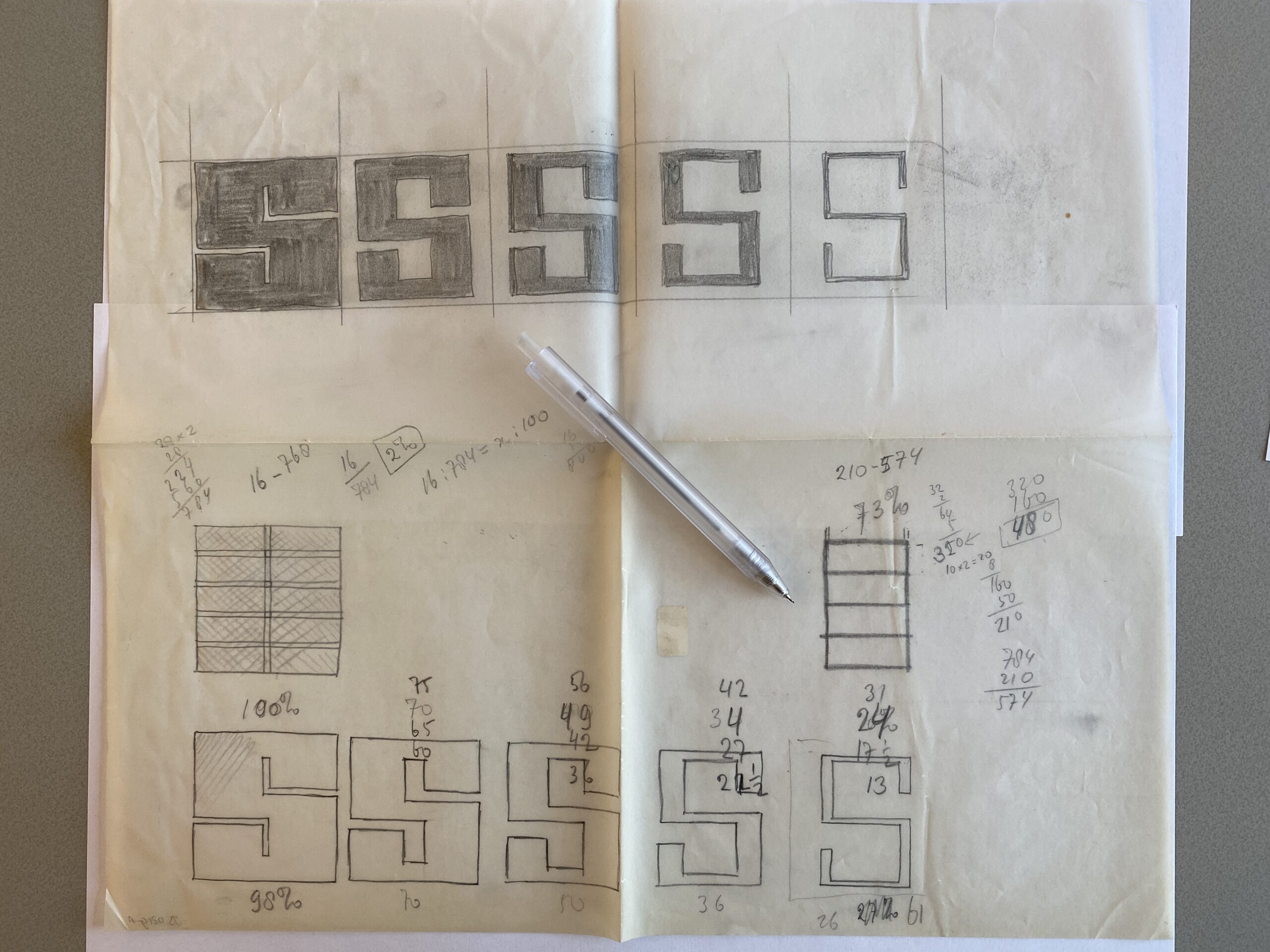
Jurriaan Schrofer’s stamps for the Netherlands, 1969. The text celebrates 50 years of International Labor Organization (IAO). More images and info in Maurice Meilleur’s excellent research.


Jurriaan Schrofer’s stamps for the Netherlands, 1969. The text celebrates 50 years of International Labor Organization (IAO). More images and info in Maurice Meilleur’s excellent research.
airconditioncomputingnightmare:
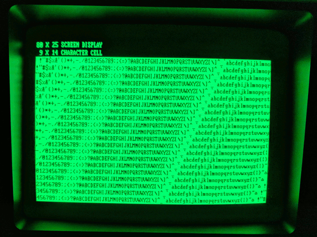
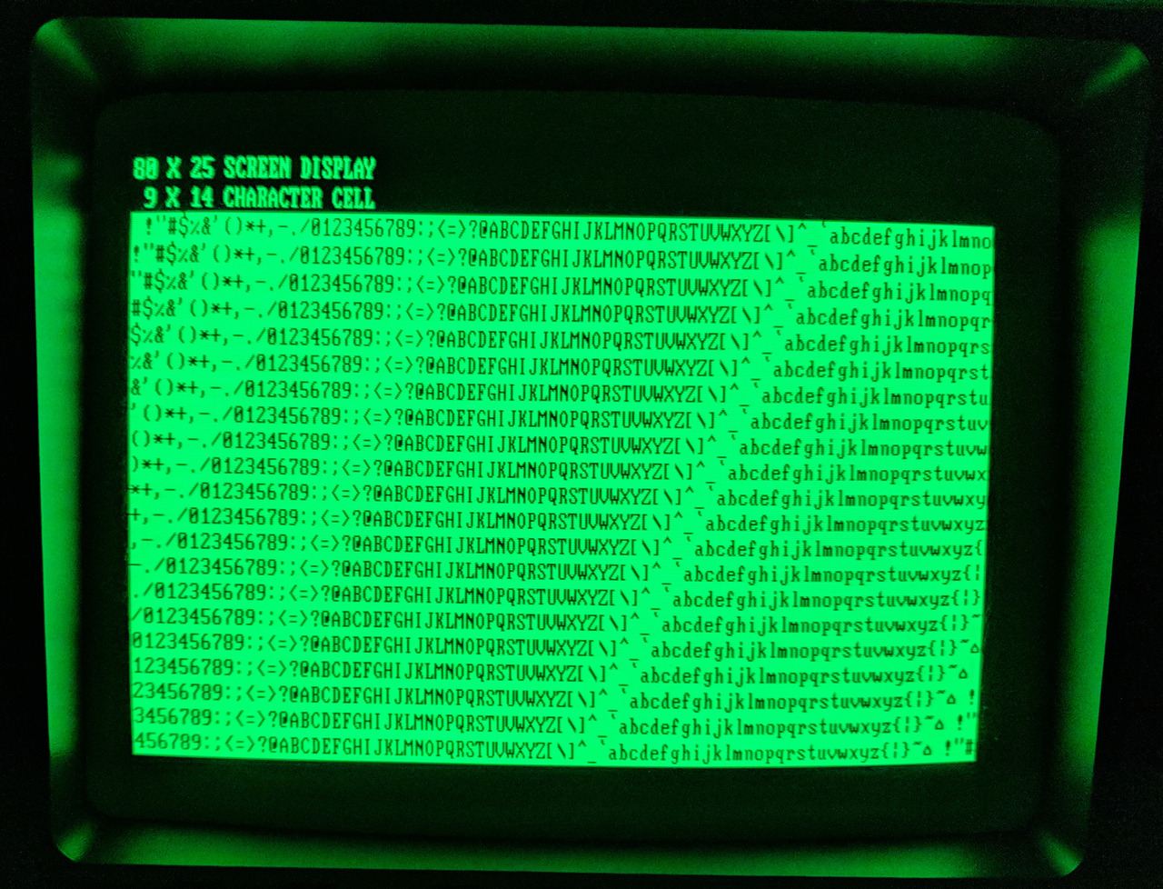
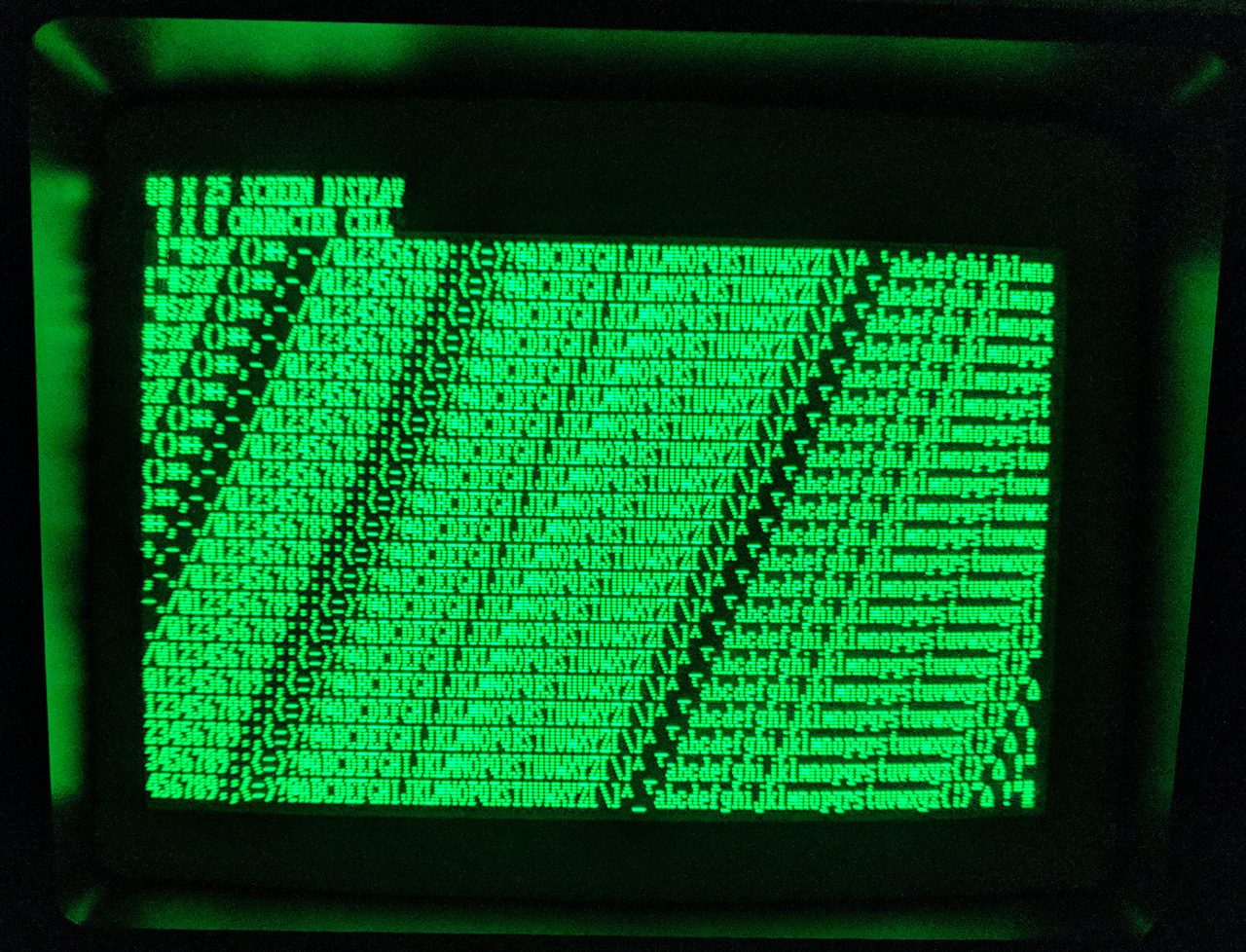
CGA and MDA, Part 2
As I briefly touched upon in my previous writeup on CGA vs. MDA, CGA’s 80×25 text mode is significantly coarser than MDA’s. CGA’s 80 column text mode is rendered at 640×200 with 8×8 characters (stretched vertically to approximately 640×400), while MDA’s 80 column text mode is rendered at 720×350 with larger 9×14 characters. MDA was capable of giving text attributes such as being bolded, italicized or underlined.
Seen here are the two side-to-side on the same display, a Compaq Portable’s screen.
Works by MuirMcNeil, a British design agency.
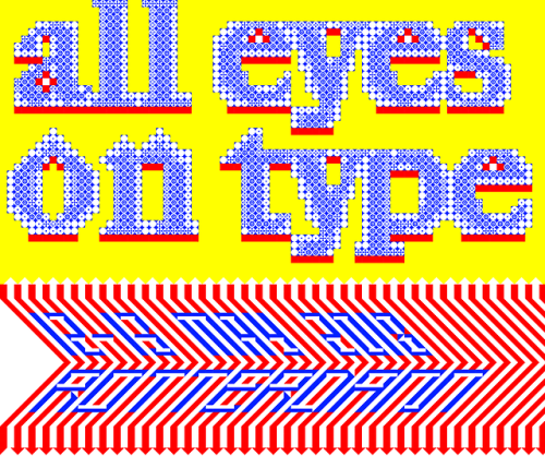
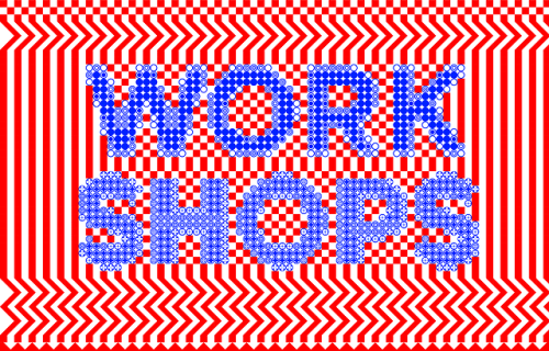
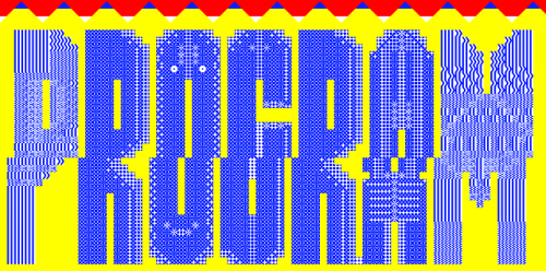
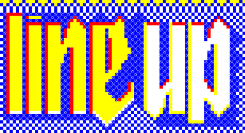
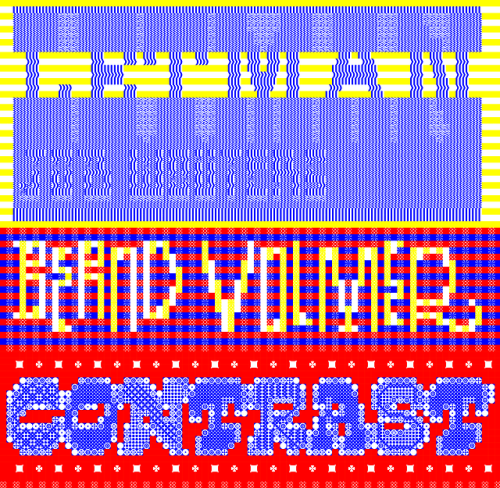
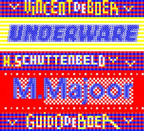
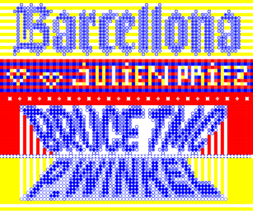
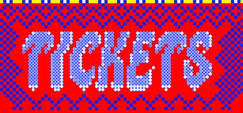
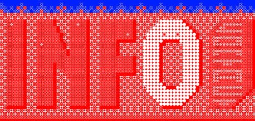
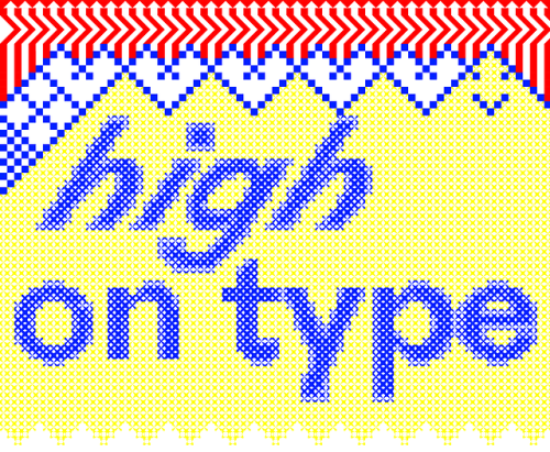
Very textmodey profile by Ivo Brower for All Eyes On Type, a calligraphy and typography festival in Rotterdam in May.
Typewritten fonts by Murielle Rouleau (top, using only m) and Julius Nelson (bottom, using X and _). From Today’s Secretary 1950-1951. Scanned by Marcin Wichary.
From 1882, these graphics were made with 13 symbols (shown at the bottom). This is a modular type called Combination Border No. 16, by Bruce’s New York Type Foundry. A little bit like PETSCII, a little bit more like alpha blox.
Found by Pinwheel Press & thanks to Marcin Wichary for the tip.