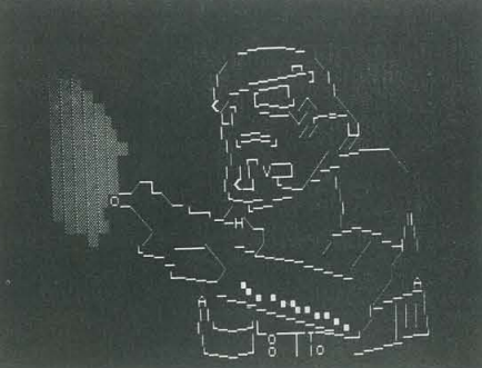
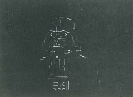
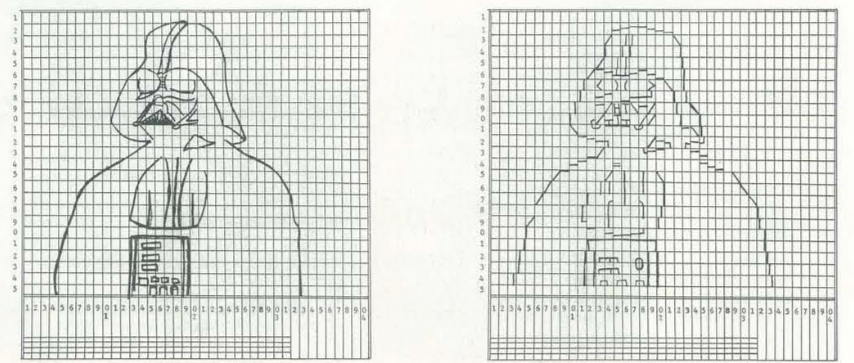
Star Wars PETSCII by Daniel Browning in People’s Computers #1, 1978. We’ve previously posted the front cover, but this is from the article inside. Browning explains how to plan the image on paper, and then use his PET-software GRAPHIX-I or GRAPHIX-II.
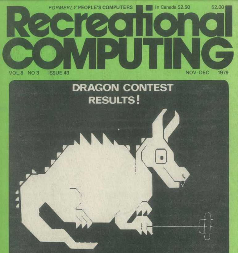
The results are in for the First International Computer Drawn Dragon Contest, 1979! These are all PETSCII-graphics made on the Commodore PET. The winner, Tom Weller from Berkeley, California, typed these graphics by hand as PRINT statements in BASIC. The other contributions were made by Steve and Tom Wuttke, 9 and 12 years old.
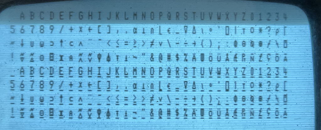
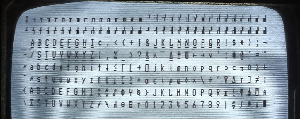
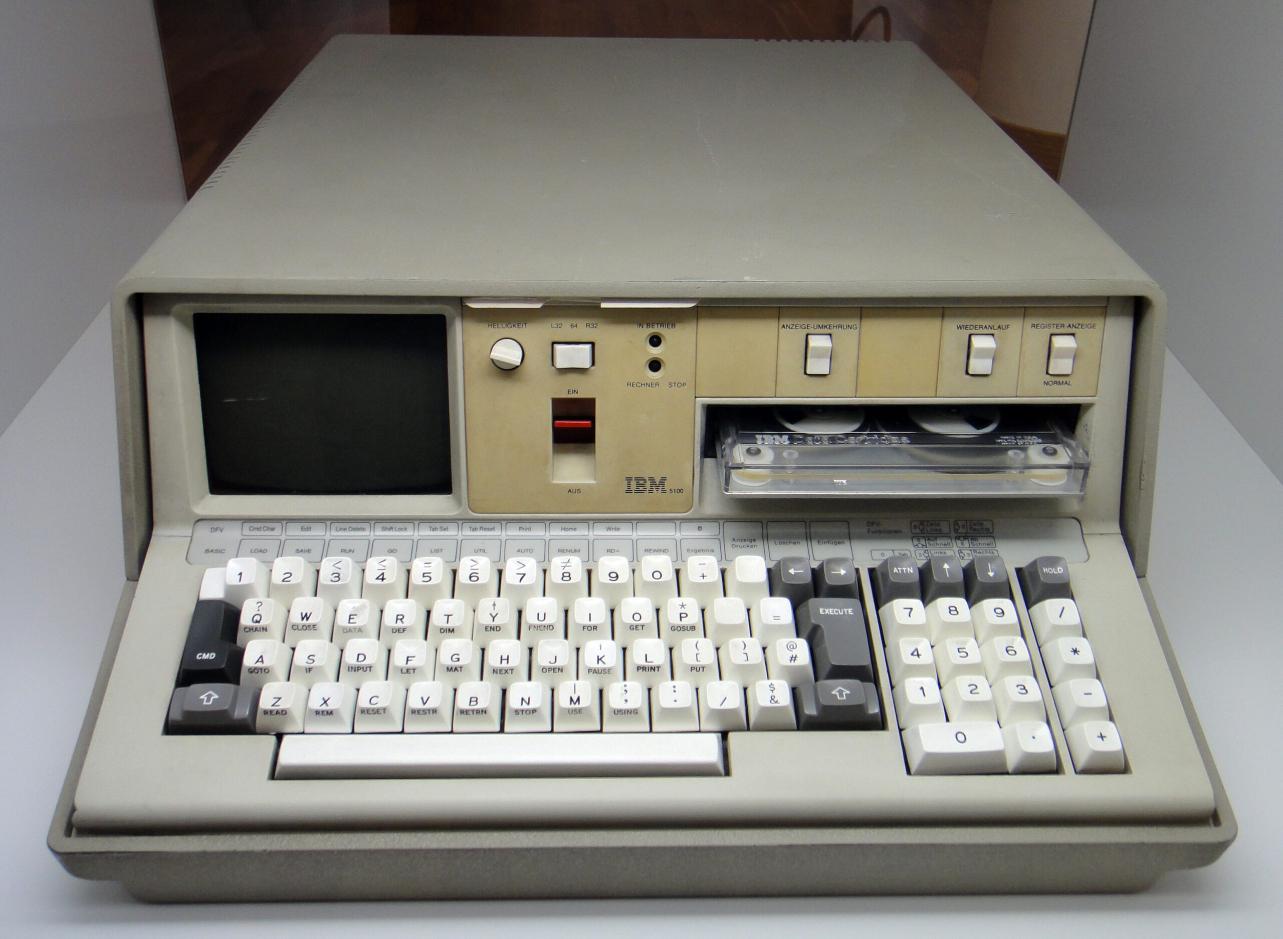
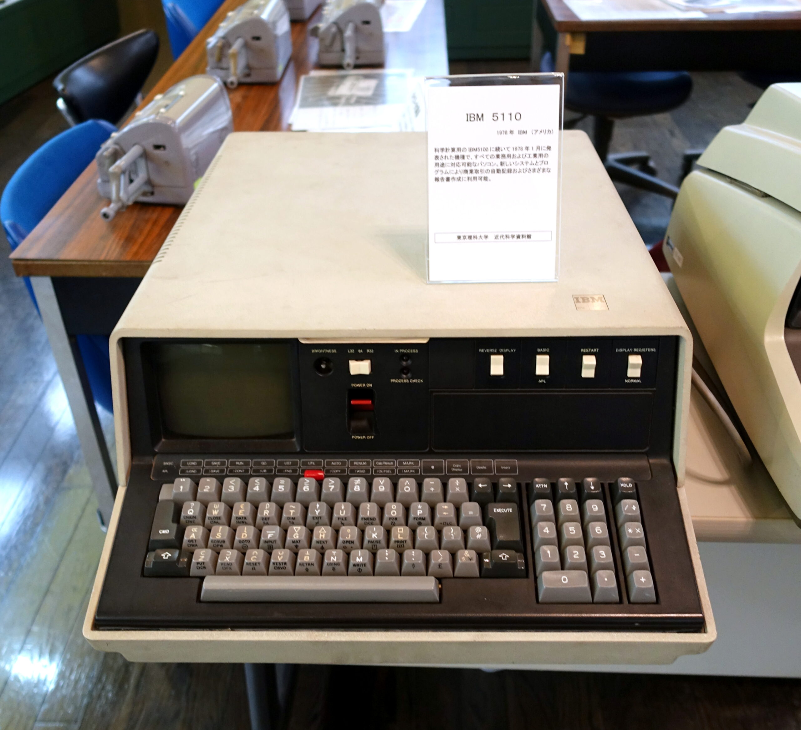
These are IBM’s first computers: IBM 5100 (1975) and IBM 5110 (1978).
The 5100 had 256 characters but half of the characters were just underscored versions of the other half. It used IBM’s mega obscure EBCD encoding instead of ASCII. IBM 5110 dropped most of the underscored characters, which made room for semi-graphic characters. Encoding was changed to the slightly less obscure EBCDIC, and there were 14 localized character sets with 12 characters each.
Character set photos from Voidstar, where there are also more details about the character sets.