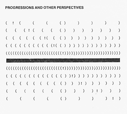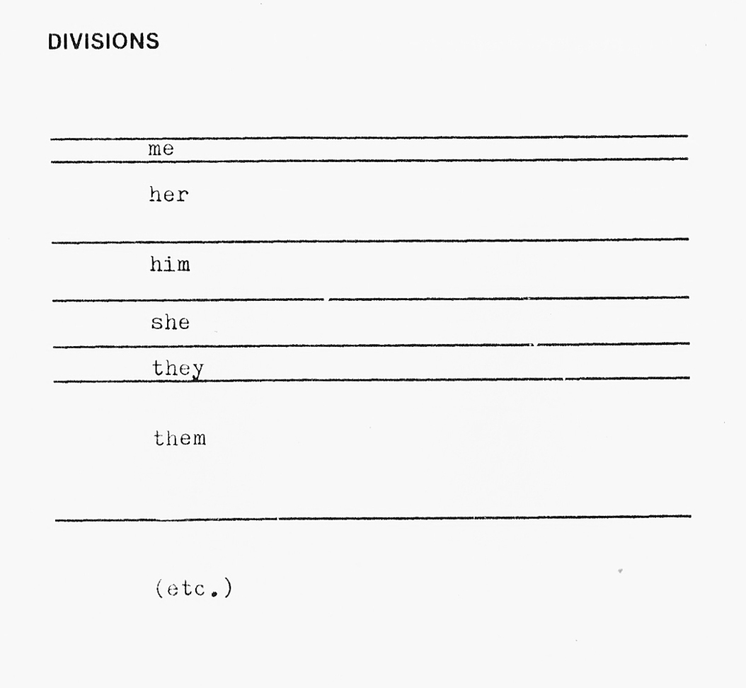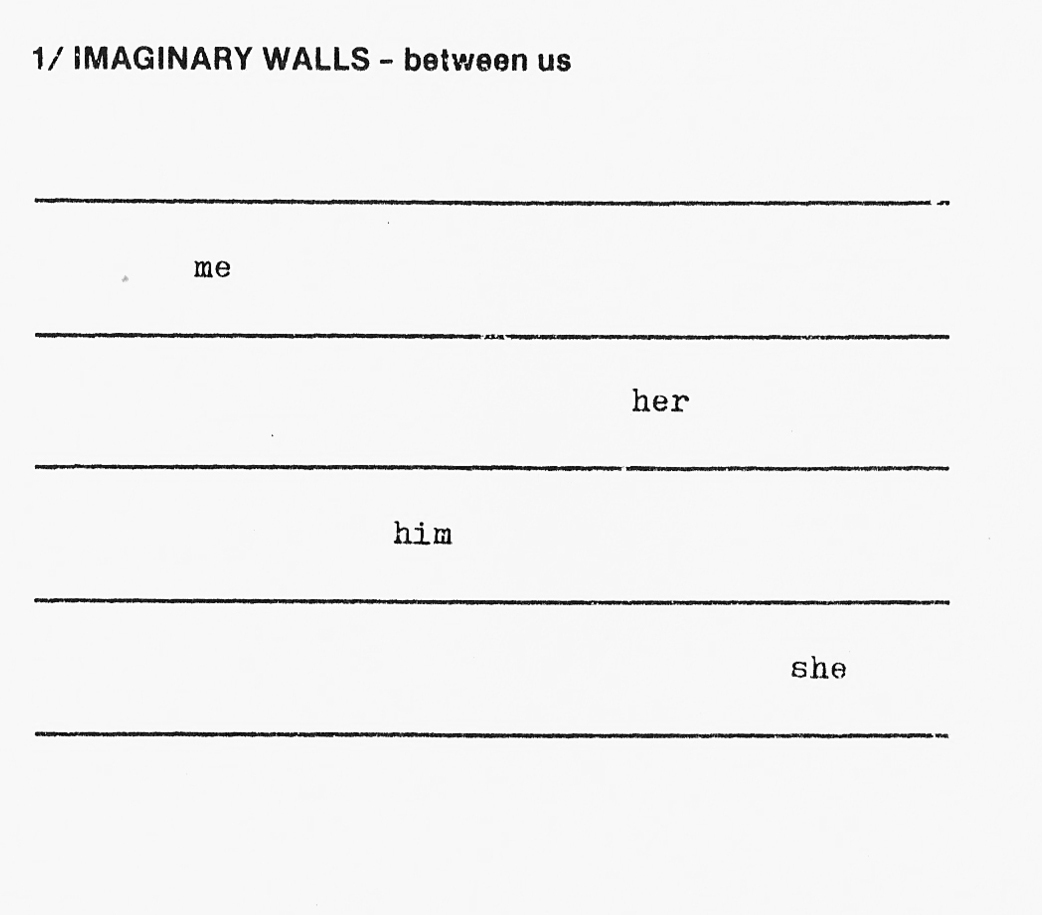

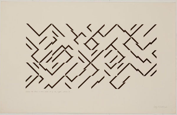
By Guy de Cointet, 1971-1978.
More here. Updated in 2024.
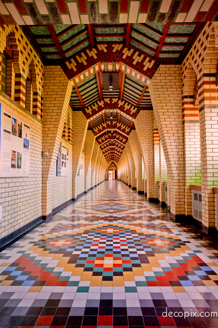
Paroisse Ste-Marguerite, Magog, Quebec (Canada), built in 1949.
Photo by decopix
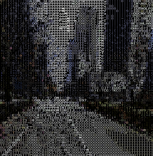


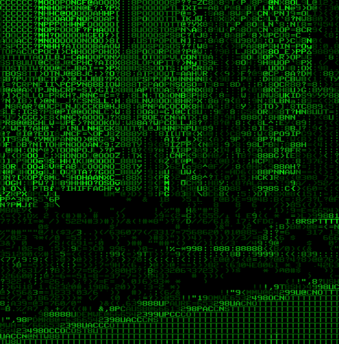
ASCII Street View by Teehan+Lax Labs
Interactive, brower-based WebGL-powered text-mode view of Google Streetview panoramas. Available in colour and green-terminal modes:
Real-time Ascii Art conversion of Google Street View panorama’s done in WebGL.
You’ll need Chrome, Firefox 8+, or another browser that supports CORS WebGL textures.
Coded by @peter_nitsch. Inspired by Sol’sTextFX library. Built with @thespite’sGoogle Street View Panorama library, and three.js.
Read about this at Teehan+Lax Labs.
Try it out here
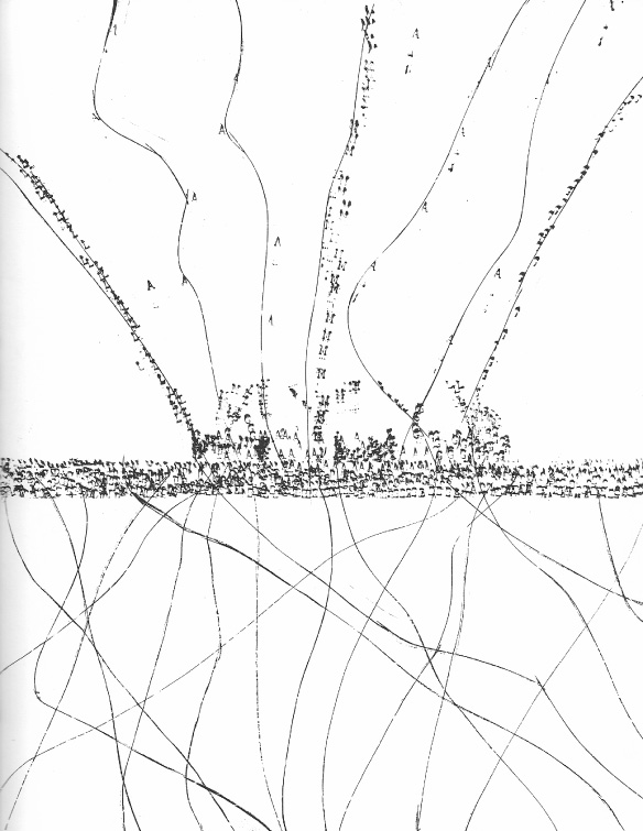
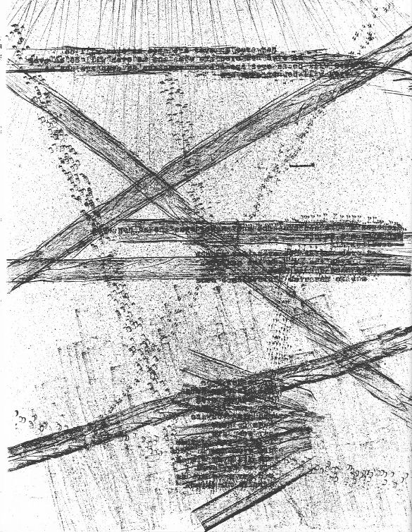
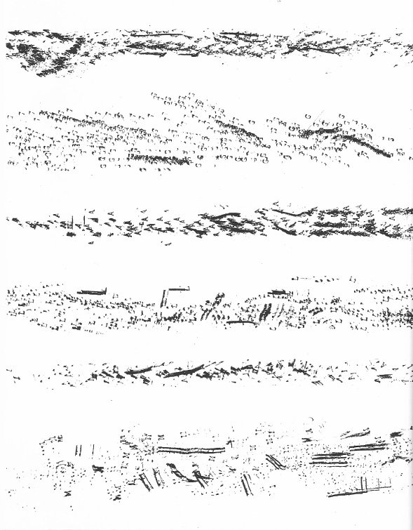
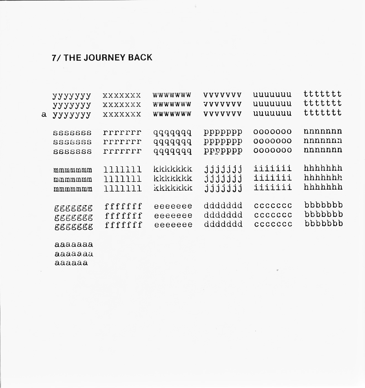
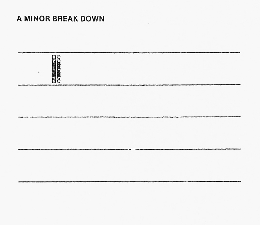
From The Plastic Typewriter book by Paul Dutton, 1993.
Although Paul Dutton finished this series of prints/smudges made from a disassembled plastic typewriter in 1977, this is the first publication of the entire work. It’s a lovely sequence of visual pieces: letters pressed on broken type, lines drawn in (presumably through typewriter ribbon), smudges, fragments of rock lyrics, ribbon rubbings, fingerprints, typed text, in short, a greatly enhanced set of textual elements. Given the replacement of the typewriter by the word processor, there’s a flavor of nostalgia, or perhaps metaphor (in the destruction of the typewriter) in this piece that may not have been originally considered.
Post updated in 2024.
Le Merle (The Blackbird) by Norman McLaren, 1958. More.

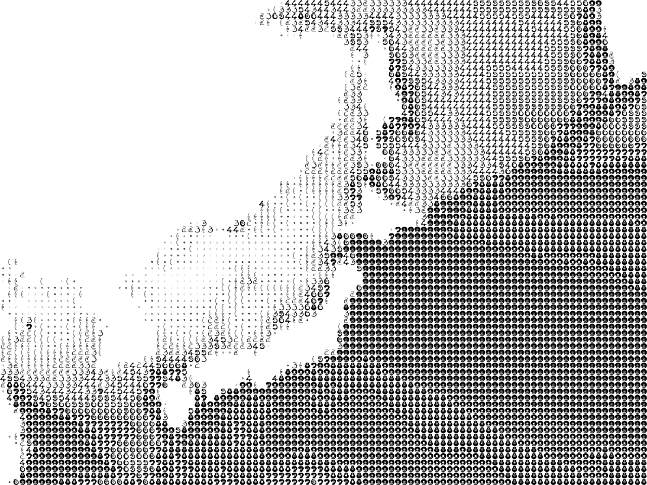
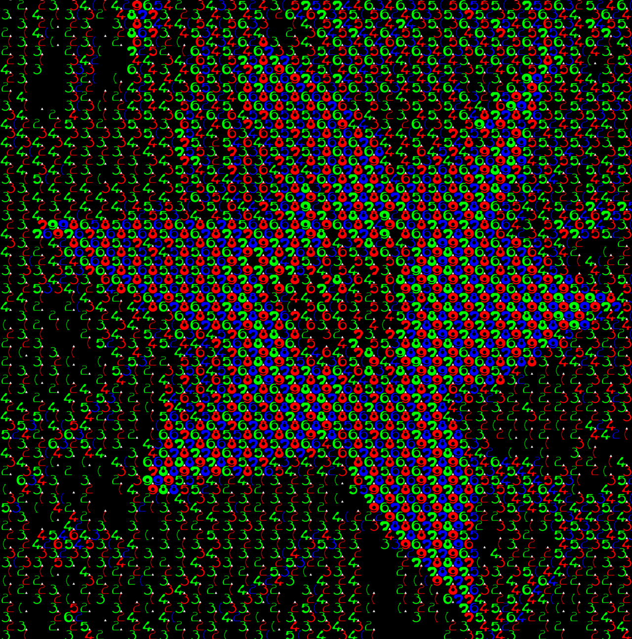
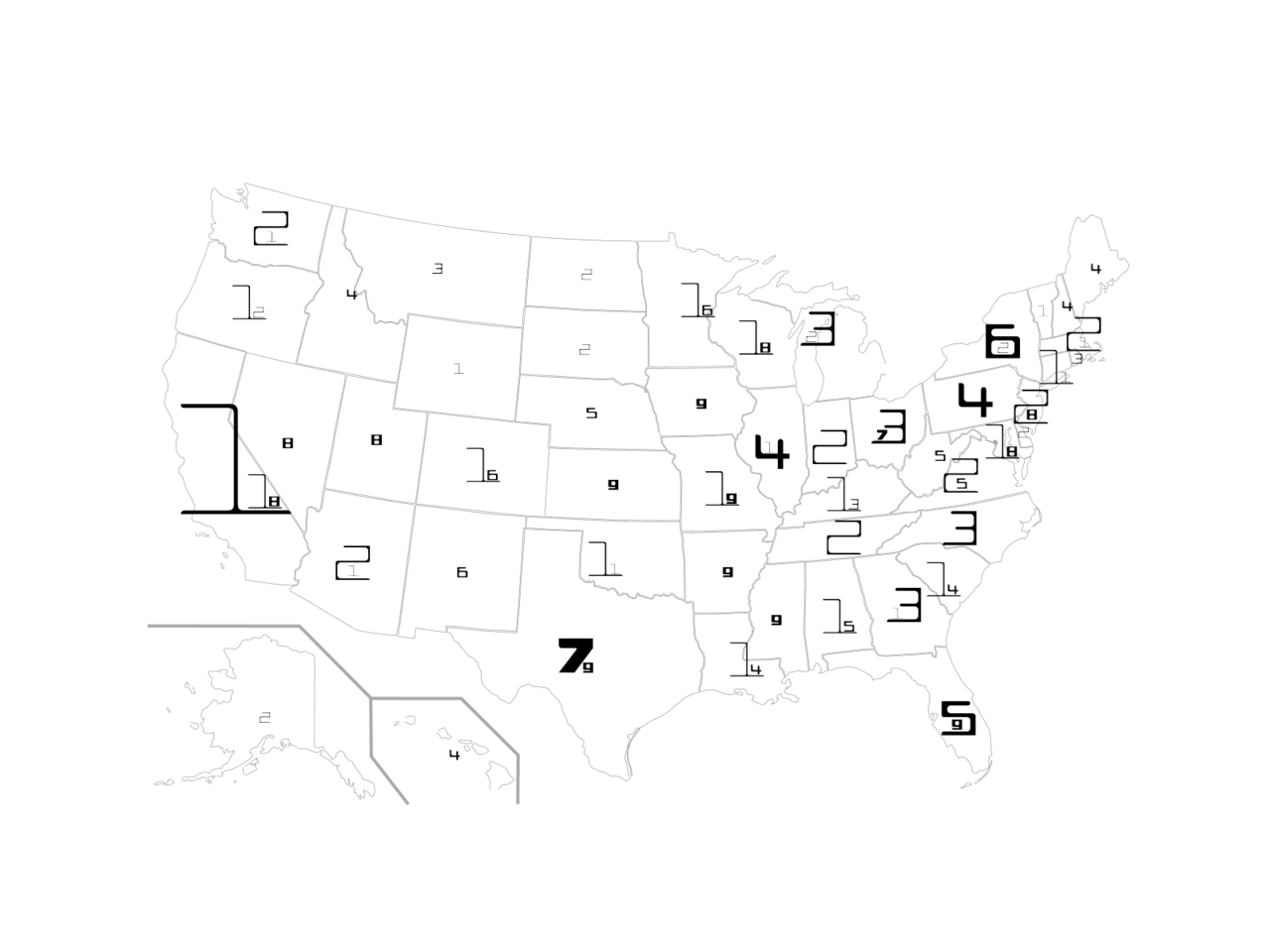
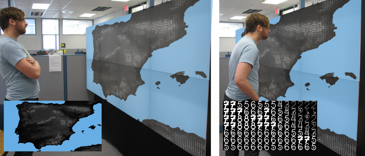
FatFont
Specifically designed for decimal numbers whose boldness corresponds with it’s value, for use in data visualization:
The FatFonts technique is based on a new type of numeric typeface designed for visualization purposes that bridge the gap between numeric and visual representations. FatFonts are based on Arabic numerals but, unlike regular numeric typefaces, the amount of ink (dark pixels) used for each digit is proportional to its quantitative value. This enables accurate reading of the numerical data while preserving an overall visual context.
Fatfonts are designed so that the amount of dark pixels in a numeral character is proportional to the number it represents … This proportionality of ink is the main property of FatFonts. It allows us to create images of data where you can read the numbers, and represent tables that can be read as images.
You can find out more about the project here