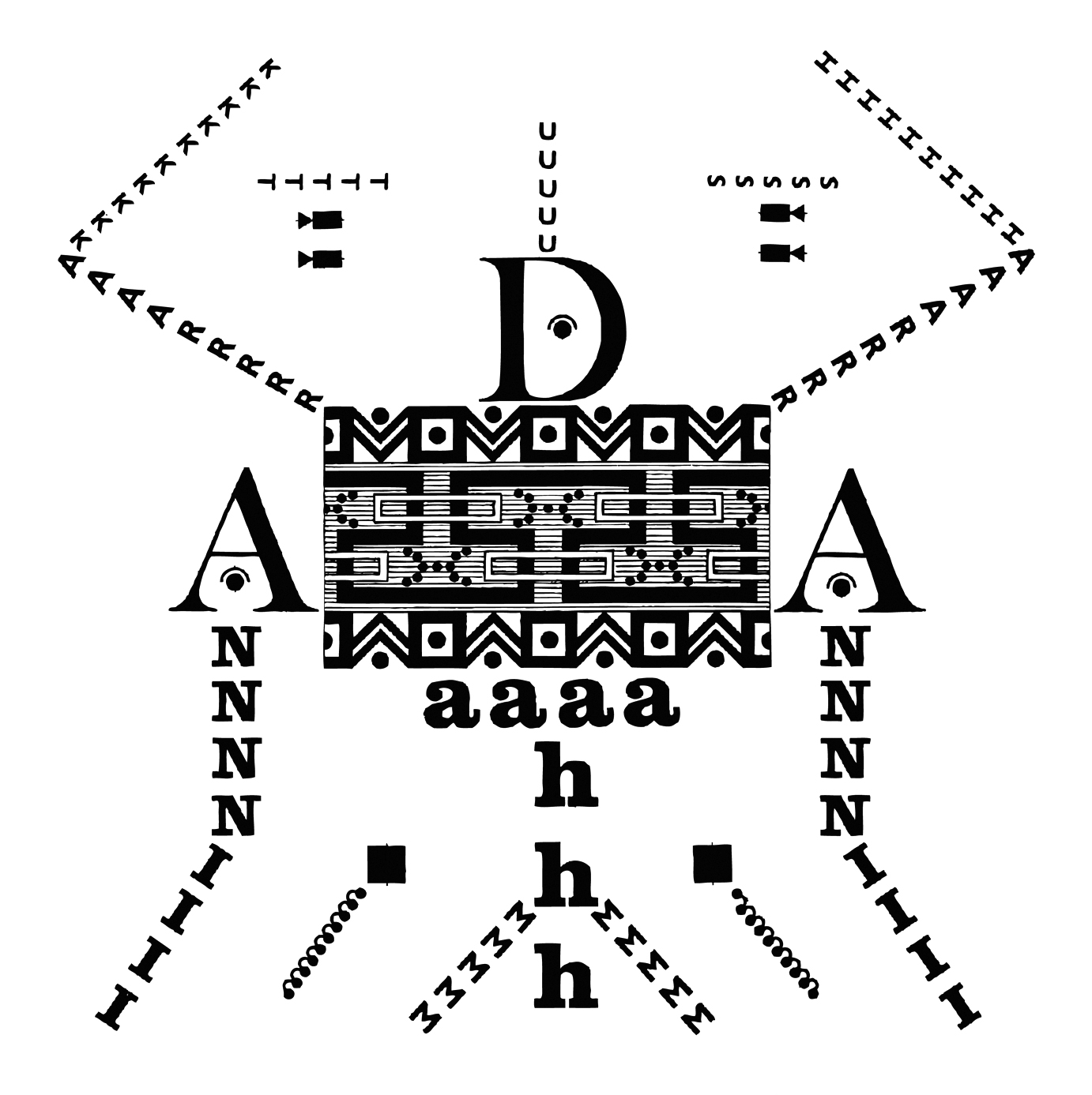
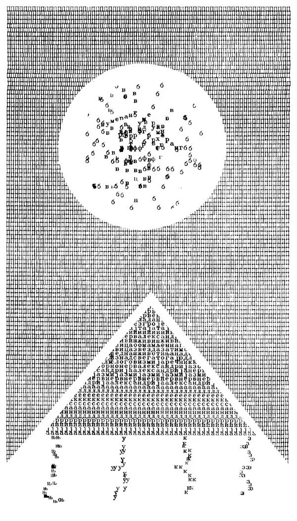
Algol (1970 and Textum 2 (1973) by Miroljub Todorović (Мирољуб Тодоровић), who founded the signalist movement.


Algol (1970 and Textum 2 (1973) by Miroljub Todorović (Мирољуб Тодоровић), who founded the signalist movement.
BAMBI versus GODZILLA, by Dave Brett for the VT100 terminal. A comment on the video mentions seeing it in 1980, so this post is dated to 1979.
It’s based on an animation from 1969 by Marv Newland. This and other VT100-animations are available at textfiles.com.
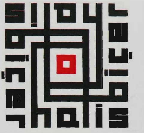
Halis Biçer, 1972.
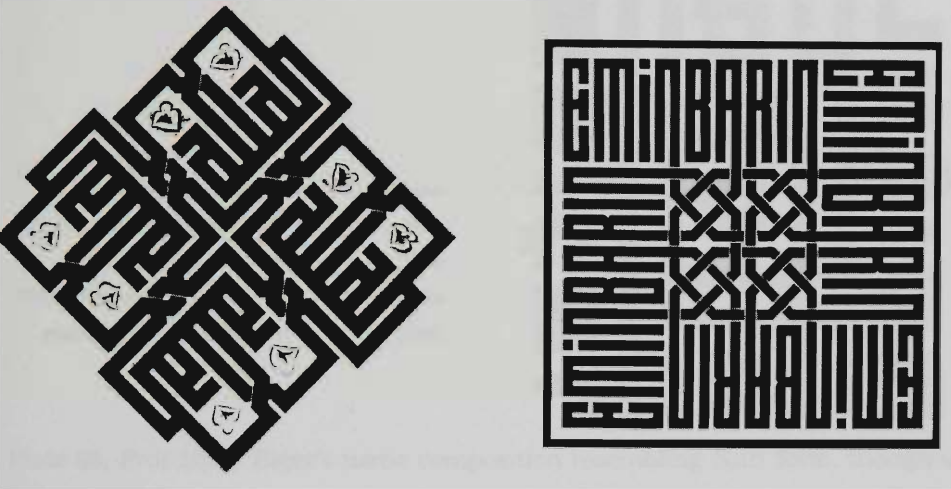
Emin Barin, 1970s
Emin Barin and Halis Biçer started to make square kufic calligraphy with Latin letters in the 1970s. Most, if not all, square kufic were previously in Arabic. Barin was inspired by the younger Biçer, according to Enis Tan’s PhD thesis, A study of Kufic script in Islamic calligraphy and its relevance to Turkish graphic art using Latin fonts in the late twentieth.
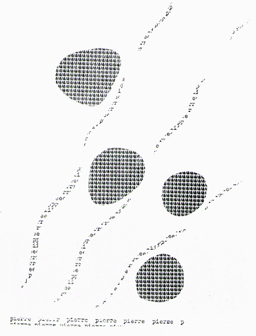
“[pierre/鳩]” [rock/pigeon]
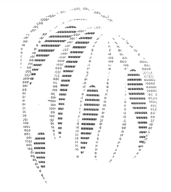
“[coq/桜]” [cock/cherry blossom]
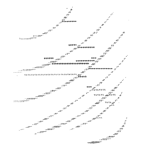
“Shizu me ru tera 沈める寺” [Sinking Temple]
All works by Niikuni Seiichi & Pierre Garnier, 1966-1977, taken from Interlingual Encounter in Pierre Garnier and Niikuni Seiichi’s French-Japanese Concrete Poetry by Elaine S. Wong, 2015.
.
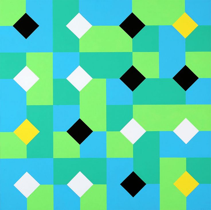
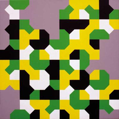
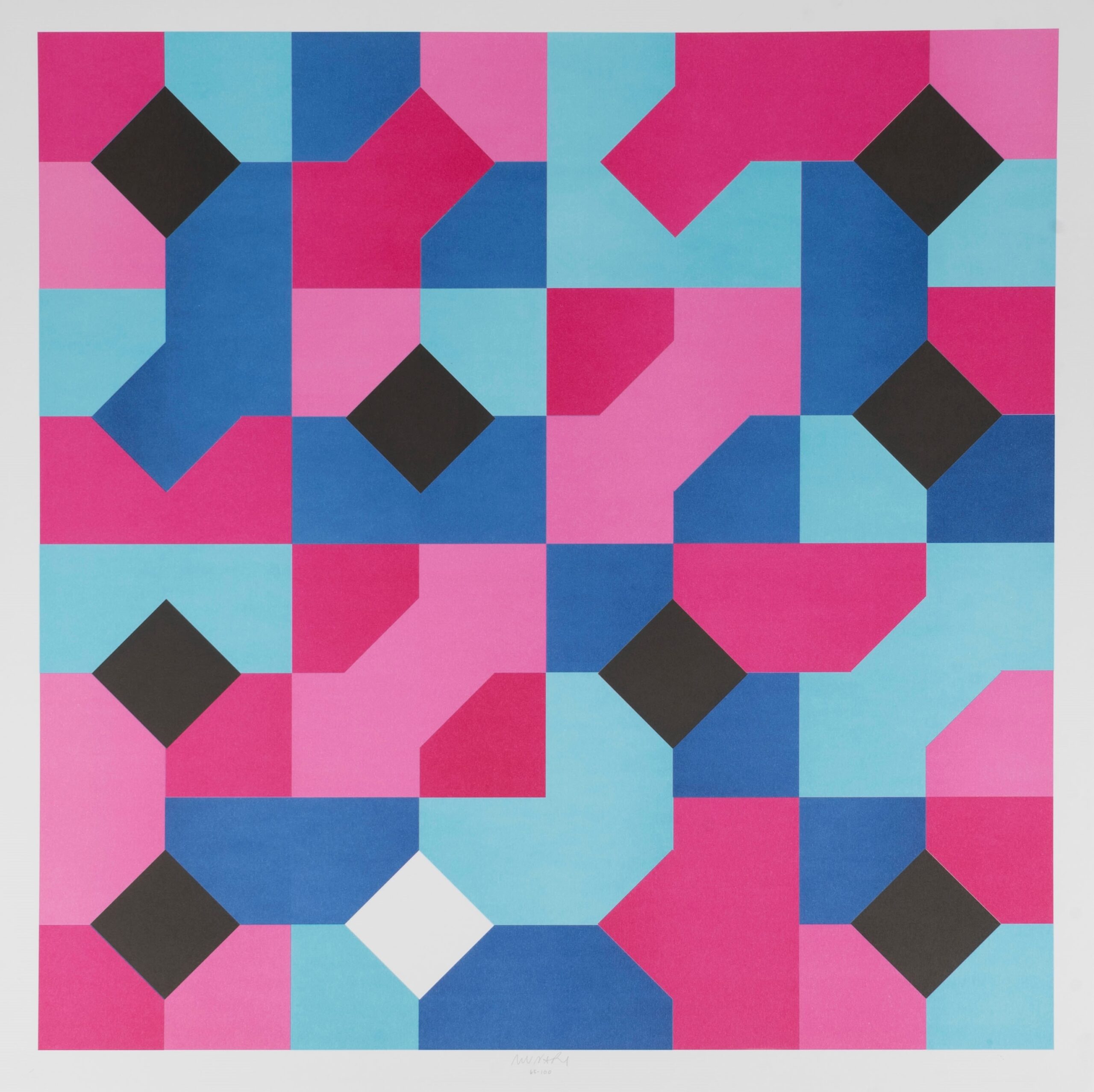
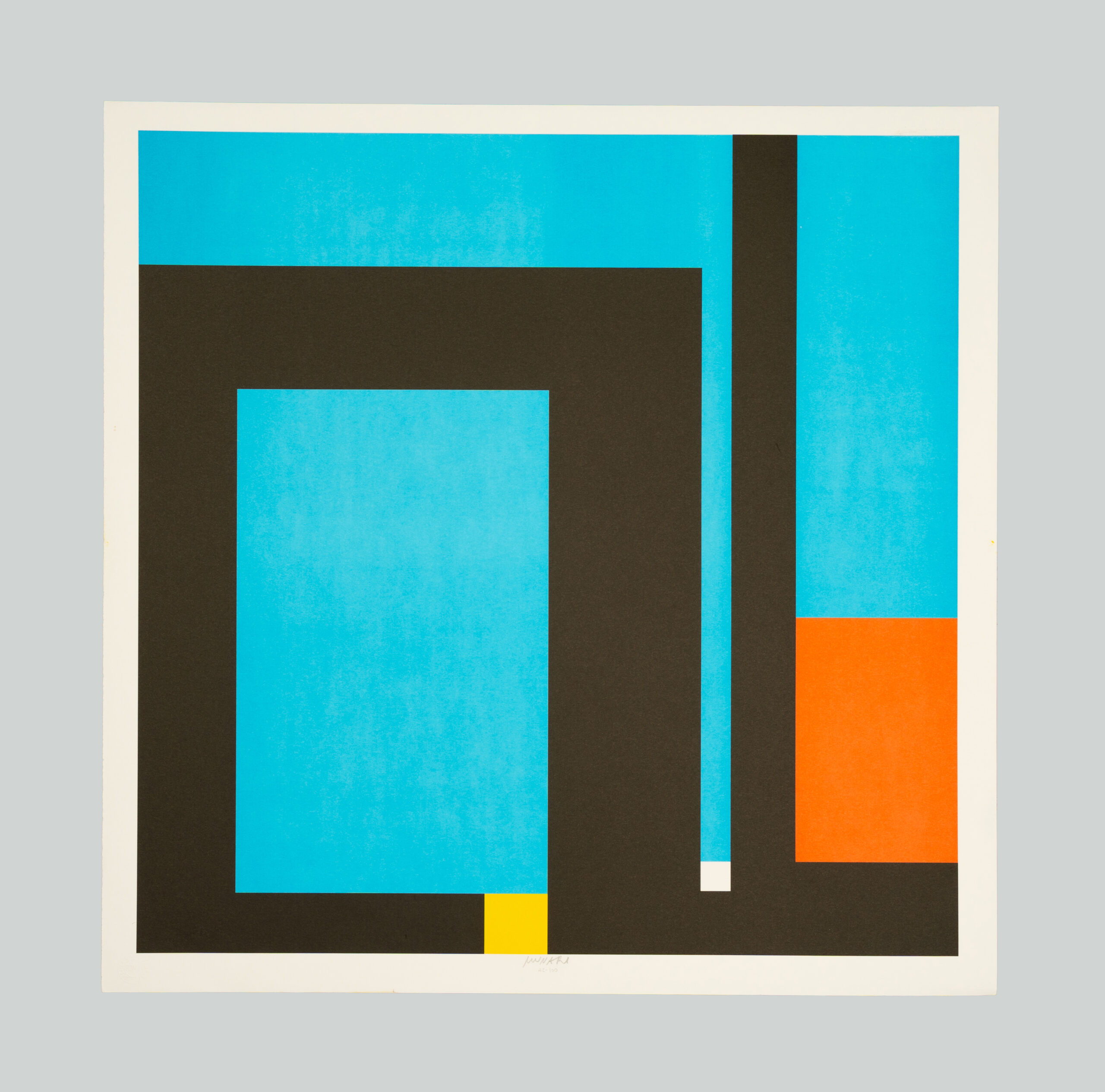
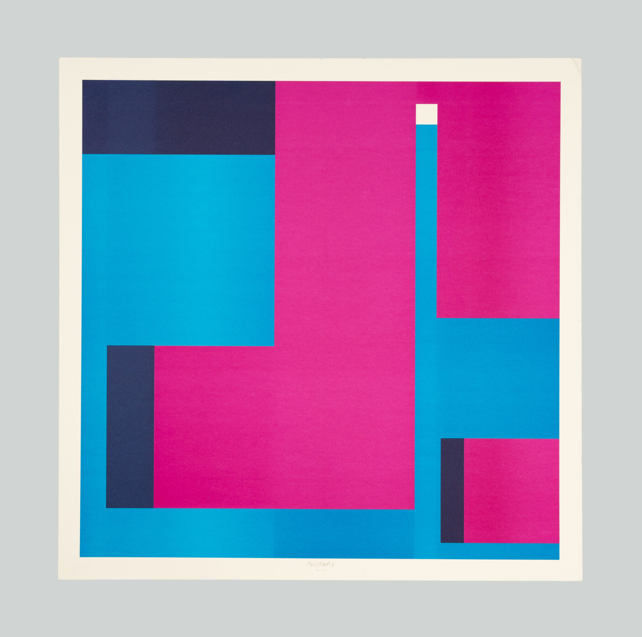
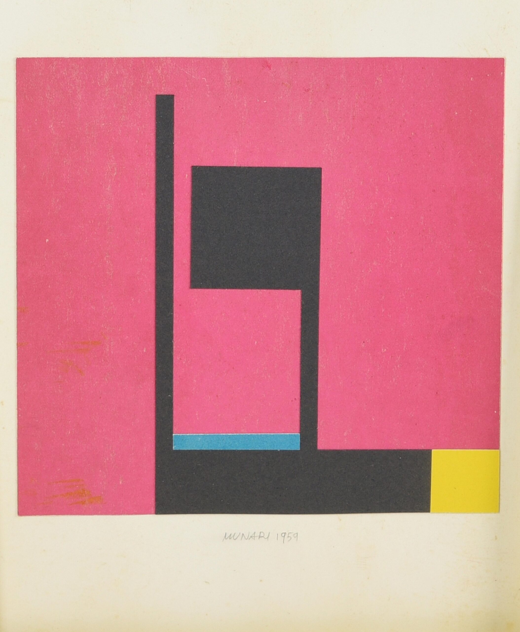
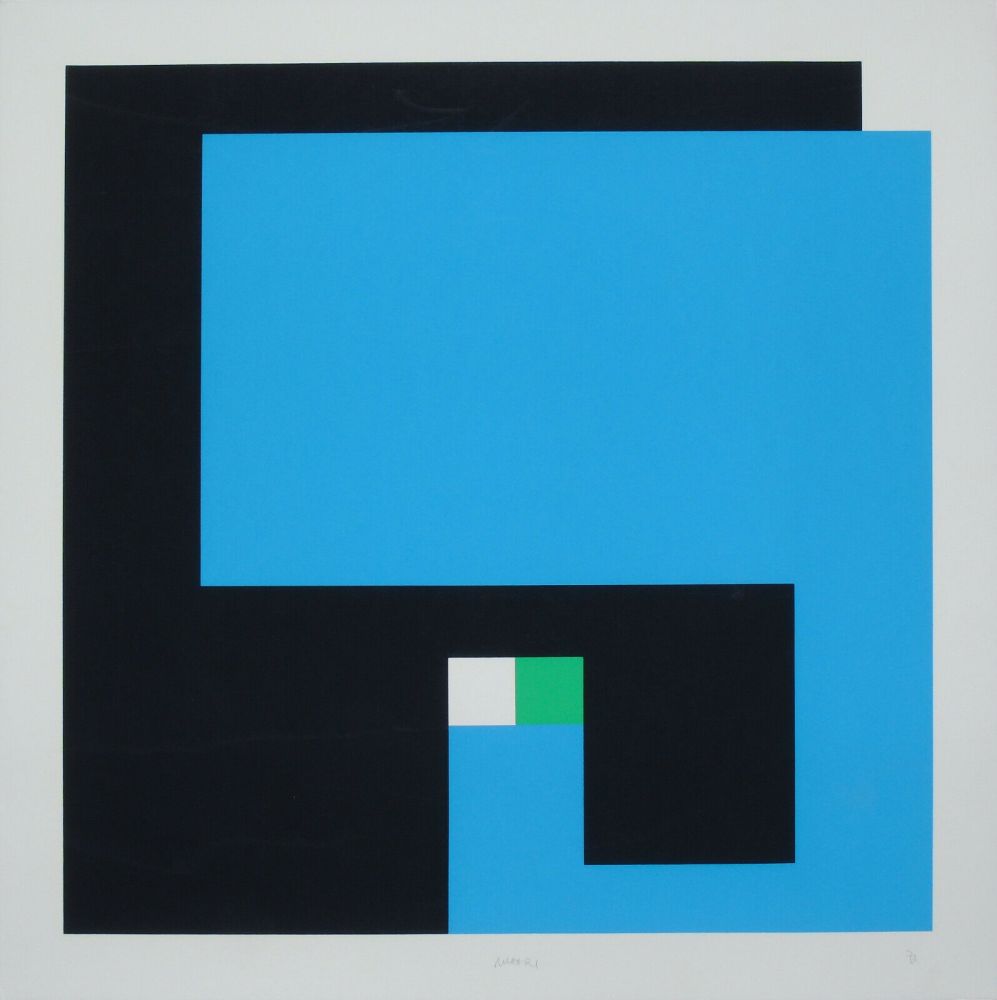
Examples from Bruno Munari‘s Curve di Peano series (1970’s) and the Negativo Positivo series (1950’s).
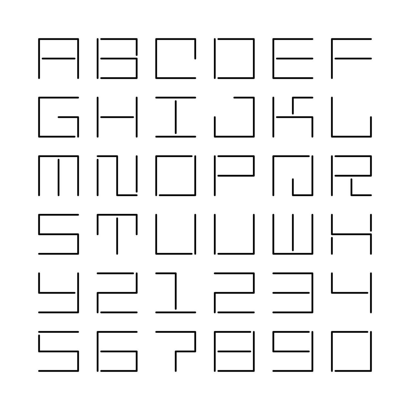
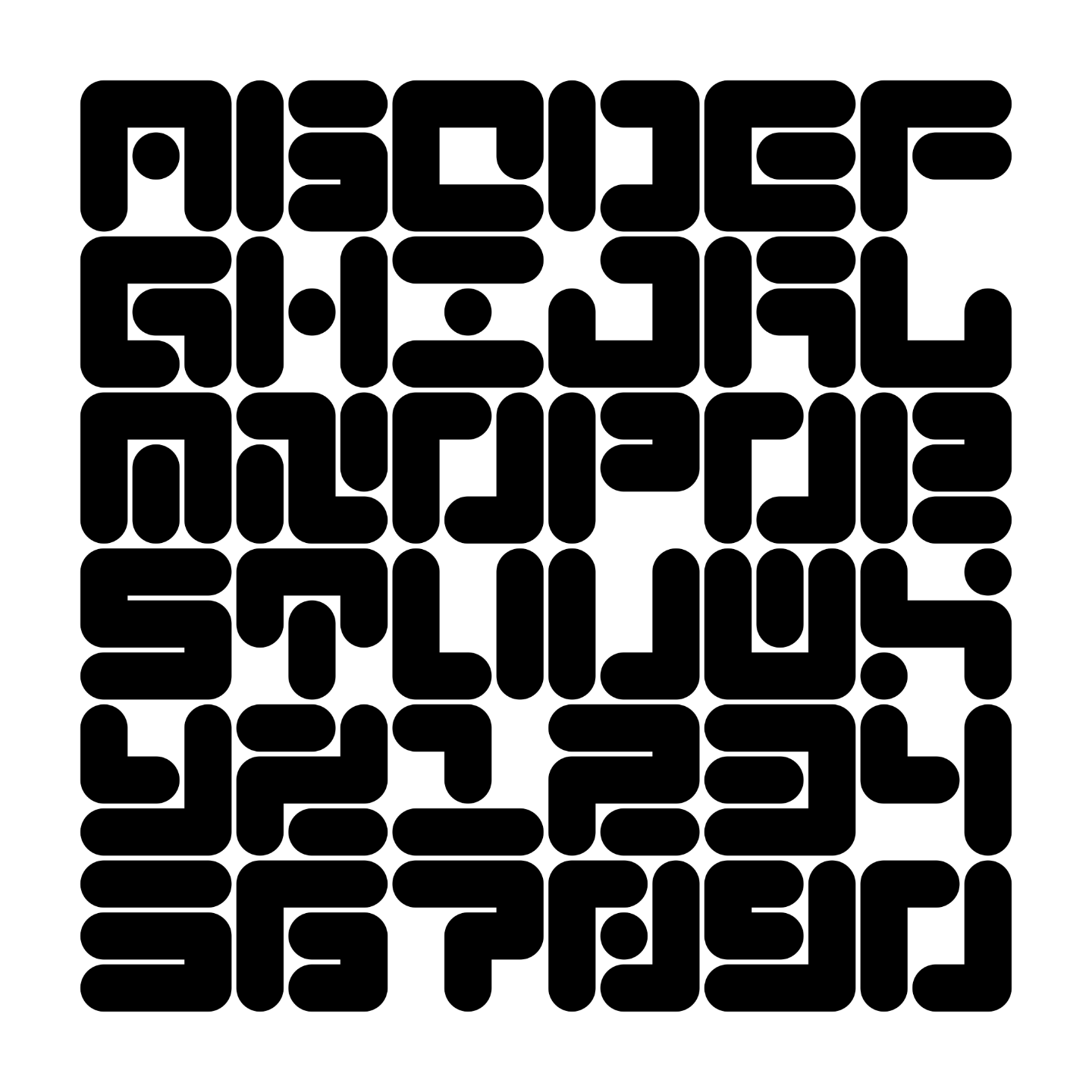
Maurice Meilleur’s re-creations of a typeface made by Jurriaan Schrofer in the 1970’s for the Dutch street cleaning and garbage removal services. It was designed to be “stencil-friendly”. In the end, it was not used as a monospaced font.
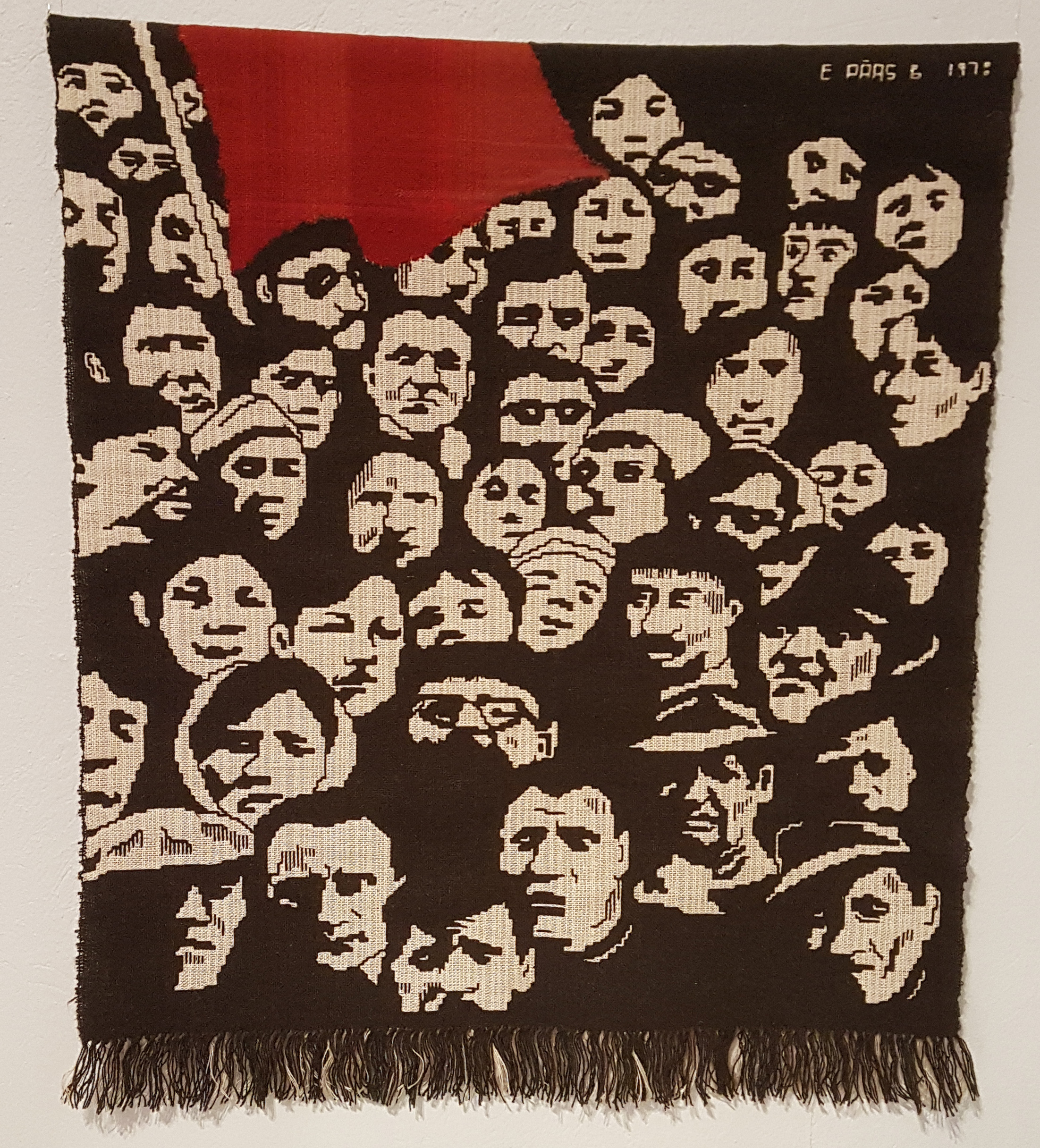
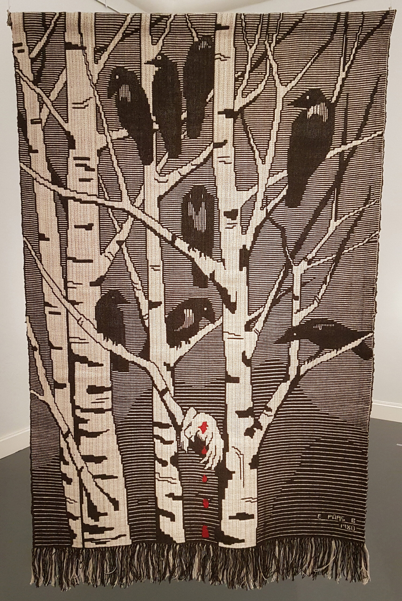
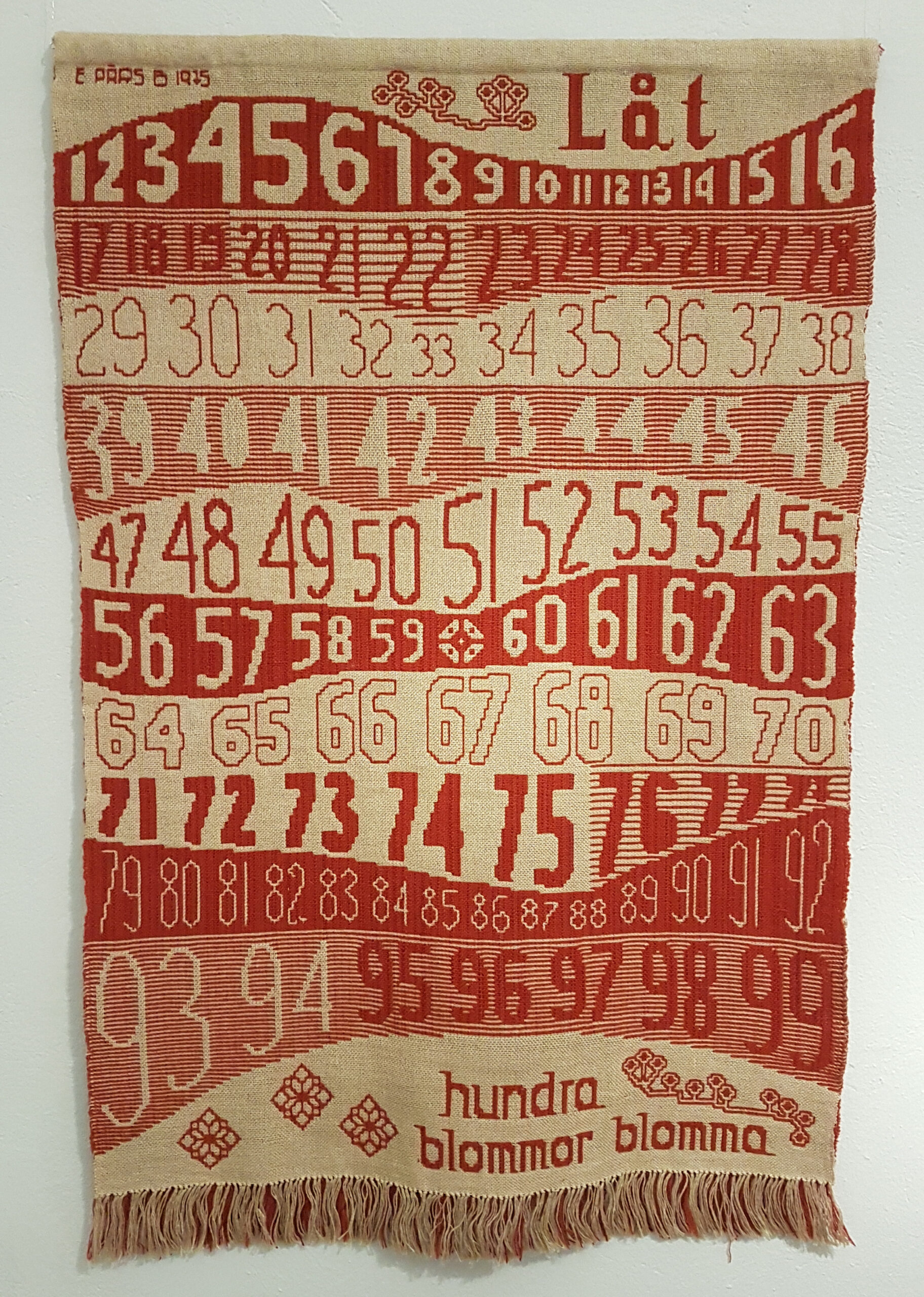
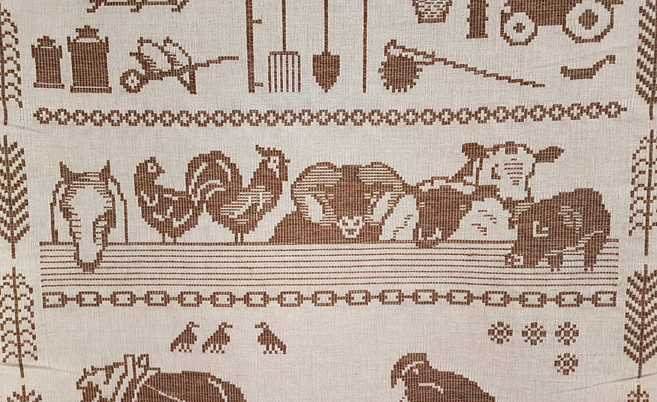
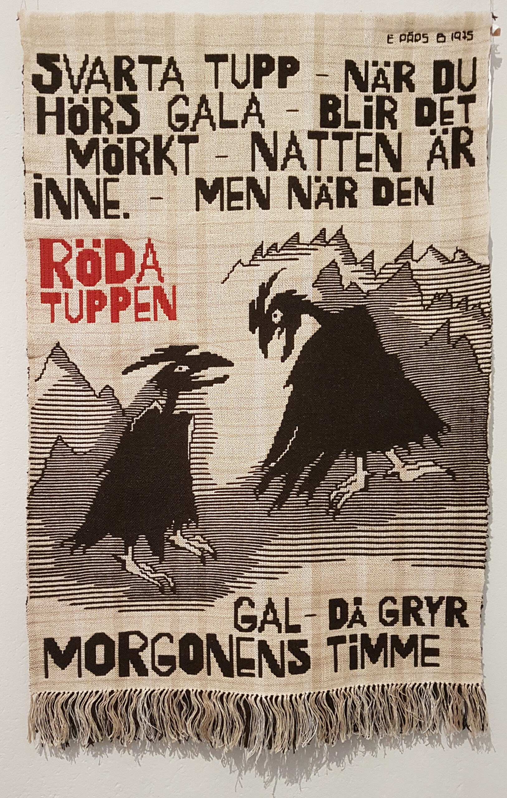
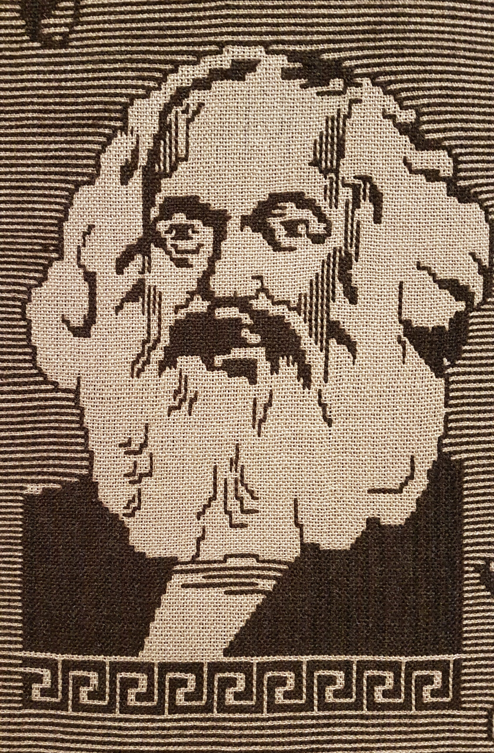
Works by Elsa Pärs-Berglund, made 1974-1984. Photos from her exhibition at Röhsska, Gothenburg.